Build your web apps using Smart UI
Smart.DropDownList - configuration and usage
Overview
Smart.DropDownList represents an input with a dropdown list of items.
Getting Started with DropDownList Web Component
Smart UI for Web Components is distributed as smart-webcomponents NPM package. You can also get the full download from our website with all demos from the Download page.Setup the DropDownList
Smart UI for Web Components is distributed as smart-webcomponents NPM package
- Download and install the package.
npm install smart-webcomponents
- Once installed, import the DropDownList module in your application.
<script type="module" src="node_modules/smart-webcomponents/source/modules/smart.dropdownlist.js"></script>
-
Adding CSS reference
The smart.default.css CSS file should be referenced using following code.
<link rel="stylesheet" type="text/css" href="node_modules/smart-webcomponents/source/styles/smart.default.css" />
- Add the DropDownList tag to your Web Page
<smart-drop-down-list id="dropdownlist"></smart-drop-down-list>
- Create the DropDownList Component
	<script type="module">
		Smart('#dropdownlist', class {
			get properties() {
				return { selectionMode: "one" }
			}
		});
	</script>
Another option is to create the DropDownList is by using the traditional Javascript way:
	const dropdownlist = document.createElement('smart-drop-down-list');

	dropdownlist.disabled = true;
	document.body.appendChild(dropdownlist);
Smart framework provides a way to dynamically create a web component on demand from a DIV tag which is used as a host. The following imports the web component's module and creates it on demand, when the document is ready. The #dropdownlist is the ID of a DIV tag.
	import "../../source/modules/smart.dropdownlist.js";

	document.readyState === 'complete' ? init() : window.onload = init;

	function init() {
		const dropdownlist = new Smart.DropDownList('#dropdownlist', { selectionMode: "one" });
	}
- Open the page in your web server.
Appearance
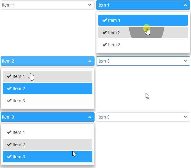
Smart.DropDownList allows to completely customize the content of the list items.
In order to change the content of an item, itemTemplate property has to be applied by assigning the id of an HTML Template element that's located inside the DOM. Here's an example:
<!DOCTYPE html>
<html lang="en">
<head>
 <link rel="stylesheet" href="../../source/styles/smart.default.css" type="text/css" />
 <script type="text/javascript" src="../../source/smart.elements.js"></script>
</head>
<body>
 <template id="template">
     <span class="glyphicon glyphicon-ok"></span>
     <span> {{label}}</span>
 </template>

 <smart-drop-down-list item-template="template">
     <smart-list-item selected value="1">Item 1</smart-list-item>
     <smart-list-item value="2">Item 2</smart-list-item>
     <smart-list-item value="3">Item 3</smart-list-item>
 </smart-drop-down-list>
</body>
</html>
The template contains a binding field surrounded by curly braces {{ label }}. The text between the breckets can be random.
Demo
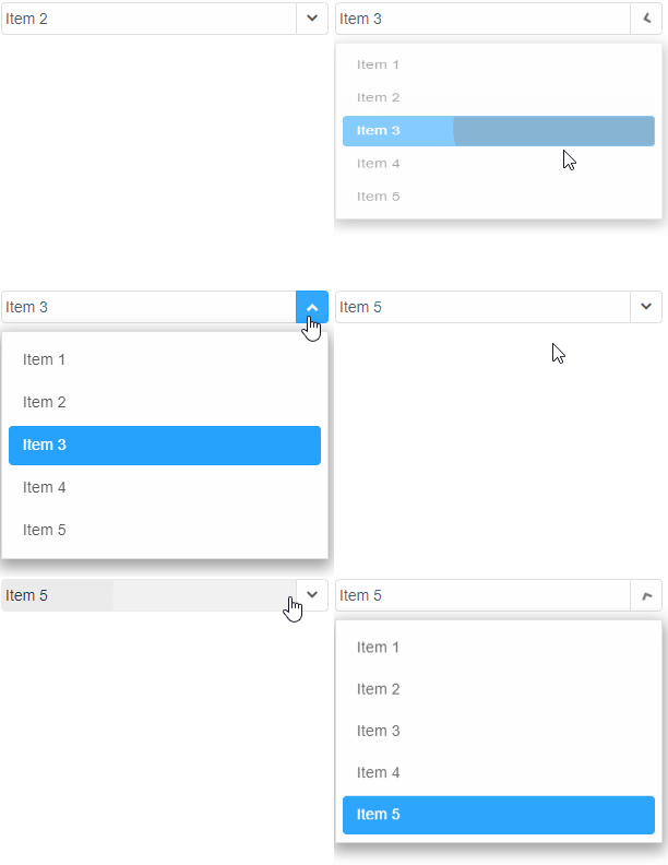
Smart.DropDownList has the abbility to behave like a simple input field or an input field with a separate drop down button. The dropDownOpenMode property determines how the drop down will open. The element can have two separate buttons: an action and a dropDown button if the property is set to 'dropDownButton'.
Available modes for dropDownOpenMode:
- none - the popup doesn't open.
- default - opens if the user clicks on the dropDownButton
- dropDownButton - the input and the button behave like two separate elements. The drop down button becomes focusable using keyboard interaction.
- auto - the drop down popup opens when the mouse is over the element and closes when not.
<smart-drop-down-list drop-down-open-mode="dropDownButton">
     <smart-list-item >Item 1</smart-list-item>
     <smart-list-item selected>Item 2</smart-list-item>
     <smart-list-item>Item 3</smart-list-item>
     <smart-list-item>Item 4</smart-list-item>
     <smart-list-item>Item 5</smart-list-item>
 </smart-drop-down-list>
Demo
Data Binding
Adding data to the Combo box can be accomplished in a few ways:
-
Nesting Smart.ListItem elements inside the Combo box's body in the HTML:
 <smart-drop-down-list>
     <smart-list-item value="value1">Item1</smart-list-item>
     <smart-list-item selected value="value2">Item2</smart-list-item>
     <smart-list-item value="value3">Item3</smart-list-item>
 </smart-drop-down-list>
Demo
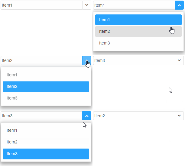
Smart.ListItem has a label and a value property. The value property can have a separate value from the label or no value at all. The user can prefer to apply a value only to the label and it will be automatically assigned to value as well.
The text inside the list item represents the value of the label property. It can also be set in the HTML code like shown in the example above.
-
Nesting Smart.ListItemGroup elements inside the DropDownList's body in the HTML:
<smart-drop-down-list>
    <smart-list-items-group label="Group 1">
        <smart-list-item>Item 1</smart-list-item>
        <smart-list-item>Item 2</smart-list-item>
        <smart-list-item>Item 3</smart-list-item>
    </smart-list-items-group>
    <smart-list-items-group label="Group 2">
        <smart-list-item>Item 4</smart-list-item>
        <smart-list-item>Item 5</smart-list-item>
        <smart-list-item>Item 6</smart-list-item>
    </smart-list-items-group>
    <smart-list-items-group label="Group 3">
        <smart-list-item>Item 7</smart-list-item>
        <smart-list-item>Item 8</smart-list-item>
        <smart-list-item>Item 9</smart-list-item>
    </smart-list-items-group>
</smart-drop-down-list>
Smart.ListItemGroup represents a group of items.
Grouping can also be enabled later via javascript by applying the grouped property.
Demo

-
Nesting HTML list elements inside the Combo box's body in the HTML:
<smart-drop-down-list>
     <ul label="Group 1">
         <li>Item 1</li>
         <li>Item 2</li>
         <li>Item 3</li>
         <li>Item 4</li>
         <li>Item 5</li>
     </ul>
     <ul label="Group 2">
         <li>Item 6</li>
         <li>Item 7</li>
         <li>Item 8</li>
         <li>Item 9</li>
         <li>Item 10</li>
     </ul>
 </smart-drop-down-list>
List items can be added without the ul tag. The grouping can be added at a later stage by setting the grouped property to the element.
Demo

-
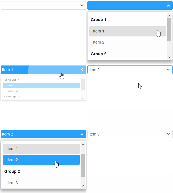
Nesting optgroup elements inside the Combo box's body in the HTML:
<smart-drop-down-list>
     <optgroup label="Group 1">
         <option value="1">Item 1</option>
         <option value="2">Item 2</option>
     </optgroup>
     <optgroup label="Group 2">
         <option value="3">Item 3</option>
         <option value="4">Item 4</option>
     </optgroup>
 </smart-drop-down-list>
optgroups are the items of an HTML select element. As usual the value attribute can be applied to each list item to assign a specific value that can differ from the label.
Demo
-
Setting the dataSource property of the element to a new value of type Array.
The property can be changed dynamically via javascript after the element has been initialized:
<!DOCTYPE html>
<html>
<head>
 <link rel="stylesheet" href=../../source/styles/smart.default.css" type="text/css" />
 <script type="text/javascript" src="../../source/smart.elements.js"></script>
 <script>
 window.onload = function () {
     document.querySelector('smart-drop-down-list').dataSource =
         [
             "Item 1",
             "Item 2",
             "Item 3"
         ];
     }
 </script>
</head>
<body>
 <smart-drop-down-list></smart-drop-down-list>
</body>
</html>
Demo
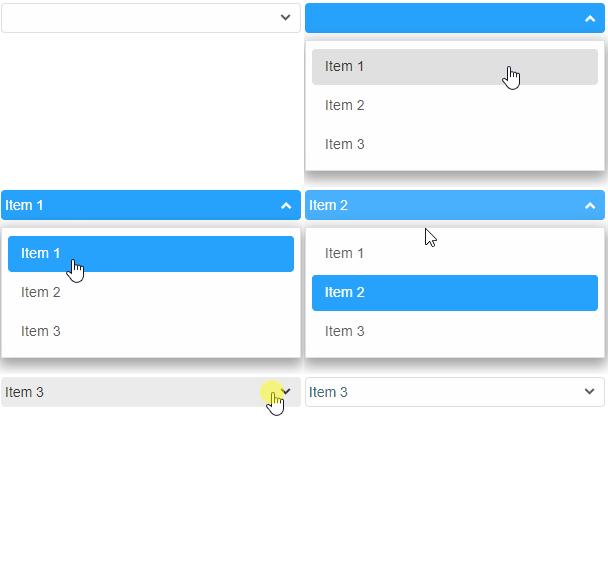
dataSource accepts Arrays of strings or Objects. An object can contain more specific data for the items. For example:
<!DOCTYPE html>
<html>
<head>
 <link rel="stylesheet" href=../../source/styles/smart.default.css" type="text/css" />
 <script type="text/javascript" src="../../source/smart.elements.js"></script>
 <script>
 window.onload = function () {
     var dropDownList = document.querySelector('smart-drop-down-list');

     dropDownList.dataSource = [
         {
             label: 'Item 1',
             value: 1
         },
         {
             label: 'Item 2',
             value: 2
         },
         {
             label: 'Item 3',
             value: 3,
             disabled: true
         },
         {
             label: 'Item 4',
             value: 4
         },
         {
             label: 'Item 5',
             value: 5
         },
     ];
 }
 </script>
</head>
<body>
 <smart-drop-down-list></smart-drop-down-list>
</body>
</html>
Demo
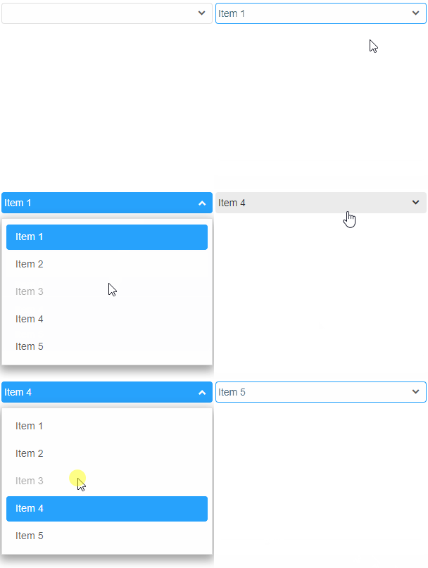
Like every other custom element property, dataSource can also be set from the HTML in the tag of the element, like so:
<smart-drop-down-list data-source='["Item1", "Item2", "Item3"]'></smart-drop-down-list>
Demo
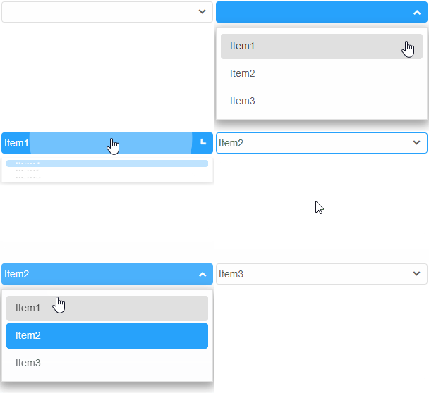
Manipulating the content
The element offers the following methods:
-
Insert method can create and insert new list items into the element.
The insert method can be called at any time after the element has been initialized.
The method accepts two arguments:
- The index at which the item will be inserted.
- An array of strings or a single string representing the labels of the items to be inserted.
<!DOCTYPE html>
<html>
<head>
 <link rel="stylesheet" href=../../source/styles/smart.default.css" type="text/css" />
 <script type="text/javascript" src="../../source/smart.elements.js"></script>
 <script>
     window.onload = function () {
         var dropDownList = document.querySelector('smart-drop-down-list');

         dropDownList.insert(0, ["Item1", "Item2", "Item3"]);
         dropDownList.insert(2, 'Item4');
     }
 </script>
</head>
<body>
 <smart-drop-down-list></smart-drop-down-list>
</body>
</html>
Demo
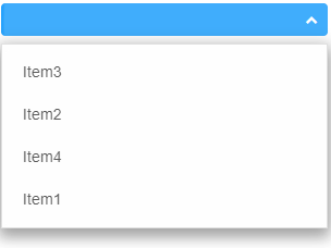
-
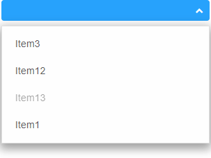
Update method allow List items to be modified after creation.
Update method accepts two arguments:- The index of the item to be updated.
- Details for the item. This argument can be an object containing properties of smartListItem, e.g. label, value, disabled. It can also be a simple string that represents the new label of the item that will be updated.
<!DOCTYPE html>
<html>
<head>
 <link rel="stylesheet" href=../../source/styles/smart.default.css" type="text/css" />
 <script type="text/javascript" src="../../source/smart.elements.js"></script>
 <script>
     window.onload = function () {
         var dropDownList = document.querySelector('smart-drop-down-list');

         //Create items
         dropDownList.insert(0, ["Item1", "Item2", "Item3"]);
         dropDownList.insert(2, 'Item4');

         //Update items
         dropDownList.update(1, 'Item12');
         dropDownList.update(2, { label: 'Item13', value: '13', disabled: true });
     }
 </script>
</head>
<body>
 <smart-drop-down-list></smart-drop-down-list>
</body>
</html>
Demo
-
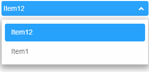
Remove deletes an item from the element. The method accepts a single argument - the index of the item to be removed.
Here's an example:
<!DOCTYPE html>
<html>
<head>
 <link rel="stylesheet" href=../../source/styles/smart.default.css" type="text/css" />
 <script type="text/javascript" src="../../source/smart.elements.js"></script>
 <script>
     window.onload = function () {
         var dropDownList = document.querySelector('smart-drop-down-list');

         //Create items
         dropDownList.insert(0, ["Item1", "Item2", "Item3"]);
         dropDownList.insert(2, 'Item4');

         //Update items
         dropDownList.update(1, 'Item12');
         dropDownList.update(2, { label: 'Item13', value: '13', disabled: true });

         //Remove items
         dropDownList.remove(2);
         dropDownList.remove(0);
     }
 </script>
</head>
<body>
 <smart-drop-down-list></smart-drop-down-list>
</body>
</html>
Demo
-
clearItems removes all items from the element. Takes no arguments:
window.onload = function () {
    var dropDownList = document.querySelector('smart-drop-down-list');

    dropDownList.clearItems();
}
Behavior
Smart.DropDownList offers different drop down positions: bottom, top, overlay-center, overlay-bottom, overlay-top, center-top, center-bottom and auto. The position of the listBox drop down can be modified via the dropDownPosition property, like so:
<!DOCTYPE html>
<html>
<head>
 <link rel="stylesheet" href=../../source/styles/smart.default.css" type="text/css" />
 <script type="text/javascript" src="../../source/smart.elements.js"></script>
 <script>
     window.onload = function () {
         var dropDownList = document.querySelector('smart-drop-down-list');

         dropDownList.dropDownPosition = 'top';
     }
 </script>
</head>
<body>
 <smart-drop-down-list>
    <smart-list-item>Item 1</smart-list-item>
    <smart-list-item>Item 2</smart-list-item>
    <smart-list-item>Item 3</smart-list-item>
 </smart-drop-down-list>
</body>
</html>
Demo

Similar to any other property dropDownPosition can be set in the HTML with an attribute:
<smart-drop-down-list drop-down-position="bottom">
    <smart-list-item>Item 1</smart-list-item>
    <smart-list-item>Item 2</smart-list-item>
    <smart-list-item>Item 3</smart-list-item>
</smart-drop-down-list>
Demo
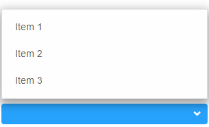
The default value of the property is 'auto'. This means that the element will automatically determine the position of the drop down depending on the space available. The algorithm always starts by trying to place the drop down below the element. If there's no space available it moves it above the element.
Keyboard Support
The following keys apply to the Combo box element:
| Key | Action |
|---|---|
| Alt + Arrow Up/Down | Open/Close the drop down popup. |
| Enter | Select/Unselect an item form the list or open/close the drop down popup if the drop down button is focused when dropDownOpenMode is set to dropDownButton. |
| Arrow Up | Navigate to the previous item from the list if the drop down popup is opened. |
| Arrow Down | Navigate to the next item in the list if the drop down popup is opened. |
| Escape | Close the drop down popup. |
Create, Append, Remove, Get/Set Property, Invoke Method, Bind to Event
Create a new element:
const dropdownlist = document.createElement('smart-drop-down-list');
Append it to the DOM:
document.body.appendChild(dropdownlist);
Remove it from the DOM:
dropdownlist.parentNode.removeChild(dropdownlist);
Set a property:
dropdownlist.propertyName = propertyValue;
Get a property value:
const propertyValue = dropdownlist.propertyName;
Invoke a method:
dropdownlist.methodName(argument1, argument2);
Add Event Listener:
	const eventHandler = (event) => {
	   // your code here.
	};

	dropdownlist.addEventListener(eventName, eventHandler);
Remove Event Listener:
dropdownlist.removeEventListener(eventName, eventHandler, true);
Using with Typescript
Smart Web Components package includes TypeScript definitions which enables strongly-typed access to the Smart UI Components and their configuration.
Inside the download package, the typescript directory contains .d.ts file for each web component and a smart.elements.d.ts typescript definitions file for all web components. Copy the typescript definitions file to your project and in your TypeScript file add a reference to smart.elements.d.ts
Read more about using Smart UI with Typescript.Getting Started with Angular DropDownList Component
Setup Angular Environment
Angular provides the easiest way to set angular CLI projects using Angular CLI tool.
Install the CLI application globally to your machine.
npm install -g @angular/cli
Create a new Application
ng new smart-angular-dropdownlist
Navigate to the created project folder
cd smart-angular-dropdownlist
Setup the DropDownList
Smart UI for Angular is distributed as smart-webcomponents-angular NPM package
- Download and install the package.
npm install smart-webcomponents-angular
- Adding CSS reference
The following CSS file is available in ../node_modules/smart-webcomponents-angular/ package folder. This can be referenced in [src/styles.css] using following code.@import 'smart-webcomponents-angular/source/styles/smart.default.css';
Another way to achieve the same is to edit the angular.json file and in the styles add the style."styles": [ "node_modules/smart-webcomponents-angular/source/styles/smart.default.css" ]
If you want to use Bootstrap, Fluent or other themes available in the package, you need to add them after 'smart.default.css'. -
Example with Angular Standalone Components
app.component.html
 <smart-drop-down-list #dropdownlist [selectedIndexes]="[0]">
    <smart-list-item [value]="'1'">Affogato</smart-list-item>
    <smart-list-item [value]="'2'">Americano</smart-list-item>
    <smart-list-item [value]="'3'">Bicerin</smart-list-item>
    <smart-list-item [value]="'4'">Breve</smart-list-item>
    <smart-list-item [value]="'5'">Cappuccino</smart-list-item>
    <smart-list-item [value]="'6'">Cafe Crema</smart-list-item>
    <smart-list-item [value]="'7'">Cafe Corretto</smart-list-item>
    <smart-list-item [value]="'8'">Cafe macchiato</smart-list-item>
    <smart-list-item [value]="'9'">Cafe mocha</smart-list-item>
    <smart-list-item [value]="'10'">Cortado</smart-list-item>
    <smart-list-item [value]="'11'">Cuban espresso</smart-list-item>
    <smart-list-item [value]="'12'">Espresso</smart-list-item>
    <smart-list-item [value]="'13'">Eiskaffee</smart-list-item>
    <smart-list-item [value]="'14'">Frappuccino</smart-list-item>
    <smart-list-item [value]="'15'">Galao</smart-list-item>
    <smart-list-item [value]="'16'">Greek frappe coffee</smart-list-item>
    <smart-list-item [value]="'17'">Iced Coffee</smart-list-item>
    <smart-list-item [value]="'18'">Instant Coffee</smart-list-item>
    <smart-list-item [value]="'19'">Latte</smart-list-item>
    <smart-list-item [value]="'20'">Liqueur coffee</smart-list-item>
</smart-drop-down-list>
app.component.ts
 import { Component, ViewEncapsulation, ViewChild, OnInit, AfterViewInit } from '@angular/core';
import { DropDownListComponent } from 'smart-webcomponents-angular/dropdownlist';


import { CommonModule } from '@angular/common';
import { RouterOutlet } from '@angular/router';
import { DropDownListModule } from 'smart-webcomponents-angular/dropdownlist';

@Component({
    selector: 'app-root',
	standalone: true,
	imports: [CommonModule, DropDownListModule, RouterOutlet],
	encapsulation: ViewEncapsulation.None,
    templateUrl: './app.component.html',
	styleUrls: ['./app.component.css']
})

export class AppComponent implements AfterViewInit, OnInit {
	@ViewChild('dropdownlist', { read: DropDownListComponent, static: false }) dropdownlist!: DropDownListComponent;


	ngOnInit(): void {
		// onInit code.
	}

	ngAfterViewInit(): void {
		// afterViewInit code.
		this.init();
    }

	init(): void {
		// init code.


	}
}
-
Example with Angular NGModule
app.component.html
 <smart-drop-down-list #dropdownlist [selectedIndexes]="[0]">
    <smart-list-item [value]="'1'">Affogato</smart-list-item>
    <smart-list-item [value]="'2'">Americano</smart-list-item>
    <smart-list-item [value]="'3'">Bicerin</smart-list-item>
    <smart-list-item [value]="'4'">Breve</smart-list-item>
    <smart-list-item [value]="'5'">Cappuccino</smart-list-item>
    <smart-list-item [value]="'6'">Cafe Crema</smart-list-item>
    <smart-list-item [value]="'7'">Cafe Corretto</smart-list-item>
    <smart-list-item [value]="'8'">Cafe macchiato</smart-list-item>
    <smart-list-item [value]="'9'">Cafe mocha</smart-list-item>
    <smart-list-item [value]="'10'">Cortado</smart-list-item>
    <smart-list-item [value]="'11'">Cuban espresso</smart-list-item>
    <smart-list-item [value]="'12'">Espresso</smart-list-item>
    <smart-list-item [value]="'13'">Eiskaffee</smart-list-item>
    <smart-list-item [value]="'14'">Frappuccino</smart-list-item>
    <smart-list-item [value]="'15'">Galao</smart-list-item>
    <smart-list-item [value]="'16'">Greek frappe coffee</smart-list-item>
    <smart-list-item [value]="'17'">Iced Coffee</smart-list-item>
    <smart-list-item [value]="'18'">Instant Coffee</smart-list-item>
    <smart-list-item [value]="'19'">Latte</smart-list-item>
    <smart-list-item [value]="'20'">Liqueur coffee</smart-list-item>
</smart-drop-down-list>
app.component.ts
 import { Component, ViewEncapsulation, ViewChild, OnInit, AfterViewInit } from '@angular/core';
import { DropDownListComponent } from 'smart-webcomponents-angular/dropdownlist';


@Component({
    selector: 'app-root',
	encapsulation: ViewEncapsulation.None,
    templateUrl: './app.component.html',
	styleUrls: ['./app.component.css']
})

export class AppComponent implements AfterViewInit, OnInit {
	@ViewChild('dropdownlist', { read: DropDownListComponent, static: false }) dropdownlist!: DropDownListComponent;


	ngOnInit(): void {
		// onInit code.
	}

	ngAfterViewInit(): void {
		// afterViewInit code.
		this.init();
    }

	init(): void {
		// init code.


	}
}
app.module.ts
 import { NgModule } from '@angular/core';
import { BrowserModule } from '@angular/platform-browser';

import { DropDownListModule } from 'smart-webcomponents-angular/dropdownlist';

import { AppComponent } from './app.component';

@NgModule({
    declarations: [ AppComponent ],
    imports: [ BrowserModule, DropDownListModule ],
    bootstrap: [ AppComponent ]
})

export class AppModule { }
Running the Angular application
After completing the steps required to render a DropDownList, run the following command to display the output in your web browser
ng serveand open localhost:4200 in your favorite web browser.
Read more about using Smart UI for Angular: https://www.htmlelements.com/docs/angular-cli/.
Getting Started with React DropDownList Component
Setup React Environment
The easiest way to start with React is to use NextJS Next.js is a full-stack React framework. It’s versatile and lets you create React apps of any size—from a mostly static blog to a complex dynamic application.
npx create-next-app my-app
cd my-app
npm run dev
or
yarn create next-app my-app
cd my-app
yarn run dev
Preparation
Setup the DropDownList
Smart UI for React is distributed as smart-webcomponents-react package
- Download and install the package.
In your React Next.js project, run one of the following commands to install Smart UI DropDownList for ReactWith NPM:
npm install smart-webcomponents-react
With Yarn:yarn add smart-webcomponents-react
- Once installed, import the React DropDownList Component and CSS files in your application and render it.
app.js
import 'smart-webcomponents-react/source/styles/smart.default.css';
import React from "react";
import ReactDOM from "react-dom/client";
import { DropDownList, ListItem } from 'smart-webcomponents-react/dropdownlist';

function App() {
	return (
		<div>
			<DropDownList  selectedIndexes={[0]}>
				<ListItem value="1">Affogato</ListItem>
				<ListItem value="2">Americano</ListItem>
				<ListItem value="3">Bicerin</ListItem>
				<ListItem value="4">Breve</ListItem>
				<ListItem value="5">Cappuccino</ListItem>
				<ListItem value="6">Cafe Crema</ListItem>
				<ListItem value="7">Cafe Corretto</ListItem>
				<ListItem value="8">Cafe macchiato</ListItem>
				<ListItem value="9">Cafe mocha</ListItem>
				<ListItem value="10">Cortado</ListItem>
				<ListItem value="11">Cuban espresso</ListItem>
				<ListItem value="12">Espresso</ListItem>
				<ListItem value="13">Eiskaffee</ListItem>
				<ListItem value="14">Frappuccino</ListItem>
				<ListItem value="15">Galao</ListItem>
				<ListItem value="16">Greek frappe coffee</ListItem>
				<ListItem value="17">Iced Coffee</ListItem>
				<ListItem value="18">Instant Coffee</ListItem>
				<ListItem value="19">Latte</ListItem>
				<ListItem value="20">Liqueur coffee</ListItem>
			</DropDownList>
		</div>
	 );
}


export default App;
Running the React application
Start the app withnpm run devor
yarn run devand open localhost:3000 in your favorite web browser to see the output.
Setup with Vite
Vite (French word for "quick", pronounced /vit/, like "veet") is a build tool that aims to provide a faster and leaner development experience for modern web projectsWith NPM:
npm create vite@latestWith Yarn:
yarn create viteThen follow the prompts and choose React as a project.
Navigate to your project's directory. By default it is 'vite-project' and install Smart UI for React
In your Vite project, run one of the following commands to install Smart UI DropDownList for ReactWith NPM:
npm install smart-webcomponents-reactWith Yarn:
yarn add smart-webcomponents-reactOpen src/App.tsx App.tsx
import 'smart-webcomponents-react/source/styles/smart.default.css';
import React from "react";
import ReactDOM from "react-dom/client";
import { DropDownList, ListItem } from 'smart-webcomponents-react/dropdownlist';

function App() {
	return (
		<div>
			<DropDownList  selectedIndexes={[0]}>
				<ListItem value="1">Affogato</ListItem>
				<ListItem value="2">Americano</ListItem>
				<ListItem value="3">Bicerin</ListItem>
				<ListItem value="4">Breve</ListItem>
				<ListItem value="5">Cappuccino</ListItem>
				<ListItem value="6">Cafe Crema</ListItem>
				<ListItem value="7">Cafe Corretto</ListItem>
				<ListItem value="8">Cafe macchiato</ListItem>
				<ListItem value="9">Cafe mocha</ListItem>
				<ListItem value="10">Cortado</ListItem>
				<ListItem value="11">Cuban espresso</ListItem>
				<ListItem value="12">Espresso</ListItem>
				<ListItem value="13">Eiskaffee</ListItem>
				<ListItem value="14">Frappuccino</ListItem>
				<ListItem value="15">Galao</ListItem>
				<ListItem value="16">Greek frappe coffee</ListItem>
				<ListItem value="17">Iced Coffee</ListItem>
				<ListItem value="18">Instant Coffee</ListItem>
				<ListItem value="19">Latte</ListItem>
				<ListItem value="20">Liqueur coffee</ListItem>
			</DropDownList>
		</div>
	 );
}


export default App;
Read more about using Smart UI for React: https://www.htmlelements.com/docs/react/.
Getting Started with Vue DropDownList Component
Setup Vue with Vite
In this section we will introduce how to scaffold a Vue Single Page Application on your local machine. The created project will be using a build setup based on Vite and allow us to use Vue Single-File Components (SFCs). Run the following command in your command linenpm create vue@latestThis command will install and execute create-vue, the official Vue project scaffolding tool. You will be presented with prompts for several optional features such as TypeScript and testing support:
✔ Project name: …If you are unsure about an option, simply choose No by hitting enter for now. Once the project is created, follow the instructions to install dependencies and start the dev server:✔ Add TypeScript? … No / Yes ✔ Add JSX Support? … No / Yes ✔ Add Vue Router for Single Page Application development? … No / Yes ✔ Add Pinia for state management? … No / Yes ✔ Add Vitest for Unit testing? … No / Yes ✔ Add an End-to-End Testing Solution? … No / Cypress / Playwright ✔ Add ESLint for code quality? … No / Yes ✔ Add Prettier for code formatting? … No / Yes Scaffolding project in ./ ... Done.
cdnpm install npm install smart-webcomponents npm run dev
-
Make Vue ignore custom elements defined outside of Vue (e.g., using the Web Components APIs). Otherwise, it will throw a warning about an Unknown custom element, assuming that you forgot to register a global component or misspelled a component name.
Open vite.config.js in your favorite text editor and change its contents to the following:
vite.config.js
import { fileURLToPath, URL } from 'node:url' import { defineConfig } from 'vite' import vue from '@vitejs/plugin-vue' // https://vitejs.dev/config/ export default defineConfig({ plugins: [ vue({ template: { compilerOptions: { isCustomElement: tag => tag.startsWith('smart-') } } }) ], resolve: { alias: { '@': fileURLToPath(new URL('./src', import.meta.url)) } } }) -
Open src/App.vue in your favorite text editor and change its contents to the following:
App.vue
<template>
  <div class="vue-root">
    <smart-drop-down-list selected-indexes="[0]">
      <smart-list-item value="1">Affogato</smart-list-item>
      <smart-list-item value="2">Americano</smart-list-item>
      <smart-list-item value="3">Bicerin</smart-list-item>
      <smart-list-item value="4">Breve</smart-list-item>
      <smart-list-item value="5">Cappuccino</smart-list-item>
      <smart-list-item value="6">Cafe Crema</smart-list-item>
      <smart-list-item value="7">Cafe Corretto</smart-list-item>
      <smart-list-item value="8">Cafe macchiato</smart-list-item>
      <smart-list-item value="9">Cafe mocha</smart-list-item>
      <smart-list-item value="10">Cortado</smart-list-item>
      <smart-list-item value="11">Cuban espresso</smart-list-item>
      <smart-list-item value="12">Espresso</smart-list-item>
      <smart-list-item value="13">Eiskaffee</smart-list-item>
      <smart-list-item value="14">Frappuccino</smart-list-item>
      <smart-list-item value="15">Galao</smart-list-item>
      <smart-list-item value="16">Greek frappe coffee</smart-list-item>
      <smart-list-item value="17">Iced Coffee</smart-list-item>
      <smart-list-item value="18">Instant Coffee</smart-list-item>
      <smart-list-item value="19">Latte</smart-list-item>
      <smart-list-item value="20">Liqueur coffee</smart-list-item>
    </smart-drop-down-list>
  </div>
</template>

<script>
import { onMounted } from "vue";
import "smart-webcomponents/source/styles/smart.default.css";
import "smart-webcomponents/source/modules/smart.dropdownlist.js";

export default {
  name: "app",
  setup() {
    onMounted(() => {});
  }
};
</script>

<style>
smart-drop-down-list {
  min-height: 35px;
  height: auto;
  width: 300px;
}
</style>
We can now use the smart-drop-down-list with Vue 3. Data binding and event handlers will just work right out of the box.
Running the Vue application
Start the app withnpm run devand open http://localhost:5173/ in your favorite web browser to see the output below:
When you are ready to ship your app to production, run the following:
npm run buildThis will create a production-ready build of your app in the project's ./dist directory.
Read more about using Smart UI for Vue: https://www.htmlelements.com/docs/vue/.