Blazor - Get Started with Smart.Gauge
Setup The Project
Follow the Getting Started guide to set up your Blazor Application with Smart UI.
Setup Basic Gauge
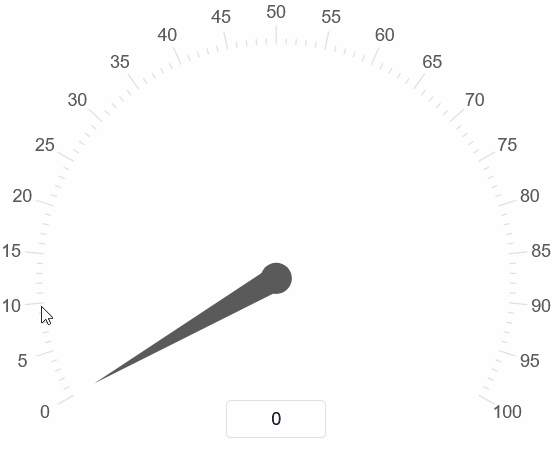
Smart.Gauge is a circular or semi-circular component that allows users to select a value along a custom range.
- Add the Gauge component to the Pages/Index.razor file:
<Gauge></Gauge> - Set the
Valueproperty to an integer value<Gauge Value="50"></Gauge>
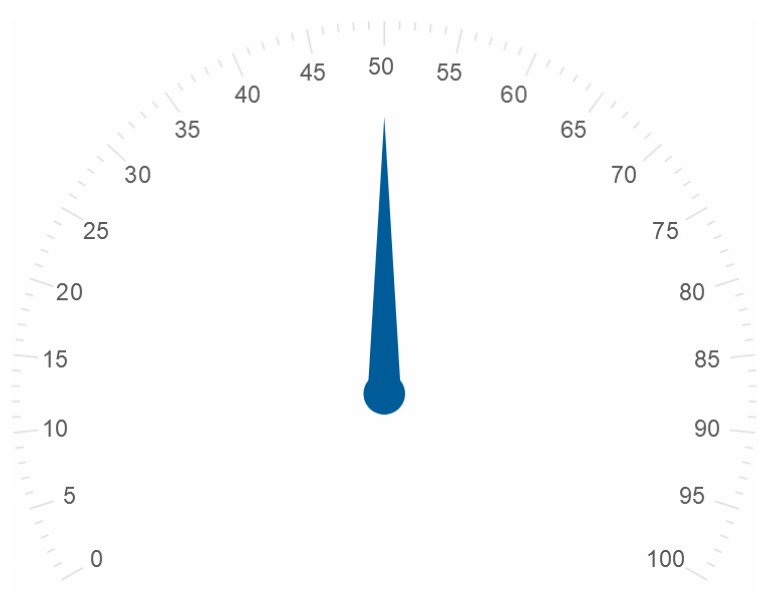
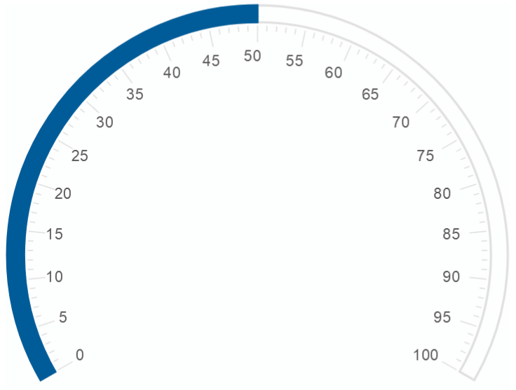
Gauge Analog Display
The analog display of the Cauge element is a Needle by default. It can also be set to Line or Fill
<Gauge Value="50" AnalogDisplayType="GaugeAnalogDisplayType.Fill" ></Gauge>
Snapping Interval
By setting the Coerce property, the Gauge will snap to the nearest value that the interval allows.
The interval between allowed values is set with the Interval property
<Gauge Value="50" AnalogDisplayType="GaugeAnalogDisplayType.Fill" Coerce Interval="10"></Gauge>
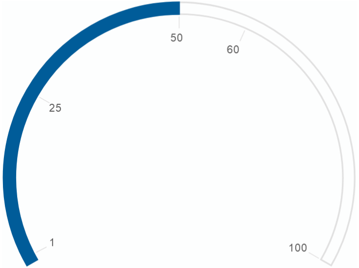
Custom Interval
The ticks of the Gauge can also be set to a custom, possibly uneven interval.
The ticks are set as an array to CustomTicks.
<Gauge Value="50" AnalogDisplayType="GaugeAnalogDisplayType.Fill" CustomInterval CustomTicks="@ticks"></Gauge>
@code{
  int[] ticks = new int[]{1, 25, 50, 60, 100};
}
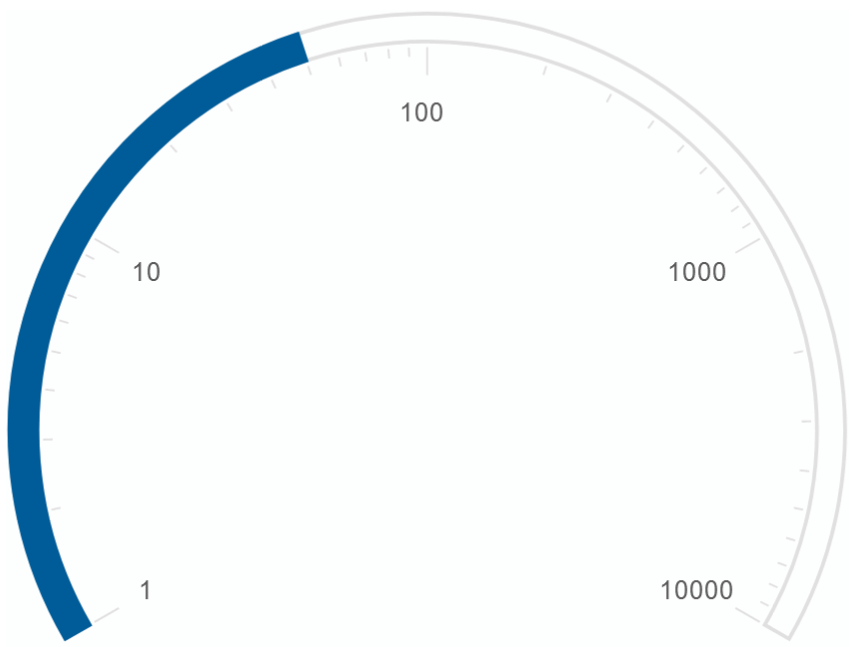
Logarithmic Gauge
In addition to normal scale, Smart.Gauge can be set to logarithmic mode by setting the LogarithmicScale property
<Gauge Max="10000" AnalogDisplayType="GaugeAnalogDisplayType.Fill" Coerce LogarithmicScale></Gauge>
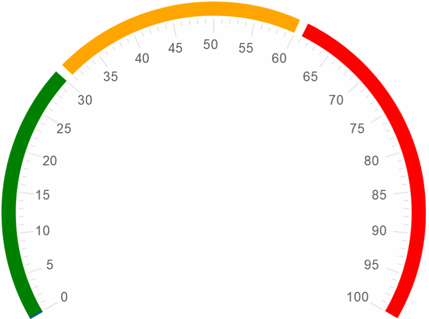
Gauge Ranges
Smart.Gauge can be split into multiple custom sections using the Ranges property.
Each range requires start and end values, as well as className.
In order to become visible, the ShowRanges property must be set
<style>
  .low-range{
    fill:green !important
  }
  .mid-range{
    fill:orange !important
  }
  .high-range{
    fill:red !important
  }
</style>
<Gauge AnalogDisplayType="GaugeAnalogDisplayType.Fill" Coerce Ranges="@ranges" ShowRanges></Gauge>
@code{
  object[] ranges = new object[]{
      new {
          startValue=0,
          endValue=30,
          className="low-range"
      },
      new {
          startValue=31,
          endValue=60,
          className="mid-range"
      },
      new {
          startValue=61,
          endValue=100,
          className="high-range"
      },
  };
}
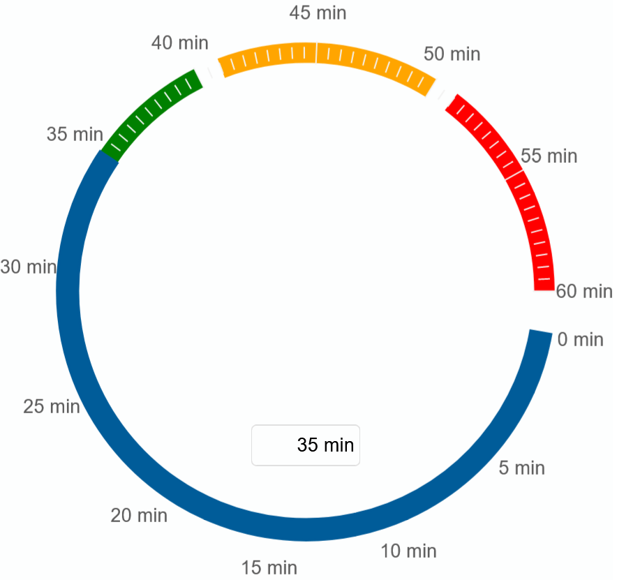
Gauge Customization
Smart.Gauge offers a wide range of methods to customize the look of the component
such as modifying the start and end angles, creating a digital display, using custom units and much more.
<Gauge DigitalDisplay AnalogDisplayType="GaugeAnalogDisplayType.Fill" Coerce StartAngle="0" EndAngle="350"
  TicksPosition="TicksPosition.Track" ScalePosition="GaugeScalePosition.Outside" Max="60"
  ShowRanges Unit="min" ShowUnit Ranges="@ranges">
</Gauge>
Gauge Events
Smart.Gauge provides an OnChange event that can help you expand the components' functionality.
OnChange- triggered when the value of the Gauge is changed.
Event Details: dynamic value, dynamic oldValue
The demo below uses the OnChange Event to disable the element when value becomes greater than 50:
<Gauge @ref="@gauge" DigitalDisplay Coerce ScalePosition="GaugeScalePosition.Outside" OnChange="OnChange"></Gauge>

@code{
    Gauge gauge;
    private void OnChange(Event ev){
        GaugeChangeEventDetail detail = ev["Detail"];
        if(detail.Value>50){
            gauge.Disabled = true;
        }
    }
}