Grid Context Menu
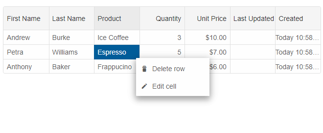
Default Context Menu
A built-in context menu is available in the Grid component. To enable the default context menu, you can use thecontextMenu property.
const gridOptions = {
    dataSourceSettings: {
        dataFields: [
            { name: 'firstName', dataType: 'string' },
            { name: 'lastName', dataType: 'string' },
            { name: 'productName', map: 'product.name', dataType: 'string' },
            { name: 'payment', map: 'product.payment', dataType: 'string' },
            { name: 'quantity', map: 'product.quantity', dataType: 'number' },
            { name: 'price', map: 'product.price', dataType: 'number' },
            { name: 'total', map: 'product.total', dataType: 'number' }
        ]
    },
    editing: {
        enabled: true
    },
    selection: {
        enabled: true,
        allowCellSelection: true,
        mode: 'extended'
    },
    contextMenu: {
        enabled: true
    },
    filtering: {
        enabled: true
    },
    behavior: {
        columnResizeMode: 'growAndShrink'
    },
    sorting: {
        enabled: true
    },
    dataSource: [
        {
            firstName: 'Andrew',
            lastName: 'Burke',
            product: {
                name: 'Ice Coffee', price: 10, quantity: 3, total: 30, payment: 'Visa'
            }
        },
        {
            firstName: 'Petra',
            lastName: 'Williams',
            product: {
                name: 'Espresso', price: 7, quantity: 5, total: 35, payment: 'Visa'
            }
        },
        {
            firstName: 'Anthony',
            lastName: 'Baker',
            product: {
                name: 'Frappucino', price: 6, quantity: 4, total: 24, payment: 'Mastercard'
            }
        }
    ],
    columns: [
        {
            label: 'First Name', dataField: 'firstName'
        },
        { label: 'Last Name', dataField: 'lastName' },
        { label: 'Product', dataField: 'productName' },
        {
            label: 'Quantity', dataField: 'quantity', cellsAlign: 'right'
        },
        {
            label: 'Unit Price', dataField: 'price', cellsAlign: 'right', cellsFormat: 'c2'
        },
        {
            label: 'Last Updated', template: 'updatedDate', dataType: 'date', allowEdit: false
        },
        {
            label: 'Created', template: 'createdDate', dataType: 'date', allowEdit: false
        }
    ]
}
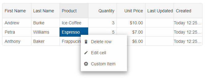
Custom Item
You can setup a custom menu item.
contextMenu: {
	enabled: true,
	dataSource: {
		'contextMenuItemCustom': {
			label: 'Custom Item',
			visible: true,
			command: (details) => {
				// your command code here.
			}
		}
	}
}
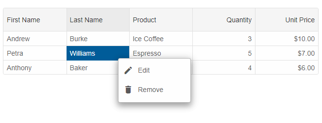
Binding to Context menu
If there is already a context menu on the web page, or you want to override the built-in Grid context menu, you can set thecontextMenu.selector property.
const gridOptions = {
    dataSourceSettings: {
        dataFields: [
            { name: 'firstName', dataType: 'string' },
            { name: 'lastName', dataType: 'string' },
            { name: 'productName', map: 'product.name', dataType: 'string' },
            { name: 'payment', map: 'product.payment', dataType: 'string' },
            { name: 'quantity', map: 'product.quantity', dataType: 'number' },
            { name: 'price', map: 'product.price', dataType: 'number' },
            { name: 'total', map: 'product.total', dataType: 'number' }
        ]
    },
    editing: {
        enabled: true
    },
    selection: {
        enabled: true,
        allowCellSelection: true,
        mode: 'extended'
    },
    contextMenu: {
        enabled: true,
        selector: "#menu"
    },
    filtering: {
        enabled: true
    },
    behavior: {
        columnResizeMode: 'growAndShrink'
    },
    sorting: {
        enabled: true
    },
    dataSource: [
        {
            firstName: 'Andrew',
            lastName: 'Burke',
            product: {
                name: 'Ice Coffee', price: 10, quantity: 3, total: 30, payment: 'Visa'
            }
        },
        {
            firstName: 'Petra',
            lastName: 'Williams',
            product: {
                name: 'Espresso', price: 7, quantity: 5, total: 35, payment: 'Visa'
            }
        },
        {
            firstName: 'Anthony',
            lastName: 'Baker',
            product: {
                name: 'Frappucino', price: 6, quantity: 4, total: 24, payment: 'Mastercard'
            }
        }
    ],
    columns: [
        {
            label: 'First Name', dataField: 'firstName'
        },
        { label: 'Last Name', dataField: 'lastName' },
        { label: 'Product', dataField: 'productName' },
        {
            label: 'Quantity', dataField: 'quantity', cellsAlign: 'right'
        },
        {
            label: 'Unit Price', dataField: 'price', cellsAlign: 'right', cellsFormat: 'c2'
        }
    ]
}
HTML for grid and menu.
<smart-grid id="grid"></smart-grid>
<smart-menu id="menu" mode="dropDown">
	<smart-menu-item data-id="Edit" label="<i class='material-icons'>edit</i>Edit"></smart-menu-item>
	<smart-menu-item data-id="Remove" label="<i class='material-icons'>delete</i> Remove"></smart-menu-item>
</smart-menu>
and the CSS for the context menu
#menu {
    height: auto;
	width: 150px;
}

@font-face {
	font-family: 'Material Icons';
	font-style: normal;
	font-weight: 400;
	src: url(https://fonts.gstatic.com/s/materialicons/v31/2fcrYFNaTjcS6g4U3t-Y5ZjZjT5FdEJ140U2DJYC3mY.woff2) format('woff2');
}

.material-icons {
	font-family: 'Material Icons';
	font-weight: normal;
	font-style: normal;
	font-size: 20px;
	line-height: 1;
	letter-spacing: normal;
	text-transform: none;
	display: inline-block;
	white-space: nowrap;
	word-wrap: normal;
	direction: ltr;
	-webkit-font-feature-settings: 'liga';
	-webkit-font-smoothing: antialiased;
	margin-right: 10px;
}
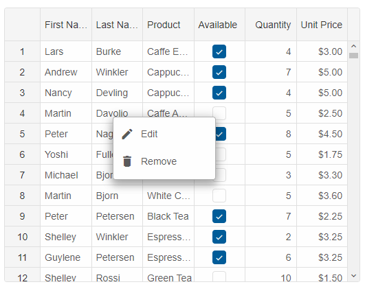
Custom Context Menu
You can use a custom Menu instance as a context menu. Let's see how we can achieve that.HTML for grid and menu.
<smart-grid id="grid"></smart-grid>
<smart-menu id="menu" mode="dropDown">
	<smart-menu-item data-id="Edit" label="<i class='material-icons'>edit</i>Edit"></smart-menu-item>
	<smart-menu-item data-id="Remove" label="<i class='material-icons'>delete</i> Remove"></smart-menu-item>
</smart-menu>
The following code shows how to open and handle the actions of the custom menu.
const menu = document.getElementById('menu');
let rowId = null;
// disable the browser's context menu and open the custom menu.
grid.addEventListener('contextmenu', function (event) {
	event.stopPropagation();
	event.preventDefault();
	menu.open(event.pageX, event.pageY);
	return false;
});
// handle the clicks of the custom menu.
menu.addEventListener('itemClick', function (event) {
	if (rowId === undefined) {
		return;
	}
	if (event.detail.item.getAttribute('data-id') === 'Edit') {
		grid.beginEdit(rowId);
	}
	else {
		grid.deleteRow(rowId);
	}
});
// disable the built-in right-click.
grid.addEventListener('rowClick', function (event) {
	if (event.detail.originalEvent.which === 3) {
		const row = event.detail.row;
		rowId = row.id;
		event.detail.originalEvent.stopPropagation();
	}
});
For AI tooling
Developer Quick Reference
Topic: grid-context-menu Component: Grid Framework: JavaScript
Main methods: addEventListener(), beginEdit(), deleteRow()
Common config keys: editing, selection, filtering, behavior, sorting, dataSource, columns
Implementation Notes
Compatibility: Modern browsers / Web Components API access pattern: const component = document.querySelector(...) + component.method()
Lifecycle guidance: Initialize configuration first, then invoke imperative API when element is available in DOM.
Common pitfalls:
- Calling methods before element initialization.
- Reassigning large configuration partially without understanding merge behavior.
- Missing required module script import for component type.
Validation checklist:
- Ensure module scripts and CSS are loaded once.
- Keep data schema aligned with columns/series definitions.
- Verify method calls target initialized component instance.