Column Menu
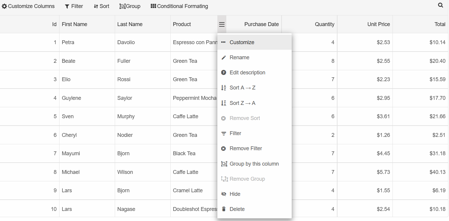
The Column Menu allows users to sort, filter, edit column description and name, customize column cells alignment, group by the column and much more.
It is displayed after clicking the 'hamburger' menu when hovering over a column
The Column Menu is set inside an instance of a GridColumnMenu() object.
The DataSource property allows you to customize which functionalities will be displayed in the menu
<Grid @ref="grid" DataSourceSettings="dataSourceSettings" DataSource="dataRecords" Grouping="@grouping">
  <Columns>
      <Column DataField="Id" Label="#" DataType="number"></Column>
      <Column DataField="FirstName" Label="First Name"></Column>
      <Column DataField="LastName" Label="Last Name"></Column>
      <Column DataField="ProductName" Label="Product"></Column>
      <Column DataField="Quantity" Label="Quantity" DataType="number"></Column>
      <Column DataField="Price" Label="Unit Price" DataType="number"></Column>
      <Column DataField="Total" Label="Total" DataType="number"></Column>
  </Columns>
</Grid>
@code{
  ....
  GridColumnMenu columnMenu = new GridColumnMenu()
  {
      Enabled = true,
      DataSource = new GridColumnMenuDataSource()
      {
          ColumnMenuCustomizeType = new GridCommand() { Visible = true },
          ColumnMenuItemRename = new GridCommand() { Visible = true },
          ColumnMenuItemEditDescription = new GridCommand() { Visible = true },
          ColumnMenuItemHide = new GridCommand() { Visible = true },
          ColumnMenuItemDelete = new GridCommand() { Visible = true }
      }
  };
}
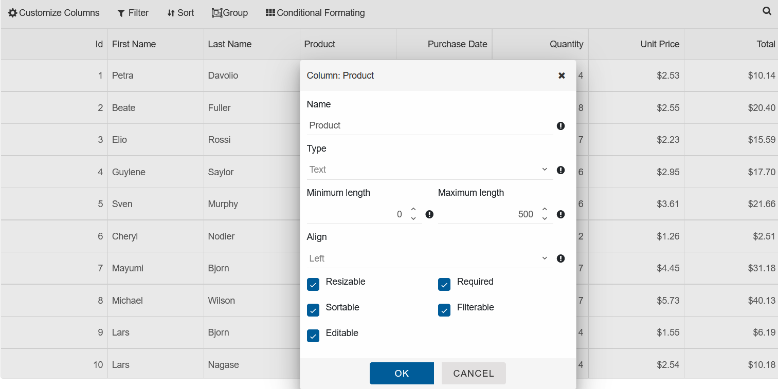
The 'Customize' option opens a modal that allows you to change the column properties such as the Column Type, Label, Alignment and more:
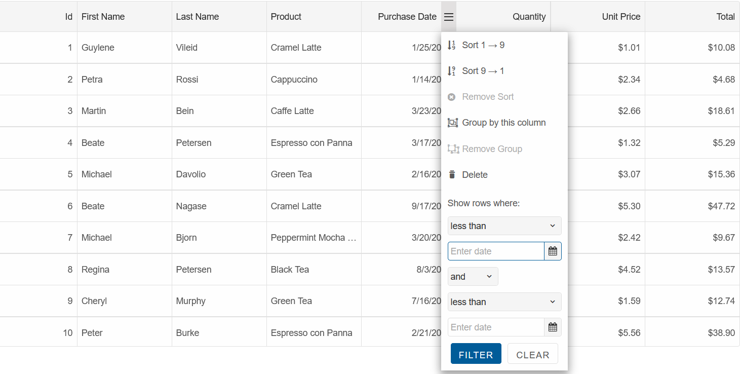
Note: When the Grid Header is declared, as in the demo above, the 'Filter' option will open the Header Filter Menu.
When the Grid Header is not declared, the filtering menu will be set directly inside the Column Menu:
GridColumnMenu Properties
The GridColumnMenu() object implements the following properties:
AutoClose- specifies whether the column menu closes automatically when users clicks on a menu option
Acceptstrue(default) | falseDataSource- specifies the data sources to the column menu
AcceptsGridColumnMenuDataSource()objectVisible- gets whether the column menu is visible
Returnstrue | falseEnabled- specifies whether the column menu is enabled
Acceptstrue | falseWidth- specifies the width of the column menu
Acceptsinteger-default: 250Height- specifies the height of the column menu
Acceptsinteger-default: null