Grid Paging
Smart.Grid allows you to split rows into multiple pages. It also provides a built-in customizable navigation menu to navigate between pages.
The behavior of the paging functionality is mainly described inside the GridPaging and GridPager functions
GridPager describes the customization options of the pager,
such as Visibility, Position, NavigationButtons and many more
GridPaging describes the functionality settings of the pager,
such as Enabled, PageSize, PageIndex and many more
@inject WeatherForecastService ForecastService
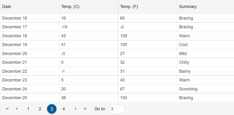
<Grid @ref="grid" DataSource="@forecast" Paging="@paging" Pager="@pager">
<Columns>
<Column DataField="Date" Label="Date" DataType="date" CellsFormat="M"></Column>
<Column DataField="TemperatureC" Label="Temp. (C)"></Column>
<Column DataField="TemperatureF" Label="Temp. (F)"></Column>
<Column DataField="Summary" Label="Summary"></Column>
</Columns>
</Grid>
@code {
Grid grid;
GridPaging paging = new GridPaging()
{
Enabled = true,
PageSize = 10,
PageIndex = 0
};
GridPager pager = new GridPager() {
Visible = true,
Position = LayoutPosition.Far,
NavigationInput = new GridPagerNavigationInput(){
Visible = true
},
};
private WeatherForecast[] forecast;
protected override async Task OnInitializedAsync()
{
forecast = await ForecastService.GetForecastAsync(DateTime.Now);
}
}
GridPager
The GridPager object has the following properties:
AutoEllipsis- sets the ellipsis display mode
AcceptsGridPagerAutoEllipsis.Both(default) | None | Before | AfterPosition- sets the position of pager
AcceptsLayoutPosition.Far(default) | NearTemplate- sets a template for the pager
Acceptsobject-default: ""PageSizeSelector- describes the settings for the 'rows per page' option
AcceptsGridPagerPageSizeSelector()objectSummary- describes the summary settings
AcceptsGridPagerSummary()objectNavigationButtons- describes the navigation buttons settings
AcceptsGridPagerNavigationButtons()objectNavigationInput- describes the settings about navigation input option
AcceptsGridPagerNavigationInput()objectPageIndexSelectors- describes the settings for the numeric page buttons
AcceptsGridPagerPageIndexSelectors()objectVisible- sets the visibility of pager
Acceptstrue | false(default)
GridPaging
The GridPaging object has the following properties:
Enabled- enables pagination
Acceptstrue | false(default)Spinner- describes the spinner pagination settings
AcceptsGridPagingSpinner()objectPageSize- sets the number of rows per page
Acceptsinteger-default: 10PageIndex- sets the start page
Acceptsinteger-default: 0