Blazor - Get Started with Smart.RadioButton
Setup The Project
Follow the Getting Started guide to set up your Blazor Application with Smart UI.
Setup Basic RadioButton
Smart.RadioButton is a custom radio button element with built-in features such as setting the click mode, check mode of the component.
It is recommended to use Smart.RadioButton in forms when the users needs to see all avaible options.
Otherwise Smart.DropDownList can provide better user experience when displaying the avaible options.
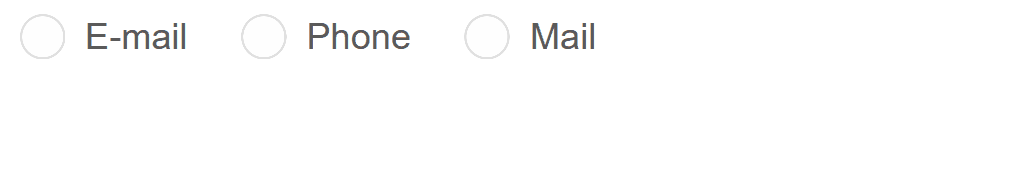
- Add the RadioButton component to the Pages/Index.razor file
<RadioButton></RadioButton>
- Optionally, set the label, value and check state of the RadioButton:
<RadioButton Name="Interests" Value="Music" Checked="true">Music</RadioButton>
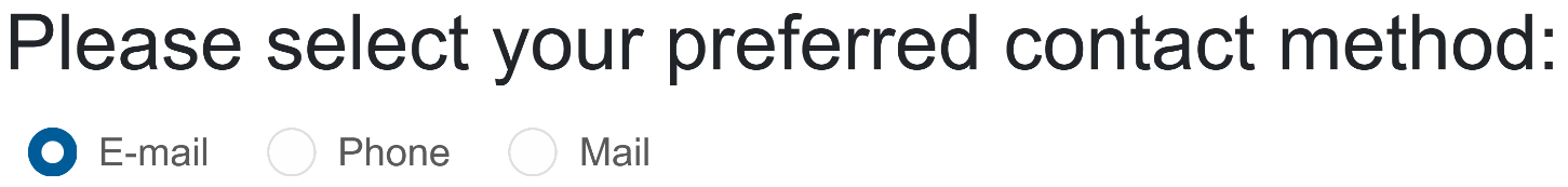
Check Mode
Check Mode determines the behavior of the element when clicking on the input and the label.
When CheckMode is set to Both - the radio button can be selected by both parts of the element.
In the example below, only "Mail" can be selected by both input and label:
<RadioButton Name="contact" Value="email" Checked="true" CheckMode="CheckMode.Label">E-mail</RadioButton>
<RadioButton Name="contact" Value="phone" CheckMode="CheckMode.Input">Phone</RadioButton>
<RadioButton Name="contact" Value="mail" CheckMode="CheckMode.Both">Mail</RadioButton>
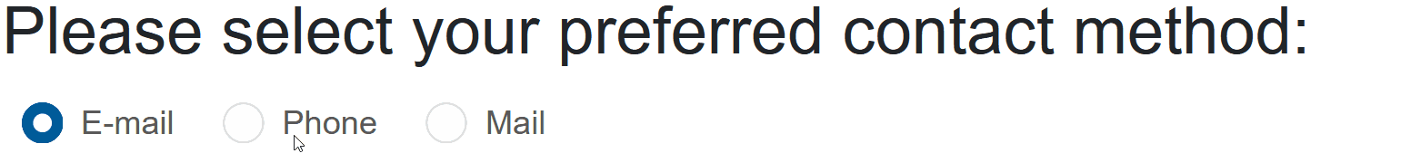
Click Mode
Click Mode determines the necessary action to select a radio button:
Possible values: ClickMode.Release | Press | PressAndRelease | Hover
<RadioButton Name="contact" Value="email" Checked="true" ClickMode="ClickMode.Hover">E-mail</RadioButton>
<RadioButton Name="contact" Value="phone"  ClickMode="ClickMode.Hover">Phone</RadioButton>
<RadioButton Name="contact" Value="mail"  ClickMode="ClickMode.Hover">Mail</RadioButton>

RadioButton Events
Smart.RadioButton provides multiple events that can help you expand the component's functionality.
Each event object has unique event.detail parameters.
OnChange- triggered when the widget is checked/unchecked.
Event Details: dynamic value, dynamic oldValue, dynamic changeTypeOnCheckValue- triggered when the component is checked.
Event Details: dynamic changeTypeOnUncheckValue- triggered when the component is unchecked.
Event Details: dynamic changeType
The demo below uses the OnCheckValue Event to log every time the "Phone" radiobutton is checked:
<RadioButton Name="contact">E-mail</RadioButton>
<RadioButton Name="contact" OnCheckValue="OnCheckValue">Phone</RadioButton>
<RadioButton Name="contact">Mail</RadioButton>
<h5>@message</h5>

@code{
    string message = "";
    private void OnCheckValue(Event ev){
        message += "Checked!, ";
    }
}