Build your web apps using Smart Custom Elements
Smart GanttChart - Timeline
Timeline Tasks
Smart GanttChart has three types of tasks that can be displayed inside the Timeline:
- Task - the most common timeline component that is used to display tasks. Tasks can be dragged/resized and connected to other.
- Project - represents a group of tasks. Similiar to the tasks it can be dragged/resizied by default but that can be changed depending on project specific properties.
- Milestone - similar to the tasks in funcitonality but unlike others it appears in a diamond shape inside the Timeline and it's starting and ending dates are the equal. Milestones can only be dragged but not resized. The purpose of this task is to mark the beginning or ending of a phase.
Task types have similar properties with the exception of Projects. They have additional that are specific only to them. Here's the list of properties:
-
Common properties for all tasks:
- id - sets a unique identifier to the task. Optional
- class - sets a common identifier to the task. This attribute is suitable for styling multiple tasks that belong to a group via CSS. Optional
- dateStart - sets the starting date of the task. Required with the exception of synchronized projects where it's automatically calculated.
- maxDateStart - sets the maximal starting date of the task. Optional
- minDateStart - sets the minimal starting date of the task. Optional
- dateEnd - sets the ending date of the task. Required unless the task has it's duration property set or is a synchronized project.
- maxDateEnd - sets the maximal ending date of the task. Optional
- minDateEnd - sets the minimal ending date of the task. Optional
- disableResize - a boolean flag that if set disables the resizing of the task. Optional
- disableDrag - a boolean flag that if set disables the dragging of the task. Optional
- duration - not applicable to Milestones. Determines the duration of the task. If the task has a dateStart and duration, it's not necessary to include a dateStart.
- minDuration - not applicable to Milestones. Determines the minimal duration of the task.
- maxDuration - not applicable to Milestones. Determines the maximal duration of the task.
- label - the text that marks the task inside the Timeline and Task Tree. Optional
- type - Determines the type of the task, e.g. task, project, milestone. Required
- connections - represents an array of objects that define the connections for the tasks. Optional
- progress - not applicable to Milestones. Determines the progress of the task from 0 to 100 percents. Optional
- resources - represents an array of objects that define the resources of the task. Optional
-
Applicable only to projects:
- dragProject - This property allows to drag the whole project including it's tasks. The drag range limits are determined by the subtasks. Optional
- synchronized - This property indicates that a project is synchronized with it's tasks so it doesn't require any date start/end to be set. The dates will be automatically calculated depending on it's children tasks. Optional
- expanded - Determines whether the project is expanded to see it's children or not. By default projects are collapsed. Optional
- tasks - Represents an array of objects that define the children tasks of a project. Optional
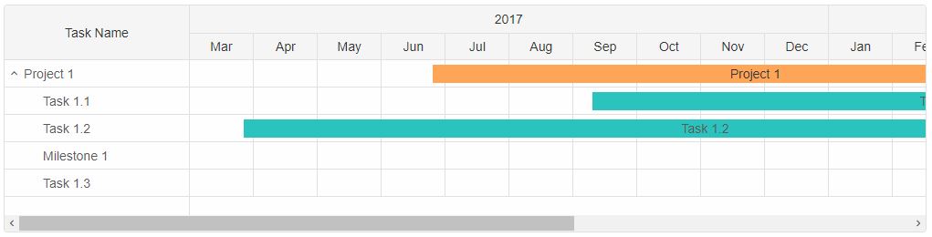
Properties are applied as objects inside GanttChart's dataSource property:
  document.querySelector('jqx-gantt-chart').dataSource = [
        {
            //Non synchronized projects require dateStart/dateEnd like every other task
            label: 'Project 1',
            dateStart: '2017-06-25',
            dateEnd: '2018-04-28',
            dragProject: true,
            expanded: true,
            type: 'project',
            tasks: [
                {
                    label: 'Task 1.1',
                    dateStart: '2017-09-10',
                    dateEnd: '2018-08-10',
                    type: 'task'
                },
                {
                    label: 'Task 1.2',
                    dateStart: '2017-03-27',
                    dateEnd: '2018-06-10',
                    type: 'task'
                },
                {
                    label: 'Milestone 1',
                    dateEnd: '2018-07-15',
                    type: 'milestone'
                },
                {
                    label: 'Task 1.3',
                    dateStart: '2018-04-21',
                    dateEnd: '2018-10-15',
                    type: 'task'
                }
            ]
        }
    ];
Timeline View
By default the timeline displays the months of an year. However this can be changed to view a more dedicated time span. There are several timeline views available:- year - the timeline shows year(s) by month(s).
- month - the timeline shows month(s) by week(s).
- week - the timeline shows week(s) of the day(s).
- day - the timeline shows the day(s) of the hour(s).
The timeline view can be changed via the view property.
document.querySelector('jqx-gantt-chart').view = 'month';
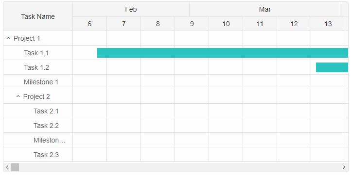
The weeks are displayed by their number inside the header of the timeline.
Timeline Customization
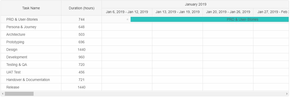
The header of the Timeline inside the GanttChart element can be completely customized via the timelineHeaderFormatFunction. This property accepts a callback that returns the new content for each date cell inside the header. The user can customize the header for a specific view or for all of them:
    const gantt = document.querySelector('jqx-gantt-chart');

    //Custom Format Function
    gantt.timelineHeaderFormatFunction = function (date, type, isHeaderDetails, dateValue) {
        if (type === 'month') {
            return date.toLocaleDateString(gantt.locale, { month: 'long', year: 'numeric' });
        }

        if (type === 'year') {
            return date.toLocaleDateString(gantt.locale, { year: 'numeric' });
        }

        if (type === 'week') {
            const startDayOfWeek = new Date(date),
                endDateOfWeek = new Date(date);

            endDateOfWeek.setDate(date.getDate() + 6);

            return startDayOfWeek.toLocaleDateString(gantt.locale, { day: gantt.dayFormat, month: gantt.monthFormat, year: gantt.yearFormat }) + ' - ' +
                endDateOfWeek.toLocaleDateString(gantt.locale, { day: gantt.dayFormat, month: gantt.monthFormat, year: gantt.yearFormat });
        }

        if (type === 'day') {
            return date.toLocaleDateString(gantt.locale, { day: gantt.dayFormat });
        }

        if (type === 'hour') {
            return date.toLocaleDateString(gantt.locale, { hour: 'numeric' });
        }
    };
The timelineHeaderFormatFunction has the following parameters:
- date - a Date object that represents the date for the current header cell.
- type - a string that represents the type of date to display ( the type depends on the view and the date can represent an year, month, week, day or hour)
- isHeaderDetails - a boolean flag that determines whether it's a cell from the header details container or not.
- dateValue - a string that represents the default value for the cell.
In the example above the header is customized for all views. However the current view is 'month'.
There are additional customizations available. In cases where the use wants to simply change the format of the header to avoid customizing it there are several properties that can do that depending on the view:
- hourFormat - determines the format for the hours when view="day". Possible values are: 'default', '2-digit', 'numeric'. By default it's 'default'.
- dayFormat - determines the format for the days when view="week". Possible values are: '2-digit', 'numeric', 'long', 'short', 'narrow'. By default it's 'short'.
- weekFormat - determines the format for the weeks when view="month". Possible values are: 'long', 'numeric'. By default it's 'long'.
- monthFormat - determines the format for the months when view="year". Possible values are: '2-digit', 'numeric', 'long', 'short', 'narrow'. By default it's 'short'.
- yearFormat - determines the format for the years when view="year". Possible values are: '2-digit', 'numeric'. By default it's 'numeric'.
These formatting properties determine how the dates are presented inside the header for both header details and header sections.
Nonworking Days/Nonworking Hours
GanttChart has two more properties for timeline customization - nonworkingDays and nonworkingHours. These two allow the users to control which days of the week and which hours of the day are treated as nonworking. Nonworking time is excluded from the timeline task date calculation when adjustToNonworkingTime property is enabled. If not set then nonrowkingDays/nonworkingHours are simply colored differently inside the timeline and do not reflect on the dateEnd calculation of the tasks. However they are still being displayed with highlighted color.
- nonworkingDays - represents an array of numbers where each number is the day of the week. Nonworking days are visible when the view is set to 'week'.
- nonworkingHours - represents an array of numbers where each number is the hour of the day. Nonworking hours are visible when the view is set to 'day'.
const ganttChart = document.querySelector('jqx-gantt-chart');

ganttChart.nonworkingDays=[0,1];
ganttChart.nonworkingHours = [[0,23]];
Nonworking time is highlighted inside the Timeline in a different color - gray. The color can be changed via CSS variable.
Weekends are also highlighted in a different color - blue. The color can also be changed via CSS variable.
Infinite Timeline
By default the Timeline's time range is determined by the tasks unless the dateStart and/or dateEnd properties are set. However an additional infiniteTimeline property is available that allows to increase the timeline's range when the horizontal scroll bar thumb reaches maximum position. When the end of the timeline is reached more cells are added to the timeline in order to extend it. The infiniteTimelineStep property determines the number of cells to add to the timeline when the max position is reached. By default the step is set to 5.
document.querySelector('jqx-gantt-chart').infiniteTimelineStep = 3;
Timeline Interaction
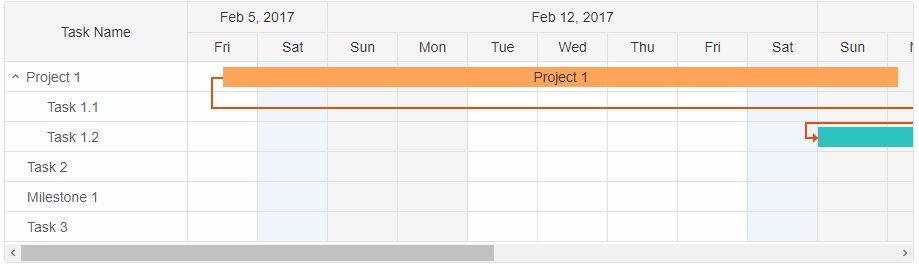
The Timeline inside the GanttChart allows many functionalities. The task bars can be selected by clicking on them, focused, hovered, dragged and resized. When a task is hovered two circle points in the begining and ending of the task bar appear. They allow to connect the task to another one. The colors of the selected/focused/hovered state can be changed via CSS variables.When a task bar is focused/selected a thumb appears below the bar. This thumb shows the progress of the task and can be dragged in order to change it.

Hovering near one of the ends of the task bar will change the cursor to indicate that resizing of the bar is possible. If disableResizing attribute is set to the task than resizing will not be allowed.
The minDuration/maxDuration properties can limit the resizing process. When a task that has one or both of these properties applied is being resized, two delimiters are shown to indicate the min/max possible date:

The green delimiter indicates the minimal starting date allowed for the task while the red shows the maximal.
The minDateStart/minDateEnd/maxDateStart/maxDateEnd properties can limit the dragging process. When a task that has one or more of these properties applied is being dragged, two other delimiters are shown inside the timeline to indicate the min/max possible possition of the task bar:

The task can be dragged in the available space between the two dragging delimiters.
Timeline Events
The following timeline events are available:-
dragStart - the dragging action of the task can be prevented by adding an event listener
to the dragStart event of the GanttChart element which is fired when the task is about to
be dragged.
ganttChart.addEventListener('dragStart', function (event) { event.preventDefault(); }) -
dragEnd - fired when the dragging of a task is completed.
ganttChart.addEventListener('dragEnd', function (event) { //Do something here... }) -
resizeEnd - fired when the resizing of a task is completed.
ganttChart.addEventListener('resizeEnd', function (event) { //Do something here... }) -
resizeStart - similar to the 'dragStart' event, resizeStart is fired before the
resizing of a task begins and the action can also be prevented.
ganttChart.addEventListener('resizeStart', function (event) { event.preventDefault(); }) -
progressChangeStart - similar to the 'resizeStart' event, progressChangeStart is
fired before the progress of a task is changed and the action can also be prevented.
ganttChart.addEventListener('progressChangeStart', function (event) { event.preventDefault(); }) -
progressChangeEnd - fired when the progress changing of a task is completed.
ganttChart.addEventListener('progressChangeEnd', function (event) { //Do something here... }) -
scrollBottomReached - fired when the user scrolls to the bottom of the timeline.
ganttChart.addEventListener('scrollBottomReached', function (event) { //Do something here... }) -
scrollTopReached - fired when the user scrolls to the top of the timeline.
ganttChart.addEventListener('scrollTopReached', function (event) { //Do something here... }) -
scrollLeftReached - fired when the user scrolls to the left (the beginning) of the
timeline.
ganttChart.addEventListener('scrollLeftReached', function (event) { //Do something here... }) -
scrollRightReached - fired when the user scrolls to the right (the end) of the timeline.
   ganttChart.addEventListener('scrollRightReached', function (event) {
           //Do something here...
    })
For AI tooling
Developer Quick Reference
Topic: gantt-timeline Component: GanttChart Framework: JavaScript
Main methods: addEventListener()
Common config keys: (none detected)
Implementation Notes
Compatibility: Modern browsers / Web Components API access pattern: const component = document.querySelector(...) + component.method()
Lifecycle guidance: Initialize configuration first, then invoke imperative API when element is available in DOM.
Common pitfalls:
- Calling methods before element initialization.
- Reassigning large configuration partially without understanding merge behavior.
- Missing required module script import for component type.
Validation checklist:
- Ensure module scripts and CSS are loaded once.
- Keep data schema aligned with columns/series definitions.
- Verify method calls target initialized component instance.