Getting Started with TimePicker Web Component
Smart UI Web Components work with current evergreen browsers and Node 18+ for local tooling; pin package versions to match your project policy.
Smart UI is distributed as the smart-webcomponents NPM package. You can also use the full download from the Download page.
Quick start
- Install the package:
npm install smart-webcomponents
- Load the TimePicker module (ES module script):
<script type="module" src="node_modules/smart-webcomponents/source/modules/smart.timepicker.js"></script>
- Add the default stylesheet (prefer angular.json / bundler entry in app codebases; for plain HTML use a link):
<link rel="stylesheet" type="text/css" href="node_modules/smart-webcomponents/source/styles/smart.default.css" />
- Add markup in one of two ways - semantic custom element (the component tag is in your HTML) or a host
div(you mount programmatically with appendTo):
Semantic element (id matches the selector in Smart()):
<smart-time-picker id="timepicker"></smart-time-picker>
Host container (id matches appendTo on Smart.TimePicker):
<div id="timepickerContainer"></div>
- Initialize after the module loads: define a const timepickerOptions object, then either bind with Smart('#timepicker', ...) on the semantic tag or use new Smart.TimePicker({ ...timepickerOptions, appendTo: '#timepickerContainer' }) on the host
div:
<script type="module">
	import 'node_modules/smart-webcomponents/source/modules/smart.timepicker.js';

	const timepickerOptions = { format: "24-hour" };

	// Option A - semantic <smart-time-picker> with id="timepicker"
	Smart('#timepicker', class {
		get properties() {
			return timepickerOptions;
		}
	});

	// Option B - host div id="timepickerContainer"
	// const timepickerInstance = new Smart.TimePicker({
	// 	...timepickerOptions,
	// 	appendTo: '#timepickerContainer'
	// });

	// Option C - constructor(selector, options), then append the returned element yourself
	// const myTimePicker = new Smart.TimePicker('#timepicker', timepickerOptions);
	// document.body.appendChild(myTimePicker);
</script>
Uncomment Option B when you use the host
div; use Option A when you use the semantic element. The Runtime cookbook also documents new Smart.TimePicker('#timepicker', timepickerOptions) with appendChild, and document.createElement('smart-time-picker') with .props or Object.assign (all are valid patterns; do not combine overlapping patterns for the same instance unless you intend multiple components). - Serve the folder over HTTP (or use your bundler dev server) and open the page.
Runtime cookbook
Alternative creation patterns and imperative APIs. These are all valid ways to create Smart UI components: semantic markup + Smart(); new Smart.TimePicker({ ...options, appendTo: '#...' }); new Smart.TimePicker('#timepicker', timepickerOptions) plus appendChild on the returned element; and document.createElement('smart-time-picker') then assigning options via .props or Object.assign on the element.
Constructor with a selector string and options, then append the returned element (for example const myTimePicker = new Smart.TimePicker('#timepicker', timepickerOptions)):
	const timepickerOptions = { format: "24-hour" };
	const myTimePicker = new Smart.TimePicker('#timepicker', timepickerOptions);
	document.body.appendChild(myTimePicker);
Create with document.createElement('smart-time-picker'), assign properties (same as any custom element), then append:
	const timepickerOptions = { format: "24-hour" };
	const timepicker = document.createElement('smart-time-picker');
	Object.assign(timepicker, timepickerOptions);
	document.body.appendChild(timepicker);
Host on a div with appendTo (import the module, then instantiate when the document is ready; the container id must match appendTo):
	import "../../source/modules/smart.timepicker.js";

	document.readyState === 'complete' ? init() : window.addEventListener('load', init);

	function init() {
		const timepickerOptions = { format: "24-hour" };
		const timepicker = new Smart.TimePicker({
			...timepickerOptions,
			appendTo: '#timepickerContainer'
		});
	}
Demo
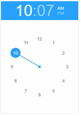
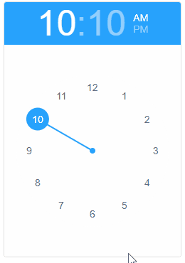
Smart.TimePicker accepts javascript Date objects as time values. The value property is responsible for the time value of the element. Like every custom element property it can be set as an attribute inside the HTML tag of the element:
<smart-time-picker value="new Date(2026,12,1,12,25)"></smart-time-picker>
Demo
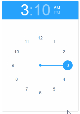
or using javascript:
<!DOCTYPE html>
<html>
<head>
 <link rel="stylesheet" href="../../source/styles/smart.default.css" type="text/css" />
 <script type="text/javascript" src="../../source/modules/smart.timepicker.js"></script>
 <script>
     window.onload = function () {
        document.querySelector('smart-time-picker').value = new Date(2026, 12, 1, 15, 24, 0);
     }
 </script>
</head>
<body>
 <smart-time-picker></smart-time-picker>
</body>
</html>
Demo
Appearance
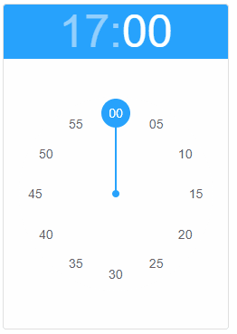
Smart.TimePicker supoprts 12 and 24 hour time format. By default the element uses 12 hour format but the user can change that via the format property like so:
<smart-time-picker format="24-hour"></smart-time-picker>
Demo
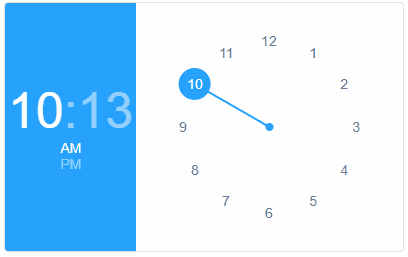
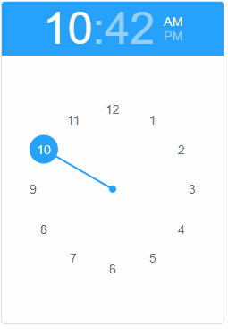
The time picker has two orientation modes that can be changed using the view property. The possible values are:
- landscape - horizontally positioned
- portrait - vertically positioned. Default value.
The property can be set as HTML attribute:
<smart-time-picker view="landscape"></smart-time-picker>
Demo
or javascript:
<!DOCTYPE html>
<html>
<head>
 <link rel="stylesheet" href="../../source/styles/smart.default.css" type="text/css" />
 <script type="text/javascript" src="../../source/modules/smart.timepicker.js"></script>
 <script>
     window.onload = function () {
        document.querySelector('smart-time-picker').view = 'landscape';
     }
 </script>
</head>
<body>
 <smart-time-picker></smart-time-picker>
</body>
</html>
Demo
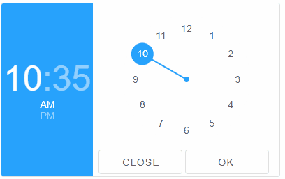
The element has a footer section that is hidden by default. The visibility of the section is controlled by the footer property. The content of the footer can be customized using an HTML Template. Here's how to enable the footer and place HTML content inside:
<!DOCTYPE html>
<html>
<head>
 <link rel="stylesheet" href="../../source/styles/smart.default.css" type="text/css" />
 <script type="text/javascript" src="https://cdnjs.cloudflare.com/ajax/libs/webcomponentsjs/0.7.22/webcomponents-lite.min.js"></script>
 <script type="text/javascript" src="../../source/Smart.element.js"></script>
 <script type="text/javascript" src="../../source/Smart.button.js"></script>
 <script type="text/javascript" src="../../source/Smart.numeric.js"></script>
 <script type="text/javascript" src="../../source/Smart.math.js"></script>
 <script type="text/javascript" src="../../source/Smart.draw.js"></script>
 <script type="text/javascript" src="../../source/Smart.timepicker.js"></script>
</head>
<body>
 <template id="footerTemplate">
     <smart-button>Close</smart-button>
     <smart-button>Ok</smart-button>
 </template>
 <smart-time-picker footer footer-template="footerTemplate"></smart-time-picker>
</body>
</html>
Demo
The same can be accomplished via javascript:
<!DOCTYPE html>
<html>
<head>
 <link rel="stylesheet" href="../../source/styles/smart.default.css" type="text/css" />
 <script type="text/javascript" src="../../source/modules/smart.timepicker.js"></script>
 <script>
     window.onload = function () {
         var timePicker = document.querySelector('smart-time-picker');

         timePicker.footerTemplate = 'footerTemplate';
         timePicker.footer = true;
     }
 </script>
</head>
<body>
 <template id="footerTemplate">
     <smart-button>Close</smart-button>
     <smart-button>Ok</smart-button>
 </template>
 <smart-time-picker></smart-time-picker>
</body>
</html>
Demo
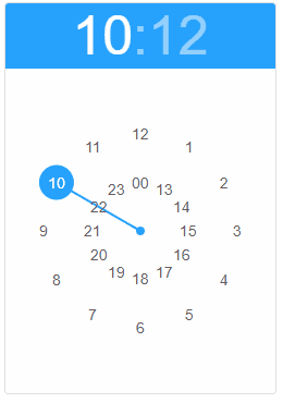
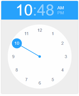
Behavior
Time selection is devided into hour selection and minute selection and the user can switch between the views by clicking on the appropriate part of the time string. However the user can enable the autoSwitchToMinutes property which redirects the user to the minute selection view after selecting an hour.
<smart-time-picker auto-switch-to-minutes></smart-time-picker>
Demo
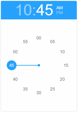
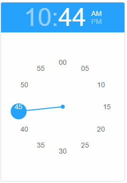
The selection view can also be controlled via the selection property. The available options are:
- hour - hour selection.
- minute - minute selection.
The view can be changed at any time using javascript or applied on HTML initialization:
<smart-time-picker selection="minute"></smart-time-picker>
Demo
The user can also change the minute interval. This can be accomplished by applying the new minute interval in numeric format to the minuteInterval property.
<smart-time-picker selection="minute" minute-interval="15"></smart-time-picker>
Demo
Append to the DOM:
const container = document.getElementById('timepicker-container');
container.appendChild(timepicker);
Remove from the DOM:
timepicker.remove();
Set a property:
timepicker.disabled = true;
timepicker.theme = 'dark';
Get a property value:
const isDisabled = timepicker.disabled;
const currentTheme = timepicker.theme;
Invoke a method:
timepicker.refresh();
timepicker.focus();
Add event listener:
timepicker.addEventListener('change', (event) => {
    console.log('change triggered:', event.detail.oldValue);
});
Remove event listener:
const handleTimePickerEvent = (event) => {
    console.log('change triggered:', event.detail.oldValue);
};

timepicker.addEventListener('change', handleTimePickerEvent);
timepicker.removeEventListener('change', handleTimePickerEvent);
Accessibility
The TimePicker component follows WAI-ARIA best practices:
- Keyboard navigation - Tab, Arrow keys, Enter, and Escape are supported
- ARIA roles - Appropriate roles and labels are applied automatically
- Focus management - Visible focus indicators for keyboard users
- Screen readers - State changes are announced to assistive technology
- High contrast - Supports Windows High Contrast Mode and forced colors
For custom labeling, set aria-label or aria-labelledby attributes on the component.
Supported stacks: Smart UI targets Angular 17+, React 18+, Vue 3+, Node 18 LTS, and evergreen browsers; pin exact package versions to your org policy.