Shadow DOM
In this page, we will show you how to use Smart Web Components with Shadow DOM.
Shadow DOM is a DOM feature that helps you build components. You can think of shadow DOM as a scoped subtree inside your custom element.
<auto-complete>
  <input/>
  <div>
  </div>
</auto-complete>
Shadow DOM lets you place the children in a scoped subtree, so document-level CSS can't restyle the button by accident, for example. This subtree is called a shadow tree.
<auto-complete>
#shadow-root
  <input/>
  <div>
  </div>
</auto-complete>
The shadow root is the top of the shadow tree. The element that the tree is attached to (<auto-complete>) is called the shadow host. The host has a property called shadowRoot that refers to the shadow root. The shadow root has a host property that identifies its host element.
The shadow tree is separate from the element's children. You can think of this shadow tree as part of the component's implementation, which outside elements don't need to know about. The element's children are part of its public interface.
Using Smart Web Components with Shadow DOM
Smart Web Components can be used with Light DOM and with Shadow DOM. In this section, we will show you how to use them with Shadow DOM.
There is only one thing, which you need to do - import the Web Component's javascript file in your web page. The complete component implementation with Templates and Styles is in the referred file.
In the download package, the single-file web components can be found in the 'source/components' folder.
<!DOCTYPE html>
<html>
    <head>
        <title>Table Shadow DOM Demo</title>
        <meta name="viewport" content="width=device-width, initial-scale=1.0, maximum-scale=1.0" />
        <link rel="stylesheet" type="text/css" href="../../source/styles/smart.ui.default.css" />
        <script type="text/javascript" src="../../scripts/data.js"></script>
        <link rel="stylesheet" type="text/css" href="styles.css" />
    </head>
    <body class="viewport">
        <smart-ui-table id="table"></smart-ui-table>

        <!-- scripts -->
        <script type="module" src="../../source/components/smart.ui.table.js"></script>
        <script type="module" src="index.js"></script>
    </body>
</html>
In the above code, we referred the 'smart.ui.default.css', which adds a style that hides the web component, while the page is still loading. The importing of that file is optional. Tha Table Web component's implementation is within the 'smart.ui.table.js' file, imported with this code:
<script type="module" src="../../source/components/smart.ui.table.js"></script>
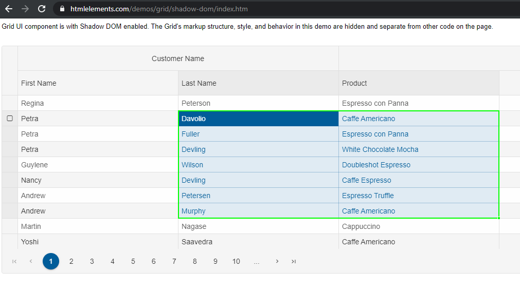
Online Demo: https://www.htmlelements.com/demos/table/shadow-dom/.
All the web components have an example with Shadow DOM usage, available online and in the download package.
Shadow DOM Styling
Styles inside a shadow tree are scoped to the shadow tree, and don't affect elements outside the shadow tree. Styles outside the shadow tree also don't match selectors inside the shadow tree.For example:
<smart-ui-grid id="grid"></smart-ui-grid>
The smart-ui-grid HTML tag adds a Smart.Grid component with all Grid related HTML Elements and CSS Styles within the component's Shadow DOM. You can't directly style anything in a shadow tree using a CSS rule outside of the shadow tree. The exception is CSS variables. A shadow tree inherits CSS properties from its host. To let users customize Smart Web Components, we expose specific styling properties. Some of them are common for all web components, such as '--smart-primary', others are component specific CSS variables like '--smart-grid-cell-color-freeze'. You can see the available set of CSS variables for the Grid component here: https://www.htmlelements.com/docs/grid-css/.
Sometimes, we may want to include an external stylesheet to a Web Component's Shadow DOM. For such scenarios, you have two options:
- The static 'style-url' attribute, which points to a CSS file.
<smart-ui-grid style-url="./styles.css" id="grid"></smart-ui-grid>
- The dynamic 'addStyle' method, which accepts a CSS string.
document.querySelector('smart-ui-grid').addStyle('smart-grid { --smart-primary: #00ff00; }');
Shadow DOM and Composition
When an element has shadow DOM, the shadow tree is rendered instead of the element's children. In Smart Web Components, we addedEvent Retargeting
As the Web Components with Shadow DOM are encapsulated, some events are stopped at the shadow DOM boundary. Other bubbling events are retargeted as they bubble up the tree. Retargeting adjusts the event's target so that it represents an element in the same scope as the listening element.
For example, given a tree like this:
<smart-ui-button>
  #shadow-root
      <smart-button>
         <img>
- A listener on the image element itself receives the
<img>as the target. - A listener on the
<smart-button>receives the<smart-button>as the target, because the original target is inside its shadow root. - A listener on the
<smart-ui-button>receives the<smart-ui-button>itself as the target.
- The
<img>element itself. - The
<smart-button>. - The shadow root of
<smart-ui-button>. - Any ancestors of
<smart-ui-button>(for example,<body>,<html>,documentandWindow).
All custom events of Smart Web Components propagate though shadow DOM boundaries.