Blazor - Get Started with Smart.ComboBox
Setup The Project
Follow the Getting Started guide to set up your Blazor Application with Smart UI.
Setup Basic ComboBox
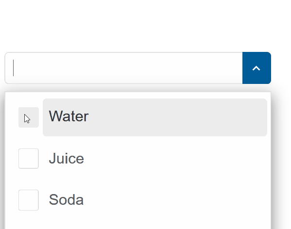
Smart.ComboBox is an input element that allows typing custom text in the field or selecting one or multiple elements from a dropdown list
The list of avaible options is set using the DataSource property.
- Add the ComboBox component to the Pages/Index.razor file
<ComboBox></ComboBox>
- Inside the
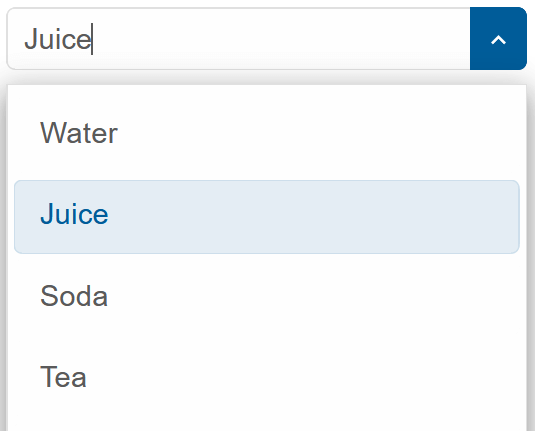
@codeblock, create an array of elements and set it as DataSource of the component<ComboBox DataSource="drinks"></ComboBox> @code{ private string[] drinks = new string[]{"Water", "Juice", "Soda", "Tea", "Beer", "Wine", }; } - Alternatively, set the items as children of the component:
<ComboBox>
  <ListItem>Water</ListItem>
  <ListItem>Juice</ListItem>
  <ListItem>Soda</ListItem>
  <ListItem>Tea</ListItem>
  <ListItem>Beer</ListItem>
</ComboBox>
Selection Modes
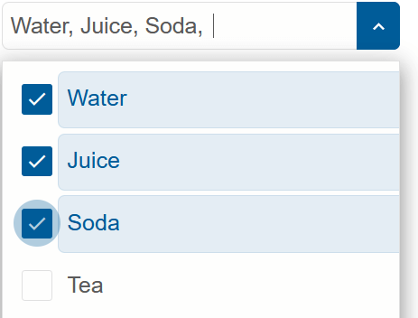
The selection mode of the component can be set to nine different modes:
CheckBox | One | None | OneOrMany | OneOrManyExtended | RadioButton | ZeroAndOne | ZeroOrMany | ZeroOrOne
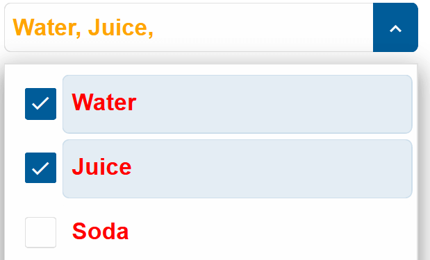
The selection mode is set to Checkbox:
<ComboBox DataSource="drinks" SelectionMode="ListSelectionMode.CheckBox"></ComboBox>
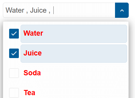
Item Templating
The style of each the list items can be customized by creating a <template> element and setting its id as ItemTemplate of the ComboBox.
<ComboBox DataSource="@source" SelectionMode="ListSelectionMode.CheckBox" ItemTemplate="@itemTemplate"></ComboBox>
<template id="item-template">
  <span style="color:red; font-weight:bold">{{label}}</span>
</template>
@code{
    string[] source = new string[]{"Water", "Juice", "Soda", "Tea", "Beer", "Wine"};
    string itemTemplate = "item-template";
}
Token Templating
The style of each token can also be customized by creating a <template> element and setting its id as Tokenemplate of the ComboBox.
<ComboBox DataSource="@source" SelectionMode="ListSelectionMode.CheckBox" ItemTemplate="@itemTemplate" TokenTemplate="@tokenTemplate"></ComboBox>
<template id="item-template">
  <span style="color:red; font-weight:bold">{{label}}</span>
</template>
<template id="token-template">
  <span style="color:orange; font-weight:bold">{{label}}</span>
</template>
@code{
    string[] source = new string[]{"Water", "Juice", "Soda", "Tea", "Beer", "Wine"};
    string itemTemplate = "item-template";
    string tokenTemplate = "token-template";
}
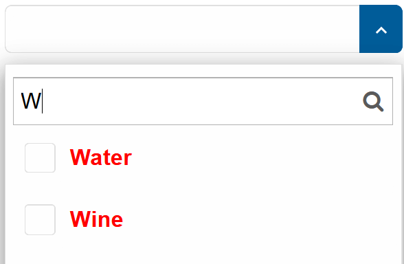
Filtering
Smart.ComboBox's built-in filtering functionality can be enabled using the Filterable property.
<ComboBox DataSource="@source" SelectionMode="ListSelectionMode.CheckBox" ItemTemplate="@itemTemplate" Filterable="true"></ComboBox>
ComboBox Events
Smart.ComboBox provides an multiple Events that can help you expand the component's functionality.
Each event object has unique event.detail parameters.
OnChange- triggered when the selection is changed.
Event Details: dynamic addedItems, dynamic disabled, int index, string label, dynamic removedItems, dynamic selected, dynamic valueOnClose- triggered when the drop down list is closed.
Event Details: N/AOnClosing- triggered when the drop down list is about to be closed.
Event Details: N/AOnItemClick- triggered when an item is clicked.
Event Details: dynamic disabled, int index, string label, dynamic selected, dynamic valueOnOpen- triggered when the drop down list is opened.
Event Details: N/AOnOpening- triggered when the drop down list is about to be open.
Event Details: N/AOnResizeStart- triggered when user starts resizing the drop down.
Event Details: dynamic positionOnResizeEnd- triggered when the resizing of the drop down is finished.
Event Details: dynamic positionOnScrollBottomReached- triggered when user scrolls to the end of the dropDown list.
Event Details: N/AOnScrollTopReached- triggered when user scrolls to the start of the dropDown list.
Event Details: N/AOnTokenClick- triggered when a token item(pill) has been clicked.
Event Details: N/A
The demo below uses the OnItemClick Event to display information regarding the item selection:
<h3>@message</h3>
<ComboBox DataSource="@source" SelectionMode="ListSelectionMode.CheckBox" OnItemClick="OnItemClick"></ComboBox>
@code{
    string[] source = new string[]{"Water", "Juice", "Soda", "Tea", "Beer", "Wine"};
    string message = "";
    private void OnItemClick(Event ev){
        ComboBoxItemClickEventDetail detail = ev["Detail"];
        message = detail.Label + " was " + (detail.Selected ? "selected":"unselected");
    }
}
Two-way Value Binding
The ComboBox component also supports two-way value binding:
<h3>@(string.Join(", ", selectedItems))</h3>
<ComboBox DataSource="@source" @bind-SelectedValues="@selectedItems" SelectionMode="ListSelectionMode.CheckBox"></ComboBox>

@code{
    private string[] source = new string[]{"Water", "Juice", "Soda", "Tea", "Beer", "Wine", };
    string[] selectedItems = new string[]{};
}