Blazor - Get Started with Smart.Input
Setup The Project
Follow the Getting Started guide to set up your Blazor Application with Smart UI.
Setup Basic Input
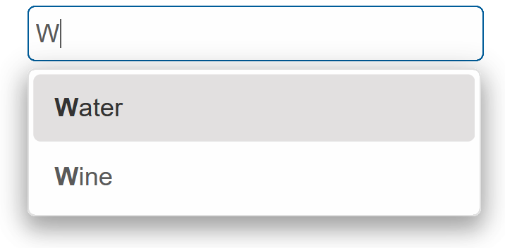
Smart.Input is a custom input element with additional built-in features such as a drop down list with predefined options.
The list of avaible options is set using the DataSource property.
- Add the Input component to the Pages/Index.razor file
<Input></Input>
- Inside the
@codeblock, create an array of elements and set it as DataSource of the component<Input DataSource="drinks" Placeholder="Type text here..."></Input> @code{ private string[] drinks = new string[]{"Water", "Juice", "Soda", "Tea", "Beer", "Wine", }; }
Input Customization
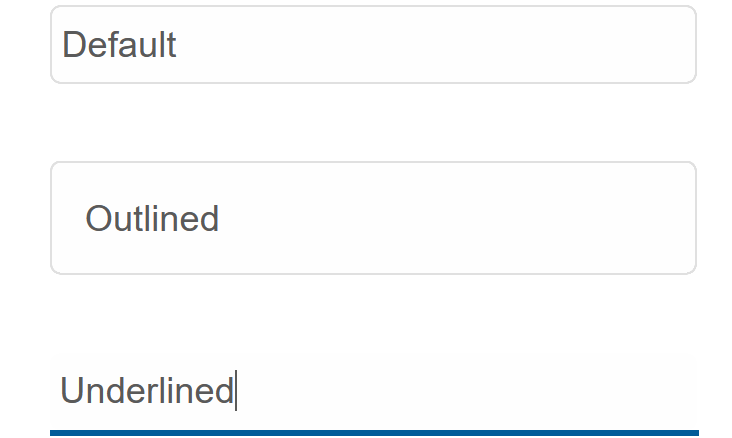
Smart.Input can be styled in different ways by setting the Class property.
The Input can be default, outlined or underlined
<Input DataSource="drinks" Placeholder="Type text here..." Class="underlined"></Input>
Input Events
Smart.Input provides multiple events that can help you expand the component's functionality.
Each event object has unique event.detail parameters.
OnChange- triggered when the selection is changed.
Event Details: string label, dynamic oldLabel, dynamic oldValue, dynamic valueOnChanging- triggered on each key up event of the Input, if the value is changed.
Event Details: dynamic oldValue, dynamic valueOnItemClick- triggered when the user clicks on an item from the popup list.
Event Details: dynamic item, string label, dynamic value
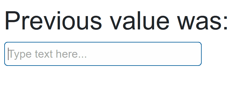
The demo below uses the OnChanging Event to display the previous value of the input field:
<h2>Previous value was:</h2>
<h2>@oldValue</h2>
<Input DataSource="drinks" Placeholder="Type text here..." OnChanging="OnChanging"></Input>

@code{
    private string[] drinks = new string[]{"Water", "Juice", "Soda", "Tea", "Beer", "Wine", };

    string oldValue;
    private void OnChanging(Event ev)
    {
        if(ev.ContainsKey("Detail")){
            InputChangingEventDetail detail = ev["Detail"];
            oldValue = detail.OldValue;
        }
    }
}
Two-way Value Binding
The Input component also supports two-way value binding:
<h3>@textValue</h3>
<Input @bind-Value = "@textValue"></Input>

@code{
    string textValue = "";
}