Blazor - Get Started with Smart.Carousel
Setup The Project
Follow the Getting Started guide to set up your Blazor Application with Smart UI.
Setup Basic Carousel
Smart.Carousel is a custom component that enables you to easily create highly customizable slideshows.
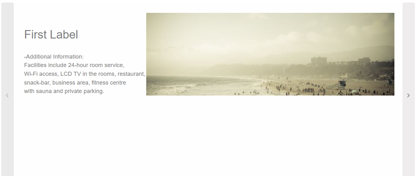
- Add the Carousel component to the Pages/Index.razor file
<Carousel></Carousel>
- Create the array of items in the Carousel. Each item can contain Label, Content and Image. Items can also be set tu custom HTML content.
<Carousel DataSource="items"></Carousel>
@code {
  dynamic[] items = new dynamic[]{
      new {label="First Label", content="Additional Information", image="https://htmlelements.com/demos/images/carousel-medium-1.jpg"},
      new {label="Second Label", content="Additional Information", image="https://htmlelements.com/demos/images/carousel-medium-2.jpg"},
      new {label="Third Label", content="Additional Information", image="https://htmlelements.com/demos/images/carousel-medium-3.jpg"},
      new {label="Forth Label", content="Additional Information", image="https://htmlelements.com/demos/images/carousel-medium-4.jpg"},
  };
}
By deafault, the carousel can be controlled with controls and/or indicators

Controls
The navigation arrows and indicators are enabled by default but can be disabled using the HideArrows and HideIndicators
The Carousel can also be set to slideshow mode - the slides are switched automatically in custom interval:
<Carousel DataSource="items" HideArrows HideIndicators SlideShow AutoPlay Loop Interval="1500"></Carousel>

Templates
Slides inside Smart.Carousel can be set to a custom template element. Set the ItemTemplate property to the id of the template:
<template id="itemTemplate">
  <h3 class="template-header">{{label}}</h3>
  <p class="template-content">{{content}}</p>
  <img class="template-image" src="{{image}}" />
</template>

<Carousel DataSource="items" ItemTemplate="itemTemplate"></Carousel>

@code {
  string itemTemplate = "itemTemplate";
  ....
}
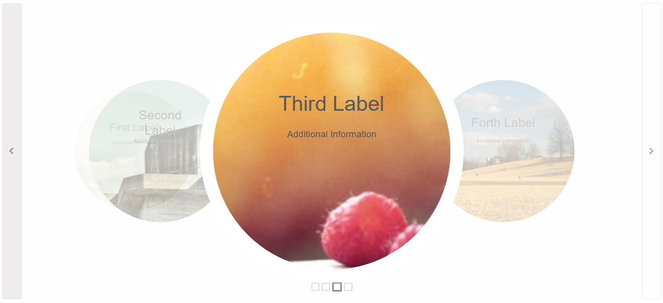
3D Carousel
Smart.Carousel natively supports 3D display mode by setting DisplayMode to CarouselDisplayMode.Threed
In addition, the scrolling direction and look of the slides can be customized with the Class property
<Carousel DataSource="items" DisplayMode="CarouselDisplayMode.Threed" Class="horizontal circle"></Carousel>
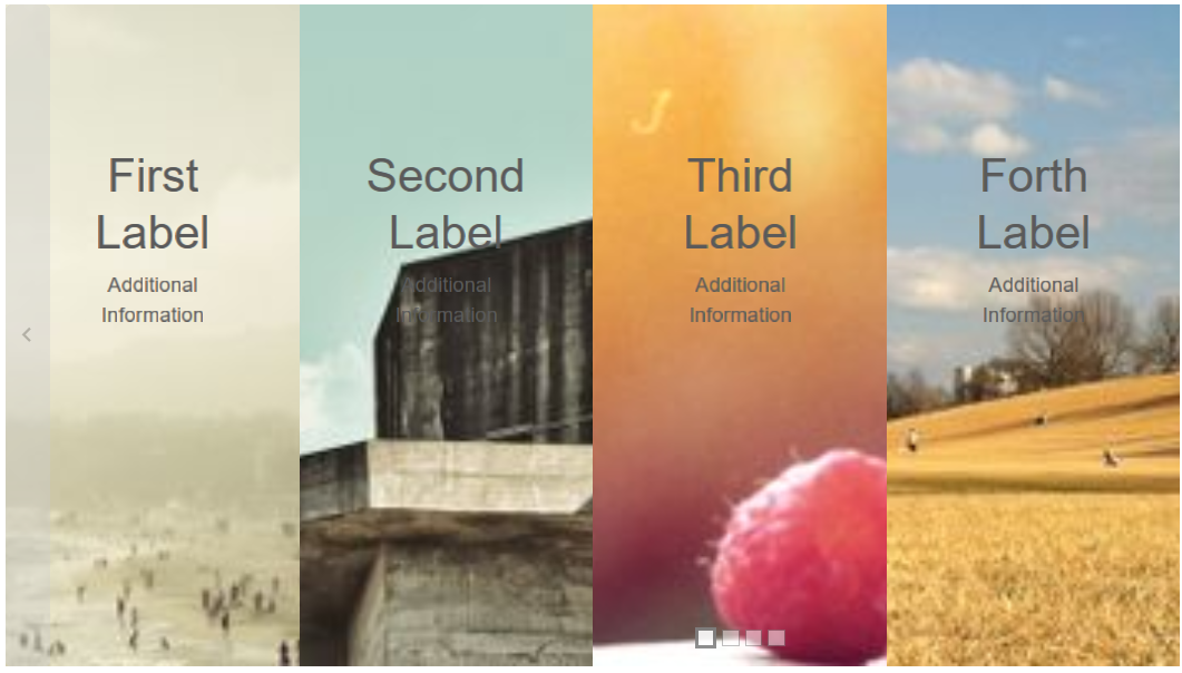
Display Multiple Slides
The Carousel component can display multiple slides at the same time by setting DisplayMode to CarouselDisplayMode.Multiple
<Carousel DataSource="items" DisplayMode="CarouselDisplayMode.Multiple"></Carousel>
Carousel Events
Smart.Carousel provides multiple events that can help you expand the component's functionality.
Each event object has unique event.detail parameters.
OnChange- triggered when the active ( in view ) slide is changed.
Event Details: int index, int indexOnChanging- triggered when the process of slide changing starts.
Event Details: int index, int indexSwipeLeft- triggered when the user swipes to the left inside the Carousel.
Event Details: N/ASwipeRight- triggered when the user swipes to the right inside the Carousel.
Event Details: N/A
The demo below uses the OnChange Event to always return to the first slide after each change:
<Carousel @ref="@carousel" DataSource="items"  DisplayMode="CarouselDisplayMode.Threed" Class="circle" OnChange="OnChange"></Carousel>

@code {
  Carousel carousel;
  dynamic[] items = new dynamic[]{
        new {label="First Label", content="Additional Information", image="https://htmlelements.com/demos/images/carousel-medium-1.jpg"},
        new {label="Second Label", content="Additional Information", image="https://htmlelements.com/demos/images/carousel-medium-2.jpg"},
        new {label="Third Label", content="Additional Information", image="https://htmlelements.com/demos/images/carousel-medium-3.jpg"},
        new {label="Forth Label", content="Additional Information", image="https://htmlelements.com/demos/images/carousel-medium-4.jpg"},
    };
    private void OnChange(){
        carousel.SlideTo(0);
    }
}