Build your web apps using Smart Custom Elements
Smart.Editor - Dialogs
Editor Dialog
Smart.Editor uses a Smart.Window component as a dialog for inserting/editing hyperlinks/tables/images and videos. The Dialog is triggered from the corresponding toolbar item or the context menu. Editor dialogs are very specific so we will cover them one by one in this topic.
The following dialog windows are used by the Smart.Editor:
- Editor Hyperlink Dialog
- Editor Image Dialog
- Editor Video Dialog
- Editor Table Dialog
- Customizing Editor Dialogs
Editor dialogs contain input fields, checkboxes and other controls that allow to configure the element before submiting the window.
Editor Dialogs can contain different fields depending on the editMode as well. Whether it's set to markdown or html, the corresponding output will be generated when the Dialog is submited.
Editor dialog content can be customized via the windowCustomizationFunction property.
Editor Hyperlink Dialog
The Hyperlink dialog allows to insert or edit the currently active hyperlink. A hyperlink is active when the carret is positioned on it.
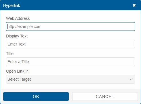
HTML Edit Mode Hyperlink Dialog
Contains the following fields:
- address - the web address for the hyperlink.
- text - the text that will be displayed for the hyperlink.
- title - the title that will be displayed when the hyperlink is hovered.
- target - the target for the hyperlink. This property determines how to open the hyperlink (e.g. inside a new window, same window, etc)
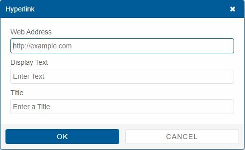
Markdown Edit Mode Hyperlink Dialog
Contains the following fields:
- address - the web address for the hyperlink.
- text - the text that will be displayed for the hyperlink.
- title - the title that will be displayed when the hyperlink is hovered.
Editor Image Dialog
The Image Dialog allows to insert/edit an image into the Editor. The image can be uploaded from the local machine or embeded via an external url address.
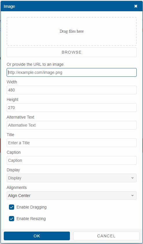
HTML Edit Mode Image Dialog
Contains the following fields:
- file - a Smart.FileUpload control that allows to select an image file to upload to the Editor.
- url - an alternative url field for the image if a local file is not selected.
- width - the width of the image.
- height - the height of the image.
- alt - an alternative text that will appear instead of the image if the image is not loaded successfully.
- title - the title that will be displayed when the image is hovered.
- caption - a caption that will appear under the image , if set.
- display - a display setting for the image which determines whether to display the image as a block or inline element.
- alignment - determines whether to align the image to the left, center or right position.
- draggable - determines whether the image is draggable or not.
- resizable - determines whether the image is resizable or not.
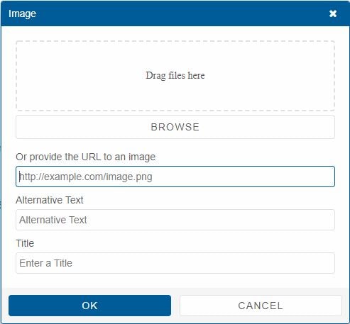
Markdown Edit Mode Image Dialog
Contains the following fields:
- file - a Smart.FileUpload control that allows to select an image file to upload to the Editor.
- url - an alternative url field for the image if a local file is not selected.
- alt - an alternative text that will appear instead of the image if the image is not loaded successfully.
- title - the title that will be displayed when the image is hovered.
Editor Video Dialog
The Video dialog allows to insert/edit videos in the Editor. The video can be uploaded from local storage or a YouTube embeded video.
When inserting an embeded video from YouTube, the user has to set the proper link to a YouTube embeded video.
When a video is inserted from local storage, an HTML5 Video element is created to display the video.
Whe an embeded via is used instead, an iframe is used to display the video.
Markdown does not support video playback. So when inserting a video in markdown edit mode, it is represented as a thumbnail image with a hyperlink that points to an external address where the video can be presented.
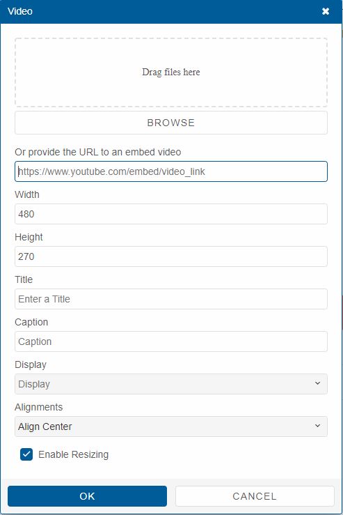
HTML Edit Mode Video Dialog
Contains the following fields:
- file - a Smart.FileUpload control that allows to select a video ( the supported video file formats are: .mp4, .webM, .avi, .ogg, .ogv) file to upload to the Editor.
- src - an alternative source to a YouTube embed video.
- width - the width for the video. By default YouTube recommends 16:9 aspect ratio of minimum 480px.
- height - the height for the video. By default YouTube recommends 16:9 aspect radio of minimum 270px.
- title - a title for the video that is displayed when hovered.
- caption - a caption for the video that is displayed below.
- display - determines whether to display the video as a block or an inline element.
- alignment - determines whether to align the video to the left, center or right position.
- resizable - determines whether the video is resizable or not.
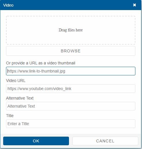
Markdown Edit Mode Video Dialog
Contains the following fields:
- file - a Smart.FileUpload control that allows to select a thumbnail image for the video from local storage.
- thumbnail - a url address to an external image that can be used as a thumbnail for the video.
- videoUrl - a url address for the video.
- alt - an alternative text to be displayed if no thumbnail is provided.
- title - a title for the video when it is hovered.
Editor Table Dialog
The Table Dialog allows to insert/edit tables inside the Editor.
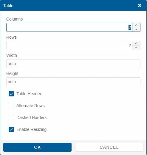
HTML Edit Mode Table Dialog
Contains the following fields:
- cols - the number of columns the Table will have.
- rows - the number of rows the Table will have.
- width - the width of the Table.
- height - the height of the Table.
- tableheader - determines whether the Table will have a header or not.
- altrrows - determines whether the Table will have alternated rows or not.
- dashedborders - determines whether the Table will have dashed borders or not.
- resizable - determines whether resizing of the Table is allowed or not.
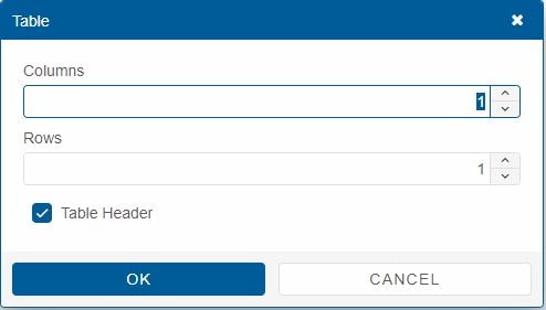
Markdown Edit Mode Table Dialog
Contains the following fields:
- cols - the number of columns the Table will have.
- rows - the number of rows the Table will have.
- tableheader - determines whether the Table will have a header or not.
Customizing Editor Dialogs
All Editor Dialogs use the same Smart.Window element. Only the controls inside the dialog differ. They depend on the toolbar item that is clicked or the currently active element inside the Editor.
The content of the Dialogs can be completely customized via the windowCustomizationFunction property. It represents a function that accepts to arguments:
- popupWindow - a reference to the dialog element.
- item - the toolbar item that corresponds to the action.
Example usage:
editor.windowCustomizationFunction = function (target, item) {
    if(item.name === 'image') {
        target.innerHTML = 'New HTML Content for the Image Dialog';
    }
    else {
        target.innerHTML = '';
    }
}
For AI tooling
Developer Quick Reference
Topic: editor-dialogs Component: Editor Framework: JavaScript
Main methods: (none detected)
Common config keys: (none detected)
Implementation Notes
Compatibility: Modern browsers / Web Components API access pattern: const component = document.querySelector(...) + component.method()
Lifecycle guidance: Initialize configuration first, then invoke imperative API when element is available in DOM.
Common pitfalls:
- Calling methods before element initialization.
- Reassigning large configuration partially without understanding merge behavior.
- Missing required module script import for component type.
Validation checklist:
- Ensure module scripts and CSS are loaded once.
- Keep data schema aligned with columns/series definitions.
- Verify method calls target initialized component instance.