Build your web apps using Smart UI
Smart.Grid - Rows and Columns
Grid Rows and Columns
Smart.Grid offers a variety of ways to configure and modify the appearance and behavior of Grid Rows and Columns.
Row & Column Virtualization is the approach which allows the grid to render large amounts of rows and columns without performance impact. The Grid renders the rows and columns that are visible while you scroll. For example, the grid can have 5,000 rows and 100 columns with only 50 rows and 10 columns rendered in the view.
Rows and columns are represented as objects in the memory. Many methods and properties are available to be set directly to the row/column object.
Row objects are indexed members of the rows property, used to describe all rows displayed in the Grid.
More information: property rows in the Grid API documentation.Column objects are indexed members of the columns property, used to describe all columns displayed in the Grid.
More information: property columns in the Grid API documentation.Major features that are available:
Column Formatting
Applying format to a column allows cells to be formatted according to their data type and a pre-defined format.
Formatting is applied by setting the column object's cellsFormat property to a format string. This is applicable to cells with numbers or dates.
Number Formats
Some frequently used formats are:'d' - decimal numbers.
'f' - floating-point numbers.
'n' - integer numbers.
'c' - currency numbers.
'p' - percentage numbers.
For adding decimal places to the numbers, add a number after the formatting stri
For example: 'c3' displays a number in this format $25.256
Applicable number formats are applied through the NumberRenderer object. All supported formats are described in the help topic Numeric API.
Date Formats
Some frequently used date formats are:Built-in Date formats:
// short date pattern
'd' - 'M/d/yyyy',
// long date pattern
'D' - 'dddd, MMMM dd, yyyy',
// short time pattern
't' - 'h:mm tt',
// long time pattern
'T' - 'h:mm:ss tt',
// long date, short time pattern
'f' - 'dddd, MMMM dd, yyyy h:mm tt',
// long date, long time pattern
'F' - 'dddd, MMMM dd, yyyy h:mm:ss tt',
// month/day pattern
'M' - 'MMMM dd',
// month/year pattern
'Y' - 'yyyy MMMM',
// S is a sortable format that does not vary by culture
'S' - 'yyyy'-'MM'-'dd'T'HH':'mm':'ss'
Date format strings:
'd'-the day of the month;
'dd'-the day of the month
'ddd'-the abbreviated name of the day of the week
'dddd'- the full name of the day of the week
'h'-the hour, using a 12-hour clock from 1 to 12
'hh'-the hour, using a 12-hour clock from 01 to 12
'H'-the hour, using a 24-hour clock from 0 to 23
'HH'- the hour, using a 24-hour clock from 00 to 23
'm'-the minute, from 0 through 59
'mm'-the minutes,from 00 though 59
'M'- the month, from 1 through 12
'MM'- the month, from 01 through 12
'MMM'-the abbreviated name of the month
'MMMM'-the full name of the month
's'-the second, from 0 through 59
'ss'-the second, from 00 through 59
't'- the first character of the AM/PM designator
'tt'-the AM/PM designator
'y'- the year, from 0 to 99
'yy'- the year, from 00 to 99
'yyy'-the year, with a minimum of three digits
'yyyy'-the year as a four-digit number;
'yyyyy'-the year as a four-digit number.
Applicable date formats are applied through the DateTime object. All supported formats are described in the help topic DateTime API.
An alternative way to format cell data is by applying the column formatSettings object, which has the following properties:
- Intl - a JavaScript Intl object to format the cell values by; with higher priority than cellsFormat.
- dateFormat - format to apply to date values (the same as setting cellsFormat).
- decimalPlaces - decimal places to apply to numeric values.
- decimalSeparator - decimal separator to use in numeric values.
- thousandsSeparator - thousands separator to use in numeric values.
- prefix - a string to add before the cell value.
- sufix - a string to add after the cell value.
- negativeWithBrackets - a boolean value determining whether negative numbers are to be displayed with brackets instead of minus.
{
	label: 'Quantity', dataField: 'quantity', cellsAlign: 'right', formatSettings: {
		Intl: {
			NumberFormat: {
				style: 'currency',
				currency: 'EUR'
			}
		}
	}
}
Example:
const gridOptions = {
dataSourceSettings: {
dataFields: [
{ name: 'firstName', dataType: 'string' },
{ name: 'lastName', dataType: 'string' },
{ name: 'productName', map: 'product.name', dataType: 'string' },
{ name: 'quantity', map: 'product.quantity', dataType: 'number' },
{ name: 'price', map: 'product.price', dataType: 'number' },
{ name: 'total', map: 'product.total', dataType: 'number' }
]
},
behavior: {
columnResizeMode: 'growAndShrink'
},
sorting: {
enabled: true
},
dataSource: [
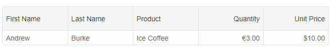
{
firstName: 'Andrew',
lastName: 'Burke',
product: {
name: 'Ice Coffee', price: 10, quantity: 3, total: 30
}
}
],
columns: [
{
label: 'First Name', dataField: 'firstName'
},
{ label: 'Last Name', dataField: 'lastName' },
{ label: 'Product', dataField: 'productName' },
{
label: 'Quantity', dataField: 'quantity', cellsAlign: 'right', formatSettings: {
Intl: {
NumberFormat: {
style: 'currency',
currency: 'EUR'
}
}
}
},
{ label: 'Unit Price', dataField: 'price', cellsAlign: 'right', cellsFormat: 'c2' }
]
}
Example using the 'cellsFormat':
const gridOptions = {
	dataSource: new Smart.DataAdapter(
	{
		dataSource: [{ "Num1": 38, "Num2": 272, "Num3": 411403131, "Num4": 585940046, "Date1": "9/17/2020", "Date2": "2019-04-14T09:44:10Z" },
					{ "Num1": 58, "Num2": 5940, "Num3": 9369865, "Num4": 966976265, "Date1": "4/29/2020", "Date2": "2019-07-22T23:33:34Z" },
					{ "Num1": 92, "Num2": 4053, "Num3": 113479426, "Num4": 744238454, "Date1": "3/5/2020", "Date2": "2019-08-29T21:54:22Z" },
					{ "Num1": 92, "Num2": 150, "Num3": 717604578, "Num4": 944555499, "Date1": "9/24/2019", "Date2": "2019-03-23T14:57:24Z" },
					{ "Num1": 24, "Num2": 391936, "Num3": 395038813, "Num4": 518887174, "Date1": "6/20/2019", "Date2": "2019-06-27T06:12:20Z" },
					{ "Num1": 86, "Num2": 135953, "Num3": 476908358, "Num4": 826766089, "Date1": "8/31/2019", "Date2": "2018-12-30T07:21:10Z" },
					{ "Num1": 58, "Num2": 8730, "Num3": 222117703, "Num4": 721247727, "Date1": "1/1/2020", "Date2": "2019-03-06T05:14:50Z" },
					{ "Num1": 46, "Num2": 10050, "Num3": 284701166, "Num4": 660343587, "Date1": "10/9/2019", "Date2": "2020-07-13T04:19:05Z" },
					{ "Num1": 59, "Num2": 27703, "Num3": 538213022, "Num4": 650603387, "Date1": "6/17/2019", "Date2": "2018-11-24T05:17:22Z" },
					{ "Num1": 46, "Num2": 391918, "Num3": 293403248, "Num4": 610631253, "Date1": "12/23/2018", "Date2": "2020-12-13T14:20:40Z" },
					{ "Num1": 11, "Num2": 93250, "Num3": 491044584, "Num4": 684146805, "Date1": "7/15/2019", "Date2": "2018-12-14T00:55:13Z" },
					{ "Num1": 58, "Num2": 619971, "Num3": 995046553, "Num4": 421110435, "Date1": "10/18/2020", "Date2": "2020-08-29T07:11:52Z" },
					{ "Num1": 23, "Num2": 6561, "Num3": 906705621, "Num4": 129530148, "Date1": "10/12/2019", "Date2": "2019-03-01T18:18:51Z" },
					{ "Num1": 45, "Num2": 2524, "Num3": 771967246, "Num4": 408329501, "Date1": "12/25/2019", "Date2": "2019-05-06T09:26:53Z" },
					{ "Num1": 17, "Num2": 2298, "Num3": 873734900, "Num4": 292375787, "Date1": "3/21/2019", "Date2": "2020-06-27T06:15:44Z" },
					{ "Num1": 90, "Num2": 68, "Num3": 554891500, "Num4": 165026397, "Date1": "7/2/2020", "Date2": "2019-05-01T02:48:40Z" },
					{ "Num1": 28, "Num2": 91868, "Num3": 377219803, "Num4": 604542434, "Date1": "12/28/2019", "Date2": "2020-11-14T11:42:29Z" },
					{ "Num1": 61, "Num2": 3989, "Num3": 681181966, "Num4": 719752037, "Date1": "6/5/2019", "Date2": "2018-11-29T11:42:21Z" }],
		dataFields:
			[
				'Num1: number',
				'Num2: number',
				'Num3: number',
				'Num4: number',
				'Date1: date',
				'Date2: date'
			]
	}),
	columns: [
		{ label: 'Percent', dataField: 'Num1', cellsFormat: 'p0' },
		{ label: 'Currency', dataField: 'Num2', cellsFormat: 'c2'},
		{ label: 'Exponential', dataField: 'Num3', cellsFormat: 'e' },
		{ label: 'Scientific', dataField: 'Num4', cellsFormat: 's' },
		{ label: 'Date', dataField: 'Date1', cellsFormat: 'dd/MM/yyyy' },
		{ label: 'Date/Time', dataField: 'Date2', cellsFormat: 'F'}
	]
}
Column Templates
Applying column templates allows for customization of how data is rendered in cells. Users can fine-tune the result in three different ways, by applying template:
-
formatFunction - a callback function applied to the column's object. A settings object is passed to this function with the following fields:
- row - the object of the row the cell belongs to.
- column - the object of the column the cell belongs to.
- cell - the object of the cell.
- oldValue - old cell value (if applicable).
- value - cell value.
- formattedValue - formatted cell value.
- template applied to the column's object that references an HTML template element on the page. If set to '#id' that corresponds to a template element, the content of the template will be rendered in the cell. In the template, bindings can be used, such as {{id}} or {{value}} which are substituted with the cell's actual id and value.
- template applied to the column's object that is a string and is applied directly as cell content. In this case, {{id}} and {{value}} bindings can also be applied.
{
		layout: {
			rowHeight: 50
		},
		dataSource: new Smart.DataAdapter(
		{
			dataSource: getEmployees(),
			dataFields:
			[
				'id: number',
				'firstName: string',
				'lastName: string',
				'title: string',
				'notes: string',
				'city: string',
				'country: string',
				'homePhone: string'
			]
		}),
		columns: [
		{
			label: 'Photo', dataField: 'Photo', width: 50, cellsVerticalAlign: 'middle', verticalAlign: 'middle', align: 'center', cellsAlign: 'center', formatFunction(settings) {
				settings.template = '<img width="32" src="' + '../../images/phonebook/' + settings.row.data.firstName.toLowerCase() + '.png"/>';
			}
		},
		{
			label: 'First Name', dataField: 'firstName',
		},
		{
			label: 'Last Name', dataField: 'lastName'
		},
		{ label: 'Title', dataField: 'title', width: 150 },
		{ label: 'Notes', dataField: 'notes', align: 'center', cellsAlign: 'center', width: 70, template: '#notesTemplate' },
		{ label: 'City', dataField: 'city'
		},
		{ label: 'Country', width: 70, cellsAlign: 'center', align: 'center', dataField: 'country' },
		{ label: 'Phone', dataField: 'homePhone', template: '<a href="#{{value}}">{{value}}</a>' }
		]
	}
}
and the template element is:
<template id="notesTemplate">
	<button data-id="{{id}}" onclick="alert('{{value}}');" class="template-button" style="width: 100%; height: 100%; overflow:hidden; text-overflow: ellipsis;">Details</button>
</template>
More advanced templates usage with Components in the Grid cells:
columns: [
	{label: 'Sales person', dataField: 'Salesperson', icon: 'fa-user', showIcon: true },
	{label: 'City', dataField: 'City', showIcon: true, icon: 'fa-university' },
	{label: 'Product', dataField: 'ProductName', icon: 'fa-product-hunt', showIcon: true },
	{label: 'Payment Method', dataField: 'PaymentMethod', icon: 'fa-money', showIcon: true,
		template: function(formatObject) {
			if (!formatObject.template) {
				if (formatObject.value === 'Mastercard') {
					formatObject.template = '<div style="font-family: FontAwesome;"><span style="margin-left: 7px;" class="far fa-cc-mastercard"></span><span style="margin-left: 5px;">' + formatObject.value + '</span></div>';
				}
				else {
					formatObject.template = '<div style="font-family: FontAwesome;"><span style="margin-left: 7px;" class="far fa-cc-visa"></span><span style="margin-left: 5px;">' + formatObject.value + '</span></div>';
				}
			}
			else {
				if (formatObject.value === 'Mastercard') {
					formatObject.template.firstChild.className = 'far fa-cc-mastercard';
				}
				else {
					formatObject.template.firstChild.className = 'far fa-cc-visa';
				}

				formatObject.template.lastChild.innerHTML = formatObject.value;
			}
		}
	},
	{label: 'Quantity', dataField: 'Quantity', showIcon: true, align: 'center', icon: 'fa-plus-circle', cellsAlign: 'center', width: 120,
		template: function(formatObject) {
			if (!formatObject.template) {
				const data = document.createElement('span');
				const plus = document.createElement('smart-button');
				const minus = document.createElement('smart-button');

				plus.style.background = getChipColor(0);
				minus.style.background = getChipColor(5);

				plus.innerHTML = '<span class="fa-plus"></span>';
				minus.innerHTML = '<span class="fa-minus"></span>';
				data.innerHTML = formatObject.value;
				data.style.marginLeft= '7px';
				plus.row = formatObject.row;
				minus.row = formatObject.row;

				plus.addEventListener('click', () => {
					const row = plus.row;

					row.getCell('Quantity').value+=5;
				});

				minus.addEventListener('click', () => {
					const row = minus.row;

					row.getCell('Quantity').value-=5;
				});


				const template = document.createElement('div');

				template.appendChild(data);
				template.appendChild(minus);
				template.appendChild(plus);


				formatObject.template = template;
			}
			else {
				formatObject.template.firstChild.innerHTML = formatObject.value;
				const buttons = formatObject.template.querySelectorAll('smart-button');

				buttons[0].row = formatObject.row;
				buttons[1].row = formatObject.row;
			}
		}
	}
]
Note that in the first render, formatObject.template is not yet defined and in following renders we just update it.
Column templates are useful for showing images or even displaying interactive elements in cells .
Frozen Rows and Columns
Rows and columns can be frozen (pinned) in order to always stay visible even when scrolling.
To freeze a row or column, set the respective object's freeze property to:
- true or 'near' - pins rows on the top and columns on the left.
- 'far' - pins rows on the bottom and columns on the right.
Example: Frozen first and last columns:
Example: Frozen first and last rows:
The unique background of frozen rows and columns can be controlled via the properties appearance.showFrozenRowBackground and appearance.showFrozenColumnBackground respectively.
Column Freeze by Column Dragging
You can dynamically freeze/unfreeze columns if the columns reorder is enabled.
const gridOptions = {
	behavior: { allowColumnReorder: true },
	dataSource: new window.JQX.DataAdapter({
		dataSource: window.generateData(100),
		dataFields: [
			'id: number',
			'firstName: string',
			'lastName: string',
			'productName: string',
			'quantity: number',
			'price: number',
			'total: number'
		]
	}),
	onColumnInserted: () => {

	},
	paging: {
		enabled: true
	},
	pager: {
		visible: true
	},
	columns: [
		{
			label: 'First Name', width: 150, dataField: 'firstName'
		},
		{ label: 'Last Name', width: 150, dataField: 'lastName' },
		{ label: 'Product', width: 200, dataField: 'productName' },
		{ label: 'Quantity', width: 100, dataField: 'quantity' },
		{ label: 'Unit Price', width: 100, dataField: 'price', cellsFormat: 'c2' },
		{ label: 'Total', dataField: 'total', cellsFormat: 'c2' }
	]
}
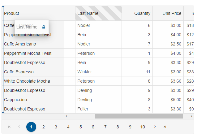
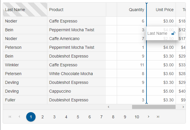
- When there are frozen columns, drag a column to the existing frozen columns area.
- When there are no frozen columns, drag a column to the edge of the grid. The grid will display a 'lock' icon. When you drop the column it will create freeze the dropped column.
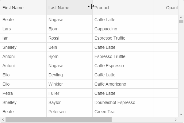
Resizing Rows and Columns
Columns and rows can be resized by dragging the resize handler between the headers of the column/row. The resize behavior is controlled by setting the values of behavior.columnResizeMode and behavior.rowResizeMode with the following possible values:
- 'none' - resize is disabled.
- 'split' - grows or shrinks the resize element's size and shrinks or grows the next sibling element's size.
- 'growAndShrink' - grows or shrinks the resize element's size only.
Resize can be disabled for a particular column/row by setting allowResize to its object to false.
Column Width
The column width can be set in the column definitions. It can be fixed width, fluid width in percentages, 'auto' or unset. When the 'width' is set to a number, the column's width will be in pixels i.e width: 200 means that the width of the column will be 200px. Width in percentages, means that the column will take a part of the Grid's width and will grow and shrink depending on the Grid's width. Width equal to 'auto' means that the column will auto-resize itself to the minimum required width. Width which is not set means that the column will take the remaining space available which is not taken by other columns.For example:
columns: [
	{
		label: 'First Name', dataField: 'firstName', width: 300
	},
	{ label: 'Last Name', dataField: 'lastName', width: '30%' },
	{ label: 'Product', dataField: 'productName', width: 'auto'},
	{ label: 'Quantity', dataField: 'quantity', align: 'right', cellsAlign: 'right' },
	{ label: 'Unit Price', dataField: 'price', align: 'right', cellsAlign: 'right', cellsFormat: 'c2' }
]
You can also use the 'layout.columnWidth' property to set equal width to all columns.
For example:
layout: {
	columnHeight: 100,
	columnWidth: 300
}
The 'autoSizeColumn(dataField)' and 'autoSizeColumns()' methods auto-size a column or columns based on the contents.
For AI tooling
Developer Quick Reference
Topic: grid-rows-columns Component: Grid Framework: JavaScript
Main methods: (none detected)
Common config keys: behavior, sorting, dataSource, columns, layout, paging, pager
Implementation Notes
Compatibility: Modern browsers / Web Components API access pattern: const component = document.querySelector(...) + component.method()
Lifecycle guidance: Initialize configuration first, then invoke imperative API when element is available in DOM.
Common pitfalls:
- Calling methods before element initialization.
- Reassigning large configuration partially without understanding merge behavior.
- Missing required module script import for component type.
Validation checklist:
- Ensure module scripts and CSS are loaded once.
- Keep data schema aligned with columns/series definitions.
- Verify method calls target initialized component instance.