Getting Started with Tank Web Component
Smart UI Web Components work with current evergreen browsers and Node 18+ for local tooling; pin package versions to match your project policy.
Smart UI is distributed as the smart-webcomponents NPM package. You can also use the full download from the Download page.
Quick start
- Install the package:
npm install smart-webcomponents
- Load the Tank module (ES module script):
<script type="module" src="node_modules/smart-webcomponents/source/modules/smart.tank.js"></script>
- Add the default stylesheet (prefer angular.json / bundler entry in app codebases; for plain HTML use a link):
<link rel="stylesheet" type="text/css" href="node_modules/smart-webcomponents/source/styles/smart.default.css" />
- Add markup in one of two ways - semantic custom element (the component tag is in your HTML) or a host
div(you mount programmatically with appendTo):
Semantic element (id matches the selector in Smart()):
<smart-tank id="tank"></smart-tank>
Host container (id matches appendTo on Smart.Tank):
<div id="tankContainer"></div>
- Initialize after the module loads: define a const tankOptions object, then either bind with Smart('#tank', ...) on the semantic tag or use new Smart.Tank({ ...tankOptions, appendTo: '#tankContainer' }) on the host
div:
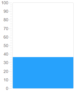
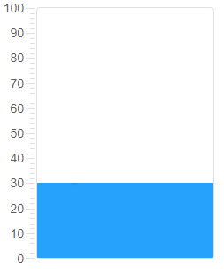
<script type="module">
	import 'node_modules/smart-webcomponents/source/modules/smart.tank.js';

	const tankOptions = { value: 25 };

	// Option A - semantic <smart-tank> with id="tank"
	Smart('#tank', class {
		get properties() {
			return tankOptions;
		}
	});

	// Option B - host div id="tankContainer"
	// const tankInstance = new Smart.Tank({
	// 	...tankOptions,
	// 	appendTo: '#tankContainer'
	// });

	// Option C - constructor(selector, options), then append the returned element yourself
	// const myTank = new Smart.Tank('#tank', tankOptions);
	// document.body.appendChild(myTank);
</script>
Uncomment Option B when you use the host
div; use Option A when you use the semantic element. The Runtime cookbook also documents new Smart.Tank('#tank', tankOptions) with appendChild, and document.createElement('smart-tank') with .props or Object.assign (all are valid patterns; do not combine overlapping patterns for the same instance unless you intend multiple components). - Serve the folder over HTTP (or use your bundler dev server) and open the page.
Runtime cookbook
Alternative creation patterns and imperative APIs. These are all valid ways to create Smart UI components: semantic markup + Smart(); new Smart.Tank({ ...options, appendTo: '#...' }); new Smart.Tank('#tank', tankOptions) plus appendChild on the returned element; and document.createElement('smart-tank') then assigning options via .props or Object.assign on the element.
Constructor with a selector string and options, then append the returned element (for example const myTank = new Smart.Tank('#tank', tankOptions)):
	const tankOptions = { value: 25 };
	const myTank = new Smart.Tank('#tank', tankOptions);
	document.body.appendChild(myTank);
Create with document.createElement('smart-tank'), assign properties (same as any custom element), then append:
	const tankOptions = { value: 25 };
	const tank = document.createElement('smart-tank');
	Object.assign(tank, tankOptions);
	document.body.appendChild(tank);
Host on a div with appendTo (import the module, then instantiate when the document is ready; the container id must match appendTo):
	import "../../source/modules/smart.tank.js";

	document.readyState === 'complete' ? init() : window.addEventListener('load', init);

	function init() {
		const tankOptions = { value: 25 };
		const tank = new Smart.Tank({
			...tankOptions,
			appendTo: '#tankContainer'
		});
	}
Demo
Appearance
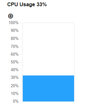
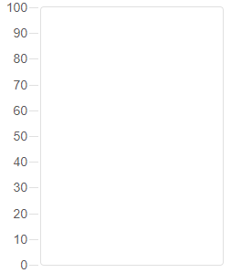
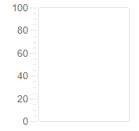
Smart.Tank can be either horizontal or vertical. The default orientation is vertical but that can be changed on initialization in the HTML:
<!DOCTYPE html>
<html lang="en">
<head>
 <link rel="stylesheet" href="../../source/styles/smart.default.css" type="text/css" />
 <script type="text/javascript" src="../../source/modules/smart.tank.js"></script>
</head>
<body>
 <smart-tank orientation="horizontal"></smart-tank>
</body>
</html>
Demo
or later using javascript:
<!DOCTYPE html>
<html lang="en">
<head>
 <link rel="stylesheet" href="../../source/styles/smart.default.css" type="text/css" />
 <script type="text/javascript" src="../../source/smart.tank.js"></script>
 <script>
     window.onload = function () {
         var tank = document.querySelector('smart-tank');
         tank.orientation = 'horizontal';
     }
 </script>
</head>
<body>
 <smart-tank></smart-tank>
</body>
</html>
Demo
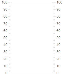
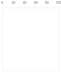
Smart.Tank uses a scale to indicate the value. The scale can be positioned above, under or on both sides of the element thanks to the scalePosition property. By default it's located over the element for horizontal tank or before the element for vertical tank.
Let's change the position of the scale via javascript:
<!DOCTYPE html>
<html lang="en">
<head>
 <link rel="stylesheet" href="../../source/styles/smart.default.css" type="text/css" />
 <script type="text/javascript" src="../../source/modules/smart.tank.js"></script>
 <script>
     window.onload = function () {
         var tank = document.querySelector('smart-tank');
         tank.scalePosition = 'both';
     }
 </script>
</head>
<body>
 <smart-tank></smart-tank>
</body>
</html>
Demo
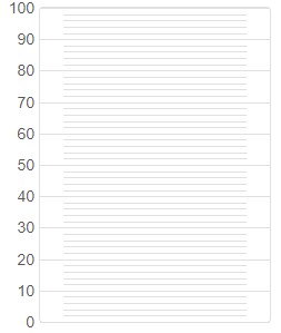
The ticks of the scale can also be customized. They can be positioned above the track or inside it by setting the tickPosition property like so:
<!DOCTYPE html>
<html lang="en">
<head>
 <link rel="stylesheet" href="../../source/styles/smart.default.css" type="text/css" />
 <script type="text/javascript" src="../../source/modules/smart.tank.js"></script>
 <script>
     window.onload = function () {
         var tank = document.querySelector('smart-tank');
         tank.ticksPosition = 'track';
     }
 </script>
</head>
<body>
 <smart-tank></smart-tank>
</body>
</html>
Demo
The scale of the Tank contains major and minor ticks which are by default visible. This can be re-configured. The user can display only the major, the minor or none of them if he prefers by setting the ticksVisibility property. This can also be done in the HTML code on initialization like so:
<smart-tank ticks-visibility="major"></smart-tank>
Demo
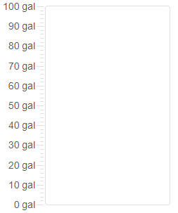
The scale of the Tank has ticks and labels. Labels are also customizable. The user can control which of them to be visible:
- none - no labels are visible
- all - all labels are visible
- endPoints - only the first and last labels are visible
The text of the label can also be modified thanks to the labelFormatFunction property. It's a format function that takes one argument - the value of the label. The function must return a string representing the new text for the labels. The property can be applied via javascript like so:
<!DOCTYPE html>
<html lang="en">
<head>
 <link rel="stylesheet" href="../../source/styles/smart.default.css" type="text/css" />
 <script type="text/javascript" src="../../source/modules/smart.tank.js"></script>
 <script>
     window.onload = function () {
             var tank = document.querySelector('smart-tank');
             tank.labelFormatFunction = function (value) {
             return value + ' ' + 'gal';
         }
     }
 </script>
</head>
<body>
 <smart-tank></smart-tank>
</body>
</html>
Demo
Behavior
Smart.Tank allows two types of scales:
- integer - the values are integers only
- floatingPoint - the values are floating point numbers
The type of the scale is determined by the scaleType property which can be set on initialization:
<smart-tank scale-type="integer"></smart-tank>
Demo
or changed later when the element is ready using javascript:
<script>
     window.onload = function () {
         var tank = document.querySelector('smart-tank');
         tank.scaleType = 'floatingPoint';
     }
 </script>
Demo
When the scaleType is set to "floatingPoing", the user can adjust the precision of the value via the "precisionDigits" property. This property determines how many numbers will appear after the decimal point of the current Tank value. Can be set like every other property:
<smart-tank precision-digits="2"></smart-tank>
Demo
Smart.Tank allows controlling the number significant digits shown on the scale. The significantDigits property determines how will the value be represented. For example, let's say the user wants to configure the value to contain only 3 significant digits:
<smart-tank max="1000000" significant-digits="3"></smart-tank>
Demo
Note: significantDigits and precisionDigits can't be applied at the same time.
Smart.Tank supports big numbers as well. The wordLength property determines the range of numbers the element can display.
The available word lengths are:
- int8 : from –128 to 127
- uint8 : from 0 to 255
- int16 : from –32,768 to 32,767
- uint16 : from 0 to 65,535
- int32 : from –2,147,483,648 to 2,147,483,647. Default value.
- uint32 : from 0 to 4,294,967,295
- int64 : from –9,223,372,036,854,775,808 to 9,223,372,036,854,775,807
- uint64 : from 0 to 18,446,744,073,709,551,615
Here's how to set it as attribute:
<smart-tank word-length="uint8"></smart-tank>
Demo

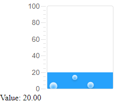
The mechanicalAction property of the element determines when the value will change. This property determines the behavior of the element. Possible values are:
- switchUntilReleased - changes the value while the user is dragging inside the track. When the mouse is released the value is returned to it's initial position.
- switchWhenReleased - changes the value only when the mouse is released. Otherwise the value remains static.
- switchWhileDragging - changes the value while the user is dragging along the track and keeps the last value when mouse is released. The default value.
<smart-tank mechanical-action="switchWhenReleased"></smart-tank>
Demo
Coerce property determines the value iteration. Once enabled the element uses the interval property to determines the next possible selectable value from the scale.
By setting the interval property the user can control the interval between the values. Interval is a property of type number and can be set on initialization or using javascript:
<!DOCTYPE html>
<html lang="en">
<head>
 <link rel="stylesheet" href="../../source/styles/smart.default.css" type="text/css" />
 <script type="text/javascript" src="../../source/smart.tank.js"></script>
 <script>
     window.onload = function () {
         var tank = document.querySelector('smart-tank');
         tank.interval = 10;
         tank.coerce = true;
     }
 </script>
</head>
<body>
 <smart-tank></smart-tank>
</body>
</html>
Demo
If coerce is enabled the track fill will snap to the next value based on the interval.
Keyboard Support
Smart.Tank implements the following keys:
| Key | Action |
|---|---|
| Arrow Up / Arrow Right | Increases the value. |
| Arrow Left / Arrow Down | Decreases the value. |
| Home | Sets the value to min. |
| End | Sets the value to max. |
Append to the DOM:
const container = document.getElementById('tank-container');
container.appendChild(tank);
Remove from the DOM:
tank.remove();
Set a property:
tank.disabled = true;
tank.theme = 'dark';
Get a property value:
const isDisabled = tank.disabled;
const currentTheme = tank.theme;
Invoke a method:
tank.refresh();
tank.focus();
Add event listener:
tank.addEventListener('change', (event) => {
    console.log('change triggered:', event.detail);
});
Remove event listener:
const handleTankEvent = (event) => {
    console.log('change triggered:', event.detail);
};

tank.addEventListener('change', handleTankEvent);
tank.removeEventListener('change', handleTankEvent);
Accessibility
The Tank component follows WAI-ARIA best practices:
- Keyboard navigation - Tab, Arrow keys, Enter, and Escape are supported
- ARIA roles - Appropriate roles and labels are applied automatically
- Focus management - Visible focus indicators for keyboard users
- Screen readers - State changes are announced to assistive technology
- High contrast - Supports Windows High Contrast Mode and forced colors
For custom labeling, set aria-label or aria-labelledby attributes on the component.
Supported stacks: Smart UI targets Angular 17+, React 18+, Vue 3+, Node 18 LTS, and evergreen browsers; pin exact package versions to your org policy.