Getting Started with Tooltip Web Component
Smart UI Web Components work with current evergreen browsers and Node 18+ for local tooling; pin package versions to match your project policy.
Smart UI is distributed as the smart-webcomponents NPM package. You can also use the full download from the Download page.
Quick start
- Install the package:
npm install smart-webcomponents
- Load the Tooltip module (ES module script):
<script type="module" src="node_modules/smart-webcomponents/source/modules/smart.tooltip.js"></script>
- Add the default stylesheet (prefer angular.json / bundler entry in app codebases; for plain HTML use a link):
<link rel="stylesheet" type="text/css" href="node_modules/smart-webcomponents/source/styles/smart.default.css" />
- Add markup in one of two ways - semantic custom element (the component tag is in your HTML) or a host
div(you mount programmatically with appendTo):
Semantic element (id matches the selector in Smart()):
<smart-tooltip id="tooltip"></smart-tooltip>
Host container (id matches appendTo on Smart.Tooltip):
<div id="tooltipContainer"></div>
- Initialize after the module loads: define a const tooltipOptions object, then either bind with Smart('#tooltip', ...) on the semantic tag or use new Smart.Tooltip({ ...tooltipOptions, appendTo: '#tooltipContainer' }) on the host
div:
<script type="module">
	import 'node_modules/smart-webcomponents/source/modules/smart.tooltip.js';

	const tooltipOptions = { selector: "button" };

	// Option A - semantic <smart-tooltip> with id="tooltip"
	Smart('#tooltip', class {
		get properties() {
			return tooltipOptions;
		}
	});

	// Option B - host div id="tooltipContainer"
	// const tooltipInstance = new Smart.Tooltip({
	// 	...tooltipOptions,
	// 	appendTo: '#tooltipContainer'
	// });

	// Option C - constructor(selector, options), then append the returned element yourself
	// const myTooltip = new Smart.Tooltip('#tooltip', tooltipOptions);
	// document.body.appendChild(myTooltip);
</script>
Uncomment Option B when you use the host
div; use Option A when you use the semantic element. The Runtime cookbook also documents new Smart.Tooltip('#tooltip', tooltipOptions) with appendChild, and document.createElement('smart-tooltip') with .props or Object.assign (all are valid patterns; do not combine overlapping patterns for the same instance unless you intend multiple components). - Serve the folder over HTTP (or use your bundler dev server) and open the page.
Runtime cookbook
Alternative creation patterns and imperative APIs. These are all valid ways to create Smart UI components: semantic markup + Smart(); new Smart.Tooltip({ ...options, appendTo: '#...' }); new Smart.Tooltip('#tooltip', tooltipOptions) plus appendChild on the returned element; and document.createElement('smart-tooltip') then assigning options via .props or Object.assign on the element.
Constructor with a selector string and options, then append the returned element (for example const myTooltip = new Smart.Tooltip('#tooltip', tooltipOptions)):
	const tooltipOptions = { selector: "button" };
	const myTooltip = new Smart.Tooltip('#tooltip', tooltipOptions);
	document.body.appendChild(myTooltip);
Create with document.createElement('smart-tooltip'), assign properties (same as any custom element), then append:
	const tooltipOptions = { selector: "button" };
	const tooltip = document.createElement('smart-tooltip');
	Object.assign(tooltip, tooltipOptions);
	document.body.appendChild(tooltip);
Host on a div with appendTo (import the module, then instantiate when the document is ready; the container id must match appendTo):
	import "../../source/modules/smart.tooltip.js";

	document.readyState === 'complete' ? init() : window.addEventListener('load', init);

	function init() {
		const tooltipOptions = { selector: "button" };
		const tooltip = new Smart.Tooltip({
			...tooltipOptions,
			appendTo: '#tooltipContainer'
		});
	}
Demo
Note how Smart.element.js and webcomponents.min.js are declared before everything else. This is mandatory for all custom elements.
Appearance
The tooltip must be attached to HTML element. This could be achieved by setting the selector property.
<!DOCTYPE html>
<html lang="en">
<head>
 <link rel="stylesheet" href="../../source/styles/smart.default.css" type="text/css" />
 <script type="text/javascript" src="https://cdnjs.cloudflare.com/ajax/libs/webcomponentsjs/0.7.22/webcomponents-lite.min.js">
</script>
 <script type="text/javascript" src="../../source/Smart.element.js"></script>
 <script type="text/javascript" src="../../source/Smart.tooltip.js"></script>
 <script>
 window.onload = function () {
    document.querySelector('smart-tooltip').selector = 'button2';
 }
 </script>
</head>
<body>
 <smart-button id="button">Button 1</smart-button>
 <smart-button id="button2">Button 2</smart-button>
 <smart-tooltip selector="button" arrow>This is a tooltip</smart-tooltip>
</body>
</html>
Demo
Smart.Тooltip could be positioned in few different positions.
- top
- right
- bottom
- left
- absolute
<smart-tooltip selector="button" position="top" arrow>This is a tooltip</smart-tooltip>
Demo
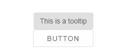
The tooltip could be with arrow when arrow property is set to true.
<smart-tooltip selector="button" arrow>This is a tooltip</smart-tooltip>
Demo

In absolute position, tooltip's arrow could be positioned on:
- top
- right
- bottom
- left
<smart-tooltip selector="button" position="absolute" arrow arrow-direction="right">This is a tooltip</smart-tooltip>
Demo
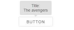
The user could set custom tooltip template via the tooltipTemplate property. As a selector have to be used the template id.
 <template id="newTemplate">
     <div>Title:</div>
     <div>{{title}}</div>
 </template>
 <smart-tooltip selector="button" arrow tooltip-template="newTemplate">The avengers</smart-tooltip>
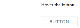
Behavior
The tooltip is displayed on hover of it's selector, but also could be shown programmatically via setting visible to true
<!DOCTYPE html>
<html lang="en">
<head>
 <link rel="stylesheet" href="../../source/styles/smart.default.css" type="text/css" />
 <script type="text/javascript" src="https://cdnjs.cloudflare.com/ajax/libs/webcomponentsjs/0.7.22/webcomponents-lite.min.js">
</script>
 <script type="text/javascript" src="../../source/Smart.element.js"></script>
 <script type="text/javascript" src="../../source/Smart.tooltip.js"></script>
 <script>
 window.onload = function () {
    document.querySelector('smart-tooltip').visible = true;
 }
 </script>
</head>
<body>
 <smart-button id="button">Button</smart-button>
 <smart-tooltip selector="button">This is a tooltip</smart-tooltip>
</body>
</html>
Demo
Smart.Tooltip could displayed after particular delay. The delay is set as interval in milliseconds.
<smart-tooltip selector="button" delay="200">This is a tooltip</smart-tooltip>
Demo
The element offers the following methods:
-
close - closes smart-tooltip.
<script> window.onload = function () { var menu = document.querySelector('smart-menu'); menu.close(); } </script> -
open - opens smart-tooltip.
<script> window.onload = function () { var menu = document.querySelector('smart-menu'); menu.open(); } </script> -
toggle - toggles smart-tooltip.
 <script>
     window.onload = function () {
         var menu = document.querySelector('smart-menu');
         menu.toggle();
     }
 </script>
Append to the DOM:
const container = document.getElementById('tooltip-container');
container.appendChild(tooltip);
Remove from the DOM:
tooltip.remove();
Set a property:
tooltip.disabled = true;
tooltip.theme = 'dark';
Get a property value:
const isDisabled = tooltip.disabled;
const currentTheme = tooltip.theme;
Invoke a method:
tooltip.refresh();
tooltip.focus();
Add event listener:
tooltip.addEventListener('open', (event) => {
    console.log('open triggered:', event.detail);
});
Remove event listener:
const handleTooltipEvent = (event) => {
    console.log('open triggered:', event.detail);
};

tooltip.addEventListener('open', handleTooltipEvent);
tooltip.removeEventListener('open', handleTooltipEvent);
Accessibility
The Tooltip component follows WAI-ARIA best practices:
- Keyboard navigation - Tab, Arrow keys, Enter, and Escape are supported
- ARIA roles - Appropriate roles and labels are applied automatically
- Focus management - Visible focus indicators for keyboard users
- Screen readers - State changes are announced to assistive technology
- High contrast - Supports Windows High Contrast Mode and forced colors
For custom labeling, set aria-label or aria-labelledby attributes on the component.
Supported stacks: Smart UI targets Angular 17+, React 18+, Vue 3+, Node 18 LTS, and evergreen browsers; pin exact package versions to your org policy.