Getting Started with Calendar Web Component
Smart UI Web Components work with current evergreen browsers and Node 18+ for local tooling; pin package versions to match your project policy.
Smart UI is distributed as the smart-webcomponents NPM package. You can also use the full download from the Download page.
Quick start
- Install the package:
npm install smart-webcomponents
- Load the Calendar module (ES module script):
<script type="module" src="node_modules/smart-webcomponents/source/modules/smart.calendar.js"></script>
- Add the default stylesheet (prefer angular.json / bundler entry in app codebases; for plain HTML use a link):
<link rel="stylesheet" type="text/css" href="node_modules/smart-webcomponents/source/styles/smart.default.css" />
- Add markup in one of two ways - semantic custom element (the component tag is in your HTML) or a host
div(you mount programmatically with appendTo):
Semantic element (id matches the selector in Smart()):
<smart-calendar id="calendar"></smart-calendar>
Host container (id matches appendTo on Smart.Calendar):
<div id="calendarContainer"></div>
- Initialize after the module loads: define a const calendarOptions object, then either bind with Smart('#calendar', ...) on the semantic tag or use new Smart.Calendar({ ...calendarOptions, appendTo: '#calendarContainer' }) on the host
div:
<script type="module">
	import 'node_modules/smart-webcomponents/source/modules/smart.calendar.js';

	const calendarOptions = { selectedDates: ["2026-7-2", "2026-7-17"] };

	// Option A - semantic <smart-calendar> with id="calendar"
	Smart('#calendar', class {
		get properties() {
			return calendarOptions;
		}
	});

	// Option B - host div id="calendarContainer"
	// const calendarInstance = new Smart.Calendar({
	// 	...calendarOptions,
	// 	appendTo: '#calendarContainer'
	// });

	// Option C - constructor(selector, options), then append the returned element yourself
	// const myCalendar = new Smart.Calendar('#calendar', calendarOptions);
	// document.body.appendChild(myCalendar);
</script>
Uncomment Option B when you use the host
div; use Option A when you use the semantic element. The Runtime cookbook also documents new Smart.Calendar('#calendar', calendarOptions) with appendChild, and document.createElement('smart-calendar') with .props or Object.assign (all are valid patterns; do not combine overlapping patterns for the same instance unless you intend multiple components). - Serve the folder over HTTP (or use your bundler dev server) and open the page.
Runtime cookbook
Alternative creation patterns and imperative APIs. These are all valid ways to create Smart UI components: semantic markup + Smart(); new Smart.Calendar({ ...options, appendTo: '#...' }); new Smart.Calendar('#calendar', calendarOptions) plus appendChild on the returned element; and document.createElement('smart-calendar') then assigning options via .props or Object.assign on the element.
Constructor with a selector string and options, then append the returned element (for example const myCalendar = new Smart.Calendar('#calendar', calendarOptions)):
	const calendarOptions = { selectedDates: ["2026-7-2", "2026-7-17"] };
	const myCalendar = new Smart.Calendar('#calendar', calendarOptions);
	document.body.appendChild(myCalendar);
Create with document.createElement('smart-calendar'), assign properties (same as any custom element), then append:
	const calendarOptions = { selectedDates: ["2026-7-2", "2026-7-17"] };
	const calendar = document.createElement('smart-calendar');
	Object.assign(calendar, calendarOptions);
	document.body.appendChild(calendar);
Host on a div with appendTo (import the module, then instantiate when the document is ready; the container id must match appendTo):
	import "../../source/modules/smart.calendar.js";

	document.readyState === 'complete' ? init() : window.addEventListener('load', init);

	function init() {
		const calendarOptions = { selectedDates: ["2026-7-2", "2026-7-17"] };
		const calendar = new Smart.Calendar({
			...calendarOptions,
			appendTo: '#calendarContainer'
		});
	}
Demo
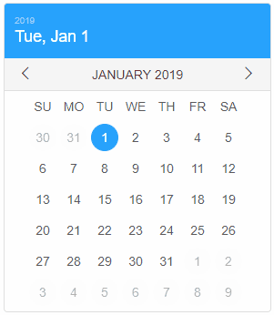
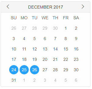
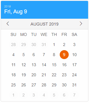
selectedDates property determines the selected dates of the Calendar. It represents an array of Date objects but the user can pass in an array of strings representing valid dates as well:
<smart-calendar selected-dates='["2026-12-24", "2026-12-25", "2026-12-26"]'></smart-calendar>
Demo
The user can also select new dates using javascript:
calendar.selectedDates = ["2026-1-1", new Date(2026,0,2)];
Demo
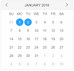
Notice how the array can contain valid dates as string and javascript Date objects at the same time.
Appearance
Smart.Calendar offers two different views - landscape and portrait:
<smart-calendar view="portrait"></smart-calendar>
Demo

Different sections of the calendar can be hidden or shown depending on the viewSection property:
<smart-calendar view-sections='["title", "header"]'></smart-calendar>
Demo
The element has three sections: title, header and footer. By default the footer is hidden and empty. Users can change the content of the three sections using HTML Template elements. This can be accomplished in the following way:
 <template id="titleTemplate">
     <div>Selected date: {{date}}</div>
 </template>
 <template id="headerTemplate">
     <div>Month:</div>
     <div>{{date}}</div>
 </template>
 <template id="footerTemplate">
     <div>Footer text</div>
 </template>
 <smart-calendar view-sections='["title","header","footer"]' title-template="titleTemplate" header-template="headerTemplate"
 footer-template="footerTemplate"></smart-calendar>
Demo
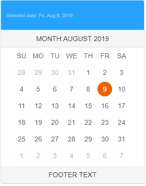
The bindings in the templates are not necessary. They can be removed and the template can contain any arbitrary HTML.
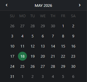
The tooltips for the important dates of the Calendar can also be modified using HTML Templates in a similar fashion:
 <template id="tooltipTemplate">
    <div>Michael's Birthday {{date}}</div>
 </template>
 <smart-calendar view-sections='["header"]' tooltip tooltip-template="tooltipTemplate" important-dates='["2026-02-18", "2026-02-1"]'></smart-calendar>
Demo
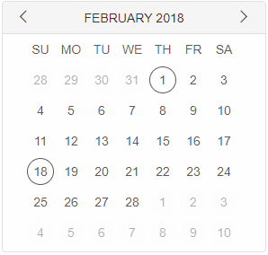
If the template contains a binding it will be replaced with the appropriate date string.
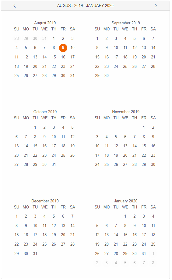
Month names are shown when more than one month is visible. The number of months is controlled by the months property. The value can vary from 1 to 12. When applying a different number the user has to set the appropriate size of the calendar for the months to be visualized properly.
         calendar.dateFormatFunction = function (date) {
            return date.getMonth() + ' - ' + date.getFullYear();
         }
 <smart-calendar months="6"></smart-calendar>
The calendar offers a date format function that allows the user to customize the format of the month names. The property is called dateFormatFunction. It represents a format function and accepts a single argument, a JavaScript Date object and expects a string to be returned. Here's an example usage:
Demo
Behavior
By default the Calendar allows single date selection using mouse interaction and multiple date selection using keyboard key combinations.
- Pressing Shift + Arrow Left/Right/Top/Bottom or Shift + mouse click on a date will select the dates from the first to the current selection.
- Pressing Ctrl + Arrow Left/Right/Top/Bottom or Ctrl + mouse click on a date will select the current date by preserving the previous selection.
Smart.Calendar has the a variety of selection modes:
- none - no selection allowed
- default - single date selection using keyboard and mouse interaction, multiple date selection using specific keyboard keys.
- one - single date selection
- many - multiple date selection using mouse interaction.
- zeroOrMany - multiple item selection
- oneOrMany - multiple item selection. Doesn't allow empty selection.
- zeroOrOne - single item selection. Allows empty selection.
Selection modes can be changed using the selectionMode property through JavaScript or during initialization of the element in the HTML:
<smart-calendar selection-mode="zeroOrOne"></smart-calendar>
Demo
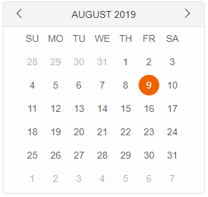
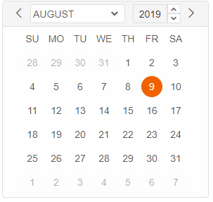
Smart.Calendar can operate in two modes: classic or default. The calendarMode property determines that behavior.
Classic mode offers month and year navigation trough the header of the element.
Default mode allows month and year navigation through separate panels that can be accessed by clicking on the month name, located in the header.
<smart-calendar calendar-mode="classic"></smart-calendar>
Demo
Append to the DOM:
const container = document.getElementById('calendar-container');
container.appendChild(calendar);
Remove from the DOM:
calendar.remove();
Set a property:
calendar.disabled = true;
calendar.theme = 'dark';
Get a property value:
const isDisabled = calendar.disabled;
const currentTheme = calendar.theme;
Invoke a method:
calendar.refresh();
calendar.focus();
Add event listener:
calendar.addEventListener('change', (event) => {
    console.log('change triggered:', event.detail.value);
});
Remove event listener:
const handleCalendarEvent = (event) => {
    console.log('change triggered:', event.detail.value);
};

calendar.addEventListener('change', handleCalendarEvent);
calendar.removeEventListener('change', handleCalendarEvent);
Accessibility
The Calendar component follows WAI-ARIA best practices:
- Keyboard navigation - Tab, Arrow keys, Enter, and Escape are supported
- ARIA roles - Appropriate roles and labels are applied automatically
- Focus management - Visible focus indicators for keyboard users
- Screen readers - State changes are announced to assistive technology
- High contrast - Supports Windows High Contrast Mode and forced colors
For custom labeling, set aria-label or aria-labelledby attributes on the component.
Supported stacks: Smart UI targets Angular 17+, React 18+, Vue 3+, Node 18 LTS, and evergreen browsers; pin exact package versions to your org policy.