Blazor - Get Started with Smart.Card
Setup The Project
Follow the Getting Started guide to set up your Blazor Application with Smart UI.
Setup Basic Card
Smart.Card elements can be used to present small amount of information with repetitive structure such as photo galleries or products in an e-commerce website.
- Add the Card component to the Pages/Index.razor file
<Card></Card>
- Set the HTML content of the card:
<Card>
<div>
  <div class="card-body">
      <div class="img-as-background">
          <img src="https://htmlelements.com/demos/images/travel/16.jpg" />
      </div>
      <h4>Family vacation</h4>
      <p>
        Book this amazing 7-day vaction now and get a 75% discount. Offer is valid only for the next 10 hours.
      </p>
      <a href="#">More information</a>
      <Button Class="primary">Book</Button>
  </div>
</div>
</Card>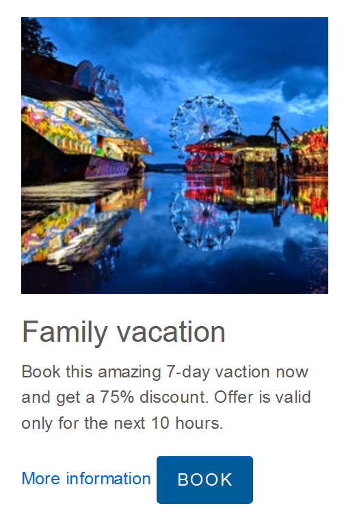
Card Templating
Smart.Card's templating functionality allows you to avoid code repetion.
Create a<template>element with parameters in the form{{variable}}. Finally, create an object with the data that will be used by the card:<template id="custom-template"> <div style="padding:3px;"> <h3 style="font-weight:bold; color:red">{{destination}}</h3> <p>A {{days}}-day vacation in {{destination}}. Book now for {{price}}$.</p> </div> </template> <Card ItemTemplate="@templateId" DataSource="@parisData"></Card> <Card ItemTemplate="@templateId" DataSource="@madridData"></Card> <Card ItemTemplate="@templateId" DataSource="@londonData"></Card> @code{ string templateId = "custom-template"; dynamic parisData = new{ destination = "Paris", days = 5, price = 150 }; dynamic madridData = new{ destination = "Madrid", days = 12, price = 450 }; dynamic londonData = new{ destination = "London", days = 3, price = 85 }; }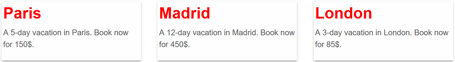
Card Events
Smart.Card provides multiple Events that can help you expand the component's functionality.
-
OnSwipebottom- triggered when the card is swiped bottom.
Event Details: N/A -
OnSwipetop- triggered when the card is swiped top.
Event Details: N/A -
OnSwipeleft- triggered when the card is swiped left.
Event Details: N/A -
OnSwiperight- triggered when the card is swiped right.
Event Details: N/A
<template id="custom-template">
  <div style="padding:3px;">
      <h3 style="font-weight:bold; color:red">{{destination}}</h3>
      <p>A {{days}}-day vacation in {{destination}}. Book now for {{price}}$.</p>
  </div>
</template>
<Card ItemTemplate="@templateId" DataSource="@parisData"
  OnSwipeleft="OnSwipeLeft" OnSwiperight="OnSwipeRight" OnSwipetop="OnSwipeTop" OnSwipebottom="OnSwipeBottom">
</Card>
<h3>@message</h3>
@code{
  string message = "";
  private void OnSwipeLeft(){
      message="swiped left";
  }
  private void OnSwipeRight(){
      message="swiped right";
  }
  private void OnSwipeTop(){
      message="swiped top";
  }
  private void OnSwipeBottom(){
      message="swiped bottom";
  }
  string templateId = "custom-template";
  dynamic parisData = new{
      destination = "Paris",
      days = 5,
      price = 150
  };
}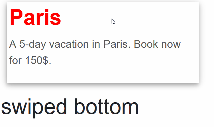
-