Blazor - Get Started with Smart.Slider
Setup The Project
Follow the Getting Started guide to set up your Blazor Application with Smart UI.
Setup Basic Slider
Smart.Slider is a custom component that allows users to select a value along a custom range. It is best used for settings such as volume control and brightness intensity
- Add the Slider component to the Pages/Index.razor file:
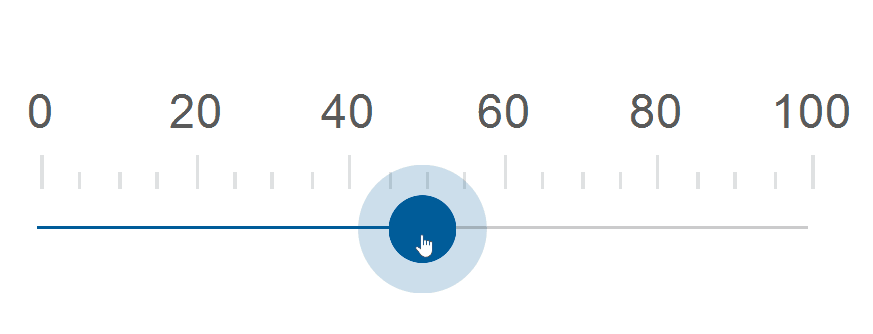
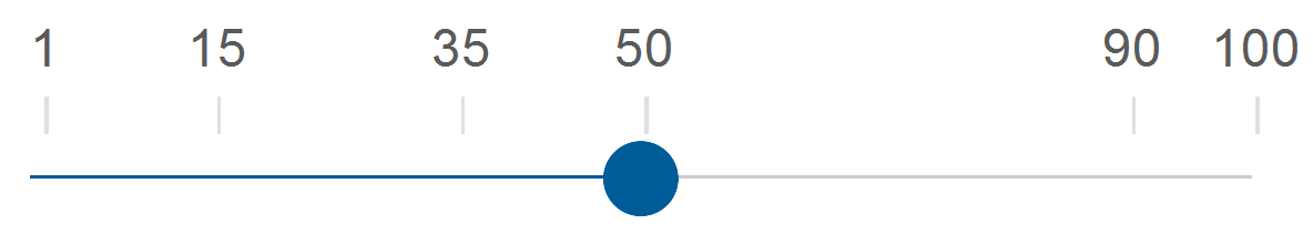
<Slider></Slider> - Set the
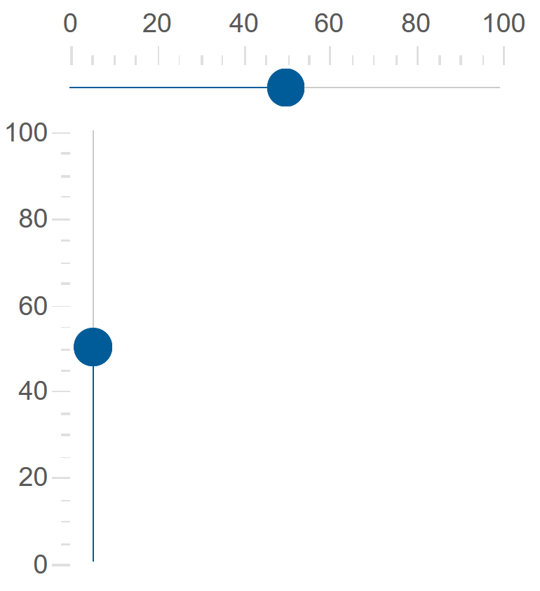
Valueproperty to an integer value<Slider Value="50"></Slider> - The orientation of the Slider can be horizontal or vertical
  <Slider Value="50"></Slider>
  <Slider Value="50" Orientation="Orientation.Vertical"></Slider>
Date Slider
In addition to numbers, Smart.Slider can also work with date values.
To enable Date Slider, set the Mode property to Date and set the date format in DateLabelFormatString
<Slider Min="@minDate" Max="@maxDate" Mode="ScaleMode.Date" DateLabelFormatString="Y"></Slider>

@code{
  string minDate = "1/1/2022";
  string maxDate = "12/1/2022";
}

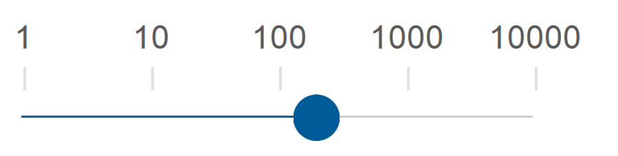
Logarithmic Slider
In addition to normal scale, Smart.Slider can be set to logarithmic mode by setting the LogarithmicScale property
<Slider Max="10000" LogarithmicScale="true"></Slider>
Discrete Slider
The draggable thumb can be set to snap wih a custom step value. Snapping is allows using the Coerce property.
The snapping interval is set using the Interval property.
<Slider Value="50" Coerce="true" Interval="25"></Slider>
Custom Interval
The ticks of the Slider can also be set to a custom, possibly uneven interval.
The ticks are set as an array to CustomTicks.
<Slider Value="50" Coerce="true" CustomInterval="true" CustomTicks="@ticks"></Slider>
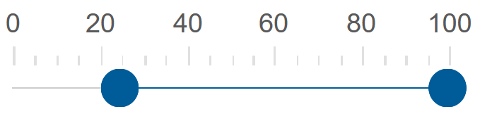
Range Slider
When the Slider is set to range mode, the range is represented by two draggable thumbs.
<Slider Value="50" Coerce="true" Interval="25" RangeSlider="true"></Slider>
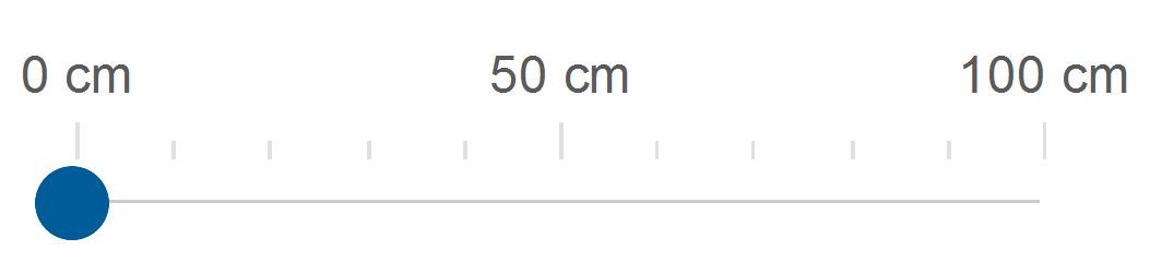
Slider Units
The Slider component can display custom units next to each label.
Set the unit in the Unit property and enable ShowUnit.
<Slider ShowUnit="true" Style="width:300px" Unit="cm"></Slider>
Slider Events
Smart.Slider provides an OnChange event that can help you expand the components' functionality.
OnChange- triggered when the value of the slider is changed.
Event Details: dynamic value, dynamic oldValue
The demo below uses the OnChange Event to return the current value of the slider:
<div style="min-height:40px">@difference</div>
<Slider Value="50" OnChange="OnChange"></Slider>

@code{
    string difference = "";

    private void OnChange(Event ev){
        SliderChangeEventDetail detail = ev["Detail"];
        difference = detail.Value;
    }
}