Blazor - Get Started with Smart.Accordion
Setup The Project
Follow the Getting Started guide to set up your Blazor Application with Smart UI.
Setup Basic Accordion
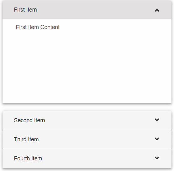
Smart.Accordion is a lightwight container with expandable items.
The items can be set as an array of object or as children elements of the component.
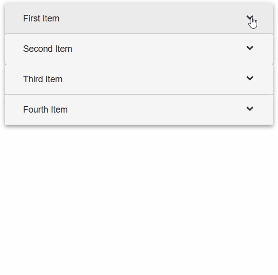
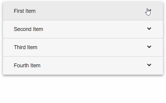
- Add the Accordion component to the Pages/Index.razor file
<Accordion></Accordion>
- Then, add the children elements to the
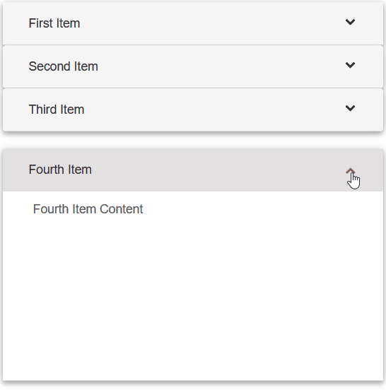
<Accordion>component<Accordion> <AccordionItem Label="First Item">First Item Content.</AccordionItem> <AccordionItem Label="Second Item">Second Item Content.</AccordionItem> <AccordionItem Label="Third Item">Third Item Content.</AccordionItem> <AccordionItem Label="Fourth Item">Fourth Item Content.</AccordionItem> </Accordion>
- Alternatively, create an array of objects and set them as DataSource of the component
<Accordion DataSource="items"></Accordion>

@code{
  private object[] items = new object[]{
      new {label="First Item", content="First Item Content"},
      new{label="Second Item", content="Second Item Content"},
      new{label="Third Item", content="Third Item Content"},
      new{label="Fourth Item", content="Fourth Item Content"}
  };
}
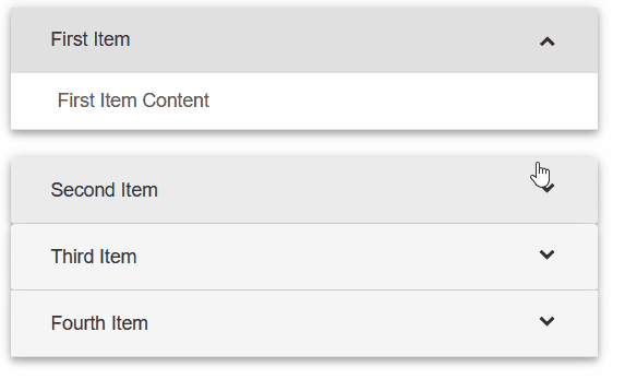
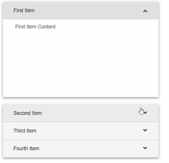
Expand Modes
The Expand Mode determines how the items will expand or collapse. It is set using the ExpandMode property.
<Accordion DataSource="items" ExpandMode="AccordionExpandMode.Single"></Accordion>
- AccordionExpandMode.Single:
- AccordionExpandMode.SingleFitHeight:
- AccordionExpandMode.Multiple:
- AccordionExpandMode.Toggle:
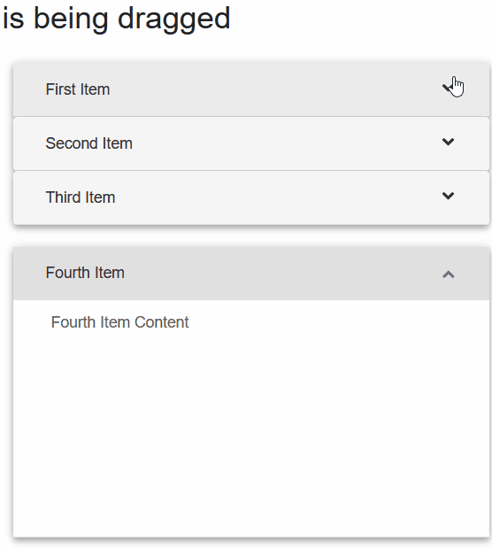
Reorder Items
Items can be reordered by dragging the mouse when the Reorder property is set to true:
<Accordion DataSource="items" Reorder="true"></Accordion>
Accordion Events
Smart.Accordion provides an multiple Events that can help you expand the component's
functionality.
Each event object has unique event.detail parameters.
OnCollapse- triggered when an item is collapsed.
Event Details: dynamic content, int index, string labelOnCollapsing- triggered when an item is going to be collapsed.
Event Details: dynamic content, int index, string labelOnDragEnd- triggered when a reordering operation is completed.
Event Details: dynamic position, dynamic target, dynamic content, int index, string labelOnDragStart- triggered when a reordering operation is started.
Event Details: dynamic position, dynamic target, dynamic content, int index, string labelOnExpand- triggered when an item is expanded.
Event Details: dynamic position, dynamic target, dynamic content, int index, string labelOnExpanding- triggered when an item is going to be expanded.
Event Details: dynamic content, int index, string label
<h3>@draggedItem is being dragged</h3>
<Accordion DataSource="items" Reorder="true" OnDragStart="OnDragStart"></Accordion>

@code{
  private object[] items = new object[]{
      new {label="First Item", content="First Item Content"},
      new{label="Second Item", content="Second Item Content"},
      new{label="Third Item", content="Third Item Content"},
      new{label="Fourth Item", content="Fourth Item Content"}
  };
  string draggedItem = "";
  public void OnDragStart(Event ev){
    if(ev.ContainsKey("Detail")){
          AccordionDragStartEventDetail detail = ev["Detail"];
          draggedItem = detail.Label;
    }
  }
}