Blazor - Get Started with Smart.Tabs
Setup The Project
Follow the Getting Started guide to set up your Blazor Application with Smart UI.
Setup Basic Tabs
Smart.Tabs allows you to organize content in multiple tabs and switch between the different views.
- Add the Tabs component to the Pages/Index.razor file
<Tabs></Tabs>
- Each tab is added as child of the Tabs element:
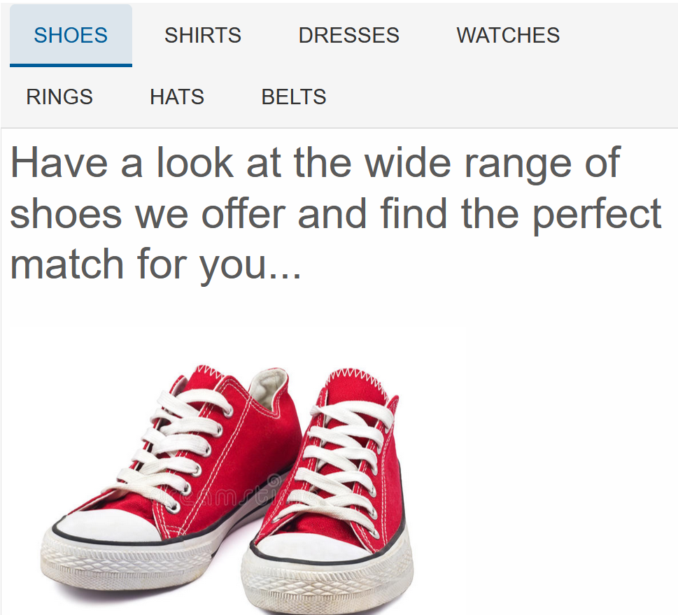
<Tabs> <TabItem Label="Shoes">Have a look at the wide range of shoes we offer and find the perfect match for you...</TabItem> <TabItem Label="Shirts">Content about Shirts</TabItem> <TabItem Label="Dresses">Content about Dresses</TabItem> <TabItem Label="Accessories">Content about Accessories</TabItem> </Tabs> - Alternatively, set the DataSource of the Tab comoponent to an array of objects:
<Tabs DataSource="dataSource"></Tabs>

@code{
  List<Dictionary<string, object>> dataSource = new List<Dictionary<string, object>>()
    {
        new Dictionary<string, object>()
        {
            { "label", "Shoes" },
            { "content", "Content about shoes" }
        },
        new Dictionary<string, object>()
        {
            { "label", "Shirts" },
            { "content", "Content about shirts" }
        },
        new Dictionary<string, object>()
        {
            { "label", "Dresses" },
            { "content", "Content about dresses" },
            { "selected", true }
        }
    };
}
Tab Grouping
Smart.Tabs allows you to establish Tab hierarchy and group tabs inside a parent tab.
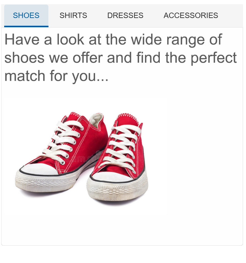
When adding tabs as children elements:
<Tabs>
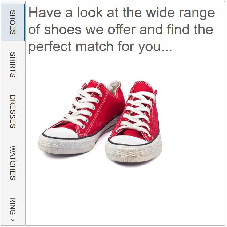
<TabItem Label="Shoes"><h3>Have a look at the wide range of shoes we offer and find the perfect match for you...</h3><br>
<img src="https://thumbs.dreamstime.com/b/vintage-red-shoes-23151148.jpg" width="300px"></TabItem>
<TabItem Label="Shirts">Content about Shirts</TabItem>
<TabItem Label="Dresses">Content about Dresses</TabItem>
<TabItemsGroup Label="Accessories">
<TabItem Label="Watches"><div>Content about Watches</div></TabItem>
<TabItem Label="Rings"><div>Content about Jewelry</div></TabItem>
<TabItem Label="Hats"><div>Content about Hats</div></TabItem>
<TabItem Label="Belts"><div>Content about Belt</div></TabItem>
</TabItemsGroup>
</Tabs>
Grouping can also be enforced when the Tabs are set to an array:
<Tabs DataSource="@dataSource"></Tabs>

@code{
  List<Dictionary<string, object>> dataSource = new List<Dictionary<string, object>>()
    {
      new Dictionary<string, object>()
        {
            { "label", "Shoes" },
            { "content", "Content about shoes" }
        },
      new Dictionary<string, object>()
        {
            { "label", "Shirts" },
            { "content", "Content about shirts" }
        },
      new Dictionary<string, object>()
        {
            { "label", "Dresses" },
            { "content", "Content about dresses" },
            { "selected", true }
        }
      new Dictionary<string, object>()
        {
            { "label", "Accessories" },
            {
                "items",
                new List<Dictionary<string, string>>()
                {
                    new Dictionary<string, string>()
                    {
                        { "label", "Watches" },
                        { "content", "Content 1.1" }
                    },
                    new Dictionary<string, string>()
                    {
                        { "label", "Jewelry" },
                        { "content", "Content 1.2" }
                    },
                    new Dictionary<string, string>()
                    {
                        { "label", "Hat" },
                        { "content", "Content 1.3" }
                    }
                }
            }
        },
    };
}
Tab Layout
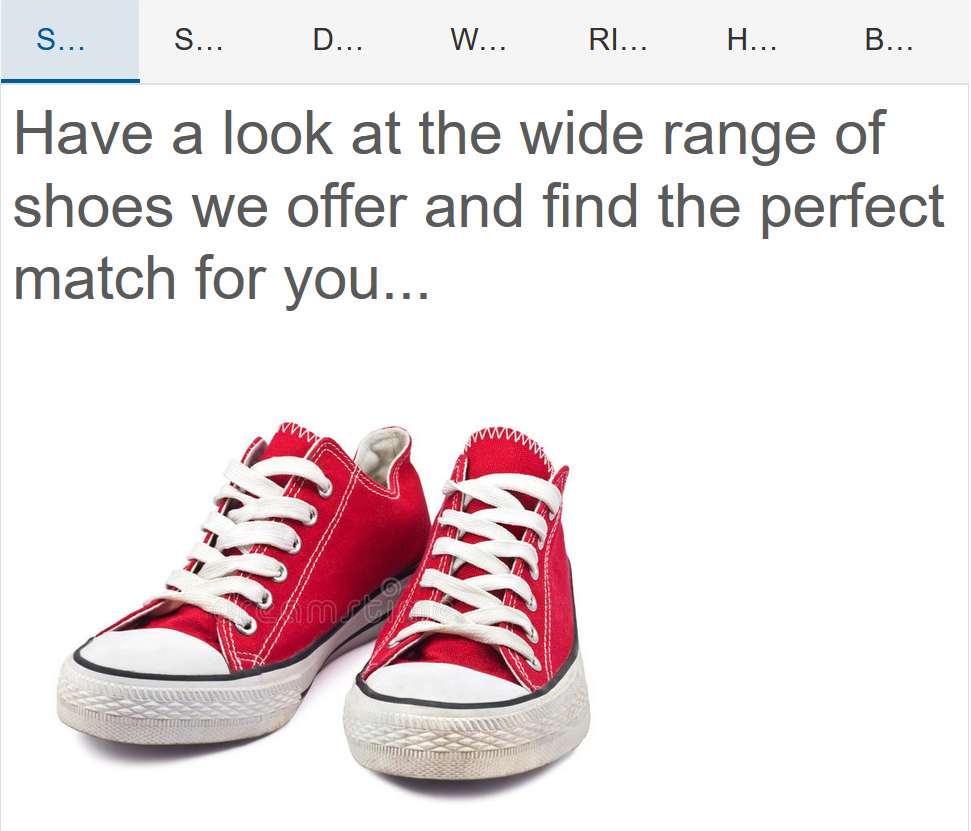
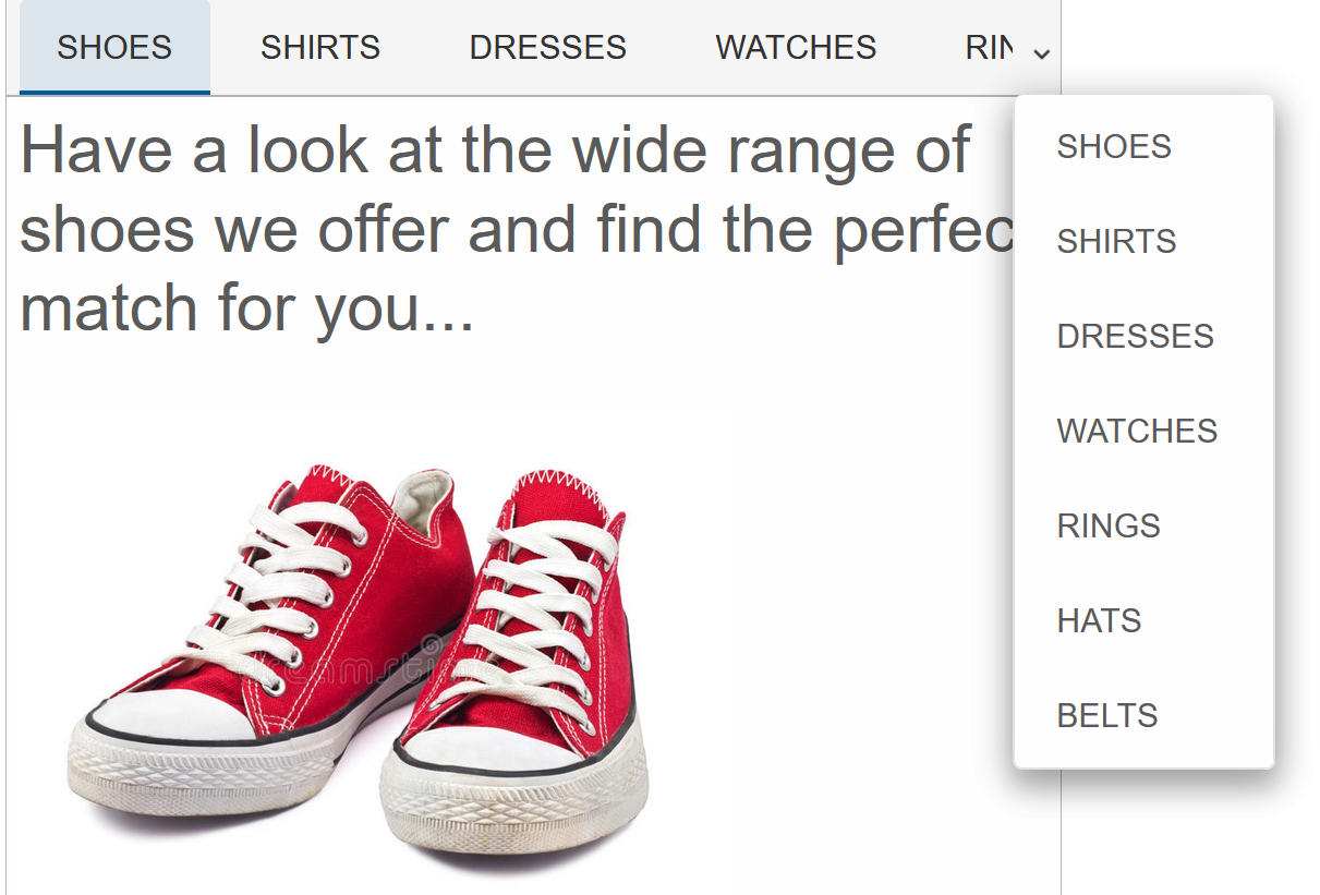
When the element is not wide enough to display all tabs, the TabLayout property determines the bevavior of the component..
<Tabs TabLayout="TabsTabLayout.Wrap">....</Tabs>
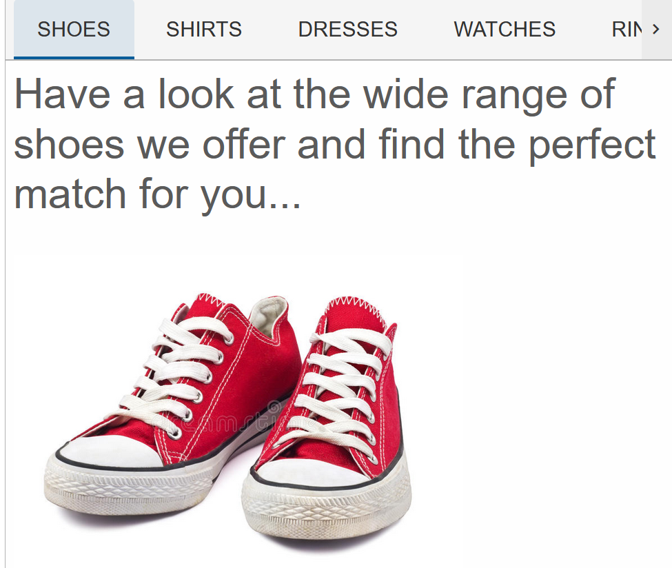
TabsTabLayout.Scroll(default) - scrolls tabs horizontlally:
TabsTabLayout.Wrap - wraps the tabs to a new line if needed:
TabsTabLayout.Shrink - shrinks tabs so that they fit within the element:
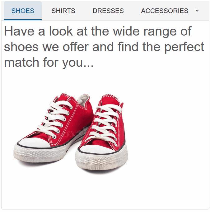
TabsTabLayout.dropdown - creates a dropdown button that shows all tabs:
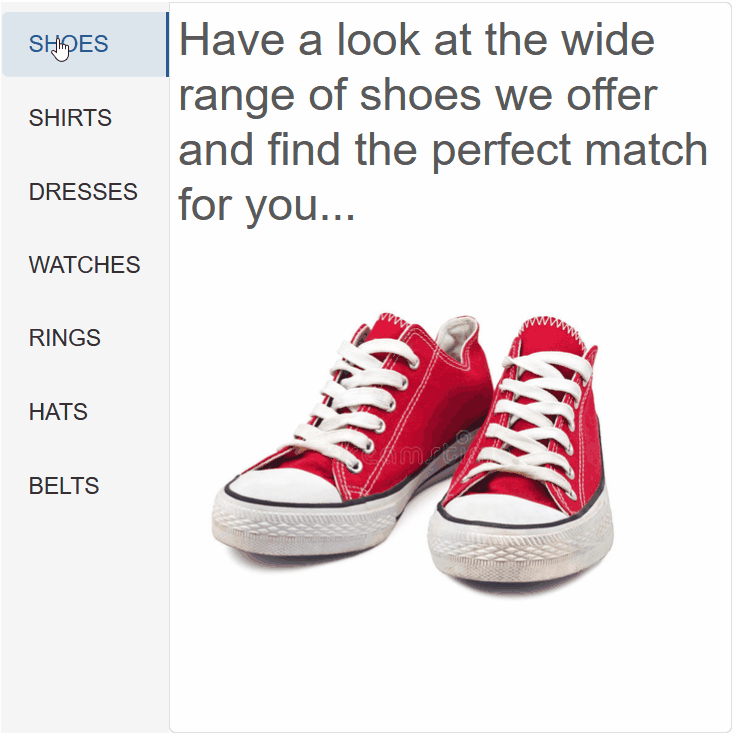
Tabs Position & Orientation
The Tabs Position and Text Orientation can be modified using the TabPosition & TabTextOrientation properties:
<Tabs TabLayout="TabsTabLayout.Scroll" TabPosition="TabPosition.Left" TabTextOrientation="Orientation.Horizontal"></Tabs>
Tabs Events
Smart.Tabs provides multiple events that can help you expand the component's functionality.
Each event object has unique event.detail parameters.
OnAddNewTabClick- triggered when the addNewTab is enabled and is clicked.
Event Details: N/AOnChange- triggered when the tab selection is changed.
Event Details: int index, int oldIndexOnClose- triggered when a tab is closed.
Event Details: int indexOnClosing- triggered when a tab is about to be closed.
Event Details: int indexOnDragEnd- triggered when a drag operation has ended.
Event Details: int left, int top, int index, string labelOnDragStart- triggered when a drag operation has started.
Event Details: int left, int top, int index, string labelOnReorder- triggered when tabs have been reordered.
Event Details: int index, int oldIndex
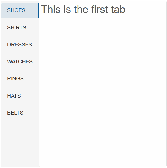
The demo uses the OnChange event to return to the first tab if the new selected tab is after the forth:
  <Tabs @ref="tabs" TabPosition="TabPosition.Left" OnChange="OnChange">
    <TabItem Label="Shoes"><h3>This is the first tab</h3></TabItem>
    <TabItem Label="Shirts"><h3>Content about Shirts</h3></TabItem>
    <TabItem Label="Dresses">Content about Dresses</TabItem>
    <TabItem Label="Watches"><div>Content about Watches</div></TabItem>
    <TabItem Label="Rings"><div>Content about Jewelry</div></TabItem>
    <TabItem Label="Hats"><div>Content about Hats</div></TabItem>
    <TabItem Label="Belts"><div>Content about  Belt</div></TabItem>
</Tabs>

@code {
    Tabs tabs;
    private async void OnChange(Event ev)
    {
        TabsChangeEventDetail detail = ev["Detail"];
        int index = detail.Index;
        if(index>3){
            tabs.Select(0);
        }
    }
}