Blazor - Get Started with Smart.DropDownButton
Setup The Project
Follow the Getting Started guide to set up your Blazor Application with Smart UI.
Setup Basic DropDownButton
Smart.DropDownButton is a button element with a dropdown container, which can contain additional actions or information
-
Add the DropDownButton component to the Pages/Index.razor file:
<DropDownButton></DropDownButton>
-
The button's text content is set inside the
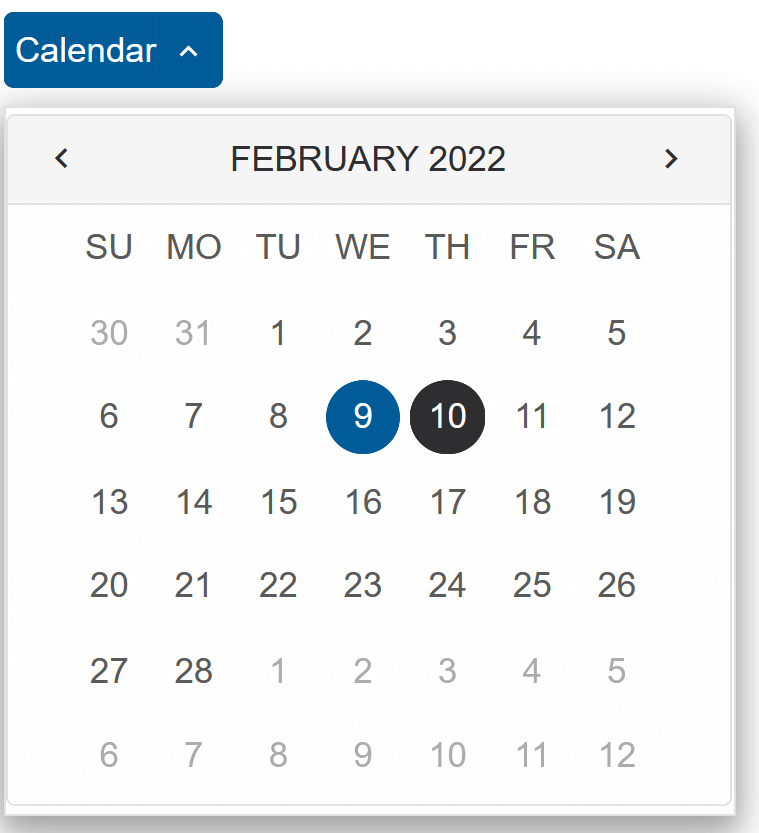
Placeholderproperty:<DropDownButton Placeholder="Calendar"></DropDownButton>
-
Inside the component, set the content of the dropdown - any valid HTML content, including other Smart UI Components:
  <DropDownButton Placeholder="Calendar" DropDownWidth="295">
    <Calendar></Calendar>
  </DropDownButton>
DropDown Open Mode
When the open mode is set to DropDownButton, the component is split into an action button and a dropdown button:
  <DropDownButton Placeholder="Send" DropDownWidth="295">
    <CheckBox>Attach Files</CheckBox>
    <CheckBox>Send Anonymously</CheckBox>
  </DropDownButton>

DropDown Position
Using the DropDownPosition propperty, the drop down position can be set to:
Auto(default) | Bottom | CenterBottom | CenterTop | OverlayBottom | OverlayCenter | OverlayTop | Top
By default, the position is set to Auto - the element will automatically determinte
the position of the dropdown depending on the space available.
<DropDownButton Placeholder="Send" DropDownWidth="300" DropDownPosition="DropDownPosition.OverlayCenter">
    <h3>Terms of Service</h3>
    <p>
      Lorem ipsum dolor sit amet, consectetur adipiscing elit. Duis et purus in diam vehicula maximus et vitae dolor.
      In pharetra tristique tellus. Maecenas imperdiet, lacus at porta pulvinar, sapien lacus mattis mi, sed egestas
    </p>
    <CheckBox Checked>I agree</CheckBox>
</DropDownButton>

DropDown Resize Mode
The ResizeMode property enables horizontal and/or vertical resizing
<DropDownButton Placeholder="Send" DropDownWidth="300" DropDownPosition="DropDownPosition.OverlayCenter" ResizeMode="ResizeMode.Both">
  <h3>Terms of Service</h3>
  <p>
    Lorem ipsum dolor sit amet, consectetur adipiscing elit. Duis et purus in diam vehicula maximus et vitae dolor.
    In pharetra tristique tellus. Maecenas imperdiet, lacus at porta pulvinar, sapien lacus mattis mi, sed egestas
  </p>
  <CheckBox Checked>I agree</CheckBox>
</DropDownButton>

DropDownButton Events
Smart.DropDownButton provides multiple Events that can help you expand the component's functionality.
Each event object can have unique event.detail parameters.
OnActionButtonClick- triggered when user clicks on the action button. The action button is visible when the "placeholder" is set.
Event Details: N/AOnClose- triggered when the drop down is closed.
Event Details: N/AOnClosing- triggered when the drop down is about to be closed.
Event Details: N/AOnDropDownButtonClick- triggered when user clicks on the drop down button.
Event Details: N/AOnOpen- triggered when the drop down is opened.
Event Details: N/AOnOpening- triggered when the drop down is about to be open.
Event Details: N/AOnResizeStart- triggered when user starts resizing the drop down.
Event Details: dynamic positionOnResizeEnd- triggered when the resizing of the drop down is finished.
Event Details: dynamic position
The demo below uses the OnItemClick Event to diisable the dropdown after it has been opened once:
<DropDownButton @ref="@button" Placeholder="Send" DropDownWidth="200" ResizeMode="ResizeMode.Both" OnDropDownButtonClick="OnDropDownButtonClick">
  <h3>Content</h3>
</DropDownButton>
@code{
  bool opened = false;
  DropDownButton button;
  private void OnDropDownButtonClick(){
      if(opened){
          button.Disabled = true;
      }
      opened = true;
  }
}