Blazor - Get Started with Smart.ListMenu
Setup The Project
Follow the Getting Started guide to set up your Blazor Application with Smart UI.
Setup Basic ListMenu
Smart.ListMenu is a custom component that can be used to navigate and select items in a nested list.
- Add the ListMenu component to the Pages/Index.razor file
<ListMenu></ListMenu>
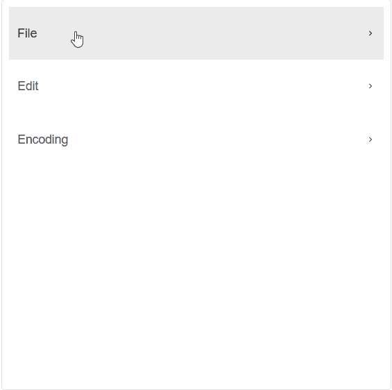
- Menu Items are added as children elements of
ListMenuorMenuItemsGroup<ListMenu> <MenuItemsGroup> File <MenuItem shortcut="Ctrl+N">New</MenuItem> <MenuItem shortcut="Ctrl+0">Open</MenuItem> <MenuItemsGroup> Open Containing Folder <MenuItem>Explorer</MenuItem> <MenuItem>cmd</MenuItem> </MenuItemsGroup> <MenuItem shortcut="Ctrl+S" disabled>Save</MenuItem> <MenuItem shortcut="Ctrl+Alt+S" separator>Save As...</MenuItem> <MenuItem shortcut="Alt+F4">Exit</MenuItem> </MenuItemsGroup> <MenuItemsGroup> Edit <MenuItem shortcut="Ctrl+Z">Undo</MenuItem> <MenuItem shortcut="Ctrl+Y" separator>Redo</MenuItem> <MenuItem shortcut="Ctrl+X">Cut</MenuItem> <MenuItem shortcut="Ctrl+C">Copy</MenuItem> <MenuItem shortcut="Ctrl+V" disabled>Paste</MenuItem> </MenuItemsGroup> <MenuItemsGroup> Encoding <MenuItem>Encode in ANSI</MenuItem> <MenuItem>Encode in UTF-8</MenuItem> <MenuItem>Encode in UTF-8-BOM</MenuItem> <MenuItemsGroup separator> Character sets <MenuItemsGroup> Cyrillic <MenuItem>ISO 8859-5</MenuItem> <MenuItem>KOI8-R</MenuItem> <MenuItem>KOI8-U</MenuItem> </MenuItemsGroup> <MenuItemsGroup> Chinese <MenuItem>Big5 (Traditional)</MenuItem> <MenuItem>GB2312 (Simplified)</MenuItem> </MenuItemsGroup> <MenuItemsGroup> Western European <MenuItem>ISO 8859-1</MenuItem> <MenuItem>ISO 8859-15</MenuItem> </MenuItemsGroup> </MenuItemsGroup> <MenuItem>Convert to ANSI</MenuItem> <MenuItem>Convert to UTF-8</MenuItem> </MenuItemsGroup> </ListMenu> - Items can also be added as an array of objects, set to the
DataSourceproperty:<ListMenu DataSource="@items"></ListMenu> @code{ IEnumerable<object> items = new dynamic[]{new{label="Item 1", value="item1"}, new{label="Item 2", value="item2"}}; }
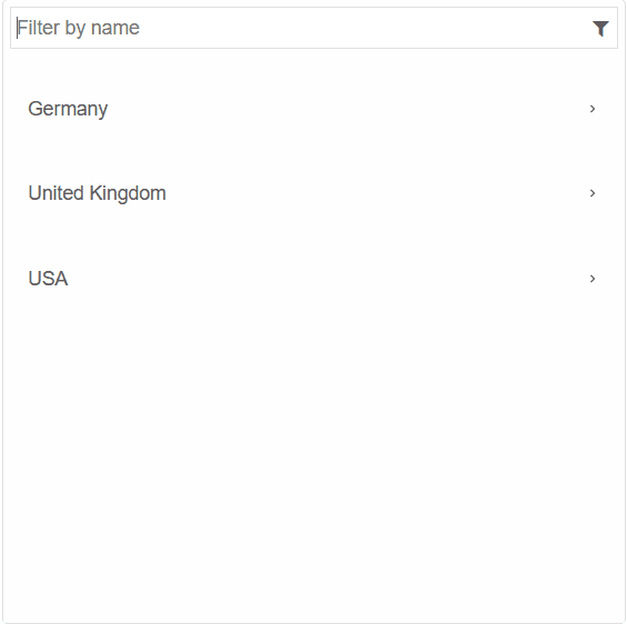
Filterable
To enable the built-in filtering functionality, set the Filterable property to true
By default, the filtering is based on the "label" property of the MenuItem. It can be modified to the "value" property or
the textContent with the FilterMember property.
FilterInputPlaceholder determines the placeholder displayed to the user in the filter input field.
<ListMenu DataSource="items" Filterable="true" FilterInputPlaceholder="Filter by name"></ListMenu>

@code{
  IEnumerable<object> items = new dynamic[]{
    new{label="Germany", items = new dynamic[]{
        new{label="Berlin"}, new{label="Munich"}
    }},
    new{label="United Kingdom", items = new dynamic[]{
        new{label="London"}, new{label="Liverpool"},
        new{label="Manchester"}, new{label="Sheffield"},
        new{label="Glasgow"}
    }},
    new{label="USA", items = new dynamic[]{
        new{label="New York City"}, new{label="Chicago"}
    }},
};
}
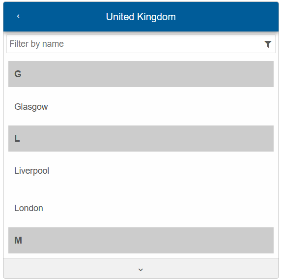
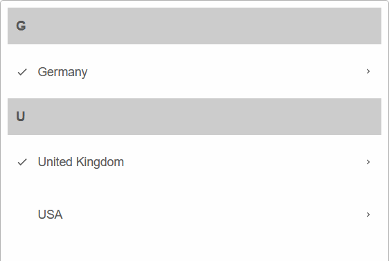
Grouping
Menu Items can be grouped alphabetically using the Grouped property:
<ListMenu DataSource="items" Filterable="true" FilterInputPlaceholder="Filter by name"></ListMenu>
Checkable
Smart.ListMenu supports selection of the top-level ListMenu items. The Selection can be of type Checkbox or Radio.
<ListMenu Checkable="true" Checkboxes="true" Grouped="true" DataSource="items"></ListMenu>
ListMenu Events
Smart.ListMenu provides multiple events that can help you expand the component's functionality.
Each event object has unique event.detail parameters.
OnExpand- triggered when a jqx-menu-items-group is expanded.
Event Details: dynamic item, string label, dynamic value, dynamic path, dynamic childrenOnItemCheckChange- triggered when a menu item check state is changed.
Event Details: dynamic item, string label, dynamic value, dynamic checkedOnItemClick- triggered when a list menu item is clicked.
Event Details: dynamic item, string label, dynamic valueOnScrollBottomReached- triggered when the user scrolls to the bottom of the ListMenu.
Event Details: N/AOnSwipeleft- triggered when the user swipes to the left inside the ListMenu.
Event Details: N/AOnSwiperight- triggered when the user swipes to the right inside the ListMenu.
Event Details: N/A
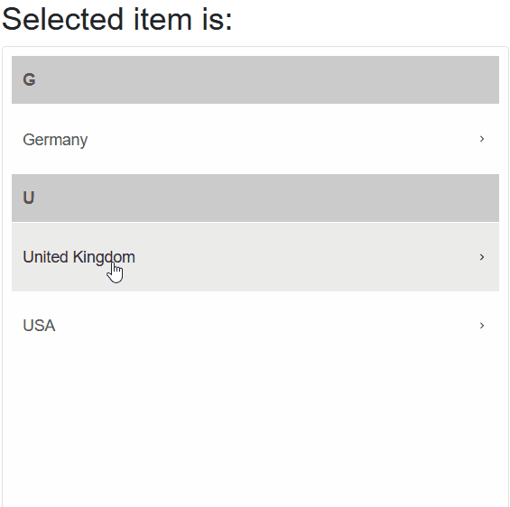
The demo below uses the OnItemClick Event to return to display the label of the clicked item:
<h3>Selected item is: @selected</h3>
<ListMenu Grouped="true" DataSource="items" OnItemClick="OnItemClick"></ListMenu>

@code {
    IEnumerable<object> items = new dynamic[]{
        new{label="Germany", items = new dynamic[]{
            new{label="Berlin"}, new{label="Munich"}
        }},
        new{label="United Kingdom", items = new dynamic[]{
            new{label="London"}, new{label="Liverpool"},
            new{label="Manchester"}, new{label="Sheffield"},
            new{label="Glasgow"}
        }},
        new{label="USA", items = new dynamic[]{
            new{label="New York City"}, new{label="Chicago"}
        }},
    };
    string selected = "";
    private void OnItemClick(Event ev){
        ListMenuItemClickEventDetail detail = ev["Detail"];
        selected = detail.Label;
    }
}}