Blazor - Get Started with Smart.PasswordTextBox
Setup The Project
Follow the Getting Started guide to set up your Blazor Application with Smart UI.
Setup Basic PasswordTextBox
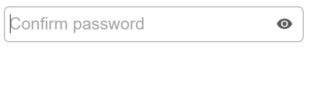
Smart.PasswordTextBox is a password input element with additional built-in features such as reveal password and strength measuring.
The list of avaible options is set using the DataSource property.
- Add the PasswordTextBox component to the Pages/Index.razor file
<PasswordTextBox></PasswordTextBox>
- Optionally, set the Name, Placeholdeer properties.
<PasswordTextBox Placeholder="Enter password" Name="password"></PasswordTextBox>
PasswordTextBox Customization
Smart.PasswordTextBox can be styled in different ways by setting the Class property.
The PasswordTextBox can be default, outlined or underlined
<PasswordTextBox Class="underlined"></PasswordTextBox>
Reveal Password
Revealing password can help users check if they have made any mistakes while typing their passwords.
It is enabled with the ShowPasswordIcon property.
<PasswordTextBox Class="underlined" ShowPasswordIcon></PasswordTextBox>
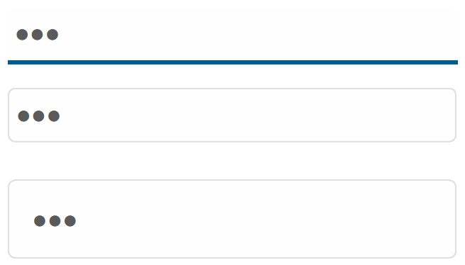
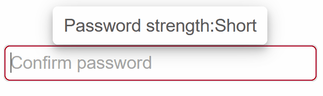
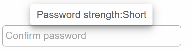
Password Strength
By default, password strength is measured by the length of the password. The position of the message can be changed with TooltipPosition
<PasswordTextBox ShowPasswordStrength></PasswordTextBox>
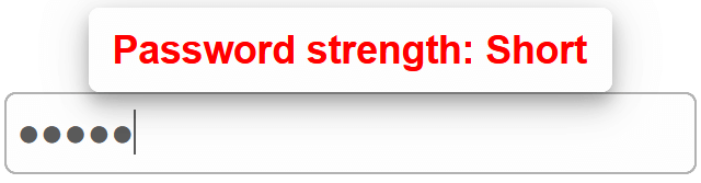
In addition, it is possible to set a custom template and customize the look of the tooltip with the TooltipTemplate property.
<template id="tooltip-template">
  <span style="font-weight:bold; color:red">{{value}}</span>
</template>
<PasswordTextBox ShowPasswordStrength TooltipTemplate="@template"></PasswordTextBox>

@code {
  string template = "tooltip-template";
}
Custom Password Strength
Smart.PasswordTextBox allows you to set custom function, which determines the strength of the password. To set the function, it is necessary to use JSInterop:
@inject IJSRuntime JS
Using JSInterop, inoke a custom JS function called "customStrength":
protected override void OnInitialized()
{
    base.OnInitialized();
    JS.InvokeVoidAsync("customStrength");
}
Inside the \_Host.cshtml file (server-side Blazor) or wwwroot/index.html (client-side WebAssembly Blazor), create a function that will attach a custom function to the customStrength property.
(function (global) {
  global.customStrength = function() {
      setTimeout(function(){
            document.querySelector("smart-password-text-box").passwordStrength = function (password, allowedSymbols) {
                const passwordLength = password.length;
                if (passwordLength < 3) {
                    return 'short' ;
                } else if (passwordLength < 5) {
                    return 'weak';
                } else if(password.includes('!')){
                    return 'strong';
                }
            };
        }, 0)
  }
})(window);
Our custom function will consider a password "strong" only if it contains !
PasswordTextBox Events
Smart.PasswordTextBox provides multiple events that can help you expand the component's functionality.
Each event object has unique event.detail parameters.
OnChange- triggered when the value of the element is changed.
Event Details: dynamic oldValue, dynamic valueOnChanging- triggered on each key up event of the PasswordTextBox, if the value is changed.
Event Details: dynamic oldValue, dynamic value
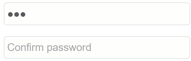
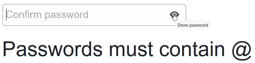
The demo below uses the OnChanging Event to check whether the password contains the required @ symbol:
    <PasswordTextBox @ref="@field" Placeholder="Confirm password" Name="password" OnChanging="OnChanging" ShowPasswordIcon></PasswordTextBox>
    <h3>@message</h3>
    @code {
      PasswordTextBox field;
      string message = "";


      private async void OnChanging(Event ev){
        PasswordTextBoxChangingEventDetail detail = ev["Detail"];
        if(!detail.Value.Contains("@")){
          message = "Passwords must contain @";
        }
        else{
          message = "Passwords is valid";
        }
      }
    }
Two-way Value Binding
The PasswordTextBox component also supports two-way value binding:
<h3>@textValue</h3>
<PasswordTextBox @bind-Value = "@textValue"></PasswordTextBox>

@code{
    string textValue = "";
}