Blazor - Get Started with Smart.DockingLayout
Setup The Project
Follow the Getting Started guide to set up your Blazor Application with Smart UI.
Setup Basic DockingLayout
Smart.DockingLayout allows you to easily create complex layouts with multiple tabs and panels.
- Add the DockingLayout component to the Pages/Index.razor file.
<DockingLayout></DockingLayout>
- Inside the @code block, create a simple layout structure and set it as a property of the DockingLayout component.
<DockingLayout Layout=@layoutStructure></DockingLayout>

@code {
  private object[] layoutStructure = new object[] {
    new {
      type = "LayoutPanel",
      label = "Input",
      id = "tabPanel",
      items = new object[] {
        new {
          type = "LayoutPanel",
          label = "Tab #1",
          content = "Smart.DockingLayout represents a flexible layout control that allows custom layout creation. "+
          "The element consists of Smart.TabsWindow items that can be re-arranged by dragging to construct a different layout. Every item can contain any HTML."
        },
        new {
          type = "LayoutPanel",
          label = "Tab #2",
          content = "I am the second Tab"
        }
      }
    }
  };
}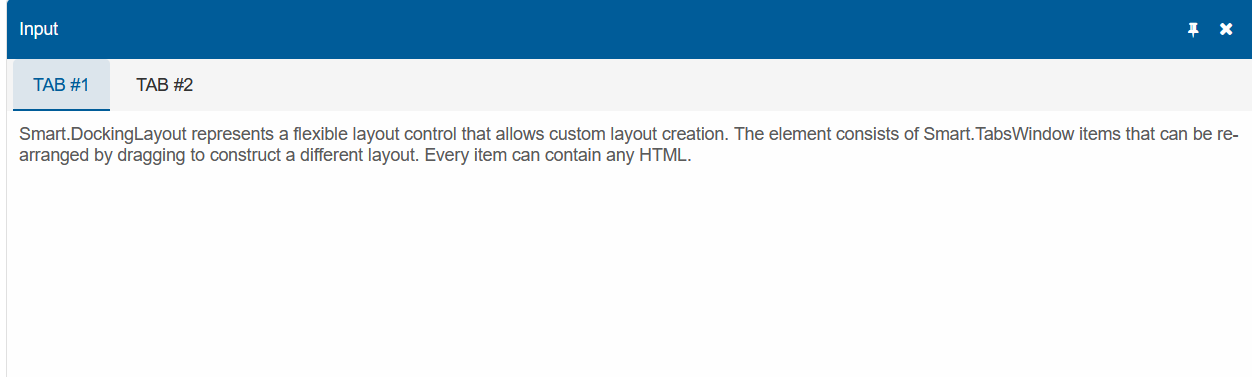
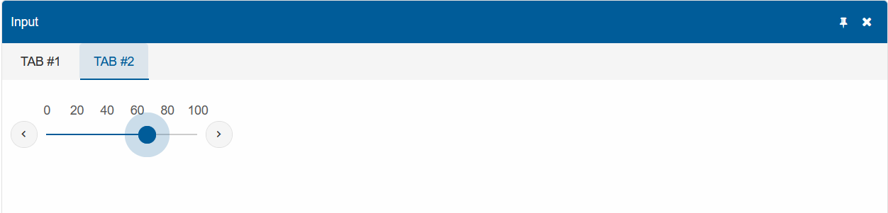
Elements as content
The content of each element can reference an HTML element. Modify Tab #2 to include a Smart.Slider.
<div id="Slider">
    <br />
    <br />
    <Slider Value="50" ShowButtons="true" TicksVisibility="TicksVisibility.Major"
      TicksPosition="TicksPosition.Track">
    </Slider>
</div>

@code{
  ....
  new {
    type = "LayoutPanel",
    label = "Tab #2",
    content = "#Slider"
  }
  ....
}
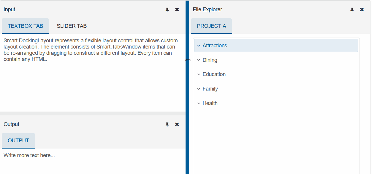
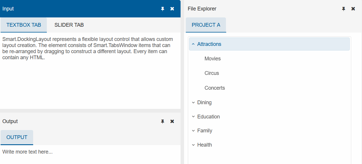
Layout Group
Layout Groups represents a container of items that make it easier to organize complex layouts. Each Group can either be horizontal or vertical.
Use LayoutGroup to create a new layout strcture.
<Tree id="tree">
  <TreeItemsGroup>
      Attractions
      <TreeItem>Movies</TreeItem>
      <TreeItem>Circus</TreeItem>
      <TreeItem>Concerts</TreeItem>
  </TreeItemsGroup>
  <TreeItemsGroup>
      Dining
      <TreeItem>Restaurants</TreeItem>
  </TreeItemsGroup>
  <TreeItemsGroup>
      Education
      <TreeItem>Schools</TreeItem>
  </TreeItemsGroup>
  <TreeItemsGroup>
      Family
      <TreeItem>Family trips</TreeItem>
  </TreeItemsGroup>
  <TreeItemsGroup>
      Health
      <TreeItem>Hospitals</TreeItem>
  </TreeItemsGroup>
</Tree>

@code {
private object[] layoutStructure = new object[] {
  new {
    type = "LayoutGroup",
    orientation = "horizontal",
    size = "500",
    items = new object[] {
      new {
        type = "LayoutGroup",
        size = "300",
        items = new object[] {
          new {
            type = "LayoutPanel",
            label = "Input",
            id = "tabPanel",
            items = new object[] {
              new {
                type = "LayoutPanel",
                label = "TextBox Tab",
                content = "Smart.DockingLayout represents a flexible layout control that allows custom layout creation. "+
        "The element consists of Smart.TabsWindow items that can be re-arranged by dragging to construct a different layout. Every item can contain any HTML."
              },
              new {
                type = "LayoutPanel",
                label = "Slider Tab",
                content = "#Slider"
              }
            }
          }
        }
      },
      new {
        type = "LayoutPanel",
        label = "Output",
        items = new object[]{
          new {
            id="outputTab",
            label = "Output",
            headerPosition = "none",
            content = "Write more text here..."
          }
        }
      }
    }
  },
  new {
    id = "item0",
    label = "File Explorer",
    items = new object[]{
      new {
        label = "Project A",
        selected = true,
        content = "#tree"
      }
    }
  }
};
}
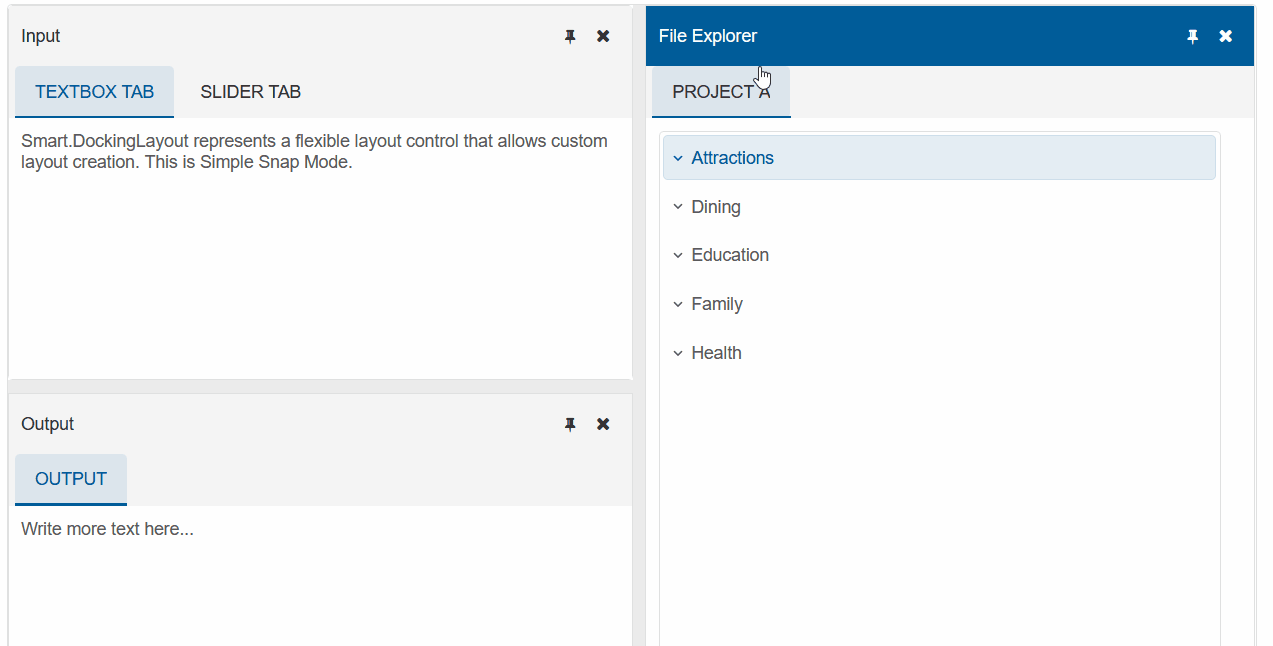
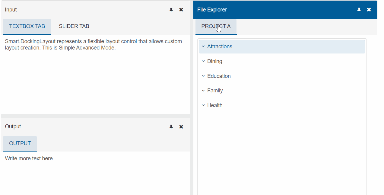
Snap Modes
Snap Modes can be set as either simple or advanced(default). This changes the feedback behaviour when dragging an item.
Set the SnapMode property to simple.
<DockingLayout Layout=@layoutStructure SnapMode="DockingLayoutSnapMode.Simple">
</DockingLayout>
Example of Simple SnapMode:
Example of Advanced SnapMode:
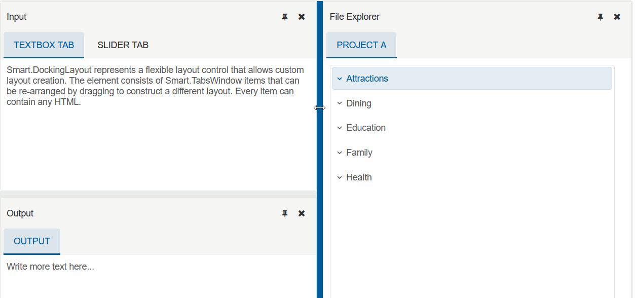
Live Resize
The Smart UI's built-in Splitter lets you resize Items by dragging the bar between them.
When the LiveResize property is set to true, Items will be resized while the user is dragging the Splitter
<DockingLayout Layout=@layoutStructure SnapMode="DockingLayoutSnapMode.Simple" LiveResize="true">
</DockingLayout>
Example of LiveResize set to false:
Example of LiveResize set to true: