Build your web apps using Smart UI
Smart.Grid - Filtering and Sorting
Grid Filtering
Smart.Grid allows users to filter the data loaded from the Grid's data source through the user interface or programmatically. Filtering is controlled via the property/object filtering. To enable it, filtering.enabled has to be set to true.
Filter Menu
Filtering through the UI can be done through the filter menu (part of the column menu), which is configured via filtering.filterMenu. If filtering.filterMenu.visible is set to true, the filter menu can be opened by clicking the menu button in a column's header:
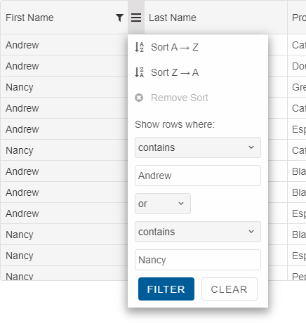
The filter menu allows filtering a column by two data fields and selecting filter condition, filter value and filter operator (or or and). Available filter conditions are determined by the data type of the column's data field.
Once the button "OK" is pressed, the filter is applied to the Grid.
Programmatic Filtering
A default filter in Grid can be applied by setting filtering.filter to an array, each member of which is an array with first member - data field to filter by and second member - filter expression:
filtering: {
    enabled: true,
    filter: [
        ['firstName', 'contains Andrew or contains Nancy'],
        ['quantity', '>= 3 and <= 8']
    ]
},
Filter can be applied in the columns definitions by using the column's 'filter' property.
columns: [
	{
		label: 'First Name', dataField: 'firstName', filterMenuMode: 'excel'
	},
	{ label: 'Last Name', filter: '= Davolio', dataField: 'lastName' },
	{ label: 'Date', dataField: 'date', align: 'right', cellsAlign: 'right', },
	{ label: 'Product', dataField: 'productName' },
	{ label: 'Quantity', filter: '> 5', dataField: 'quantity', align: 'right', cellsAlign: 'right', }
]
Excel-like Filtering. The filter menu can be displayed in default and excel mode. In the default mode, the filter menu displays 2 inputs for applying filters to the column. In excel-mode, it displays a list of check items for more precise filtering. To enable excel-like filtering, use this:
filtering: {
	enabled: true,
	filterMenu: {
		mode: 'excel'
	}
}
Alternatively, you can apply excel-like filtering to some of the columns by setting the column's "filterMenuMode" property.
label: 'First Name', dataField: 'firstName', filterMenuMode: 'excel'
Filter Row
You can enable filter row in its header by setting the grid's filtering->filterRow->visible property to true. Thus based on the data type of the underlying columns data, the Grid will render inputs for string values, numeric inputs or date pickers for filtering in the column headers.
 filtering: {
	enabled: true,
	filterRow: {
		visible: true
	}
}

Filter Panel
The filter panel is another built-in type of filtering UI. The filters in this mode are displayed in the Grid's header panel and with a drop-down you can apply and clear all filters.
filtering: {
	enabled: true
},
header: {
	visible: true
}

Filter Expressions
A filter expression is a string that contains consecutively filter condition, filter value, filter operator (optional, for chaining multiple conditions). Supported filter conditions for use in expressions are:
- '='
- '<>'
- '<'
- '>'
- '<='
- '>='
- 'equal'
- 'not equal'
- 'less than'
- 'greater than'
- 'greater than or equal'
- 'less than or equal'
- 'starts with'
- 'ends with'
- 'null'
- ''
- 'isblank'
- 'isnotblank'
- 'contains'
- 'notcontains'
- 'startswith'
- 'endswith'
- 'NULL'
- 'NOT_NULL'
More information: property filtering in the Grid API documentation.
Filtering-related Methods:
- addFilter - adds a filter. This method takes two parameters, corresponding to filtering.filter - data field and filter expression.
grid.addFilter("firstName","startsWith B"); - clearFilter - clears all applied filters, refreshes the view and updates all filter input components.
- removeFilter - removes a column filter.
Grid Sorting
Smart.Grid allows users to sort the data loaded from the Grid's data source through the user interface or programmatically, by one or multiple columns. Sorting is controlled via the property/object sorting. To enable it, sorting.enabled has to be set to true.
Whether or not the Grid can be sorted by multiple columns is controlled by sorting.mode (which can be 'one' or 'many').
Sorting can be disabled for particular columns by setting allowSort to false in the column's definition. To sort a column by default, its sortOrder property has to be set to either 'asc' (ascending) or 'desc' (descending).
Sort UI
A Grid column can be sorted by clicking the column's header. The first click sorts ascending, the second one - descending and the third one clears the sorting. If sorting.sortToggleThreeStates is set to false, third click sorts ascending again (it does not remove sorting).
Sorting through the UI can also be done through the sort menu (part of the column menu) which can be opened by clicking the menu button in a column's header. The sort menu allows the options Sort ascending, Sort descending, and Remove Sort.
More information: property sorting in the Grid API documentation.
Sort Animation
Sort animation can be enabled by setting appearance.allowSortAnimation to true. The animation duration is controlled by setting appearance.sortAnimationDuration.
Sorting-related Methods:
- addSort - sorts a column.
- clearSort - clears any applied sorting.
- getSortedColumns - gets an array of columns with applied sorting.
- removeSort - clears the sorting of a column.
For AI tooling
Developer Quick Reference
Topic: grid-filtering-sorting Component: Grid Framework: JavaScript
Main methods: addFilter()
Common config keys: header, filtering, columns
Implementation Notes
Compatibility: Modern browsers / Web Components API access pattern: const component = document.querySelector(...) + component.method()
Lifecycle guidance: Initialize configuration first, then invoke imperative API when element is available in DOM.
Common pitfalls:
- Calling methods before element initialization.
- Reassigning large configuration partially without understanding merge behavior.
- Missing required module script import for component type.
Validation checklist:
- Ensure module scripts and CSS are loaded once.
- Keep data schema aligned with columns/series definitions.
- Verify method calls target initialized component instance.