Blazor - Get Started with Smart.MultiComboInput
Setup The Project
Follow the Getting Started guide to set up your Blazor Application with Smart UI.
Setup Basic Multi Combo Input
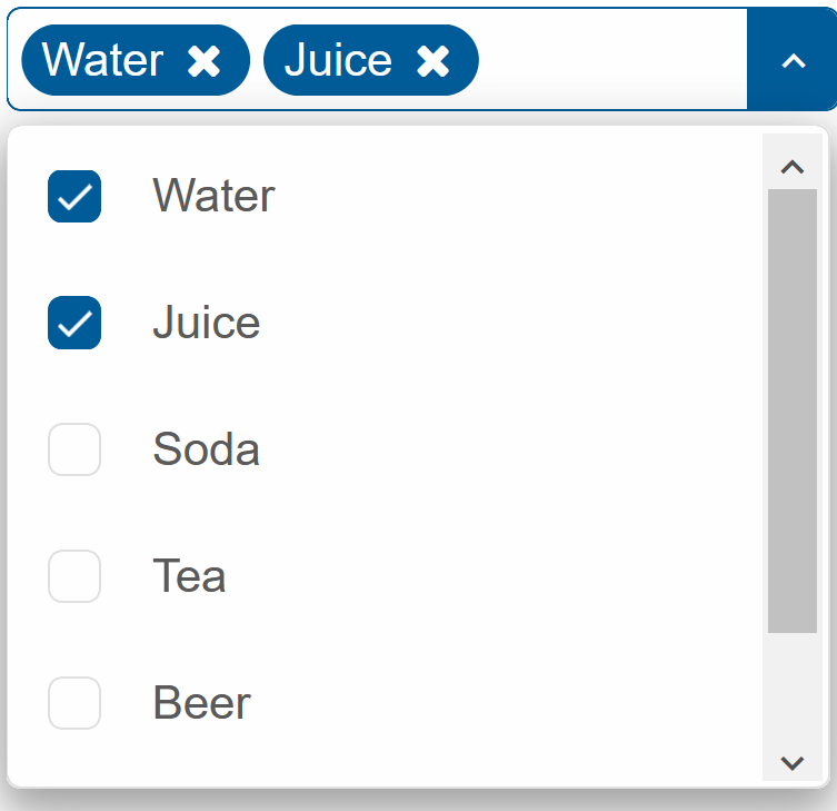
Smart.MultiComboInput is an input that allows selecting from a predefined drop down list. The selected options are then added as tags
The list of avaible options is set using the DataSource property.
- Add the MultiComboInput component to the Pages/Index.razor file
<MultiComboInput></MultiComboInput>
- Inside the
@codeblock, create an array of elements and set it as DataSource of the component<MultiComboInput DataSource="drinks"></MultiComboInput> @code{ private string[] drinks = new string[]{"Water", "Juice", "Soda", "Tea", "Beer", "Wine", }; }
Readonly
When the Readonly property is set to true, the input field will be disabled and changes will be allowed only by using the dropdown list.
<MultiComboInput DataSource="drinks" Readonly="true"></MultiComboInput>

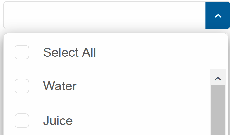
Select All
The SelectAll property creates an addition option row, which allows selection of the entire dropdown
<MultiComboInput DataSource="drinks" SelectAll="true"></MultiComboInput>
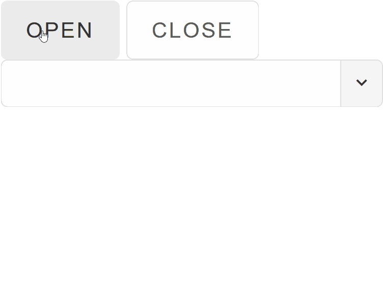
MultiComboInput Methods
Smart.MultiComboInput can be easily controlled programmatically using some of the built-in Methods.
Create buttons that can control the Open/Close state of the dropdown list:
<Button OnClick="Open">Open</Button> <Button OnClick="Close">Close</Button>
<MultiComboInput @ref="multiComboInput" DataSource="drinks"></MultiComboInput>

@code{
  MultiComboInput multiComboInput;
  private string[] drinks = new string[]{"Water", "Juice", "Soda", "Tea", "Beer", "Wine", };

  private void Open(){
    multiComboInput.Open();
  }
  private void Close(){
    multiComboInput.Close();
  }
}
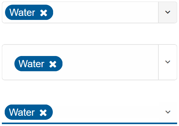
MultiComboInput Customization
Smart.MultiComboInput can be styled in different ways by setting the Class property.
The MultiComboInput can be styled as default, outlined or underlined
<MultiComboInput DataSource="drinks" SelectAll="true" Class="underlined"></MultiComboInput>
MultiComboInput Events
Smart.MultiComboInput provides an OnChange Event that can help you expand the component's functionality.
The event object has unique event.detail parameters.
OnChange- triggered when the selection is changed.
Event Details: string label, dynamic oldLabel, dynamic oldValue, dynamic value
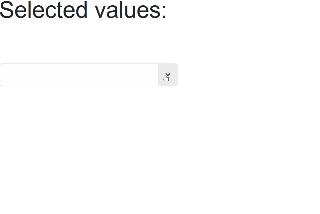
The demo below uses the OnChange Event to display the selected dropdown options:
<h2>Selected values: @values</h2>
<MultiComboInput DataSource="drinks" SelectAll="true" OnChange="OnChange"></MultiComboInput>

@code{
    private string[] drinks = new string[]{"Water", "Juice", "Soda", "Tea", "Beer", "Wine", };
    string values;

    private void OnChange(Event ev){
        if(ev.ContainsKey("Detail")){
          MultiComboInputChangeEventDetail detail = ev["Detail"];
            values = detail.Value;
        }
    }
}
Two-way Value Binding
The MultiComboInput component also supports two-way value binding:
<h3>@textValue</h3>
<MultiComboInput DataSource="drinks" @bind-Value = "@textValue"></MultiComboInput>

@code{
    private string[] drinks = new string[]{"Water", "Juice", "Soda", "Tea", "Beer", "Wine", };
    string textValue = "";
}