Theme Builder
The Smart Web Components Theme Builder tool allows you to create custom themes based on our Material Light and Dark themes.
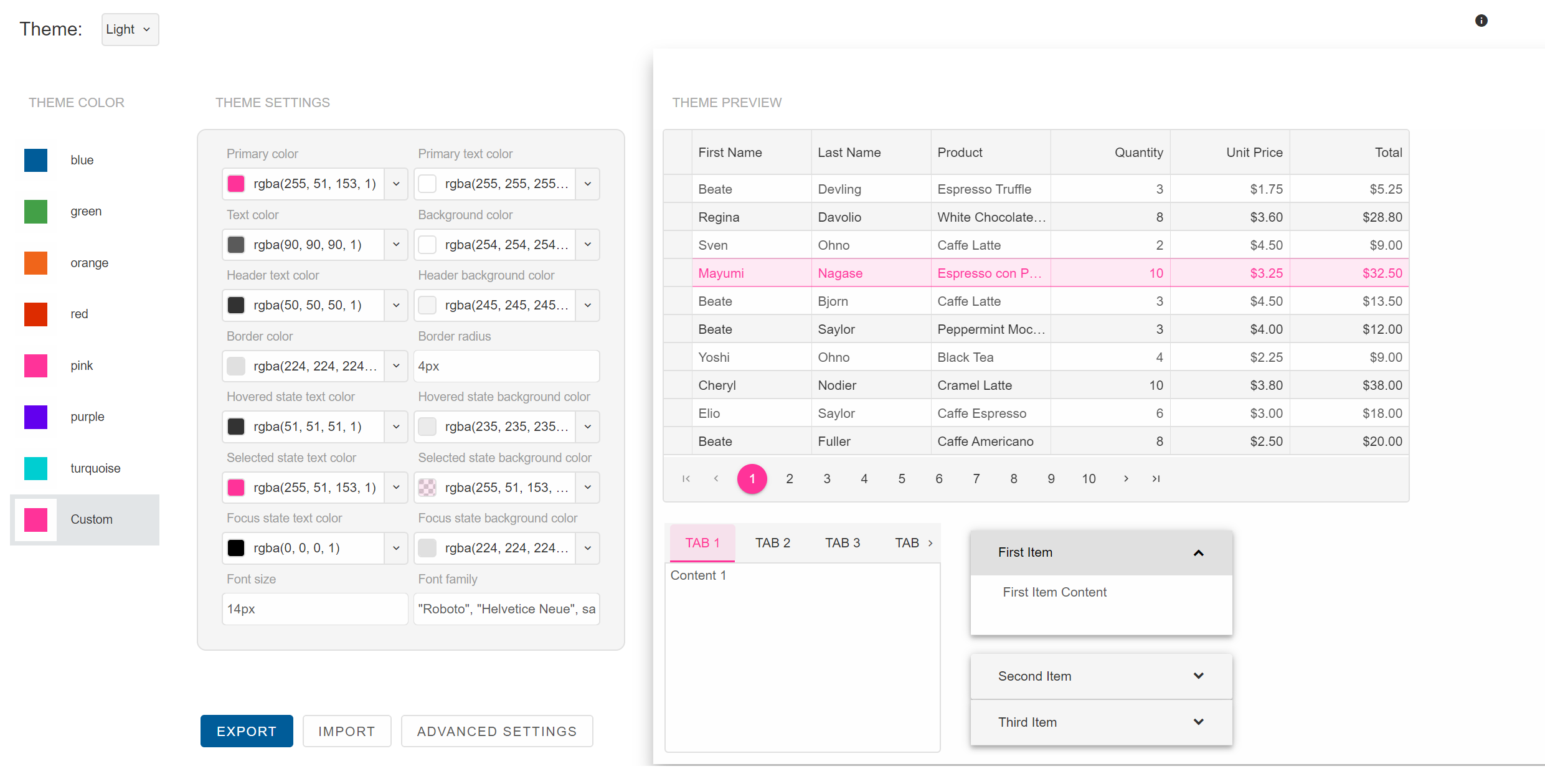
Introduction
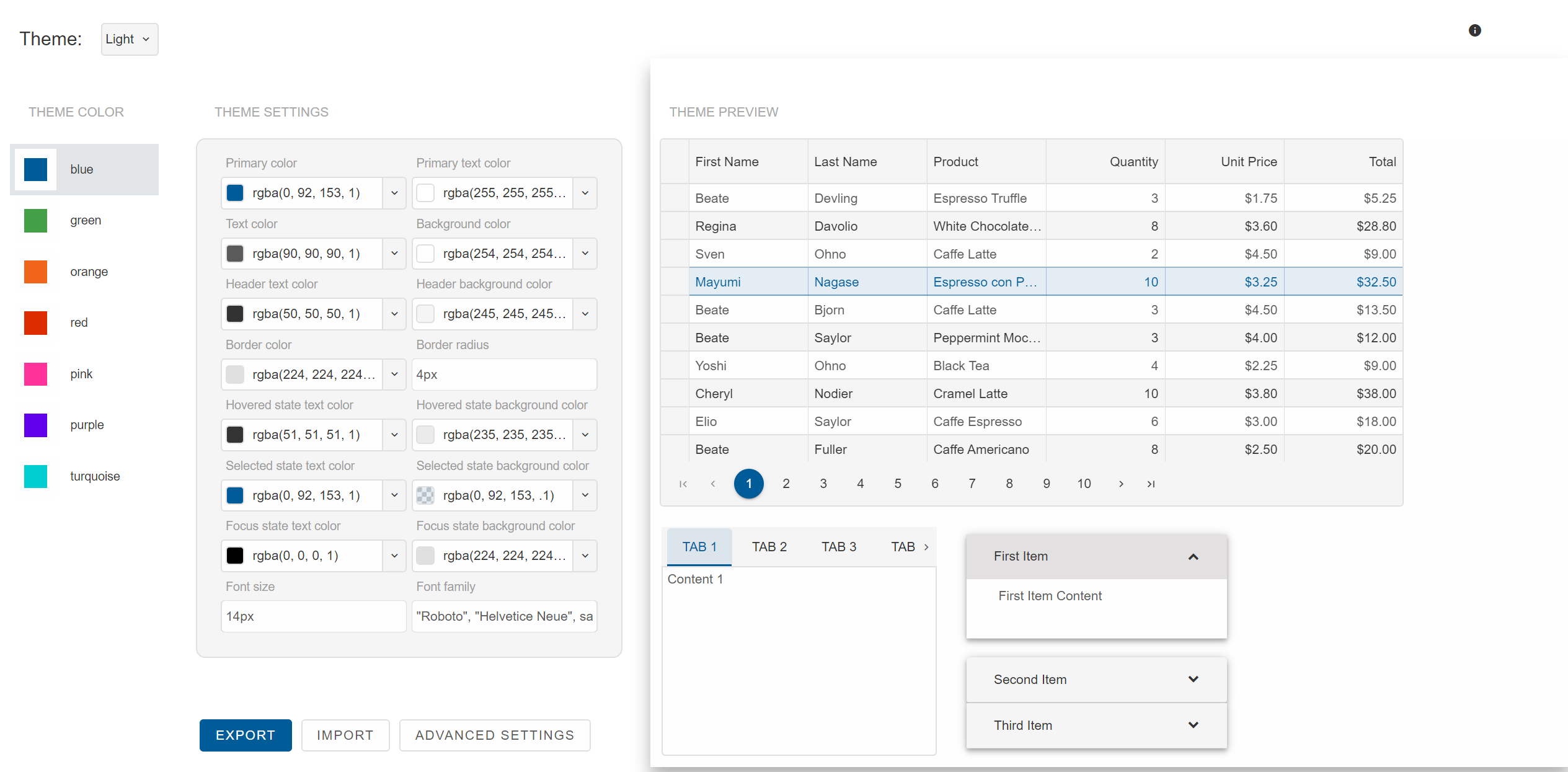
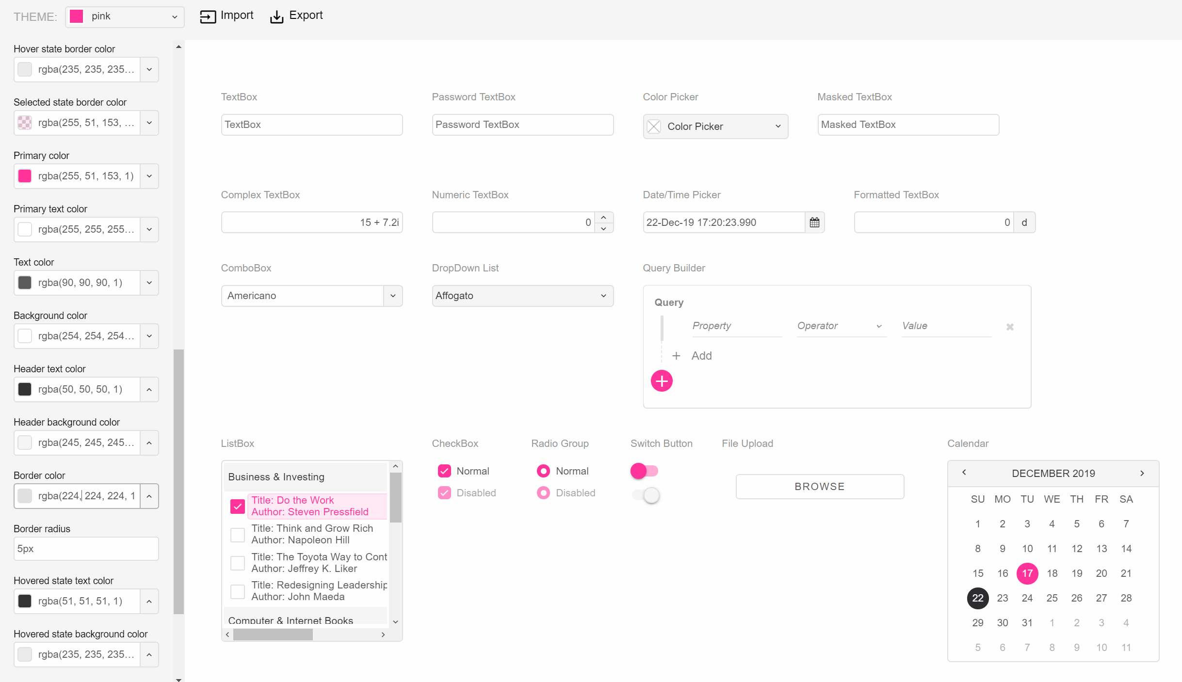
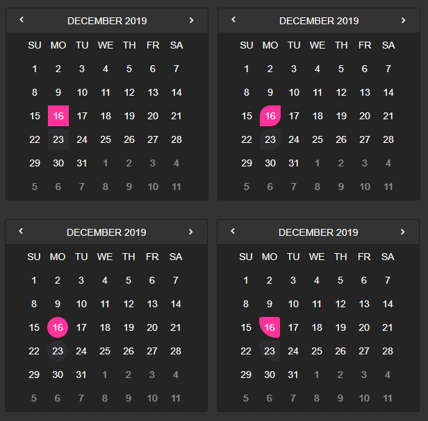
After you open the ThemeBuilder, a screen with web components and themes selector appears. You can choose a Theme color from the menu on the left and whether the theme is Light or Dark from the Theme selector on top. The Preview with the web components is updated automatically when you change any setting.
Create a Theme
New themes are based on Smart Web Components Material Light and Dark Themes. Follow these steps to create a new theme in the wizard:
Select a theme for Light and Dark modes.
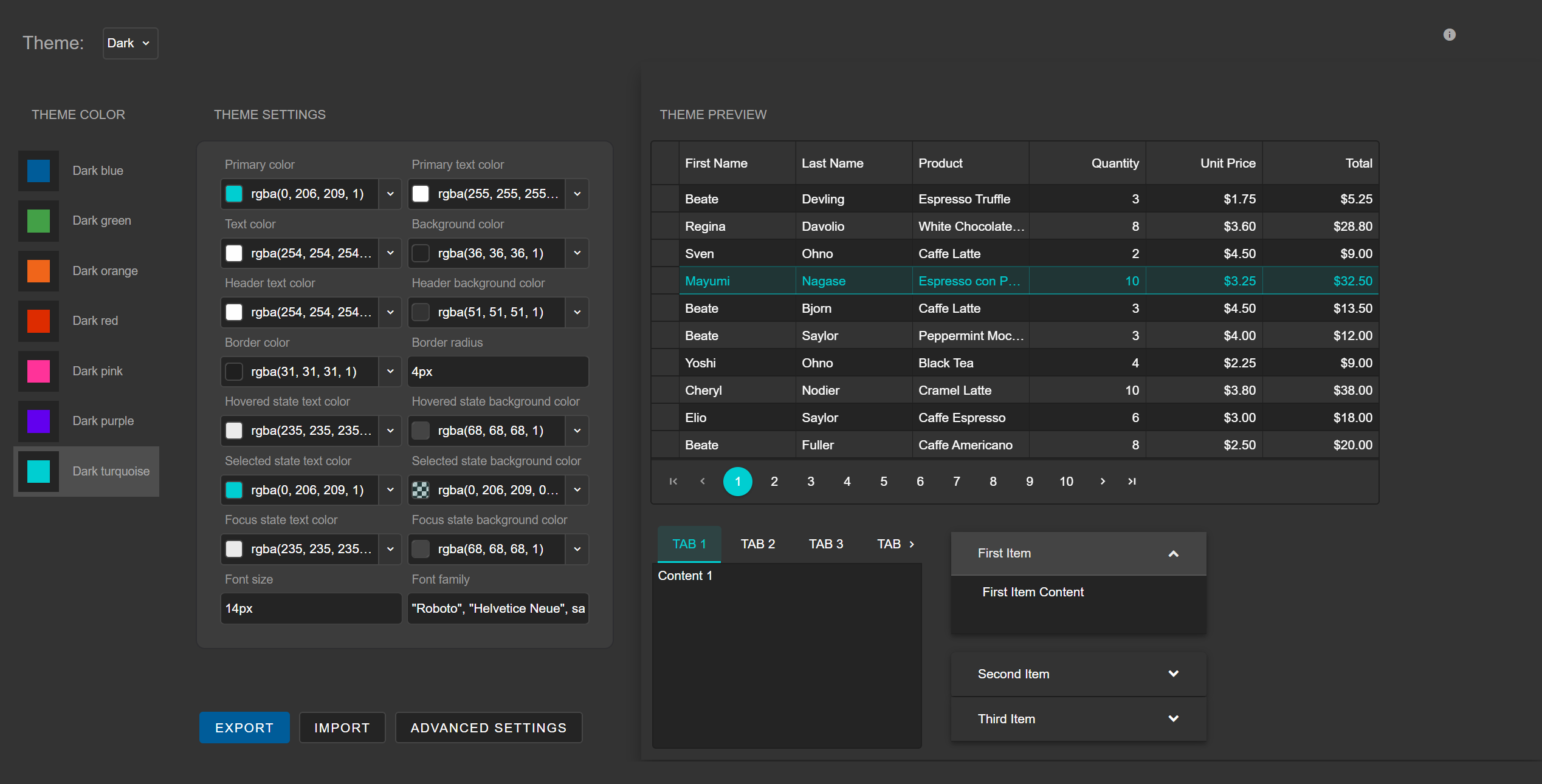
Select a theme color and change basic appearance settings.
If the appearance on the preview meets you requirements, click Export to export the theme.
For more precise customization, click Advanced Settings to navigate to the view with additional more advanced configuration with many theme options.
Import an Existing Theme
You can import an existing theme from previously saved Theme metadata. Metadata is saved in JSON format. Follow the steps below to import a theme:
Click Import.
Paste the Theme's JSON metadata in the text area.
Click UPLOAD METADATA.
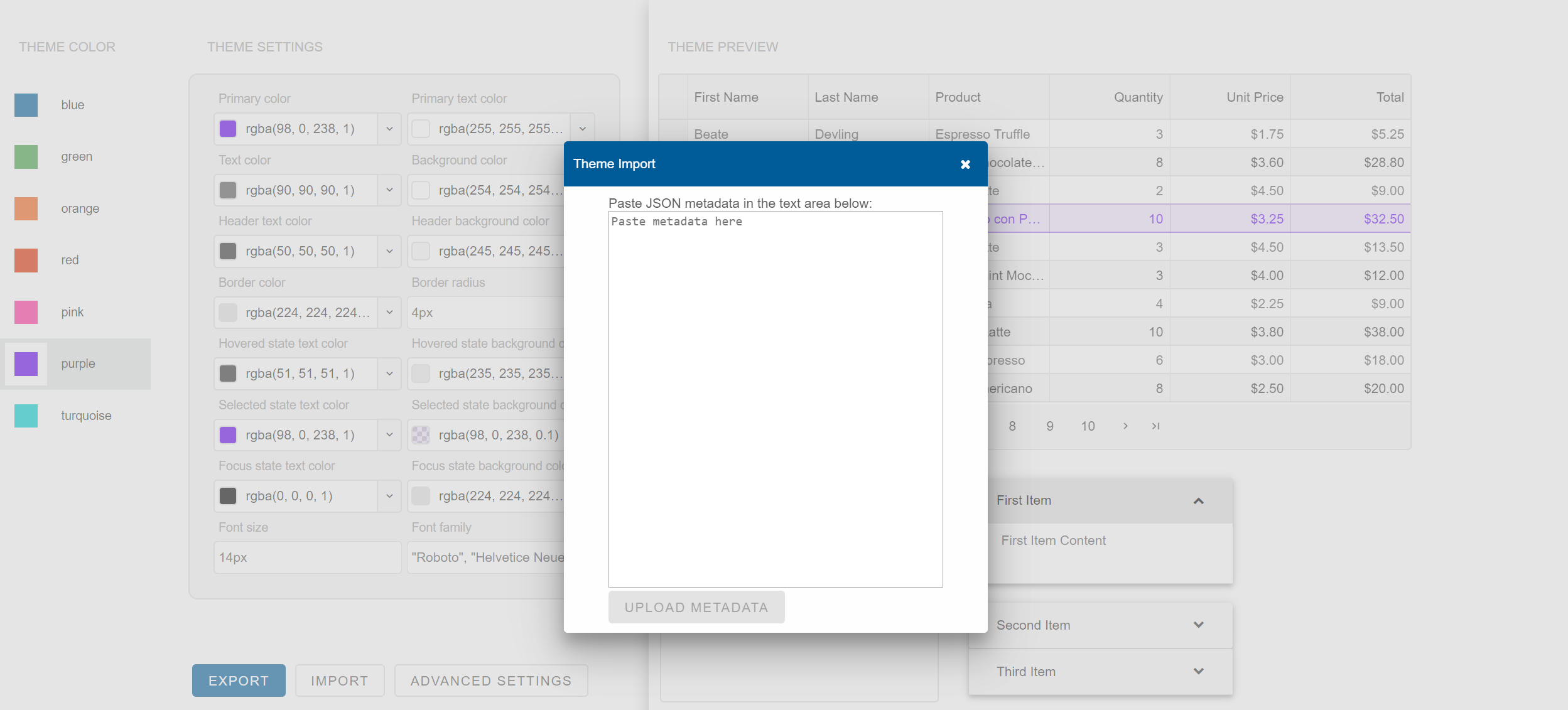
When the metadata is imported, the Theme Builder displays the imported theme in the list.
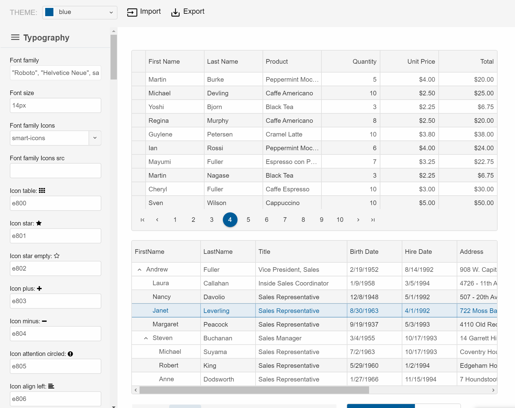
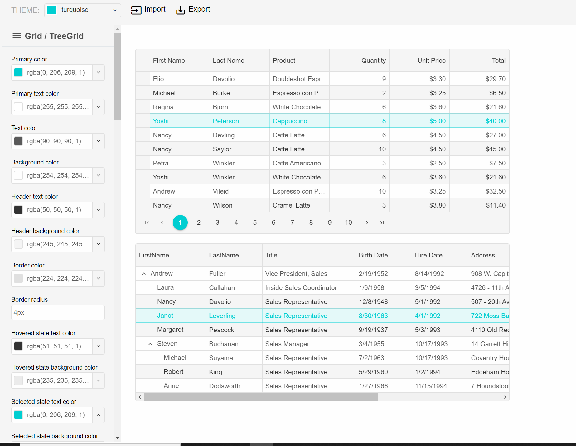
Advanced Theme Settings
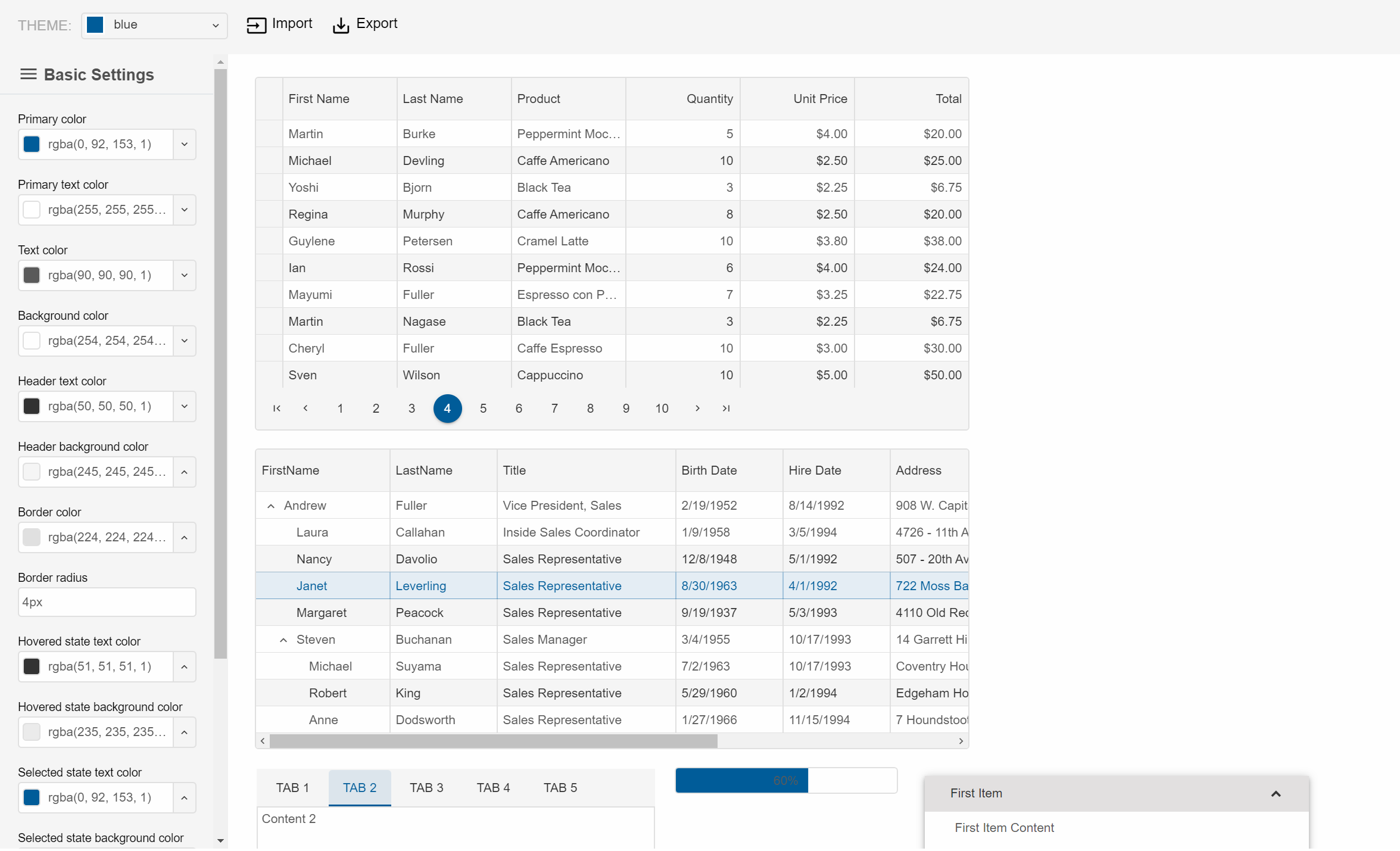
The Advanced view consists of the following elements:
- Top Area - Toolbar with Theme selector, Import and Export buttons.
- Left Area - Settings Menu. It contains the following items:
Basic Settings - settings used by all web components
Typography Settings - settings that configure font family, font size, icons font and icons
Web components - settings used by an individual web component or web components group
- Right Area - Preview with Web components. It it updated automatically when you change any theme setting.
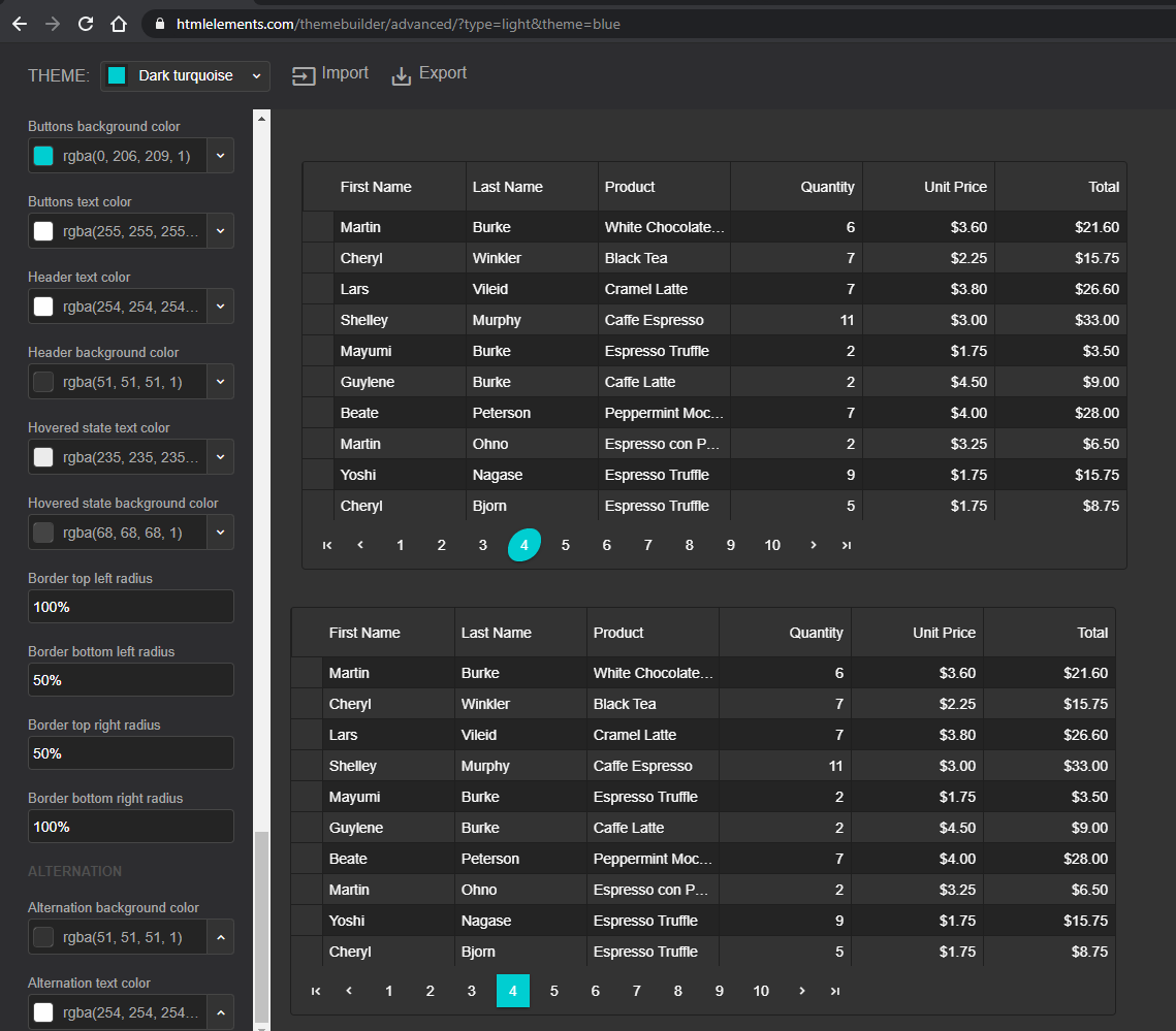
The Advanced view of the Theme Builder enables you to customize many more settings. For example, the Smart.Grid's customization options are more than 50 and you can customize the appearance from the cell horizontal and vertical borders to the column menu with sorting and filtering options.
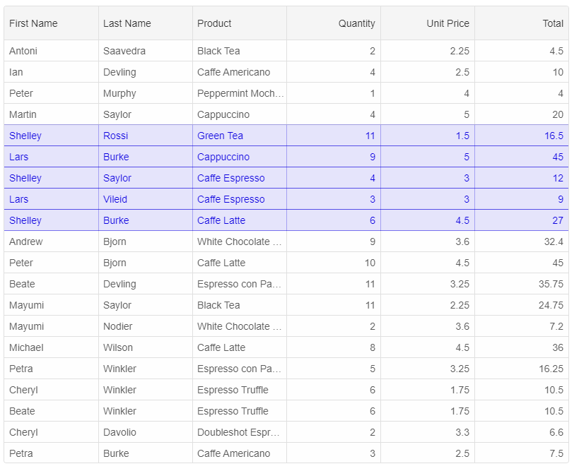
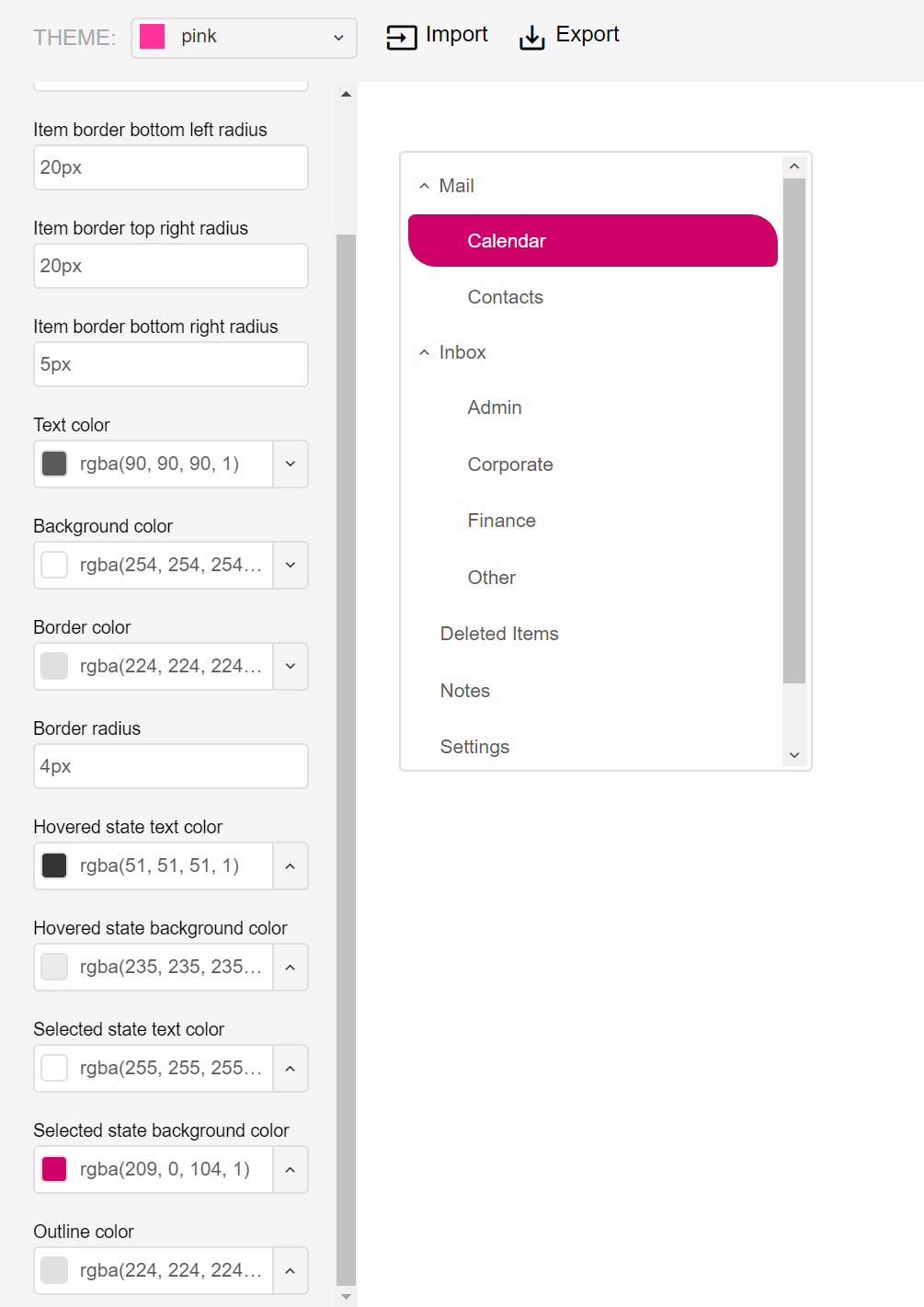
Shapes of the components and inner items can be customized by using settings for border top-left, top-right, bottom-left and border-right radius. For example, in the image below, the Tree items are with custom shapes.
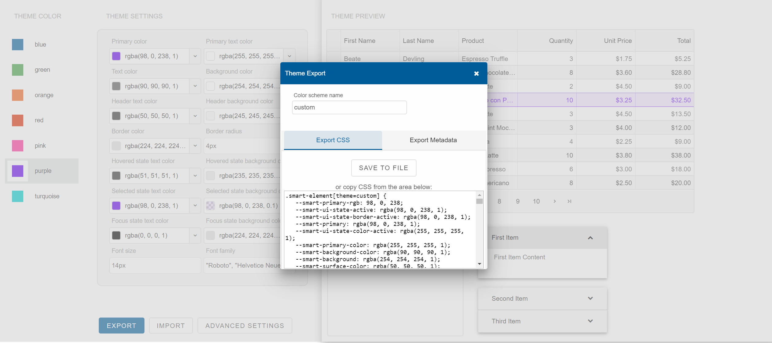
Export the Theme
Click Export to open the Theme Export popup dialog. In this dialog, enter the theme name.
Click Save to File to save a file named smart.[theme-name].css or copy the generated CSS from the text area at the bottom:
Using the Theme
- Copy the theme CSS file to '/source/styles/'. Ex: 'smart.custom.css'.
- Add the theme CSS file to your project.
- Import the theme CSS file after 'smart.default.css'.
- Set the 'theme' attribute of your web component to the theme's name. Ex: '
'
Example
<!DOCTYPE html>
 <html xmlns="http://www.w3.org/1999/xhtml">
 <head>
   <title>Custom Theme</title>
   <meta http-equiv="X-UA-Compatible" content="IE=edge" />
   <meta http-equiv="Content-Type" content="text/html; charset=utf-8" />
   <meta name="viewport" content="width=device-width, initial-scale=1.0, maximum-scale=1.0" />
      <link rel="stylesheet" type="text/css" href="../../../source/styles/smart.default.css" />
      <link rel="stylesheet" type="text/css" href="../../../source/styles/smart.custom.css" />
      <link rel="stylesheet" type="text/css" href="styles.css" />
   <!-- scripts -->
      <script src="../../../scripts/data.js"></script>
   <script src="../../../source/smart.element.js"></script>
   <script src="../../../source/smart.data.js"></script>
   <script src="../../../source/smart.button.js"></script>
   <script src="../../../source/smart.scrollbar.js"></script>
   <script src="../../../source/smart.menu.js"></script>
   <script src="../../../source/smart.listbox.js"></script>
   <script src="../../../source/smart.dropdownlist.js"></script>
   <script src="../../../source/smart.pager.js"></script>
      <script src="../../../source/smart.grid.js"></script>
      <script src="index.js"></script>
 </head>
 <body>
   <smart-grid theme="custom" id="grid"></smart-grid>
 </body>
</html>