Getting Started with Tabs Web Component
Smart UI Web Components work with current evergreen browsers and Node 18+ for local tooling; pin package versions to match your project policy.
Smart UI is distributed as the smart-webcomponents NPM package. You can also use the full download from the Download page.
Quick start
- Install the package:
npm install smart-webcomponents
- Load the Tabs module (ES module script):
<script type="module" src="node_modules/smart-webcomponents/source/modules/smart.tabs.js"></script>
- Add the default stylesheet (prefer angular.json / bundler entry in app codebases; for plain HTML use a link):
<link rel="stylesheet" type="text/css" href="node_modules/smart-webcomponents/source/styles/smart.default.css" />
- Add markup in one of two ways - semantic custom element (the component tag is in your HTML) or a host
div(you mount programmatically with appendTo):
Semantic element (id matches the selector in Smart()):
<smart-tabs id="tabs"></smart-tabs>
Host container (id matches appendTo on Smart.Tabs):
<div id="tabsContainer"></div>
- Initialize after the module loads: define a const tabsOptions object, then either bind with Smart('#tabs', ...) on the semantic tag or use new Smart.Tabs({ ...tabsOptions, appendTo: '#tabsContainer' }) on the host
div:
<script type="module">
	import 'node_modules/smart-webcomponents/source/modules/smart.tabs.js';

	const tabsOptions = { selectedIndex: 0 };

	// Option A - semantic <smart-tabs> with id="tabs"
	Smart('#tabs', class {
		get properties() {
			return tabsOptions;
		}
	});

	// Option B - host div id="tabsContainer"
	// const tabsInstance = new Smart.Tabs({
	// 	...tabsOptions,
	// 	appendTo: '#tabsContainer'
	// });

	// Option C - constructor(selector, options), then append the returned element yourself
	// const myTabs = new Smart.Tabs('#tabs', tabsOptions);
	// document.body.appendChild(myTabs);
</script>
Uncomment Option B when you use the host
div; use Option A when you use the semantic element. The Runtime cookbook also documents new Smart.Tabs('#tabs', tabsOptions) with appendChild, and document.createElement('smart-tabs') with .props or Object.assign (all are valid patterns; do not combine overlapping patterns for the same instance unless you intend multiple components). - Serve the folder over HTTP (or use your bundler dev server) and open the page.
Runtime cookbook
Alternative creation patterns and imperative APIs. These are all valid ways to create Smart UI components: semantic markup + Smart(); new Smart.Tabs({ ...options, appendTo: '#...' }); new Smart.Tabs('#tabs', tabsOptions) plus appendChild on the returned element; and document.createElement('smart-tabs') then assigning options via .props or Object.assign on the element.
Constructor with a selector string and options, then append the returned element (for example const myTabs = new Smart.Tabs('#tabs', tabsOptions)):
	const tabsOptions = { selectedIndex: 0 };
	const myTabs = new Smart.Tabs('#tabs', tabsOptions);
	document.body.appendChild(myTabs);
Create with document.createElement('smart-tabs'), assign properties (same as any custom element), then append:
	const tabsOptions = { selectedIndex: 0 };
	const tabs = document.createElement('smart-tabs');
	Object.assign(tabs, tabsOptions);
	document.body.appendChild(tabs);
Host on a div with appendTo (import the module, then instantiate when the document is ready; the container id must match appendTo):
	import "../../source/modules/smart.tabs.js";

	document.readyState === 'complete' ? init() : window.addEventListener('load', init);

	function init() {
		const tabsOptions = { selectedIndex: 0 };
		const tabs = new Smart.Tabs({
			...tabsOptions,
			appendTo: '#tabsContainer'
		});
	}
Demo
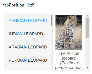
Appearance
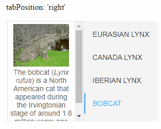
The position of the tab strip is controlled by setting the property tabPosition. Possible values for it are:
- top
- bottom
- left
- right
- hidden
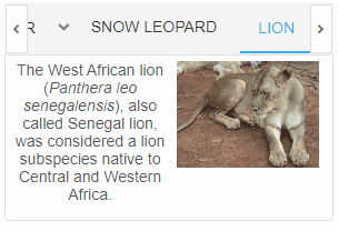
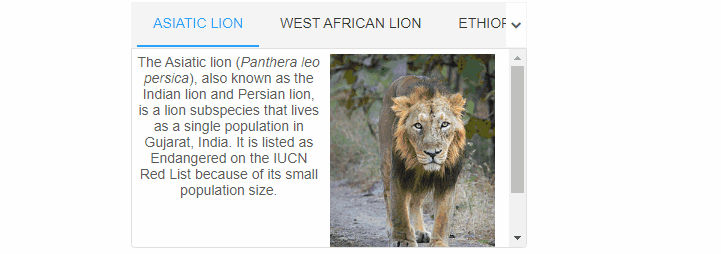
 <smart-tabs tab-position="bottom">
    <smart-tab-item label="Asiatic lion" selected>
    // Content goes here.
    </smart-tab-item>
    <smart-tab-item label="West African lion">
    // Content goes here.
    </smart-tab-item>
    <smart-tab-item label="Ethiopian lion">
	// Content goes here.
    </smart-tab-item>
    <smart-tab-item label="Masai lion">
	// Content goes here.
    </smart-tab-item>
 </smart-tabs>
Demo
Position "bottom"
Position "top"
Position "left"
Position "right"
Position "hidden"
Behavior
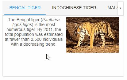
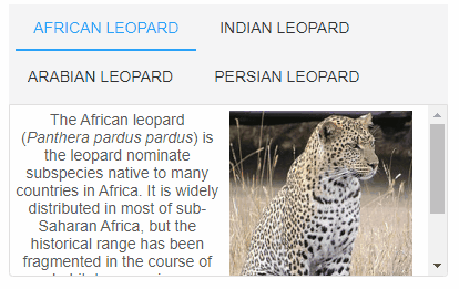
When the custom element is not wide enough to display all tabs, one of four behaviors occurs. These are controlled by the tabLayout property and are:
- scroll - scroll buttons (instances of smart-repeat-button) allow the tabs to be scrolled through;
- dropdown - shows a dropdown with all tabs, even those that could not be displayed. Selecting an item from the dropdown makes its corresponding tab visible and selects it;
- wrap - all tabs are visible and are displayed on multiple lines (if necessary);
- shrink - tabs shrink in size (if necessary) so that all of them are visible on a single line (similar to how tabs behave in browsers).
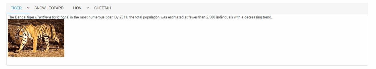
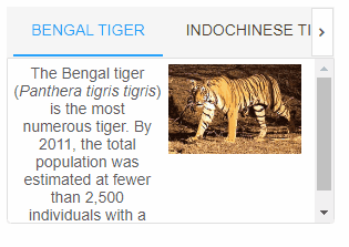
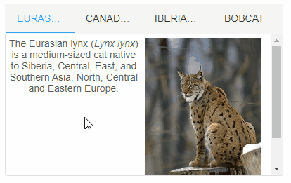
 <smart-tabs overflow="scroll">
    <smart-tab-item label="Bengal tiger" selected>
    // Content goes here.
    </smart-tab-item>
    <smart-tab-item label="Indochinese tiger">
    // Content goes here.
    </smart-tab-item>
    <smart-tab-item label="Malayan tiger">
	// Content goes here.
    </smart-tab-item>
    <smart-tab-item label="Siberian tiger">
	// Content goes here.
    </smart-tab-item>
 </smart-tabs>
Demo
Tab layout "scroll"
Tab layout "dropdown"
Tab layout "wrap"
Tab layout "shrink"
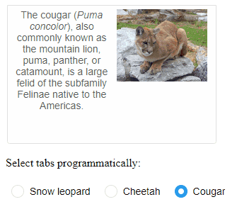
The initially selected tab is the one which has the attribute selected. Only one tab can be selected at a given time. If selected is not applied to any tab, the first one is selected by default. Selection can be dynamically changed using the mouse, keyboard and by calling the method select.
The property selectionMode determines the way the user can switch between tabs. Possible values are:
- click
- dblclick
- mouseenter
- none - tabs can be switched only programmatically.
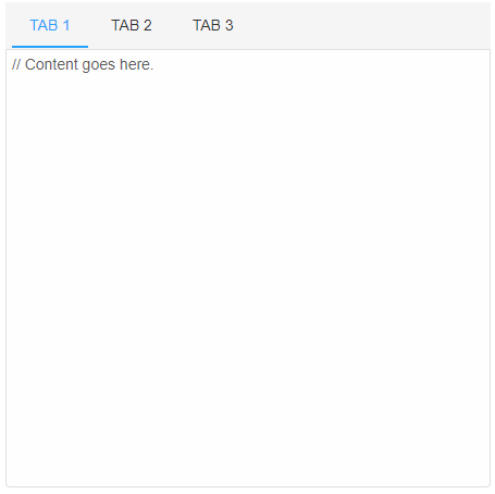
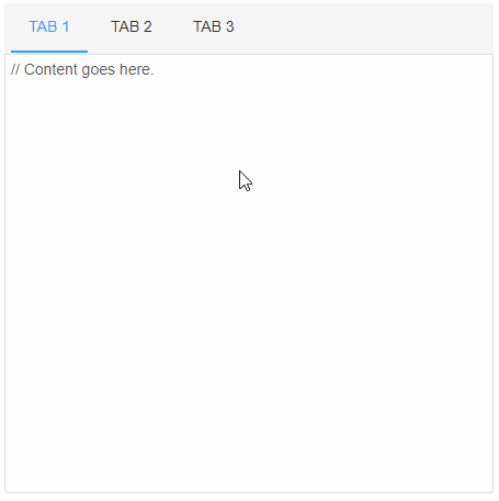
 <smart-tabs selection-mode="dblclick">
    <smart-tab-item label="Tab 1" selected>
    // Content goes here.
    </smart-tab-item>
    <smart-tab-item label="Tab 2">
    // Content goes here.
    </smart-tab-item>
    <smart-tab-item label="Tab 3">
	// Content goes here.
    </smart-tab-item>
 </smart-tabs>
Demo
Tabs can be reordered by dragging with the mouse if the property reorder is set to true.
 <smart-tabs reorder>
    <smart-tab-item label="Tab 1" selected>
    // Content goes here.
    </smart-tab-item>
    <smart-tab-item label="Tab 2">
    // Content goes here.
    </smart-tab-item>
    <smart-tab-item label="Tab 3">
	// Content goes here.
    </smart-tab-item>
 </smart-tabs>
Demo
Content sections can be collapsed if the property collapsible is set to true and if the corresponding tab is clicked. Clicking the tab again restores the collapsed content section.
 <smart-tabs collapsible>
    <smart-tab-item label="Tab 1" selected>
    // Content goes here.
    </smart-tab-item>
    <smart-tab-item label="Tab 2">
    // Content goes here.
    </smart-tab-item>
    <smart-tab-item label="Tab 3">
	// Content goes here.
    </smart-tab-item>
 </smart-tabs>
Demo
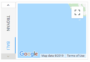
The orientation of the text in the tabs can be set via "tabTextOrientation" property.
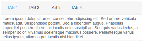
 <smart-tabs tab-text-orientation="vertical">
    <smart-tab-item label="New York" selected>
    // Content goes here.
    </smart-tab-item>
    <smart-tab-item label="Hong Kong">
    // Content goes here.
    </smart-tab-item>
    <smart-tab-item label="Troyan">
	// Content goes here.
    </smart-tab-item>
    <smart-tab-item label="Bali">
	// Content goes here.
    </smart-tab-item>
 </smart-tabs>
Demo
Append to the DOM:
const container = document.getElementById('tabs-container');
container.appendChild(tabs);
Remove from the DOM:
tabs.remove();
Set a property:
tabs.disabled = true;
tabs.theme = 'dark';
Get a property value:
const isDisabled = tabs.disabled;
const currentTheme = tabs.theme;
Invoke a method:
tabs.refresh();
tabs.focus();
Add event listener:
tabs.addEventListener('change', (event) => {
    console.log('change triggered:', event.detail.index);
});
Remove event listener:
const handleTabsEvent = (event) => {
    console.log('change triggered:', event.detail.index);
};

tabs.addEventListener('change', handleTabsEvent);
tabs.removeEventListener('change', handleTabsEvent);
Common Use Cases
-
Add tab dynamically
Create new tabs at runtime
tabs.insert(tabs.length, { label: 'New Tab', content: 'Tab content here' }); -
Handle tab change
Respond when user switches tabs
tabs.addEventListener('change', (e) => {
  console.log('Active tab:', e.detail.index);
});
Troubleshooting
- How do I add tabs dynamically?
- Use the insert method: tabs.insert(index, { label: 'Tab Label', content: 'Tab content' }).
- How do I make tabs closable?
- Set closeButtons = true to show close buttons on each tab.
Accessibility
The Tabs component follows WAI-ARIA best practices:
- Keyboard navigation - Tab, Arrow keys, Enter, and Escape are supported
- ARIA roles - Appropriate roles and labels are applied automatically
- Focus management - Visible focus indicators for keyboard users
- Screen readers - State changes are announced to assistive technology
- High contrast - Supports Windows High Contrast Mode and forced colors
For custom labeling, set aria-label or aria-labelledby attributes on the component.
Supported stacks: Smart UI targets Angular 17+, React 18+, Vue 3+, Node 18 LTS, and evergreen browsers; pin exact package versions to your org policy.