Blazor - Get Started with Smart.CheckBox
Setup The Project
Follow the Getting Started guide to set up your Blazor Application with Smart UI.
Setup Basic CheckBox
Smart.CheckBox is a custom checkbox element with built-in features such as animations, image support and checkMode.
It is recommended to use Smart.CheckBox in forms with multiple options and Smart.SwitchButton in single settings option.
- Add the CheckBox component to the Pages/Index.razor file
<CheckBox></CheckBox>
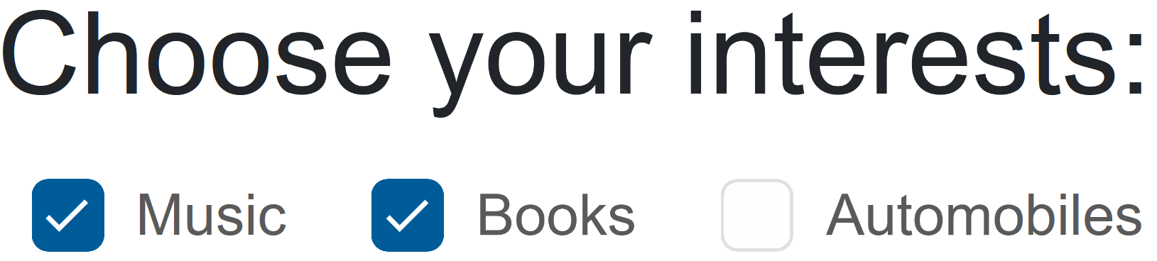
- Optionally, set the label, value and check state of the CheckBox:
<CheckBox Name="Interests" Value="Music" Checked="true">Music</CheckBox>
Check Mode
Check Mode determines the behavior of the element when clicking on the input and the label.
When CheckMode is set to Both - it can be selected by both parts of the component.
In the example below, the checkbox can only be selected by clicking on the label:
<CheckBox Name="Subscribe" Value="newsletter" Checked="true" CheckMode="CheckMode.Label">Subscribe to newsletter?</CheckBox>

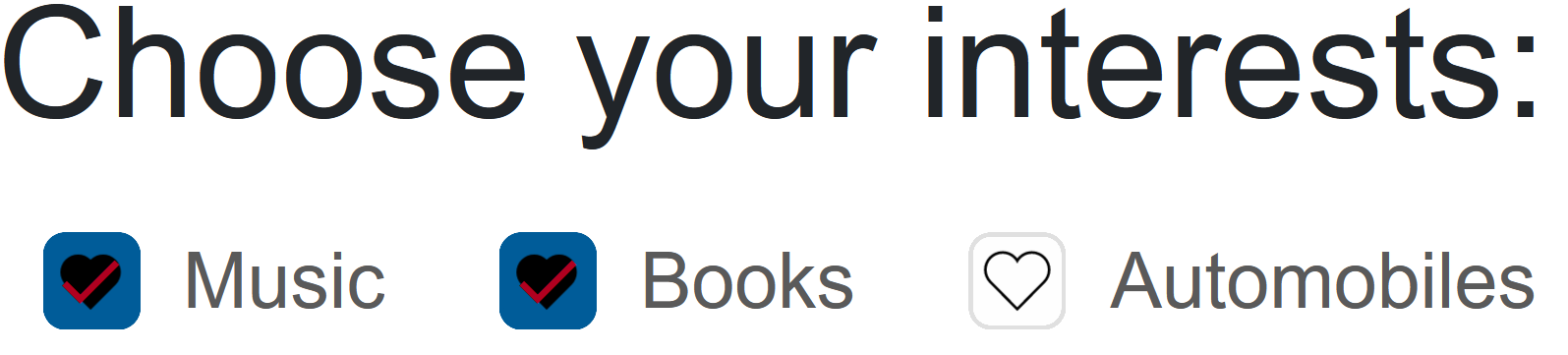
CheckBox with Image
Smart.CheckBox supports applying custom images with CSS:
<style>
  smart-check-box.heart .smart-input {
    background-image: url(https://www.htmlelements.com/demos/images/check-mark-heart-empty.svg);
    background-repeat: no-repeat;
    border-color: transparent;
    background-color: transparent;
  }

  smart-check-box.heart .smart-input::after {
    content: '';
  }

  smart-check-box.heart .smart-overlay {
    display:none;
  }

  smart-check-box.heart[checked] .smart-input {
    background-image: url(https://www.htmlelements.com/demos/images/check-mark-heart.svg);
    background-repeat: no-repeat;
    color: var(--smart-error);
  }

  smart-check-box.heart[checked="null"] .smart-input {
    background-image: url(https://www.htmlelements.com/demos/images/check-mark-heart-indetermined.svg);
    background-repeat: no-repeat;
  }
</style>
<CheckBox Name="Interests" Value="Music" Checked="true" Class="heart">Music</CheckBox>
<CheckBox Name="Interests" Value="Books" Checked="true"Class="heart">Books</CheckBox>
CheckBox Events
Smart.CheckBox provides multiple events that can help you expand the component's functionality.
Each event object has unique event.detail parameters.
OnChange- triggered when the widget is checked/unchecked.
Event Details: dynamic value, dynamic oldValue, dynamic changeTypeOnCheckValue- triggered when the component is checked.
Event Details: dynamic changeTypeOnUncheckValue- triggered when the component is unchecked.
Event Details: dynamic changeType
The demo below uses the OnCheckValue Event to log every time the checkbox is checked:
<CheckBox Name="Subscribe" Checked="true" OnCheckValue="OnCheckValue">Subscribe to newsletter?</CheckBox>
<h5>@message</h5>

@code{
    string message = "";
    private void OnCheckValue(Event ev){
        message += "Checked!, ";
    }
}

Two-way Value Binding
The CheckBox component also supports two-way value binding:
<h3>@CheckBoxValue</h3>
<CheckBox @bind-Checked="@CheckBoxValue">Subscribe to newsletter?</CheckBox>

@code{
    public bool CheckBoxValue = true;
}