Column Height
The column height is automatically measured by the Grid taking into account the column label, font size and font weight. There are situations in which you may want to set the column height. This can be achived by using the 'layout.columnHeight' property.For example:
layout: {
	columnHeight: 100
}
Column Width
The column width can be set in the column definitions. It can be fixed width, fluid width in percentages, 'auto' or unset. When the 'width' is set to a number, the column's width will be in pixels i.e width: 200 means that the width of the column will be 200px. Width in percentages, means that the column will take a part of the Grid's width and will grow and shrink depending on the Grid's width. Width equal to 'auto' means that the column will auto-resize itself to the minimum required width. Width which is not set means that the column will take the remaining space available which is not taken by other columns.For example:
columns: [
	{
		label: 'First Name', dataField: 'firstName', width: 300
	},
	{ label: 'Last Name', dataField: 'lastName', width: '30%' },
	{ label: 'Product', dataField: 'productName', width: 'auto'},
	{ label: 'Quantity', dataField: 'quantity', align: 'right', cellsAlign: 'right' },
	{ label: 'Unit Price', dataField: 'price', align: 'right', cellsAlign: 'right', cellsFormat: 'c2' }
]
You can also use the 'layout.columnWidth' property to set equal width to all columns.
For example:
layout: {
	columnHeight: 100,
	columnWidth: 300
}
The 'autoSizeColumn(dataField)' and 'autoSizeColumns()' methods auto-size a column or columns based on the contents.
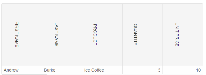
Custom Column Headers
With the help of CSS, we can customize the column headers by using the 'className' property.
.labelTemplate {
    transform: rotate(90deg);
    transform-origin: initial;
    text-transform: uppercase;
    display: inline-block;
}
const gridOptions = {
    dataSourceSettings: {
        dataFields: [
            { name: 'firstName', dataType: 'string' },
            { name: 'lastName', dataType: 'string' },
            { name: 'productName', map: 'product.name', dataType: 'string' },
            { name: 'quantity', map: 'product.quantity', dataType: 'string' },
            { name: 'price', map: 'product.price', dataType: 'string' },
            { name: 'total', map: 'product.total', dataType: 'string' }
        ]
    },
    behavior: {
        columnResizeMode: 'growAndShrink'
    },
    sorting: {
        enabled: true
    },
    layout: {
        columnHeight: 200
    },
    dataSource: [
        {
            firstName: 'Andrew',
            lastName: 'Burke',
            product: {
                name: 'Ice Coffee', price: 10, quantity: 3, total: 30
            }
        }
    ],
    columns: [
        { label: 'First Name', dataField: 'firstName', className: 'labelTemplate' },
        { label: 'Last Name', dataField: 'lastName', className: 'labelTemplate' },
        { label: 'Product', dataField: 'productName', className: 'labelTemplate' },
        { label: 'Quantity', dataField: 'quantity', cellsAlign: 'right', className: 'labelTemplate' },
        { label: 'Unit Price', dataField: 'price', cellsAlign: 'right', cellsFormat: 'c2', className: 'labelTemplate' }
    ]
}
const grid = new Smart.Grid("#grid", gridOptions);
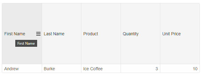
Column Headers Tooltips
In order to add header tooltips, you can set the 'labelTemplate' property of the column and add a 'title' attribute. For example:
{label: 'First Name', dataField: 'firstName', labelTemplate: (label) => { return `<span title="${label}">${label}</span>`}}
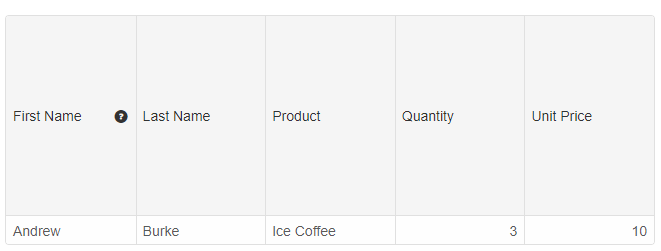
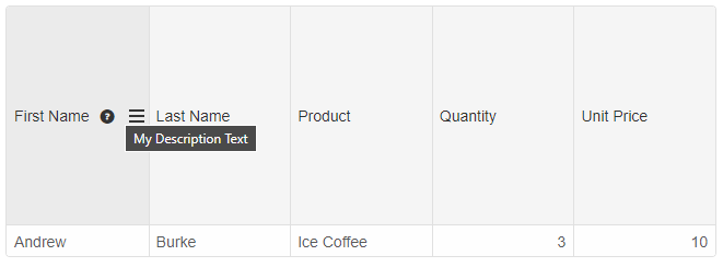
Column Headers Description
The column header optionally displays a description text. To enable this feature, set the 'showDescriptionButton' and 'description' properties in the column definition. For example:
columns: [
	{ label: 'First Name', dataField: 'firstName', showDescriptionButton: true, description: 'My Description Text' },
	{ label: 'Last Name', dataField: 'lastName' },
	{ label: 'Product', dataField: 'productName' },
	{ label: 'Quantity', dataField: 'quantity', cellsAlign: 'right' },
	{ label: 'Unit Price', dataField: 'price', cellsAlign: 'right', cellsFormat: 'c2' }
]
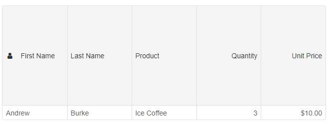
Column Headers Icons
To display a custom icon in a column header, you need to set the 'icon' property to a CSS class and 'showIcon' property to true.
columns: [
	{ label: 'First Name', dataField: 'firstName', showIcon: true, icon: 'fa-user custom-icon' },
	{ label: 'Last Name', dataField: 'lastName' },
	{ label: 'Product', dataField: 'productName' },
	{ label: 'Quantity', dataField: 'quantity', cellsAlign: 'right' },
	{ label: 'Unit Price', dataField: 'price', cellsAlign: 'right', cellsFormat: 'c2' }
]
The 'custom-icon' CSS class is:
.custom-icon {
	margin-left: 4px;
	margin-right: 4px;
	font-family: 'FontAwesome';
}
and we need to import the custom icon in the CSS or HTML page. Sample link with fonts: https://cdnjs.cloudflare.com/ajax/libs/font-awesome/4.7.0/css/font-awesome.min.css.
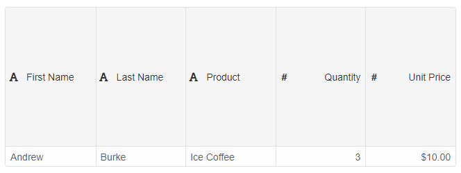
Optionally you can display default built-in column header icons showing the column type using the 'appearance.showColumnIcon' property and set it to true.
const gridOptions = {
    dataSourceSettings: {
        dataFields: [
            { name: 'firstName', dataType: 'string' },
            { name: 'lastName', dataType: 'string' },
            { name: 'productName', map: 'product.name', dataType: 'string' },
            { name: 'quantity', map: 'product.quantity', dataType: 'number' },
            { name: 'price', map: 'product.price', dataType: 'number' },
            { name: 'total', map: 'product.total', dataType: 'number' }
        ]
    },
    behavior: {
        columnResizeMode: 'growAndShrink'
    },
    sorting: {
        enabled: true
    },
    layout: {
        columnHeight: 200
    },
    dataSource: [
        {
            firstName: 'Andrew',
            lastName: 'Burke',
            product: {
                name: 'Ice Coffee', price: 10, quantity: 3, total: 30
            }
        }
    ],
    appearance: {
        showColumnIcon: true
    },
    columns: [
        { label: 'First Name', dataField: 'firstName' },
        { label: 'Last Name', dataField: 'lastName' },
        { label: 'Product', dataField: 'productName' },
        { label: 'Quantity', dataField: 'quantity', cellsAlign: 'right' },
        { label: 'Unit Price', dataField: 'price', cellsAlign: 'right', cellsFormat: 'c2' }
    ]
}
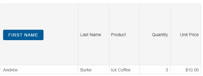
Column Headers Templates
By using the 'labelTemplate' property, you can render custom HTML in the column headers.
columns: [
	{
		label: 'First Name', dataField: 'firstName', width: 250, labelTemplate: (label) => {
			return `<div><smart-button class="primary">${label}</smart-button></div>`
		}
	},
	{ label: 'Last Name', dataField: 'lastName' },
	{ label: 'Product', dataField: 'productName' },
	{ label: 'Quantity', dataField: 'quantity', cellsAlign: 'right' },
	{ label: 'Unit Price', dataField: 'price', cellsAlign: 'right', cellsFormat: 'c2' }
]
For AI tooling
Developer Quick Reference
Topic: grid-column-headers Component: Grid Framework: JavaScript
Main methods: (none detected)
Common config keys: layout, columns, behavior, sorting, dataSource, appearance
Implementation Notes
Compatibility: Modern browsers / Web Components API access pattern: const component = document.querySelector(...) + component.method()
Lifecycle guidance: Initialize configuration first, then invoke imperative API when element is available in DOM.
Common pitfalls:
- Calling methods before element initialization.
- Reassigning large configuration partially without understanding merge behavior.
- Missing required module script import for component type.
Validation checklist:
- Ensure module scripts and CSS are loaded once.
- Keep data schema aligned with columns/series definitions.
- Verify method calls target initialized component instance.