Getting Started with FileUpload Web Component
Smart UI Web Components work with current evergreen browsers and Node 18+ for local tooling; pin package versions to match your project policy.
Smart UI is distributed as the smart-webcomponents NPM package. You can also use the full download from the Download page.
Quick start
- Install the package:
npm install smart-webcomponents
- Load the FileUpload module (ES module script):
<script type="module" src="node_modules/smart-webcomponents/source/modules/smart.fileupload.js"></script>
- Add the default stylesheet (prefer angular.json / bundler entry in app codebases; for plain HTML use a link):
<link rel="stylesheet" type="text/css" href="node_modules/smart-webcomponents/source/styles/smart.default.css" />
- Add markup in one of two ways - semantic custom element (the component tag is in your HTML) or a host
div(you mount programmatically with appendTo):
Semantic element (id matches the selector in Smart()):
<smart-file-upload id="fileupload"></smart-file-upload>
Host container (id matches appendTo on Smart.FileUpload):
<div id="fileuploadContainer"></div>
- Initialize after the module loads: define a const fileuploadOptions object, then either bind with Smart('#fileupload', ...) on the semantic tag or use new Smart.FileUpload({ ...fileuploadOptions, appendTo: '#fileuploadContainer' }) on the host
div:
<script type="module">
	import 'node_modules/smart-webcomponents/source/modules/smart.fileupload.js';

	const fileuploadOptions = {};

	// Option A - semantic <smart-file-upload> with id="fileupload"
	Smart('#fileupload', class {
		get properties() {
			return fileuploadOptions;
		}
	});

	// Option B - host div id="fileuploadContainer"
	// const fileuploadInstance = new Smart.FileUpload({
	// 	...fileuploadOptions,
	// 	appendTo: '#fileuploadContainer'
	// });

	// Option C - constructor(selector, options), then append the returned element yourself
	// const myFileUpload = new Smart.FileUpload('#fileupload', fileuploadOptions);
	// document.body.appendChild(myFileUpload);
</script>
Uncomment Option B when you use the host
div; use Option A when you use the semantic element. The Runtime cookbook also documents new Smart.FileUpload('#fileupload', fileuploadOptions) with appendChild, and document.createElement('smart-file-upload') with .props or Object.assign (all are valid patterns; do not combine overlapping patterns for the same instance unless you intend multiple components). - Serve the folder over HTTP (or use your bundler dev server) and open the page.
Runtime cookbook
Alternative creation patterns and imperative APIs. These are all valid ways to create Smart UI components: semantic markup + Smart(); new Smart.FileUpload({ ...options, appendTo: '#...' }); new Smart.FileUpload('#fileupload', fileuploadOptions) plus appendChild on the returned element; and document.createElement('smart-file-upload') then assigning options via .props or Object.assign on the element.
Constructor with a selector string and options, then append the returned element (for example const myFileUpload = new Smart.FileUpload('#fileupload', fileuploadOptions)):
	const fileuploadOptions = {};
	const myFileUpload = new Smart.FileUpload('#fileupload', fileuploadOptions);
	document.body.appendChild(myFileUpload);
Create with document.createElement('smart-file-upload'), assign properties (same as any custom element), then append:
	const fileuploadOptions = {};
	const fileupload = document.createElement('smart-file-upload');
	Object.assign(fileupload, fileuploadOptions);
	document.body.appendChild(fileupload);
Host on a div with appendTo (import the module, then instantiate when the document is ready; the container id must match appendTo):
	import "../../source/modules/smart.fileupload.js";

	document.readyState === 'complete' ? init() : window.addEventListener('load', init);

	function init() {
		const fileuploadOptions = {};
		const fileupload = new Smart.FileUpload({
			...fileuploadOptions,
			appendTo: '#fileuploadContainer'
		});
	}
Demo
Appearance
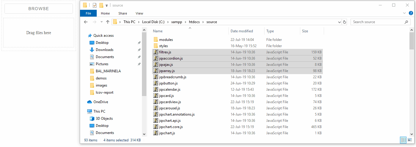
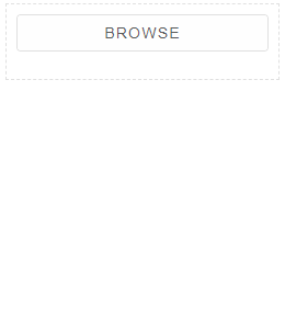
File upload's structure contains browse button, file list(with all selected files), footer(with common buttons) and optional drop zone.
When an element is empty, it contains only 'browse' button. When user browses file/files, they are displayed in list. Below that list, is shown footer, contained following buttons - "Upload All", "Cancel All", "Pause All".
uploadUrl property defines path to the server that will handle the files, sent from the element. If this property is not set, as destination is used current location.
Demo
<smart-file-upload upload-url="upload.php"></smart-file-upload>
Each file list item is visualized in container, included file name and buttons(Upload File, Cancel File, Pause File ).
Both "Upload File" and "Cancel File" buttons are shown permanently.
"Pause File" is shown during the proces of upload to the server.
Demo
Setting "showProgress" to true includes additional progressbar at the bottom of the item's container.
Demo
User can upload files by dropping them in zone, defined by the value of "dropZone" property.
If 'dropZone' is set to true - the drop area is displayed inside the element.
Demo
<smart-file-upload multiple drop-zone></smart-file-upload>
If "dropZone" is set to custom string(id of an element in the same page) - the drop area is append to the element with this .
Demo
 <div id="dropZoneCustomContainer"></div>
 <smart-file-upload multiple drop-zone="dropZoneCustomContainer"></smart-file-upload>
The file list also can be moved outside of the element by setting "appendTo" property to particular element's id.
Demo
 <smart-file-upload multiple append-to="fileListCustomContainer"></smart-file-upload>
 <div id="fileListCustomContainer"></div>

Behavior
By default File Upload allows single file.
Demo
Setting "multiple" to true allows upload of multiple files at the same time.
Demo
<smart-file-upload multiple></smart-file-upload>
Setting "directory" to true allows upload of a directory. This feature works in part of the browsers(Google Chrome and Firefox for example)
Demo
<smart-file-upload directory></smart-file-upload>

The element allows auto upload mode, when "autoUpload" is set to true. In this case file are uploaded immediatelly after their selection.
Demo
<smart-file-upload auto-upload></smart-file-upload>

Smart.FileUpload's files can be validated via "validateFile" callback. As parameter is used an object, represented uploaded file. If the validation fails is fired "validationError" and file is not added to the file list.
Demo
<!DOCTYPE html>
<html lang="en">
<head>
 <link rel="stylesheet" href="../../source/styles/smart.default.css" type="text/css" />
 <script type="text/javascript" src="../../source/modules/smart.fileupload.js"></script>
 <script>
        window.onload = function () {
            const fileUpload = document.querySelector('smart-file-upload');
            fileUpload.validateFile = function (file) {
                if (file.size > 204800) {
                    return false;
                }
                return true;
            };
        }
 </script>
</head>
<body>
 <smart-file-upload></smart-file-upload>
</body>
</html>
During process of upload the server response can vary. User can handle various cases via responseHandler
Demo
<!DOCTYPE html>
<html lang="en">
<head>
 <link rel="stylesheet" href="../../source/styles/smart.default.css" type="text/css" />
 <script type="text/javascript" src="../../source/modules/smart.fileupload.js"></script>
 <script>
        window.onload = function () {
            const fileUpload = document.querySelector('smart-file-upload');
            fileUpload.responseHandler = function (xhr) {
                if (xhr.readyState === 4 && xhr.status === 200) {
                    console.log(xhr.responseText);
                }
            };
        }
 </script>
</head>
<body>
 <smart-file-upload></smart-file-upload>
</body>
</html>
Methods
The element offers the following methods:
- browse - browses for a file.
- cancelAll - cancels all selected files. Files are removed from the file list and their upload is prevented.
- cancelFile - cancels a file with particular file index. File is removed from the file list and it's upload is prevented.
- pauseAll - pauses upload of all files. Files upload is prevented but files are ramaining in the file list.
- pauseFile - pauses upload of a file with particular file index. File upload is prevented but file ramains in the file list.
- uploadAll - uploads all selected files.
- uploadFile - uploads file by given file's index.
Events
The element fires the following events:
- fileSelected - triggered when a file has been selected.
- uploadCanceled - triggered when a file upload operation is canceled.
- uploadCompleted - triggered when a file upload operation is completed succesfully.
- uploadError - triggered when during the file upload process something happens and upload fails.
- uploadPaused - triggered when a file upload operation is paused.
- uploadStarted - triggered when a file upload operation is started.
- validationError - triggered if the validation of a user defined 'validateFile' callback fails.
Append to the DOM:
const container = document.getElementById('fileupload-container');
container.appendChild(fileupload);
Remove from the DOM:
fileupload.remove();
Set a property:
fileupload.disabled = true;
fileupload.theme = 'dark';
Get a property value:
const isDisabled = fileupload.disabled;
const currentTheme = fileupload.theme;
Invoke a method:
fileupload.refresh();
fileupload.focus();
Add event listener:
fileupload.addEventListener('fileSelected', (event) => {
    console.log('fileSelected triggered:', event.detail.filename);
});
Remove event listener:
const handleFileUploadEvent = (event) => {
    console.log('fileSelected triggered:', event.detail.filename);
};

fileupload.addEventListener('fileSelected', handleFileUploadEvent);
fileupload.removeEventListener('fileSelected', handleFileUploadEvent);
Accessibility
The FileUpload component follows WAI-ARIA best practices:
- Keyboard navigation - Tab, Arrow keys, Enter, and Escape are supported
- ARIA roles - Appropriate roles and labels are applied automatically
- Focus management - Visible focus indicators for keyboard users
- Screen readers - State changes are announced to assistive technology
- High contrast - Supports Windows High Contrast Mode and forced colors
For custom labeling, set aria-label or aria-labelledby attributes on the component.
Supported stacks: Smart UI targets Angular 17+, React 18+, Vue 3+, Node 18 LTS, and evergreen browsers; pin exact package versions to your org policy.