Blazor - Get Started with Smart.SwitchButton
Setup The Project
Follow the Getting Started guide to set up your Blazor Application with Smart UI.
Setup Basic SwitchButton
Smart.SwitchButton is a custom element that can be toggled On and Off.
SwitchButton is the most efficient choice for singular settings option.
You may consider using Smart.RadioButton or Smart.SwitchBox when the available options are more than two.
- Add the SwitchButton component to the Pages/Index.razor file
<SwitchButton></SwitchButton>
- Optionally, set the name, value and check state of the SwitchButton:
<SwitchButton Checked="true" Name="dark-theme" Value="enabled"></SwitchButton>

Switch Mode
Switch Mode determines the necessary action to change the state of the element.
When SwitchMode is set to Default - its state can be changed by dragging and by clicking.
When it is None - it can obly be changed programmatically.
The button below is set to Drag - the state can be changed only by dragging:
<SwitchButton Checked="true" Name="dark-theme" Value="enabled" SwitchMode="SwitchButtonSwitchMode.Drag"></SwitchButton>

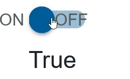
True and False Content
It is possible to set values to the left and right of the button in order to provide more information to the user:
<SwitchButton TrueContent="@trueCont" FalseContent="@falseCont" Checked="true" Name="dark-theme" Value="enabled"></SwitchButton>

@code{
  string trueCont = "ON";
  string falseCont = "OFF";
}

SwitchButton Events
Smart.SwitchButton provides multiple events that can help you expand the component's functionality.
Each event object has unique event.detail parameters.
OnChange- triggered when the widget is checked/unchecked.
Event Details: dynamic value, dynamic oldValue, dynamic changeTypeOnCheckValue- triggered when the component is checked.
Event Details: dynamic changeTypeOnUncheckValue- triggered when the component is unchecked.
Event Details: dynamic changeType
The demo below uses the OnCheckValue Event to log every time the switch_button is checked:
<SwitchButton TrueContent="@trueCont" FalseContent="@falseCont" Checked="true" OnCheckValue="OnCheckValue"></SwitchButton>
<h5>@message</h5>

@code{
    string message = "";
    private void OnCheckValue(Event ev){
        message += "Checked!, ";
    }
}

Two-way Value Binding
The SwitchButton component also supports two-way value binding:
<h3>@SwitchButtonValue</h3>
<SwitchButton  TrueContent="@trueCont" FalseContent="@falseCont" @bind-Checked="@SwitchButtonValue"></SwitchButton>

@code{
    public bool SwitchButtonValue = true;
}