Blazor - Get Started with Smart.NumericTextBox
Setup The Project
Follow the Getting Started guide to set up your Blazor Application with Smart UI.
Setup Basic Number Input
Smart.NumericTextBox is an editable number input field with many additional features such as different numeric systems, units and more.
- Add the NumericTextBox component to the Pages/Index.razor file
<NumericTextBox></NumericTextBox>
- Inside the component, set additional properties such as Min and Max values:
<NumericTextBox Min="0" Max="100" Value="50"></NumericTextBox>

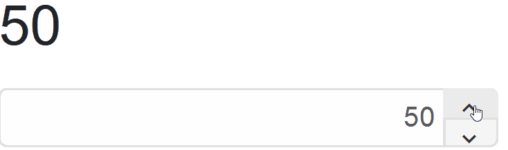
Spin Buttons
Smart.NumericTextBox offers customizable spin buttons for increasing or decreaasing the number value:
<NumericTextBox Value="50" SpinButtons SpinButtonsPosition="NumericTextBoxDisplayPosition.Right" SpinButtonsStep="5"></NumericTextBox>
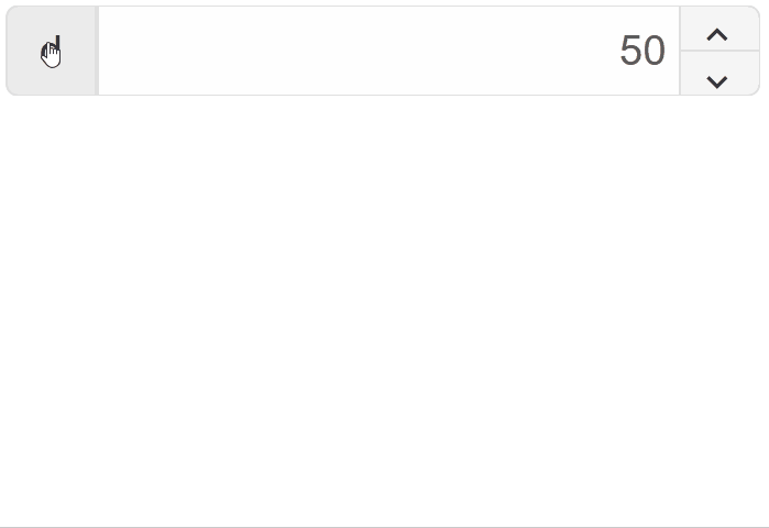
Numerical Systems
The radix or numerical system of the input can be changed by the user if the Radix Display is enabled:
<NumericTextBox RadixDisplay DropDownEnabled Value="50" SpinButtons SpinButtonsPosition="NumericTextBoxDisplayPosition.Right" SpinButtonsStep="5"></NumericTextBox>
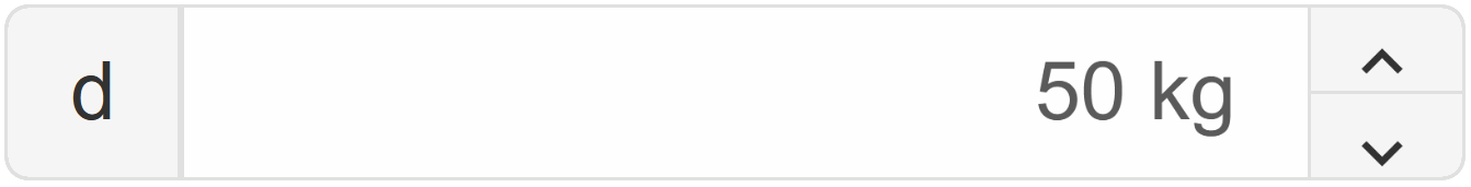
Number Units
Smart.NumericTextBox allows you to set custom units of the input value:
<NumericTextBox Value="50" SpinButtons SpinButtonsPosition="NumericTextBoxDisplayPosition.Right" SpinButtonsStep="5"></NumericTextBox>
Number Formats
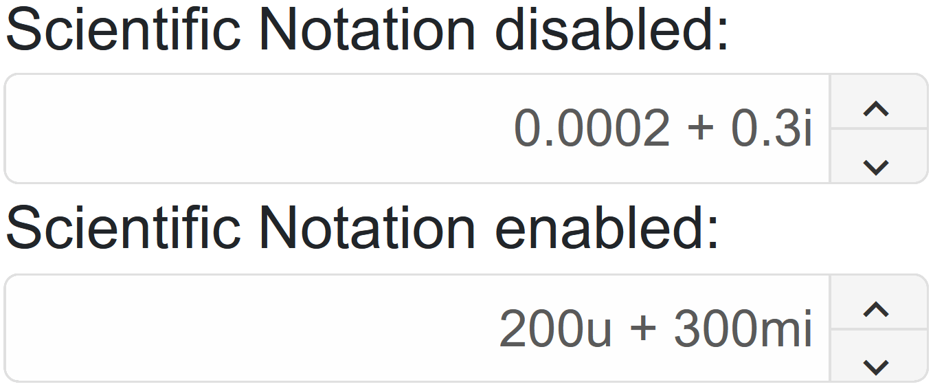
The number in the input field can be set to integer, floating-point or complex number using the InputFormat property:
In addition, scientific notation can also be enabled:
<NumericTextBox Value="50" SpinButtons SpinButtonsPosition="NumericTextBoxDisplayPosition.Right" SpinButtonsStep="5"></NumericTextBox>
NumericTextBox Events
Smart.NumericTextBox provides multiple Events that can help you expand the component's functionality.
OnChange- triggered when the value is changed.
Event Details: N/AOnChanging- triggered when the value in the input is being changed via keypress or paste.
Event Details: N/AOnClose- triggered when the dropdown is closed.
Event Details: N/AOnClosing- riggered when the dropdown is about to be closed.
Event Details: N/AOnOpen- triggered when the dropdown is opened.
Event Details: N/AOnOpening- triggered when the dropdown is about to be opened.
Event Details: N/AOnRadixChange- triggered when the radix is changed.
Event Details: N/A
The demo below uses the OnChange Event to disable the input when the value reaches 50:
<NumericTextBox @ref="@numericBox"  SpinButtons
SpinButtonsPosition="NumericTextBoxDisplayPosition.Right" SpinButtonsStep="@step" OnChange="OnChange"></NumericTextBox>
@code{
    string step = "10";
    NumericTextBox numericBox;

    private async void OnChange(Event ev){
        if(Int16.Parse(await numericBox.Val())>=50){
            numericBox.Disabled = true;
        }
    }
}
Two-way Value Binding
The NumericTextBox component also supports two-way value binding:
<h3 style="min-height:40px">@numericValue </h3>
<NumericTextBox @bind-Value="@numericValue" SpinButtons
SpinButtonsPosition="NumericTextBoxDisplayPosition.Right" SpinButtonsStep="@step"> </NumericTextBox>
@code{
    string step = "5";
    string numericValue = "50";
}