Grid Expanding Groups
Enabling Grouping
To enable the row grouping functionality, you need to use thegrouping Grid property.
grouping: {
	enabled: true
}
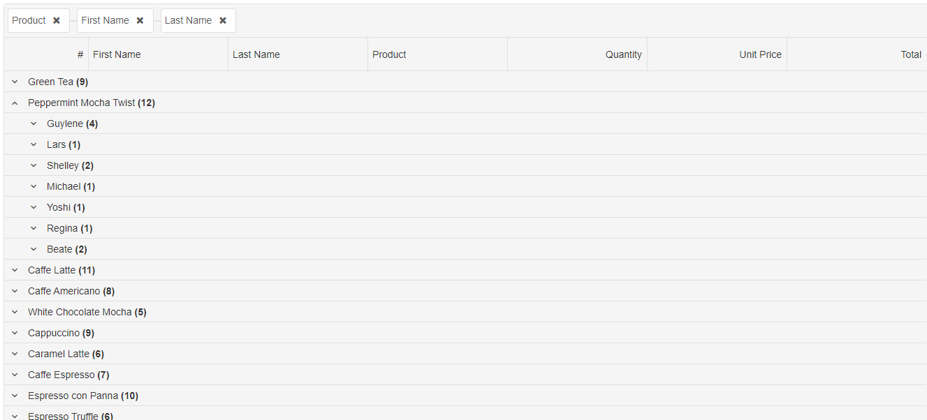
Expanding groups by using a condition
TheonGroupDefaultExpanded callback function can be used for expanding specific groups. For example, the following example shows how to
expand a group where the header label is equal to "Peppermint Mocha Twist"
grouping: {
	enabled: true,
	renderMode: 'basic',
	onGroupDefaultExpanded: (dataItem) => { return dataItem.label === "Peppermint Mocha Twist" },
	groupBar: {
		visible: true
	}
}
To expand a group by its index, you can use the
expandRow method and to collapse a group the collapseRow method. The methods also accept indexed path. For example the expandRow('0.0') expands the first group and its first sub group.
The
expandAllRows and collapseAllRows methods can be use to expand and collapse all groups. The expandRowsToGroupLevel method can be use to expand all groups to a specific level. For example: expandRowsToGroupLevel(1) expands all root groups. expandRowsToGroupLevel(2) expands all root groups and their sub groups.
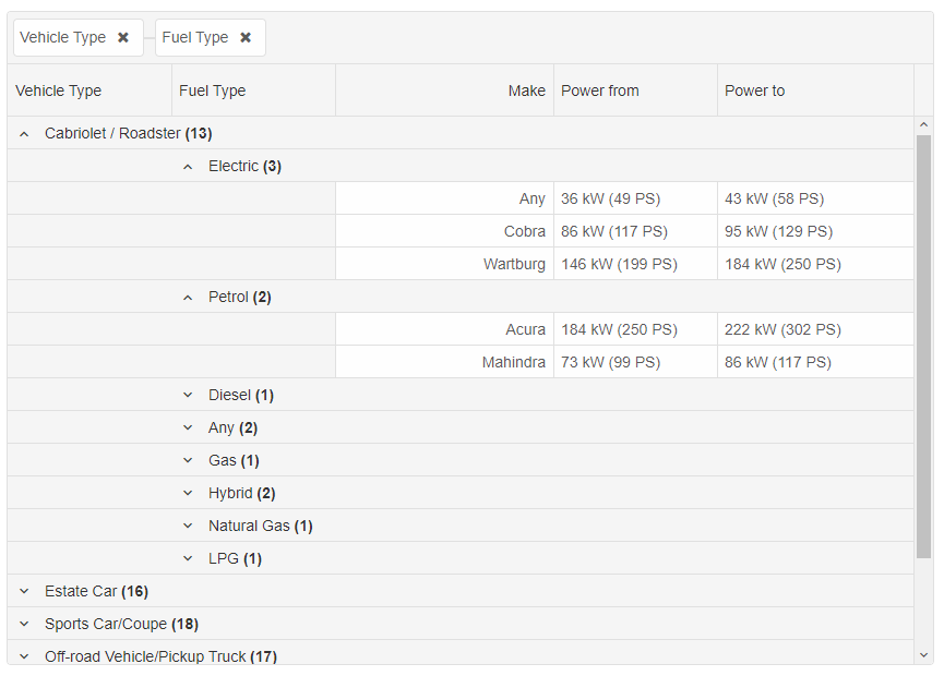
Multiple Group columns rendering
In this rendering mode, each row group is displayed in its grid column.
const gripOptions = {
	dataSource: new Smart.DataAdapter({
		dataSource: generateCarsData(500),
		groupBy: ['vehicleType', 'fuelType'],
		dataFields: [
			{ name: 'make', dataType: 'string' },
			{ name: 'fuelType', dataType: 'string' },
			{ name: 'vehicleType', dataType: 'string' },
			{ name: 'powerFrom', map: 'powerFrom.label', dataType: 'string' },
			{ name: 'powerTo', map: 'powerTo.label', dataType: 'string' }
		]
	}),
	selection: {
		enabled: true,
		allowCellSelection: true,
		mode: 'extended'
	},
	filtering: {
		enabled: true
	},
	sorting: {
		enabled: true
	},
	behavior: {
		allowColumnReorder: true
	},
	grouping: {
		enabled: true,
		renderMode: 'multipleColumns',
		groupBar: {
			visible: true
		},
		summaryRow: {
			inline: true
		}
	},
	columns: [
		{ label: 'Vehicle Type', dataField: 'vehicleType', width: 180 },
		{ label: 'Fuel Type', dataField: 'fuelType', width: 180 },
		{ label: 'Make', dataField: 'make', align: 'right', width: 200, cellsAlign: 'right', },
		{ label: 'Power from', dataField: 'powerFrom', width: 150 },
		{ label: 'Power to', dataField: 'powerTo' }
	]
}
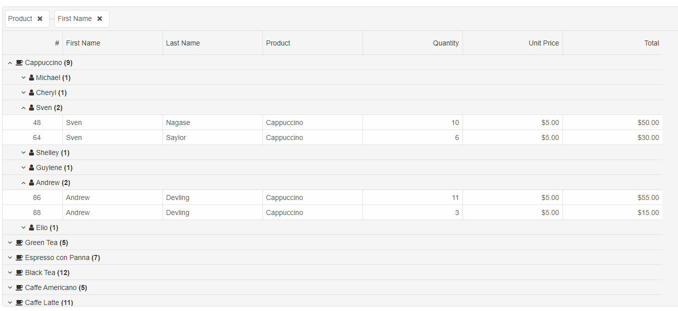
Custom Rendering in Groups
It is possible to customize the rendering with your own rendering function. To achieve that, you can use the 'grouping.formatFunction'. The formatFunction's settings object is a JSON object with 'row', 'column', 'cell', 'value' and 'template'. The passed value is the default value which will be rendered unless you set the 'template' property.
const gridOptions = {
	dataSource: new Smart.DataAdapter({
		dataSource: generateData(100),
		groupBy: ['productName', 'firstName'],
		dataFields: [
			'id: number',
			'firstName: string',
			'lastName: string',
			'productName: string',
			'date: date',
			'quantity: number',
			'price: number',
			'total: number'
		]
	}),
	sorting: {
		enabled: true
	},
	filtering: {
		enabled: true
	},
	behavior: {
		allowColumnReorder: true
	},
	grouping: {
		enabled: true,
		renderMode: 'basic',
		onGroupDefaultExpanded: (dataItem) => { return dataItem.label === "Peppermint Mocha Twist" },
		formatFunction(settings) {
			if (settings.row.level === 0) {
				settings.template = `<div><span class="custom-icon fa-coffee"></span>${settings.value}</div>`
			}
			else if (settings.row.level === 1) {
				settings.template = `<div><span class="custom-icon fa-user"></span>${settings.value}</div>`
			}
		},
		groupBar: {
			visible: true
		}
	},
	onLoad(grid) {
	},
	columns: [
		{
			label: '#',
			width: 120,
			dataField: 'id',
			minWidth: 20,
			freeze: false
		},
		{
			label: 'First Name',
			dataField: 'firstName',
			width: 200,
		},
		{ label: 'Last Name', dataField: 'lastName', width: 200 },
		{ label: 'Product', dataField: 'productName', width: 200 },
		{
			label: 'Quantity',
			dataField: 'quantity',
			align: 'right',
			cellsAlign: 'right',
			width: 200,
		},
		{
			label: 'Unit Price',
			dataField: 'price',
			align: 'right',
			cellsAlign: 'right',
			cellsFormat: 'c2',
			width: 200,
		},
		{
			label: 'Total',
			dataField: 'total',
			align: 'right',
			cellsAlign: 'right',
			cellsFormat: 'c2',
			width: 200,
		}
	]
};
The .custom-icon CSS class is:
.custom-icon {
	margin-left: -8px;
	margin-right: 4px;
	font-family: 'FontAwesome';
}
You can refer FontAwesome from any source. For the sample purposes, you can try <link rel="stylesheet" href="https://cdnjs.cloudflare.com/ajax/libs/font-awesome/4.7.0/css/font-awesome.min.css">
For AI tooling
Developer Quick Reference
Topic: grid-expanding-groups Component: Grid Framework: JavaScript
Main methods: (none detected)
Common config keys: grouping, dataSource, selection, filtering, sorting, behavior, columns
Implementation Notes
Compatibility: Modern browsers / Web Components API access pattern: const component = document.querySelector(...) + component.method()
Lifecycle guidance: Initialize configuration first, then invoke imperative API when element is available in DOM.
Common pitfalls:
- Calling methods before element initialization.
- Reassigning large configuration partially without understanding merge behavior.
- Missing required module script import for component type.
Validation checklist:
- Ensure module scripts and CSS are loaded once.
- Keep data schema aligned with columns/series definitions.
- Verify method calls target initialized component instance.