Blazor - Get Started with Smart.Toast
Setup The Project
Follow the Getting Started guide to set up your Blazor Application with Smart UI.
Setup Basic Toast
Smart.Toast represents an element which displays an unobtrusive notification to the user. Multiple instances of the same toast can be shown at the same time.
-
Add the Toast component to the Pages/Index.razor file:
<Toast></Toast>
-
Toast can be opened by setting the
AutoOpenproperty:<Toast AutoOpen>You have 2 new messages.</Toast>
-
Alernatively, create a button that can control the state of the Toast:
<Button @onclick="Open">Open Toast</Button>
<Toast AutoOpen>
    You have 2 new messages.
</Toast>

@code {
    private Toast toast;

    public async Task Open()
    {
        try
        {
            await toast.Open("", "");
        }
        catch (Exception ex)
        {
        }
    }
}

Positioning
Smart.Toast offers three different ways to position the element:
- Using the
Positionproperty, the Toast can be set to any corner of the screen.<Toast Position="ToastPosition.BottomLeft" AutoOpen>You have 2 new messages.</Toast> - Using the
AppendToproperty, the Toast can be appended to an HTML element.
AppendTooverwritesPosition<Toast AppendTo="@containerId" AutoOpen> You have 2 new messages. </Toast> <div id="container"></div> @code { string containerId = "container"; }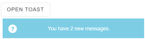
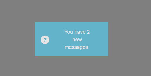
- When
Modalis enabled, the Toast is displayed in the center of the screen.
This is an obtrusive notification and should be used only for important messages and warnings.
ModaloverwritesAppendToandPosition<Toast Modal="true" AutoOpen>
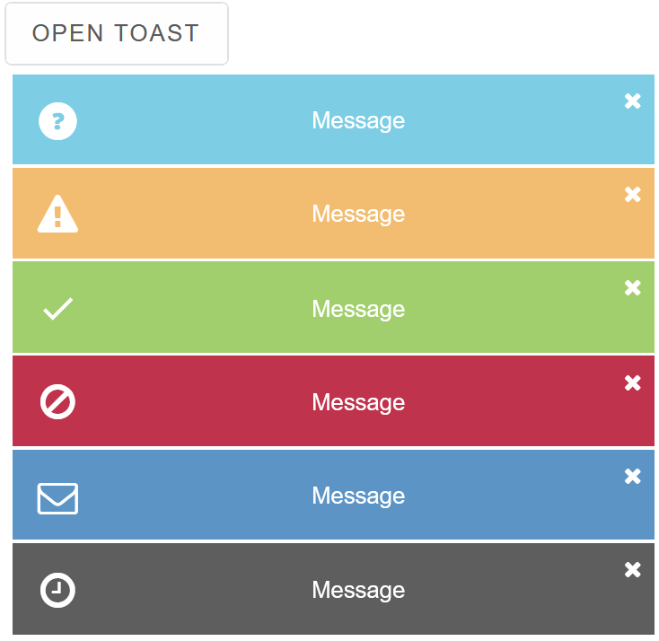
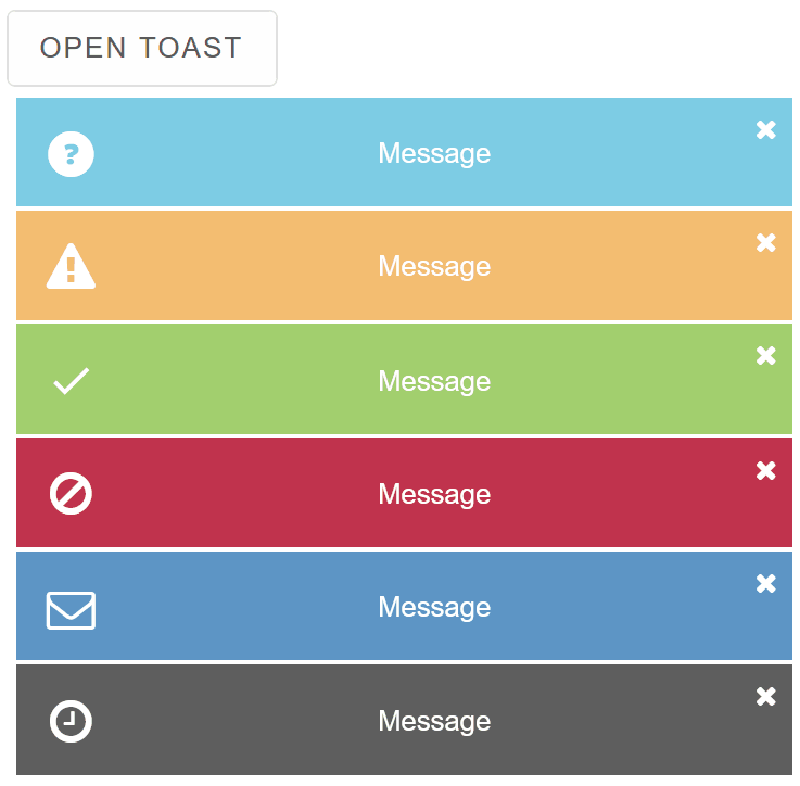
Toast Types
Smart.Toast provides multiple built-in types, depending on the type of the notification.
The type can be with the Type property or added dynamically when opening a new toast:
<Button @onclick="Open">Open Toast</Button>
<Toast @ref="@toast" AppendTo="@containerId" ShowCloseButton>Message</Toast>
<div id="container"></div>

@code {
    string containerId = "container";
    private Toast toast;

    public async Task Open()
    {
        try
        {
            await toast.Open("", "info");
            await toast.Open("", "warning");
            await toast.Open("", "success");
            await toast.Open("", "error");
            await toast.Open("", "mail");
            await toast.Open("", "time");
        }
        catch (Exception ex)
        {
        }
    }
}
Toast Blinking
By adding a blink class, toasts will display a blinking animation, making them easier to notice by the user
<Toast @ref="@toast" AppendTo="@containerId" ShowCloseButton Class="blink">Message</Toast>
Clsoing Toasts
Toasts can be closed by clicking on the close button when ShowCloseButton is enabled or by setting AutoCloseDelay.
The value is set in milliseconds
<Toast @ref="@toast" AppendTo="@containerId" AutoClose AutoCloseDelay="3000" Class="blink">Message</Toast>
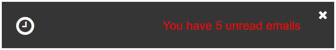
Toast Templates
Smart.Toast allows you to create custom template for the inner content.
Create <template> element with any valid HTML inside.
Then set its id as value of the ItemTemplate property.
<template id="template"><div style="color:red; float:right">{{value}}</div></template>
<Toast @ref="@toast" AppendTo="@containerId" ShowCloseButton Type="ToastType.Time" ItemTemplate="@templateId">You have 5 unread emails</Toast>
@code{
  string containerId = "container";
  string templateId = "template";
  private Toast toast;
}
Events
Smart.Toast provides built-in Events that can help you expand the component's default functionality.
OnItemClick- triggered when the toast item is clicked.
Event Details: N/AOnOpen- triggered when the toast is opened.
Event Details: N/AOnClose- triggered when the toast is closed.
Event Details: N/AOnSwipebottom- triggered on swipebottom over an toast item.
Event Details: N/AOnSwipeleft- triggered on swipeleft over an toast item.
Event Details: N/AOnSwiperight- triggered on swiperight over an toast item.
Event Details: N/AOnSwipetop- triggered on swipetop over an toast item.
Event Details: N/A
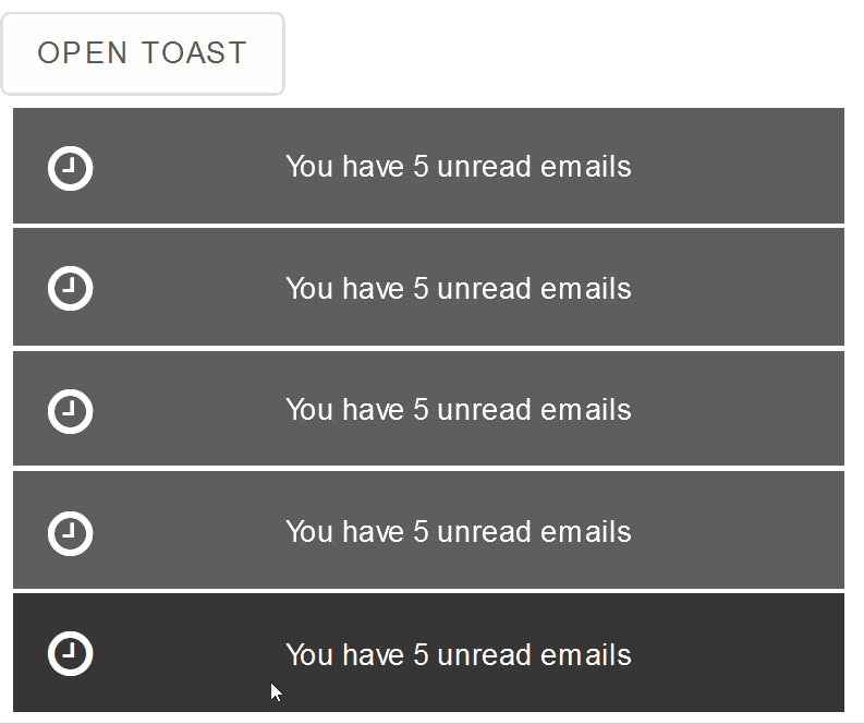
The demo below will close the notification when the user swipes to the right:
<Button @onclick="Open">Open Toast</Button>
<Toast @ref="@toast" AppendTo="@containerId" OnSwiperight="OnSwiperight">You have 5 unread emails</Toast>
<div id="container"></div>

@code {
    string containerId = "container";
    private Toast toast;

    private void OnSwiperight(Event ev){
        toast.CloseLast();
    }

    public async Task Open()
    {
        try
        {
            await toast.Open("", "time");
        }
        catch (Exception ex)
        {
        }
    }
}