Build your web apps using Smart UI
Smart.Grid - Selection
Grid Selection
Smart.Grid allows users to select Grid cells or rows in order to easily manipulate or navigate through them.
Selection is configured by setting the sub-properties of the property/object selection. To enable it, selection.enabled has to be set to true.
The major features related to selection are:
- Row Selection
- Cell Selection
- Checkbox Selection
- Selection Modes
- Header Selection
- Selection-related Methods
More information: property selection in the Grid API documentation.
Row Selection
Row selection allows the user to select one or multiple Grid rows. To enable row selection, selection.allowRowSelection has to be set to true.
Selection can be initiated according to the value of selection.action, which, by default, is 'click' (and can also be set to 'none' and 'doubleClick').
One or multiple rows can be selected. This depends on selection.mode. For more information, please refer to the Selection Modes section of this article.
When rows are selected, they are highlighted accordingly:
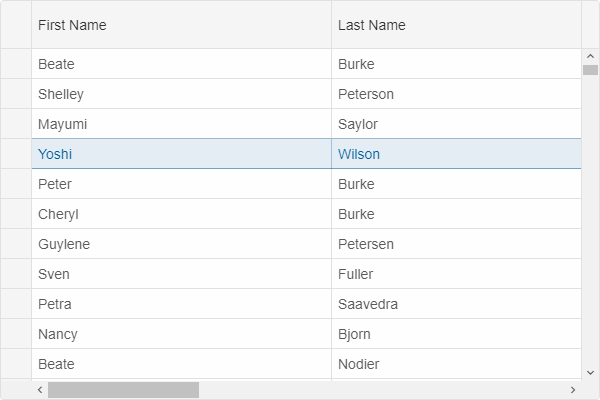
The selection of a particular row can be disabled by setting allowSelect to the respective row object to false. A row can be selected programmatically by setting its property selected.
Cell Selection
Cell selection allows the user to select one or multiple Grid cells. To enable cell selection, selection.allowCellSelection has to be set to true.
As with row selection, cell selection can be initiated according to the value of selection.action, which, by default, is 'click'.
One or multiple cells can be selected. This depends on selection.mode. For more information, please refer to the Selection Modes section of this article.
When cells are selected, they are highlighted accordingly:
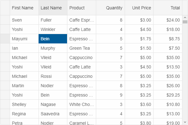
A cell can be selected programmatically by setting the property selected of the respective cell object.
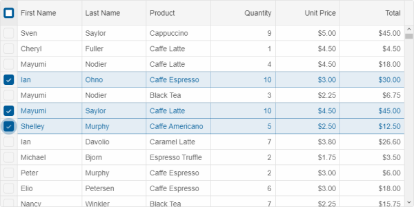
Checkbox Selection
An alternative way to select Grid rows is via checkboxes that can be enabled by setting selection.checkBoxes.enabled to true. When enabled, a column with checkboxes appears on one side of the Grid (accroding to the value of the property selection.checkBoxes.position - 'near' (left) or 'far' (right).
A "select all" checkbox can, optionally, appear in the header of the column with checkboxes. Its behavior is controlled by selection.checkBoxes.selectAllMode:
- 'none' - the "select all" checkbox does not appear.
- 'page' - selects all rows on the page.
- 'all' - selects all rows in the grid.
Checkbox selection can be initiated according to the value of selection.checkBoxes.action, which, by default, is 'click' (and can also be set to 'none' and 'doubleClick').
Selection Modes
There are three selection modes available to row and cell selection. To configure which one is applied, selection.mode has to be set to one of the following:
- 'one' - only one row/cell can be selected at a time. When the user clicks a new row/cell, the previously selected one is unselected.
- 'many' - multiple rows/cells can be selected at a time. When the user clicks a new row/cell, it is selected as well. When the user clicks a selected row/cell again, it is unselected.
-
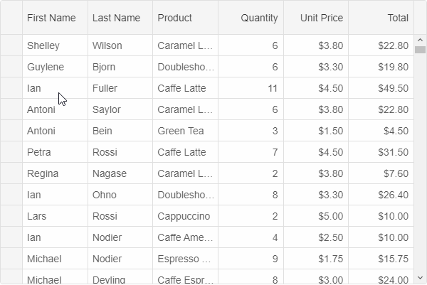
'extended' - multiple rows/cells can be selected at a time using Ctrl or Shift. Drag-selection is also available in this case if selection.allowDragSelection is enabled:
Header Selection
Selecting all cells from a column by clicking the column's header can be enabled by setting selection.allowColumnHeaderSelection to true.
Similarly, selecting a row by clicking its header is enabled by setting selection.allowRowHeaderSelection to true.
Selection-related Methods
- clearSelection - clears the selection.
- getSelection - gets the selection.
- select - selects a row, cell or column.
- selectRange - selects a range of rows, cells or columns.
- unselect - unselects a row, cell or column.
For AI tooling
Developer Quick Reference
Topic: grid-selection Component: Grid Framework: JavaScript
Main methods: (none detected)
Common config keys: (none detected)
Implementation Notes
Compatibility: Modern browsers / Web Components API access pattern: const component = document.querySelector(...) + component.method()
Lifecycle guidance: Initialize configuration first, then invoke imperative API when element is available in DOM.
Common pitfalls:
- Calling methods before element initialization.
- Reassigning large configuration partially without understanding merge behavior.
- Missing required module script import for component type.
Validation checklist:
- Ensure module scripts and CSS are loaded once.
- Keep data schema aligned with columns/series definitions.
- Verify method calls target initialized component instance.