Editor Toolbar Items
Setup The Blazor Application
Follow the Getting Started guide to set up your Blazor Application with Smart UI.
Setup the Blazor Smart.Editor
Follow the Get Started with Smart.Editor guide to set up the component.
Toolbar
Check the Smart.Editor Toolbar guide to read about the basics of the editor's toolbar.
Toolbar Items
The ToolbarItems property determines the items inside the toolbar. The property can be used to modify the items and/or add additional custom items. Its type is IEnumerable<IEditorToolbarItem>.
The default toolbar items types are buttons, drop downs, color inputs or delimiters.
Here's the full list of all built-in toolbar item names:
- SourceCode -
Toggle Button- Toggles Source Code/Preview Mode. Changes the view to HTML content editor. - SplitMode -
Toggle Button- Toggles Split Mode. Split mode allows to view both HTML/Markdown and Code/HTML and makes changes live. - FullScreen -
Toggle Button- Toggles Full Screen Mode. When full screen mode is on the Editor fills the whole screen. - Alignment -
Drop Down- Opens a drop down with alignment options. - FontName -
Drop Down- Opens a drop down with font family options. - FontSize -
Drop Down- Opens a drop down with font size options. - Formats -
Drop Down- Opens a drop down with formating options. - TableRows -
Drop Down- Opens a drop down with table row options. Available only for Inline toolbar and applicable only to Tables inside the Editor. - TableColumns -
Drop Down- Opens a drop down with table column options. Available only for Inline toolbar and applicable only to Tables inside the Editor. - TableVAlign -
Drop Down- Opens a drop down with table vertical alignment options. Available only for Inline toolbar and applicable only to Tables inside the Editor. - TableStyle -
Drop Down- Opens a drop down with additional table styling options. Available only for Inline toolbar and applicable only to Tables inside the Editor. - BackgroundColor -
Color Input- Opens a color input in order to select a background color for the current selection. - FontColor -
Color Input- Opens a color input in order to select a background color for the current selection. - Bold -
Button- Applies bold formatting to the currently selected text. - Italic -
Button- Applies Italic formatting to the currently selected text. - Underline -
Button- Applies Underline formatting to the currently selected text. - Striketrough -
Button- Applies Striketrough formatting to the currently selected text. - Delete -
Button- Deletes the current selection. - Redo -
Button- Redo the previous operation. - Undo -
Button- Undo the previous operation. - Indent -
Button- Applies indentation to the current selection. - Outdent -
Button- Applies outdentation to the current selection. - OpenLink -
Button- Opens the url of the currently selected link. Applicable only when a link element is selected. - EditLink -
Button- Opens a Dialog Window for advanced link editing. - CreateLink/Hyperlink -
Button- Opens a Dialog Window for advanced link creation or editing. - RemoveLink -
Button- Removes the hyperlink from the selected text. - Cut -
Button- Cuts the currently selected text to the Clipboard. - Copy -
Button- Copies the currently selected text to the Clipboard. - Paste -
Button/Drop Down- Pastes the contents of the Clipboard at the current cursor location. By default it's a button unless the Advanced attribute is set to 'true' in a custom defition of the toolbar item. - Image -
Button- Opens a Dialog Window for advanced image inserting/editing. - Table -
Button- Opens a Dialog Window for advanced table inserting/editing. - Lowercase -
Button- Applies lower case to the currently selected text. - Uppercase -
Button- Applies upper case to the currently selected text. - Print -
Button- Opens the borwser's Print Preview in order to pring the current content of the Editor. - Caption -
Button- Insert/Remove a caption to the currently selected image. Available only to the Inline Toolbar and applicable only to Image elements. - ClearFormat -
Button- Clears the formatting of the current selection. - TableHeader -
Button- Insert/Remove a header to the currently selected table. Available only to the Inline Toolbar and applicable only to Table elements. - OrderedList -
Button- Inserts an ordered list item at the current selection location. - UnorderedList -
Button- Inserts an unordered list item at the current selection location. - Subscript -
Button- Applies subscript formatting to the current text selection. - Superscript -
Button- Applies superscript formatting to the current text selection. - Other -
Other- All other item names are treated as delimiters. Delimiters are non clickable.
EditorToolbarItem class with its Name property defined to the List that is set to ToolbarItems.Example:
  List<IEditorToolbarItem> toolbarItems = new List<IEditorToolbarItem>()
  {
      new EditorToolbarItem() { Name = "Bold" },
      new EditorToolbarItem() { Name = "Italic" },
      new EditorToolbarItem() { Name = "Underline" },
      new EditorToolbarItem() { Name = "StrikeThrough" },
      new EditorToolbarItem() { Name = "FontName" },
      new EditorToolbarItem() { Name = "FontSize" },
      new EditorToolbarItem() { Name = "FontColor" },
      new EditorToolbarItem() { Name = "BackgroundColor" },
      new EditorToolbarItem() { Name = "LowerCase" },
      new EditorToolbarItem() { Name = "UpperCase" },
      new EditorToolbarItem() { Name = "|" },
      new EditorToolbarItem() { Name = "Formats" },
      new EditorToolbarItem() { Name = "Alignment" },
      new EditorToolbarItem() { Name = "OrderedList" },
      new EditorToolbarItem() { Name = "UnorderedList" },
      new EditorToolbarItem() { Name = "Outdent" },
      new EditorToolbarItem() { Name = "Indent" },
      new EditorToolbarItem() { Name = "|" },
      new EditorToolbarItem() { Name = "hyperlink" },
      new EditorToolbarItem() { Name = "Image" },
      new EditorToolbarItem() { Name = "|" },
      new EditorToolbarItem() { Name = "ClearFormat" },
      new EditorToolbarItem() { Name = "Print" },
      new EditorToolbarItem() { Name = "SourceCode" },
      new EditorToolbarItem() { Name = "FullScreen" },
      new EditorToolbarItem() { Name = "|" },
      new EditorToolbarItem() { Name = "Undo" },
      new EditorToolbarItem() { Name = "Redo" }
  };
Result: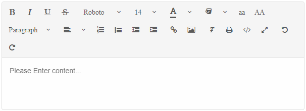
Custom Toolbar Items
You can also modify the items or define custom tools by using the other properties of the EditorToolbarItem class.
Here are the available properties of EditorToolbarItem:
-
Name -
String- Represents the name of the toolbar item. The name can be one of the default names described above which will allow to customize the built-in toolbar item or a custom name for a new custom item. -
Advanced -
Boolean- Applicable only to item "Paste". Transforms the type of the Paste toolbar item to drop down list with paste format options. -
Disabled -
Boolean- Determines whether the item is disabled or not. -
Width -
String | Number- Determines the width of the item. -
Template -
object- Allows to set a template for a custom Toolbar item. -
Editor -
ToolbarItemEditor- Allows to preset most of the inputs for items that use a Dialog Window. -
DataSource -
IEnumerable<object>- Allows to modify the DataSource for the drop down and color input toolbar items. Useful when the user wants custom colors or custom options for a toolbar item. -
InlineToolbarItems -
IEnumerable<object>- Determines the inline toolbar items for specific targets. Applicable only to the following items: 'Hyperlink' and 'CreateLink' for hyperlinks, 'Cut', 'Copy', 'Paste' for Text selection, 'Image' for images and 'Table' for tables. This property allows to modify the inline toolbar items for the previously mentioned elements. The property has the same definition asToolbarItemsproperty.
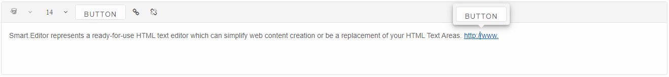
<Editor ToolbarItems="toolbarItems">
Smart.Editor represents a ready-for-use HTML text editor which can simplify web content creation or be a
replacement of your HTML Text Areas.
</Editor>
@code {
List<IEditorToolbarItem> toolbarItems = new List<IEditorToolbarItem>()
{
new EditorToolbarItem()
{
Name = "BackgroundColor",
Disabled = true
},
new EditorToolbarItem()
{
Name = "FontSize",
DataSource = new List<string>() { "10", "20", "30", "40" }
},
new EditorToolbarItem()
{
Name = "customButton",
Width = 100,
Template = "<smart-button>Button</smart-button>"
},
new EditorToolbarItem()
{
Name = "hyperlink",
InlineToolbarItems = new List<EditorToolbarItem>()
{
new EditorToolbarItem()
{
Width = 100,
Template = "<smart-button>Button</smart-button>"
}
},
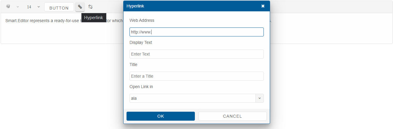
Editor = new ToolbarItemEditor() { Address = "http://www.", Target = "ala" }
},
new EditorToolbarItem() { Name = "removeLink" }
};
}
Result: