Editor Toolbar
Setup The Blazor Application
Follow the Getting Started guide to set up your Blazor Application with Smart UI.
Setup the Blazor Smart.Editor
Follow the Get Started with Smart.Editor guide to set up the component.
Toolbar
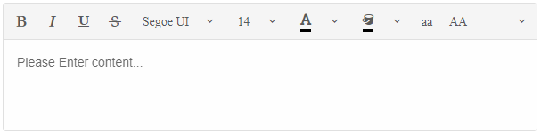
Smart.Editor has a Toolbar that contains command button items that when clicked execute an action.
Actions can insert/delete content or apply various styles and formatting to the current text selection as well as creating lists, tables, inserting images and so on.
You can also define custom toolbar items.
There are two types of Toolbars inside the Editor:
-
Toolbar - the main toolbar of the Editor. Always visible and positioned right above the content section.

-
Inline Toolbar - an additional toolbar that appears when text is selected or a specific text or node is clicked, for example: text, link, image, table.
The inline toolbar main purpose is for Images and Tables where it offers additional actions to be applied to the selection target.

You can read more about it in the Editor Inline Toolbar Guide.
Smart.Editor allows you to customize the tools displayed to the user in the Toolbar.
To do that you need to use the ToolbarItems property of the Editor. It is of type IEnumerable<IEditorToolbarItem> where the toolbar items can be chosen from the default ones, modified or new custom items.
You can read in details about them in the Editor Toolbar Items Guide.
Editor Toolbar View Mode
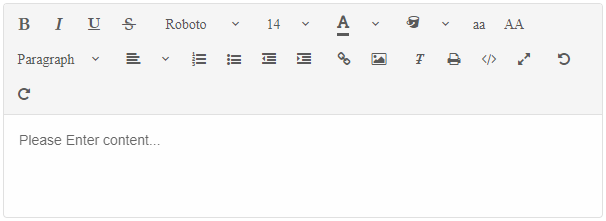
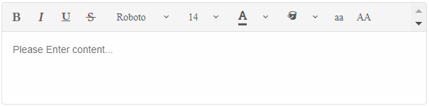
Editor's Toolbar can display the items as a drop down, a scrollable container or on multiple levels. This is determined by the ToolbarViewMode property. By default the toolbar's view mode is toggle.
The available values for ToolbarViewMode are:
-
Toggle - The Toolbar can be toggled in order to display the additional items.
<Editor ToolbarItems="@items" ToolbarViewMode="ToolbarViewMode.Toggle" />
-
MultiRow - The Toolbar items are positioned on multiple levels depending on the space available.
<Editor ToolbarItems="@items" ToolbarViewMode="ToolbarViewMode.MultiRow" />
-
Scroll - The Toolbar represent a scrollable contain and the user can scroll through the items via a scroll bar.
<Editor ToolbarItems="@items" ToolbarViewMode="ToolbarViewMode.Scroll" />
Editor Toolbar Sticky
When the height of the Editor is bigger than the page viewport size the toolbar might not be visible when the user has scrolled to the bottom.
The ToolbarSticky(bool) property allows to make the Toolbar stick to the top of the page regardless of the scroll top position. That way the toolbar items are easy to reach at any time.
<Editor ToolbarItems="@items" ToolbarSticky />