Blazor - Get Started with Smart.ToggleButton
Setup The Project
Follow the Getting Started guide to set up your Blazor Application with Smart UI.
Setup Basic ToggleButton
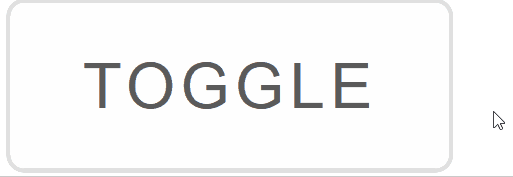
Smart.ToggleButton is a custom element that can be toggled On and Off. It is typically used in a group of other ToggleButtons
- Add the ToggleButton component to the Pages/Index.razor file
<ToggleButton></ToggleButton>
- Optionally, set the name, value and check state of the ToggleButton:
<ToggleButton Checked="true" Name="toggle" Value="enabled">Toggle</ToggleButton>
Check Mode
Check Mode determines the necessary action to change the state of the element.
When CheckMode is set to Press - its state is changed when pressing the button.
When it is Hover - it is changed by hovering over the button.
<ToggleButton Checked="true" Name="dark-theme" Value="enabled" ToggleMode="ToggleButtonToggleMode.Drag"></ToggleButton>
ToggleButton Events
Smart.ToggleButton provides multiple events that can help you expand the component's functionality.
Each event object has unique event.detail parameters.
OnChange- triggered when the widget is checked/unchecked.
Event Details: dynamic value, dynamic oldValue, dynamic changeTypeOnCheckValue- triggered when the component is checked.
Event Details: dynamic changeTypeOnUncheckValue- triggered when the component is unchecked.
Event Details: dynamic changeType
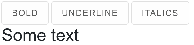
The demo below uses the OnChange Event to apply custom CSS to an element:
<style>
  h3{
      font-weight: @boldness;
      text-decoration: @underline;
      font-style: @italics;
  }
</style>
<ToggleButton @ref="@boldBtn" OnChange="Bold">Bold</ToggleButton>
<ToggleButton @ref="@underlineBtn" OnChange="Underline">Underline</ToggleButton>
<ToggleButton @ref="@italicsBtn" OnChange="Italics">Italics</ToggleButton>
<h3>Some text</h3>

@code{
    ToggleButton boldBtn;
    ToggleButton underlineBtn;
    ToggleButton italicsBtn;

    string boldness = "400";
    string underline = "none";
    string italics = "normal";

    private void Bold(Event ev){
        ToggleButtonChangeEventDetail detail = ev["Detail"];
        if(boldBtn.Checked){
            boldness = "bold";
        }
        else{
            boldness = "400";
        }
    }
    private void Underline(Event ev){
        ToggleButtonChangeEventDetail detail = ev["Detail"];
        if(underlineBtn.Checked){
            underline = "underline";
        }
        else{
            underline = "none";
        }
    }
    private void Italics(Event ev){
        ToggleButtonChangeEventDetail detail = ev["Detail"];
        if(italicsBtn.Checked){
            italics = "italic";
        }
        else{
            italics = "normal";
        }
    }
}
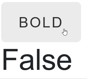
Two-way Value Binding
The ToggleButton component also supports two-way value binding:
<ToggleButton @bind-Checked="@toggleValue">Bold</ToggleButton>
<h3>@toggleValue</h3>

@code{
    bool toggleValue = true;
}