Getting Started with DateTimePicker Web Component
Smart UI Web Components work with current evergreen browsers and Node 18+ for local tooling; pin package versions to match your project policy.
Smart UI is distributed as the smart-webcomponents NPM package. You can also use the full download from the Download page.
Quick start
- Install the package:
npm install smart-webcomponents
- Load the DateTimePicker module (ES module script):
<script type="module" src="node_modules/smart-webcomponents/source/modules/smart.datetimepicker.js"></script>
- Add the default stylesheet (prefer angular.json / bundler entry in app codebases; for plain HTML use a link):
<link rel="stylesheet" type="text/css" href="node_modules/smart-webcomponents/source/styles/smart.default.css" />
- Add markup in one of two ways - semantic custom element (the component tag is in your HTML) or a host
div(you mount programmatically with appendTo):
Semantic element (id matches the selector in Smart()):
<smart-date-time-picker id="datetimepicker"></smart-date-time-picker>
Host container (id matches appendTo on Smart.DateTimePicker):
<div id="datetimepickerContainer"></div>
- Initialize after the module loads: define a const datetimepickerOptions object, then either bind with Smart('#datetimepicker', ...) on the semantic tag or use new Smart.DateTimePicker({ ...datetimepickerOptions, appendTo: '#datetimepickerContainer' }) on the host
div:
<script type="module">
	import 'node_modules/smart-webcomponents/source/modules/smart.datetimepicker.js';

	const datetimepickerOptions = {};

	// Option A - semantic <smart-date-time-picker> with id="datetimepicker"
	Smart('#datetimepicker', class {
		get properties() {
			return datetimepickerOptions;
		}
	});

	// Option B - host div id="datetimepickerContainer"
	// const datetimepickerInstance = new Smart.DateTimePicker({
	// 	...datetimepickerOptions,
	// 	appendTo: '#datetimepickerContainer'
	// });

	// Option C - constructor(selector, options), then append the returned element yourself
	// const myDateTimePicker = new Smart.DateTimePicker('#datetimepicker', datetimepickerOptions);
	// document.body.appendChild(myDateTimePicker);
</script>
Uncomment Option B when you use the host
div; use Option A when you use the semantic element. The Runtime cookbook also documents new Smart.DateTimePicker('#datetimepicker', datetimepickerOptions) with appendChild, and document.createElement('smart-date-time-picker') with .props or Object.assign (all are valid patterns; do not combine overlapping patterns for the same instance unless you intend multiple components). - Serve the folder over HTTP (or use your bundler dev server) and open the page.
Runtime cookbook
Alternative creation patterns and imperative APIs. These are all valid ways to create Smart UI components: semantic markup + Smart(); new Smart.DateTimePicker({ ...options, appendTo: '#...' }); new Smart.DateTimePicker('#datetimepicker', datetimepickerOptions) plus appendChild on the returned element; and document.createElement('smart-date-time-picker') then assigning options via .props or Object.assign on the element.
Constructor with a selector string and options, then append the returned element (for example const myDateTimePicker = new Smart.DateTimePicker('#datetimepicker', datetimepickerOptions)):
	const datetimepickerOptions = {};
	const myDateTimePicker = new Smart.DateTimePicker('#datetimepicker', datetimepickerOptions);
	document.body.appendChild(myDateTimePicker);
Create with document.createElement('smart-date-time-picker'), assign properties (same as any custom element), then append:
	const datetimepickerOptions = {};
	const datetimepicker = document.createElement('smart-date-time-picker');
	Object.assign(datetimepicker, datetimepickerOptions);
	document.body.appendChild(datetimepicker);
Host on a div with appendTo (import the module, then instantiate when the document is ready; the container id must match appendTo):
	import "../../source/modules/smart.datetimepicker.js";

	document.readyState === 'complete' ? init() : window.addEventListener('load', init);

	function init() {
		const datetimepickerOptions = {};
		const datetimepicker = new Smart.DateTimePicker({
			...datetimepickerOptions,
			appendTo: '#datetimepickerContainer'
		});
	}
Demo

Note how smart.element.js and webcomponents.min.js are declared before everything else. This is mandatory for all custom elements.
Appearance
By default smart.DateTimePicker appears as a simple date time input. The user has to enable the popup button for the date/time picker, the navigation buttons and etc.
All available settings are listed in the API documentation of the element.
The date time picker can easily be transformed from a simple input into a drop down with date and time pickers. This can be done by simply applying a few properties:
<smart-date-time-picker calendar-button spin-buttons spin-buttons-position="left"></smart-date-time-picker>
Demo
The properties are self-describing:
- calendar-button - enables the button for the drop down date/time picker.
- spin-buttons - enables the buttons used to calibrate the date/time in the input.
- spin-buttons-position - sets the position of the spin buttons.
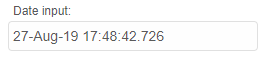
smart.DateTimePicker like the other Smart inputs has a label and a hint property. Positioned above and below the input field respectively, the fields that represent those properties serve as text labels that the user can modify to fit his needs. Here's how to apply them:
<smart-date-time-picker label="Date input:" hint="Calendar buttons is disabled"></smart-date-time-picker>
Demo
They can be changed after the element is ready using JavaScript.
Behavior
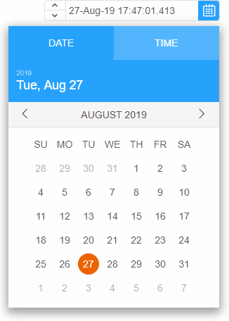
smart.DateTimePicker can behave like a time picker, date picker or both.
dropDownDisplayMode property determines this behavior:
<smart-date-time-picker calendar-button drop-down-display-mode="timePicker" ></smart-date-time-picker>
Demo
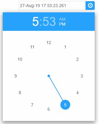
The possible values are:
- default - the drop down popup behaves like a tab control with two separate tabs: Date and Time.
- classic - Time and Date pickers are combined into one in the drop down popup.
- calendar - the drop down popup contains only a date picker - a Calendar.
- timePicker - the drop down popup contains only a time picker - a TimePicker.
The user can edit the date or time directly in the input field. What part of the date/time can be edited depends on the editMode property. The user can prefer to edit fixed parts of the date/time string.
<smart-date-time-picker edit-mode="partial"></smart-date-time-picker>
Demo
smart.DateTimePicker supports different date/time input formats.The formatString property determines the format of the date/time string. It can be changed in the HTML tag on initialization or later using javascript:
<!DOCTYPE html>
<html>
<head>
<link rel="stylesheet" href="../../source/styles/smart.default.css" type="text/css" />
<script type="text/javascript" src="../../source/modules/smart.datetimepicker.js"></script>
<script type="text/javascript">
window.onload = function () {
var dateTimePicker = document.getElementsByTagName('smart-date-time-picker')[0];
//Default format
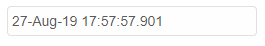
dateTimePicker.formatString = 'dd-MMM-yy HH:mm:ss.fff';
//Short date format
dateTimePicker.formatString = 'd';
//Custom date format
dateTimePicker.formatString = 'dddd-MMMM-yyyy';
}
</script>
</head>
<body>
<smart-date-time-picker></smart-date-time-picker>
</body>
</html>
Demo
The format of the date/time string can be standardized or custom.
smart.DateTimePicker uses a smart.Calendar as a date picker and smart.TimePicker as a time picker.
Append to the DOM:
const container = document.getElementById('datetimepicker-container');
container.appendChild(datetimepicker);
Remove from the DOM:
datetimepicker.remove();
Set a property:
datetimepicker.disabled = true;
datetimepicker.theme = 'dark';
Get a property value:
const isDisabled = datetimepicker.disabled;
const currentTheme = datetimepicker.theme;
Invoke a method:
datetimepicker.refresh();
datetimepicker.focus();
Add event listener:
datetimepicker.addEventListener('change', (event) => {
    console.log('change triggered:', event.detail.oldValue);
});
Remove event listener:
const handleDateTimePickerEvent = (event) => {
    console.log('change triggered:', event.detail.oldValue);
};

datetimepicker.addEventListener('change', handleDateTimePickerEvent);
datetimepicker.removeEventListener('change', handleDateTimePickerEvent);
Common Use Cases
-
Set date range
Configure min and max selectable dates
dateTimePicker.min = new Date(2026, 0, 1);
dateTimePicker.max = new Date(2026, 11, 31);
-
Format display
Customize the date format shown
dateTimePicker.formatString = 'yyyy-MM-dd HH:mm';
Troubleshooting
- How do I set the date format?
- Use the formatString property: formatString = 'yyyy-MM-dd' for ISO format or 'MM/dd/yyyy' for US format.
- How do I disable certain dates?
- Use the disabledDates property with an array of dates or date ranges to prevent selection.
Accessibility
The DateTimePicker component follows WAI-ARIA best practices:
- Keyboard navigation - Tab, Arrow keys, Enter, and Escape are supported
- ARIA roles - Appropriate roles and labels are applied automatically
- Focus management - Visible focus indicators for keyboard users
- Screen readers - State changes are announced to assistive technology
- High contrast - Supports Windows High Contrast Mode and forced colors
For custom labeling, set aria-label or aria-labelledby attributes on the component.
Supported stacks: Smart UI targets Angular 17+, React 18+, Vue 3+, Node 18 LTS, and evergreen browsers; pin exact package versions to your org policy.