Blazor - Get Started with Smart.DropDownList
Setup The Project
Follow the Getting Started guide to set up your Blazor Application with Smart UI.
Setup Basic DropDownList
Smart.DropDownList represents a dropdown list of items with additional features such as multiple selection, filter, sort, group and more.
- Add the DropDownList component to the Pages/Index.razor file
<DropDownList></DropDownList>
- Inside the
@codeblock, create an array of elements and set it as DataSource of the component<DropDownList DataSource="items"></DropDownList> @code{ string[] items = new string[]{"Affogato", "Americano", "Bicerin", "Breve" } - Alternatively, set the items as children of the component:
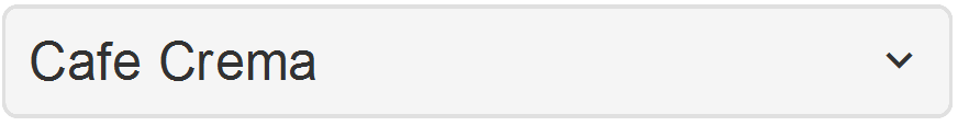
<DropDownList>
  <ListItem Value="1">Affogato</ListItem>
  <ListItem Value="2">Americano</ListItem>
  <ListItem Value="3">Bicerin</ListItem>
  <ListItem Value="4">Breve</ListItem>
  <ListItem Value="5">Cappuccino</ListItem>
  <ListItem Value="6">Cafe Crema</ListItem>
  <ListItem Value="7">Cafe Corretto</ListItem>
</DropDownList>
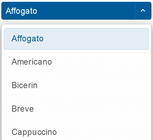
Default Selection
Smart.DropDownList offers multiple possibilites to select an item programatically.
Defult selection can be achieved by adding the Selected property to a ListItem:
<ListItem Value="1" Selected>Affogato</ListItem>
Or by using the SelectedIndexes or SelectedValues properties:
<DropDownList SelectedIndexes="@values">
  ....
</DropDownList>
@code{
  int[] values = new int[]{0, 1};
}
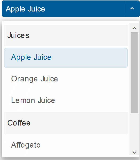
Grouping
List items can be grouped into sections by using the <ListItemsGroup> element:
  <DropDownList>
    <ListItemsGroup Label="Juices">
        <ListItem>Apple Juice</ListItem>
        <ListItem>Orange Juice</ListItem>
        <ListItem>Lemon Juice</ListItem>
    </ListItemsGroup>
    <ListItemsGroup Label="Coffee">
        <ListItem>Affogato</ListItem>
        <ListItem>Americano</ListItem>
        <ListItem>Bicerin</ListItem>
    </ListItemsGroup>
</DropDownList>
Selection Modes
The selection mode of the component can be set to nine different modes:
CheckBox | One | None | OneOrMany | OneOrManyExtended | RadioButton | ZeroAndOne | ZeroOrMany | ZeroOrOne
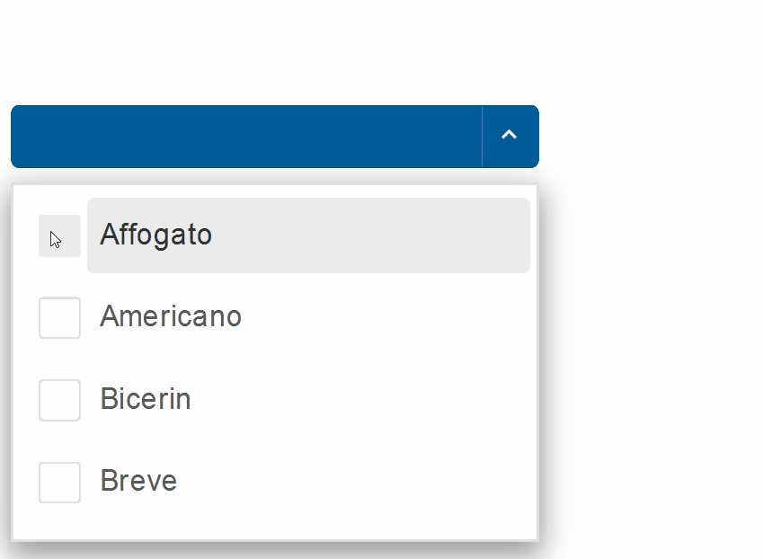
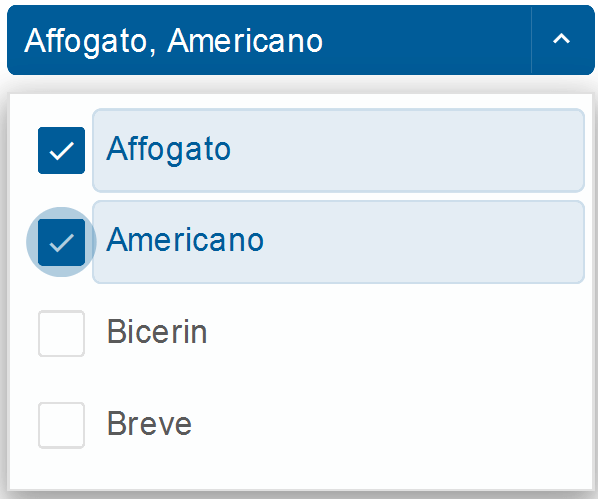
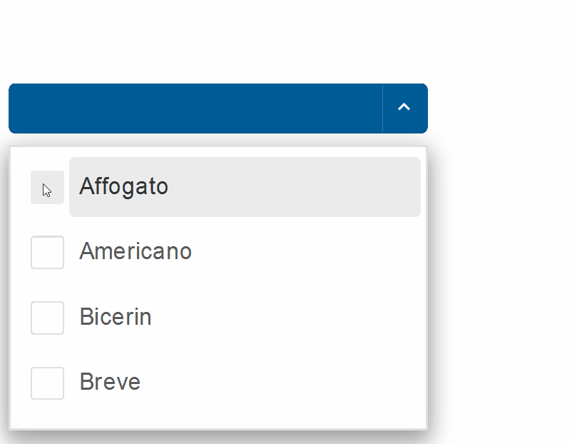
The selection mode is set to Checkbox:
<DropDownList DataSource="@items" SelectionMode="ListSelectionMode.CheckBox"></DropDownList>
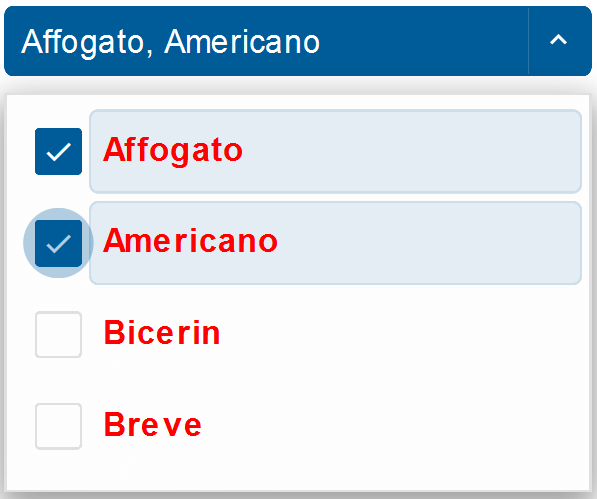
Item Templating
The style of each list item can be customized by creating a <template> element and setting its id as ItemTemplate of the DropDownList.
<DropDownList  DataSource="@items" SelectionMode="ListSelectionMode.CheckBox" ItemTemplate="@itemTemplate"></DropDownList>
<template id="item-template">
  <span style="color:red; font-weight:bold">{{label}}</span>
</template>
@code{
  string[] items = new string[]{"Affogato", "Americano", "Bicerin", "Breve"};
  string itemTemplate = "item-template";
}
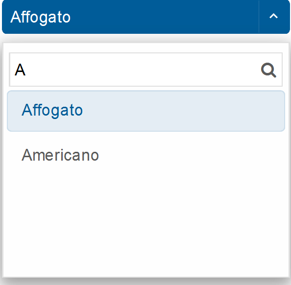
Filtering
Smart.DropDownList's built-in filtering functionality can be enabled using the Filterable property.
<DropDownList DataSource="@items" Filterable="true"></DropDownList>
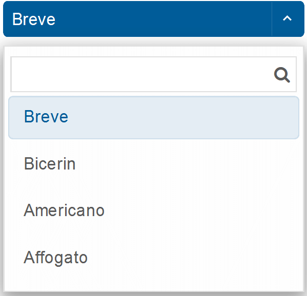
Sorting
The DropDownList can also be sorted alphabetically in a ascending or descending order:
<DropDownList DataSource="@items"Sorted="true"></DropDownList>
DropDownList Events
Smart.DropDownList provides an multiple Events that can help you expand the component's functionality.
Each event object has unique event.detail parameters.
OnActionButtonClick- triggered when user clicks on the action button. The action button is only visible when dropDownOpenMode is set to 'dropDownbutton'.
Event Details: N/AOnChange- triggered when the selection is changed.
Event Details: dynamic addedItems, dynamic disabled, int index, string label, dynamic removedItems, dynamic selected, dynamic valueOnClose- triggered when the drop down list is closed.
Event Details: N/AOnClosing- triggered when the drop down list is about to be closed.
Event Details: N/AOnItemClick- triggered when an item is clicked.
Event Details: dynamic disabled, int index, string label, dynamic selected, dynamic valueOnOpen- triggered when the drop down list is opened.
Event Details: N/AOnOpening- triggered when the drop down list is about to be open.
Event Details: N/AOnResizeStart- triggered when user starts resizing the drop down.
Event Details: dynamic positionOnResizeEnd- triggered when the resizing of the drop down is finished.
Event Details: dynamic positionOnScrollBottomReached- triggered when user scrolls to the end of the dropDown list.
Event Details: N/AOnScrollTopReached- triggered when user scrolls to the start of the dropDown list.
Event Details: N/A
The demo below uses the OnItemClick Event to display information regarding the item selection:
<h3>@message</h3>
<DropDownList DataSource="@items" SelectionMode="ListSelectionMode.CheckBox" OnItemClick="OnItemClick"></DropDownList>
@code{
    string[] items = new string[]{"Affogato", "Americano", "Bicerin", "Breve"};
    string message = "";
    private void OnItemClick(Event ev){
        DropDownListItemClickEventDetail detail = ev["Detail"];
        message = detail.Label + " was " + (detail.Selected ? "selected":"unselected");
    }
}
Two-way Value Binding
The DropDownList component also supports two-way value binding:
<h3>@(string.Join(", ", selectedItems))</h3>
<DropDownList DataSource="@items" @bind-SelectedValues="@selectedItems" SelectionMode="ListSelectionMode.CheckBox"></DropDownList>

@code{
    string[] items = new string[]{"Affogato", "Americano", "Bicerin", "Breve"};
    string[] selectedItems = new string[]{};
}