Blazor - Get Started with Smart.FileUpload
Setup The Project
Follow the Getting Started guide to set up your Blazor Application with Smart UI.
Setup Basic FileUpload
Smart.FileUpload is a custom input element that allows uploading one or multiple files.
- Add the FileUpload component to the Pages/Index.razor file. Attached files can be uploaded or removed:
<FileUpload></FileUpload>
- To upload multiple files set the
Multipleproperty. Users can choose to upload all attached files at once or one by one.<FileUpload Multiple></FileUpload>

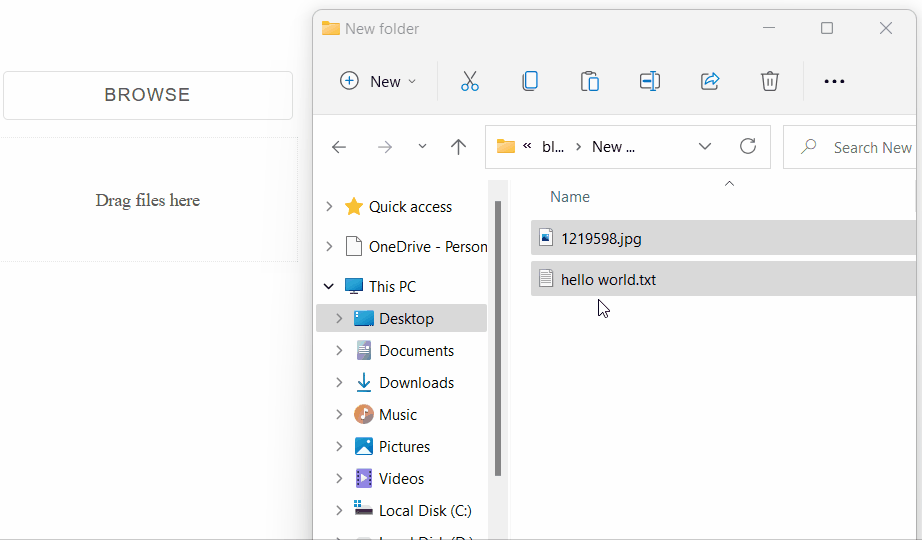
Drop Zone
Setting the DropZone property, creates an area where users can drag & drop files.
<FileUpload Multiple DropZone="true"></FileUpload>
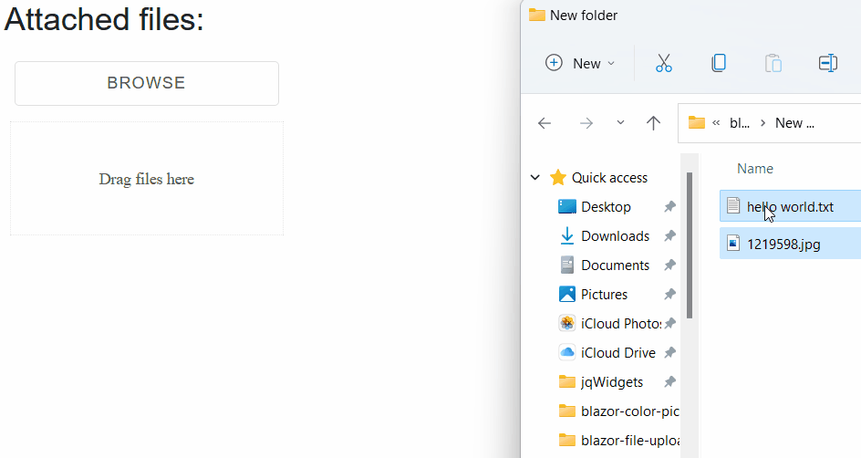
Custom Container
The file list and the drop zone can be moved to a custom container by setting the
AppendTo or the DropZone property to the id of the container element
<h3>Attached files:</h3>
<div id="container"></div>
<FileUpload Multiple DropZone="true" AppendTo="@containerId"></FileUpload>

@code{
  string containerId = "container";
}
Upload Directory
Setting the Directory property allows users to upload the content of a selected folder.
<FileUpload Multiple Directory></FileUpload>
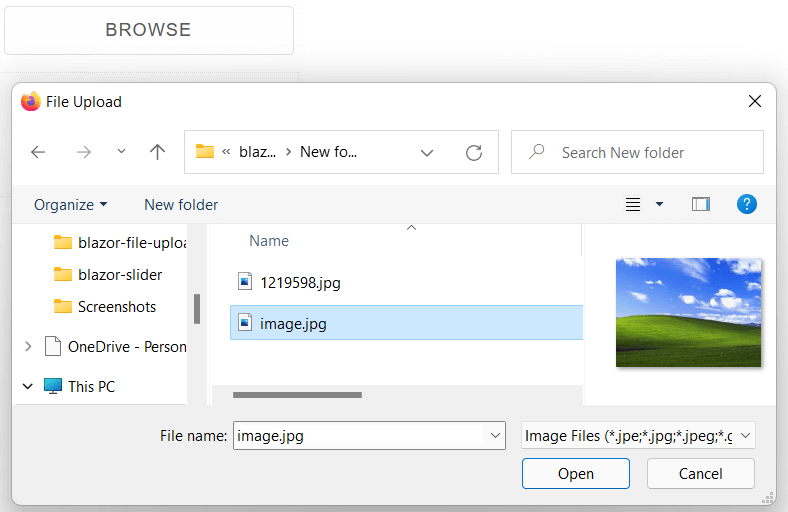
File Types
The Accept property of the component sets what type of files can be attached by the user.
<FileUpload Multiple Accept="image/*"></FileUpload>
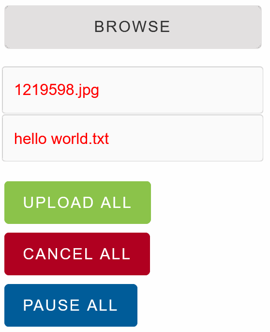
File Templates
The appearance of the attached files can be modified by creating an item template.
Create a <template> element and set its id to the ItemTemplate property
<template id="file-template">
    <div style="color:red">{{filename}}</div>
</template>
<FileUpload Multiple ItemTemplate="@fileTemplate"></FileUpload>

@code{
    string fileTemplate = "file-template";
}
FileUpload Events
Smart.FileUpload provides an multiple events
that can help you expand the components' functionality.
Each event has unique event.details providing additional data
OnFileSelected- triggered when a file has been selected.
Event Details: dynamic filename, dynamic type, dynamic size, int indexOnUploadCanceled- triggered when a file has been selected.
Event Details: dynamic filename, dynamic type, dynamic size, int index, dynamic statusOnUploadCompleted- triggered when a file has been selected.
Event Details: dynamic filename, dynamic type, dynamic size, int index, dynamic statusOnUploadError- triggered when a file has been selected.
Event Details: dynamic filename, dynamic type, dynamic size, int indexOnUploadPaused- triggered when a file has been selected.
Event Details: dynamic filename, dynamic type, dynamic size, int indexOnUploadStarted- triggered when a file has been selected.
Event Details: dynamic filename, dynamic type, dynamic size, int indexOnValidationError- triggered when a file has been selected.
Event Details: dynamic filename, dynamic type, dynamic size
The demo below uses the OnFileSelected Event to show relevant information about the file size:
<div style="min-height:40px">@message</div>
<FileUpload Multiple OnFileSelected="OnFileSelected"></FileUpload>

@code{
  string message = "";
  private void OnFileSelected(Event ev){
      FileUploadFileSelectedEventDetail detail = ev["Detail"];
      message = $"{detail.Filename} is a {detail.Type}. The size is {detail.Size/1000} KB";
  }
}