Build your web apps using Smart Custom Elements
Smart.Scheduler - Header Customization
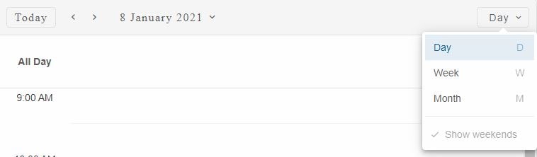
Smart.Scheduler Header
Smart.Scheduler Header contains navigation controls for the date and view selection. It contains the following controls:
- Today Button - a button that switches to the current date when clicked.
- Date Navigation Buttons - buttons that allow to navigate the date backwards and forwards. Depending on the view the buttons can navigate by date, week or month.
- Date Selector - a drop down button that when clicked opens a popup containing the Smart.Calendar component that allows to select a specific date.
- View Selector - depending on the viewSelectorType it can be a drop down button or tabs control. Both components allow to select the current view.
The header components update the dateCurrent and view properties of the Smart.Scheduler.
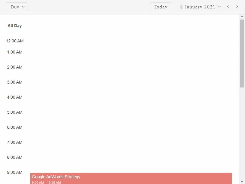
Demo
The Today Button is visible by default but it can be hidden via the hideTodayButton
The Navigation Buttons are Smart.RepeatButtons. This means that the action repeats while the button is pressed. The position of the buttons can be changed via the scrollButtonsPosition property. It has three possible values: 'near', 'far', 'both'. By default the position of the buttons is 'near'.
The Date Selector control indicates the currently selected time period and allows to change it via the calendar popup. The popup can be disabled via the disableDateMenu property. When disabled the control becomes an indicator for the currently selected time period. The position of the Date selector is determined by the headerDatePosition property. Two values are allowed: 'near' and 'far'.
The View Selector by default represents a button that when clicked opens a list of view items for selection. The viewSelectorType determines the type of the control. Three possible values are available: 'auto', 'tabs' and 'menu'. By default, it is set to 'menu'.
When set to 'tabs' the view items are positioned one after another horizontally. If the view labels overflow the parent, two additional scroll buttons appear on both ends of the view selection container. The buttons allow to scroll to the desired view if not visible.

When set to 'auto' the Smart.Scheduler automatically determines when to use tabs or drop down button for the view selection. The decision is based on the space available for the view items. If the items overflow then the drop down button is prefered. If not, tabs is used instead. For mobile devices the drop down button is the prefered choice.
The View Selector can also be transformed into an indicator. The disableViewMenu property disables the view selector menu. This is only applicable when view seletor is a drop down button.
The position of the View Selector can also be changed via the headerViewPosition property. The possible values are: 'near' and 'far'. By default the View Selector is positioned on the 'far' side of the header.
Here's how to change the position of the header controls:
window.Smart('#scheduler', class {
    get properties() {
        return {
            //Properties
            dataSource: data,
            headerDatePosition: 'far',
            headerViewPosition: 'near',
            scrollButtonsPosition: 'far'
        };
    }
});
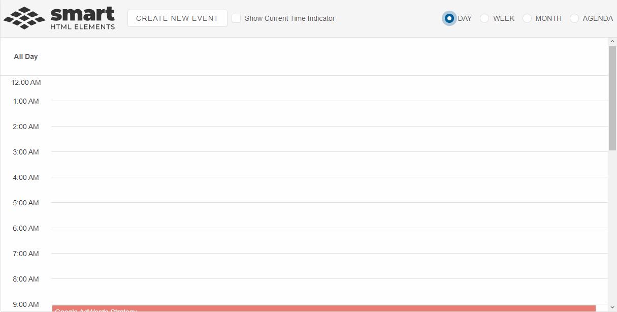
Header Customization
Smart.Scheduler header can be completely customized via the headerTemplate property. The property accepts a function HTMLTemplate element or the id of HTMLTemplate element.
Here's how to create a completely custom Smart.Scheduler header with radio buttons for view selection, a check box component for enabling/disabling the currentTimeIndicator and button that allows to create a new event when clicked.
window.Smart('#scheduler', class {
    get properties() {
        return {
            //Properties
            dataSource: data,
            headerTemplate: function (headerContainer) {
                const scheduler = document.querySelector('smart-scheduler'),
                container = document.createElement('div'),
                div = document.createElement('div'),
                radioButtons = document.createElement('div'),
                checkBox = document.createElement('smart-check-box'),
                button = document.createElement('smart-button');
                container.classList.add('custom-header');

                div.id = 'logo';

                radioButtons.classList.add('radio-buttons-container');

                ['day', 'week', 'month', 'agenda'].forEach(v => {
                    const radioButton = document.createElement('smart-radio-button');
                    if (v === 'day') {
                        radioButton.checked = true;
                    }
                    radioButton.innerHTML = v.toUpperCase();
                    radioButton.value = v;
                    radioButtons.appendChild(radioButton);
                });

                radioButtons.addEventListener('change', function (event) {
                    if (event.target instanceof window.Smart.RadioButton) {
                        scheduler.view = event.target.value;
                    }
                });

                button.id = 'newButton';
                button.innerHTML = 'Create New Event';

                checkBox.innerHTML = 'Show Current Time Indicator';
                checkBox.id = 'indicatorCheckBox';

                checkBox.addEventListener('change', function (event) {
                    scheduler.currentTimeIndicator = event.detail.value;
                });

                button.addEventListener('click', function () {
                    scheduler.openWindow({});
                });

                container.appendChild(div);
                container.appendChild(button);
                container.appendChild(checkBox);
                container.appendChild(radioButtons);

                headerContainer.innerHTML = '';
                headerContainer.appendChild(container);
            }
        };
    }
});
Demo
The footer section of the Smart.Scheduler is also customizable.
For AI tooling
Developer Quick Reference
Topic: scheduler-header-customization Component: Scheduler Framework: JavaScript
Main methods: openWindow()
Common config keys: dataSource
Implementation Notes
Compatibility: Modern browsers / Web Components API access pattern: const component = document.querySelector(...) + component.method()
Lifecycle guidance: Initialize configuration first, then invoke imperative API when element is available in DOM.
Common pitfalls:
- Calling methods before element initialization.
- Reassigning large configuration partially without understanding merge behavior.
- Missing required module script import for component type.
Validation checklist:
- Ensure module scripts and CSS are loaded once.
- Keep data schema aligned with columns/series definitions.
- Verify method calls target initialized component instance.