Build your web apps using Smart UI
Smart.Card - usage
Overview
smartCard is a sheet that can be used as an entry point to more detailed information. The content of the card may vary. Cards are used for creating rich content experiences quicker, regardless of the used device. Cards also can be static or interactive.
Files
- CSS files
- smart.default.css - the CSS file containing the styles for the element.
- Javascript module
- smart.card.js - the JS module which is in the
source/modules/folder and loads all script dependencies.
- smart.card.js - the JS module which is in the
- Javascript files
- smart.element.js – the base class
- smart.card.js – the JS file containing the definition for the cards.
Usage
- Import a module
With this approach, we import a module and create the web component by using the Smart function. The #card is a smart-card tag.
import {smartCard} from "../../source/modules/smart.card.js";

Smart('#card', class {
get properties() {
	return {
		name: 'ConfirmBtn'
	}
}
});

document.readyState === 'complete' ? init() : window.onload = init;

function init() {

}
Using the Smart function is optional. You can useconst card = document.querySelector("#card");and set the properties like that:const card = document.querySelector("#card"); card.name = 'ConfirmBtn'; - Import a module, Init on Demand
The following imports the web component's module and creates it on demand, when the document is ready. The #card is a DIV tag.
import {smartCard} from "../../source/modules/smart.card.js"; document.readyState === 'complete' ? init() : window.onload = init; function init() { const card = new smartCard('#card', { }); } - Load scripts
The following code adds the custom element to the page.
<!DOCTYPE html> <html> <head> <meta charset="utf-8" /> <link rel="stylesheet" href=../../source/styles/smart.base.css" type="text/css" /> <script type="text/javascript" src="../../source/smart.element.js"></script> <script type="text/javascript" src="../../source/smart.card.js"></script> <script> window.onload = function () { let card= document.querySelector('smart-card'); card.dataSource = { image: 'https://upload.wikimedia.org/wikipedia/commons/thumb/6/62/MalayanTiger01.jpg/1280px-MalayanTiger01.jpg', title: 'Malayan tiger', comment: 'The average length of ...', content: 'The Malayan tiger ...' }; card.contentHandler = function(card) { var toggleBtn = card.getElementsByTagName('smart-toggle-button')[0], content = card.querySelector('.card-content'); toggleBtn.addEventListener('click', function () { content.classList.toggle('hidden'); }); }; } </script> </head> <body> <smart-card> <div class="card-image"> <img src="{{image}}"> <h2 class="card-title">{{title}}</h2> </div> <div class="card-comment">{{comment}}</div> <div class="card-buttons"> <smart-button class="share">Share</smart-butto> <smart-button class="more">More</smart-button> <smart-toggle-button><i class="material-icons"></i></smart-toggle-button> </div> <div class="card-content hidden">{{content}}</div> </smart-card> </body> </html>Demo

Note how smart.element.js is declared before everything else. This is mandatory for all custom elements.
Create, Append, Remove, Get/Set Property, Invoke Method, Bind to Event
Create a new element:
const card= document.createElement('smart-card');
Append it to the DOM:
document.body.appendChild(card);
Remove it from the DOM:
card.parentNode.removeChild(card);
Set a property:
card.propertyName = propertyValue;
Get a property value:
const propertyValue = card.propertyName;
Invoke a method:
card.methodName(argument1, argument2);
Add Event Listener:
const eventHandler = (event) => {
// your code here.
};

card.addEventListener(eventName, eventHandler);
Remove Event Listener:
card.removeEventListener(eventName, eventHandler, true);
Appearance
Cards may contain a photo, text, and a link about a single subject. They may display content containing elements of varying size, such as photos with captions of variable length. The content of a card could be set by few different approaches :
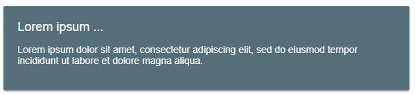
Card can be used as a wrapper of pure HTML content.
 <smart-card>
    <h2 class="card-title">Lorem ipsum ...</h2>
    <div class="card-comment">Lorem ipsum dolor sit amet, consectetur adipiscing elit, sed do eiusmod tempor incididunt ut labore et dolore magna aliqua.</div>
 </smart-card>
Card's content may be a template structure, using mustache syntax ({{propertyName}}). In this case must be used dataSource to fill the template with right values.
 <smart-card data-source='{"title":"Lorem ipsum ...", "content":"Lorem ipsum dolor sit amet, consectetur adipiscing elit, sed do eiusmod tempor incididunt ut labore et dolore magna aliqua."}'>
    <h2 class="card-title">{{title}}</h2>
    <div class="card-comment">{{content}}t</div>
 </smart-card>
Use template element in combination with proper dataSource.
 <smart-card item-template="customTemplate" data-source='{"title":"Lorem ipsum ...", "content":"Lorem ipsum dolor sit amet, consectetur adipiscing elit, sed do eiusmod tempor incididunt ut labore et dolore magna aliqua."}'></smart-card>
 <template id="customTemplate">
    <h2 class="card-title">{{title}}</h2>
    <div class="card-comment">{{content}}t</div>
 </template>
Demo
Combination of smart-card elements could be wrapped in smart-cards item. It's not required, but is useful for styling purposes.
 <smart-cards>
     <smart-card>
        <h2 class="card-title">Lorem ipsum ...</h2>
        <div class="card-comment">Lorem ipsum dolor sit amet, consectetur adipiscing elit, sed do eiusmod tempor incididunt ut labore et dolore magna aliqua.</div>
     </smart-card>
     <smart-card>
        <h2 class="card-title">Lorem ipsum ...</h2>
        <div class="card-comment">Lorem ipsum dolor sit amet, consectetur adipiscing elit, sed do eiusmod tempor incididunt ut labore et dolore magna aliqua.</div>
     </smart-card>
     <smart-card>
        <h2 class="card-title">Lorem ipsum ...</h2>
        <div class="card-comment">Lorem ipsum dolor sit amet, consectetur adipiscing elit, sed do eiusmod tempor incididunt ut labore et dolore magna aliqua.</div>
     </smart-card>
 </smart-cards>
Demo

Behavior
By defauld cards are used especially as a design pattern to deliver small pieces of information. Additionally could be added more interaction via JavaScript, using contentHandler callback.
 <script>
 window.onload = function () {
    let card= document.querySelector('smart-card');
    card.contentHandler = function(card) {
        var toggleBtn = card.getElementsByTagName('smart-toggle-button')[0],
            content = card.querySelector('.card-content');
        toggleBtn.addEventListener('click', function () {
            content.classList.toggle('hidden');
        });
    };
 }
 </script>
Demo