Build your web apps using Smart UI
Smart.DockingLayout - configuration and usage
Overview
Smart.DockingLayout represents a flexible layout control that allows custom layout creation. The element consists of Smart.TabsWindow items that can be re-arranged by dragging to construct a different layout. Every item can contain any HTML.
To initialize a DockingLayout element the user has to include the following files to the head of the page:
Getting Started with DockingLayout Web Component
Smart UI for Web Components is distributed as smart-webcomponents NPM package. You can also get the full download from our website with all demos from the Download page.Setup the DockingLayout
Smart UI for Web Components is distributed as smart-webcomponents NPM package
- Download and install the package.
npm install smart-webcomponents
- Once installed, import the DockingLayout module in your application.
<script type="module" src="node_modules/smart-webcomponents/source/modules/smart.dockinglayout.js"></script>
-
Adding CSS reference
The smart.default.css CSS file should be referenced using following code.
<link rel="stylesheet" type="text/css" href="node_modules/smart-webcomponents/source/styles/smart.default.css" />
- Add the DockingLayout tag to your Web Page
<smart-docking-layout id="dockinglayout"></smart-docking-layout>
- Create the DockingLayout Component
<script type="module"> Smart('#dockinglayout', class { get properties() { return { layout: [ { type: 'LayoutGroup', orientation: 'horizontal', items: [ { type: 'LayoutGroup', items: [ { type: 'LayoutPanel', id: 'tabPanel', label: 'Input', items: [{ label: 'TextBox Tab', content: 'Write more text here ... ' }, { label: 'Slider Tab', content: '' }] }, { type: 'LayoutPanel', label: 'Output', items: [ { id: 'outputTab', label: 'Output', headerPosition: 'none', content: 'Write more text here ...' } ] } ], orientation: 'vertical' }, { id: 'item0', label: 'Tabs 0', items: [{ label: 'Tab A', selected: true, content: 'What is Lorem Ipsum? ' + 'Lorem Ipsum is simply dummy text of the printing and typesetting industry. Lorem Ipsum has been the industry's standard dummy text ever since the 1500s, when an unknown printer took a galley of' + 'type and scrambled it to make a type specimen book. It has survived not only five centuries, but also the leap into electronic typesetting, remaining essentially unchanged. It was popularised in ' + 'the 1960s with the release of Letraset sheets containing Lorem Ipsum passages, and more recently with desktop publishing software like Aldus PageMaker including versions of Lorem Ipsum. ' + 'Why do we use it? ' + 'It is a long established fact that a reader will be distracted by the readable content of a page when looking at its layout. The point of using Lorem Ipsum is that it has a more-or-less normal ' + 'distribution of letters, as opposed to using 'Content here, content here', making it look like readable English. Many desktop publishing packages and web page editors now use Lorem Ipsum as their' + 'default model text, and a search for 'lorem ipsum' will uncover many web sites still in their infancy. Various versions have evolved over the years, sometimes by accident, sometimes on ' + 'purpose (injected humour and the like).' }] }] }] } } }); </script>
Another option is to create the DockingLayout is by using the traditional Javascript way:
	const dockinglayout = document.createElement('smart-docking-layout');

	dockinglayout.disabled = true;
	document.body.appendChild(dockinglayout);
Smart framework provides a way to dynamically create a web component on demand from a DIV tag which is used as a host. The following imports the web component's module and creates it on demand, when the document is ready. The #dockinglayout is the ID of a DIV tag.
import "../../source/modules/smart.dockinglayout.js"; document.readyState === 'complete' ? init() : window.onload = init; function init() { const dockinglayout = new Smart.DockingLayout('#dockinglayout', { layout: [ { type: 'LayoutGroup', orientation: 'horizontal', items: [ { type: 'LayoutGroup', items: [ { type: 'LayoutPanel', id: 'tabPanel', label: 'Input', items: [{ label: 'TextBox Tab', content: 'Write more text here ... ' }, { label: 'Slider Tab', content: '' }] }, { type: 'LayoutPanel', label: 'Output', items: [ { id: 'outputTab', label: 'Output', headerPosition: 'none', content: 'Write more text here ...' } ] } ], orientation: 'vertical' }, { id: 'item0', label: 'Tabs 0', items: [{ label: 'Tab A', selected: true, content: 'What is Lorem Ipsum? ' + 'Lorem Ipsum is simply dummy text of the printing and typesetting industry. Lorem Ipsum has been the industry's standard dummy text ever since the 1500s, when an unknown printer took a galley of' + 'type and scrambled it to make a type specimen book. It has survived not only five centuries, but also the leap into electronic typesetting, remaining essentially unchanged. It was popularised in ' + 'the 1960s with the release of Letraset sheets containing Lorem Ipsum passages, and more recently with desktop publishing software like Aldus PageMaker including versions of Lorem Ipsum. ' + 'Why do we use it? ' + 'It is a long established fact that a reader will be distracted by the readable content of a page when looking at its layout. The point of using Lorem Ipsum is that it has a more-or-less normal ' + 'distribution of letters, as opposed to using 'Content here, content here', making it look like readable English. Many desktop publishing packages and web page editors now use Lorem Ipsum as their' + 'default model text, and a search for 'lorem ipsum' will uncover many web sites still in their infancy. Various versions have evolved over the years, sometimes by accident, sometimes on ' + 'purpose (injected humour and the like).' }] }] }] }); }
- Open the page in your web server.
Defining the Layout
In order to create a layout the user has to create a JSON Array and pass it to the layout property. The Array must contain objects describing the items of the layout and their settings. The element can have two types of items:
-
LayoutPanel - Represents a DockingLayout item. This type of items hold the content that the user wants to load. DockingLayout items are smartTabsWindow instances and as such they can have an unlimited number ot TabItems inside them.
Let's take a closer look at a LayoutItem's definition:
    const item = {
                   type: 'LayoutPanel',
                   label: 'TabsWindow A',
                   size: '45%',
                   max: 400,
                   headerButtons: ['customButton1', 'customButton2'],
                   items: [{
                           label: 'Tab A1',
                           content: 'Content of A1'
                       },
                       {
                           label: 'Tab A2',
                           selected: true,
                           content: 'Content of A2'
                       },
                       {
                           label: 'Tab A3',
                           content: '<smart-slider value="25"></smart-slider>'
                       }
                    ]
                };
Every 'LayoutPanel' (DockingLayout item) has an items attribute of type Array that describes the it's TabIems and their content. In the current example we have three TabItems. Each with different content. The content can be a string or any HTML code including a Smart Custom Element.
Here's how to create a LayoutPanel item with a single TabItem with content:
<!DOCTYPE html>
<html>
<head>
 <link rel="stylesheet" href=../../source/styles/smart.default.css" type="text/css" />
 <script type="text/javascript" src="../../source/smart.element.js"></script>
 <script type="text/javascript" src="../../source/smart.button.js"></script>
 <script type="text/javascript" src="../../source/smart.splitter.js"></script>
<script type="text/javascript" src="../../source/smart.tabs.js"></script>
<script type="text/javascript" src="../../source/smart.window.js"></script>
<script type="text/javascript" src="../../source/smart.dockinglayout.js"></script>
<script>
    window.onload = function() {
    const dockingLayout = document.querySelector('smart-docking-layout');

    dockingLayout.layout = [
        {
            //The Base Group
            type: 'LayoutGroup',
            orientation: 'horizontal',
            items: [
                {
                    //DockingLayout Item A
                    type: 'LayoutPanel',
                    label: 'TabsWindow A',
                    size: '75%',
                    items: [{
                        //Tab Item A1 of Item A
                        label: 'Tab A1',
                        content: 'Content of A1'
                    }]
                },
                {
                    //DockingLayout Item B
                    type: 'LayoutPanel',
                    label: 'TabsWindow B',
                    size: '25%',
                    items: [{
                        //Tab Item B1 of Item B
                        label: 'Tab B1',
                        content: 'Content of B1'
                    }]
                }]
        }];
    }
</script>
</head>
<body>
    <smart-docking-layout></smart-docking-layout>
</body>
</html>
Demo
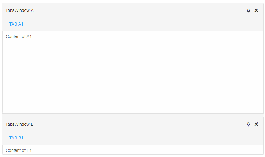
Every layout structure begins with the 'Base Group'. It's the root of the layout. It's not mandatory to include it every time when defining a new layout but in order to change the default orientation of the base layout, it has to be included. In the following scenario we have defined two DockingLayout items of type 'LayoutPanel' which are nested inside the base group with orientation set to 'horizontal'. If the orientaiton property is not set it's default value is 'vertical'.
If the same layout is defined without the 'Base Group' the result will be the same but the items will be vertically oriented:
<!DOCTYPE html> <html> <head> <link rel="stylesheet" href=../../source/styles/smart.default.css" type="text/css" /> <script type="text/javascript" src="../../source/smart.element.js"></script> <script type="text/javascript" src="../../source/smart.button.js"></script> <script type="text/javascript" src="../../source/smart.splitter.js"></script> <script type="text/javascript" src="../../source/smart.tabs.js"></script> <script type="text/javascript" src="../../source/smart.window.js"></script> <script type="text/javascript" src="../../source/smart.dockinglayout.js"></script> <script> window.onload = function() { const dockingLayout = document.querySelector('smart-docking-layout'); dockingLayout.layout = [ { //DockingLayout Item A type: 'LayoutPanel', label: 'TabsWindow A', size: '75%', items: [{ //Tab Item A1 of Item A label: 'Tab A1', content: 'Content of A1' }] }, { //DockingLayout Item B type: 'LayoutPanel', label: 'TabsWindow B', size: '25%', items: [{ //Tab Item B1 of Item B label: 'Tab B1', content: 'Content of B1' }] }]; </script> </head> <body> <smart-docking-layout></smart-docking-layout> </body> </html> -
LayoutGroup - Represents a group of items. When the user wants to create a group of items they must be defined as part of a LayoutGroup.
Let's take a closer look at a LayoutGroup's definition:
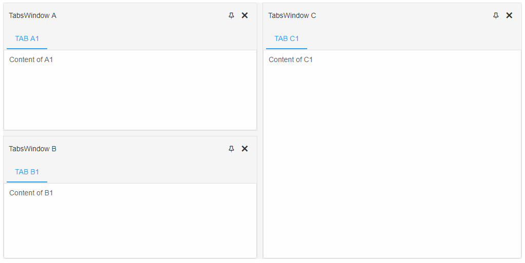
                const itemGroup =  {
                    //A Panel Group
                    type: 'LayoutGroup',
                    orientation: 'horizontal',
                    size: 25%,
                    resizeMode: 'none',
                    items: [
                        {
                            //DockingLayout Item A
                            type: 'LayoutPanel',
                            label: 'TabsWindow A',
                            size: '50%',
                            items: [{
                                //Tab Item A1 of Item A
                                label: 'Tab A1',
                                content: 'Content of A1'
                            }]
                        },
                        {
                            //DockingLayout Item B
                            type: 'LayoutPanel',
                            label: 'TabsWindow B',
                            size: '50%',
                            items: [{
                                //Tab Item B1 of Item B
                                label: 'Tab B1',
                                content: 'Content of B1'
                            }]
                        }
                    ]
                };
The LayoutGroup contains two LayoutPanels - 'TabsWindow A' and 'tabsWindow B'. Each panel has one TabItem - 'Tab A1' and 'Tab B1' with content set. LayoutGroup properties can be applied the same was as with LayoutPanels since they are also DockingLayout items. LayoutGroups have some additional properties like orientation and resizeMode. Items property of a 'LayoutGroup' defines the LayoutPanels of that group.
Here's how to define a DockingLayout group with two items:
<!DOCTYPE html>
<html>
<head>
 <link rel="stylesheet" href=../../source/styles/smart.default.css" type="text/css" />
 <script type="text/javascript" src="../../source/smart.element.js"></script>
 <script type="text/javascript" src="../../source/smart.button.js"></script>
 <script type="text/javascript" src="../../source/smart.splitter.js"></script>
<script type="text/javascript" src="../../source/smart.tabs.js"></script>
<script type="text/javascript" src="../../source/smart.window.js"></script>
<script type="text/javascript" src="../../source/smart.dockinglayout.js"></script>
<script>
    window.onload = function() {
    const dockingLayout = document.querySelector('smart-docking-layout');

    dockingLayout.layout = [
        {
            //The Base Group
            type: 'LayoutGroup',
            items: [

                {
                    //A new Horizontal Panel Group
                    type: 'LayoutGroup',
                    orientation: 'horizontal',
                    items: [
                        {
                            //DockingLayout Item A
                            type: 'LayoutPanel',
                            label: 'TabsWindow A',
                            size: '50%',
                            items: [{
                                //Tab Item A1 of Item A
                                label: 'Tab A1',
                                content: 'Content of A1'
                            }]
                        },
                        {
                            //DockingLayout Item B
                            type: 'LayoutPanel',
                            label: 'TabsWindow B',
                            size: '50%',
                            items: [{
                                //Tab Item B1 of Item B
                                label: 'Tab B1',
                                content: 'Content of B1'
                            }]
                        }
                    ]
                },
                {
                    //DockingLayout Item C
                    type: 'LayoutPanel',
                    label: 'TabsWindow C',
                    size: '50%',
                    items: [{
                        //Tab Item C1 of Item C
                        label: 'Tab C1',
                        content: 'Content of C1'
                    }]
                }
            ]
        }];
    }
</script>
</head>
<body>
    <smart-docking-layout></smart-docking-layout>
</body>
</html>
The JSON structure used in the above example creates one horizontal LayoutGroup that contains two LayoutPanels. Each panel contains one item with content. The Base group has a default orientation of 'vertical' since it's not set.
Demo
DockingLayout element has three types of items depending on their position - docked, autoHide, undocked/floating.
-
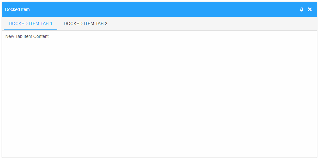
Docked items are indexed according to their position in the hierarchy starting from left to right. The API provides a getter called items that can be used to get a collection of all docked items inside the layout.
Note:
Docked items can be closed by pressing the close button in the header section or pressing the Escape button on the keyboard while the LayoutPanel is focused. Closed items are removed from the DOM but the DockingLayout keeps a reference to them. A collection of all closed items can be retrieved by calling the getter closedItems. These items can be re-inserted back inside the Layout at any time by calling one of the insert methods.All items inside the Base group are docked. Here's a simple dock item object definition:
    const dockingLayout = document.querySelector('smart-docking-layout'),
        dockedItem =
            {
                label: 'Docked Item',
                items: [{
                    label: 'Docked Item Tab 1',
                    content: 'New Tab Item Content'
                },
                {
                    label: 'Docked Item Tab 2',
                    content: 'New Tab Item Content'
                }]
            };

    //Insert's a new docked item as the first item in the layout
    dockingLayout.insertBeforeItem(0, dockedItem);
Demo
-
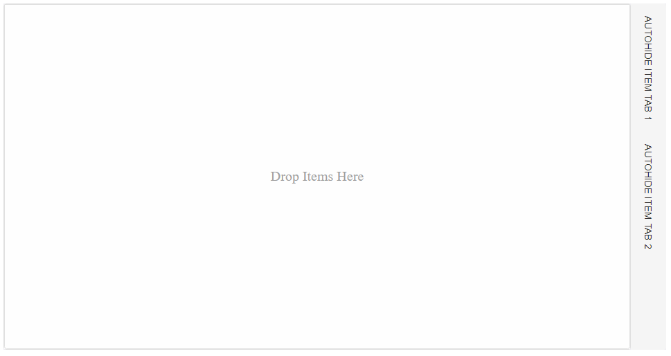
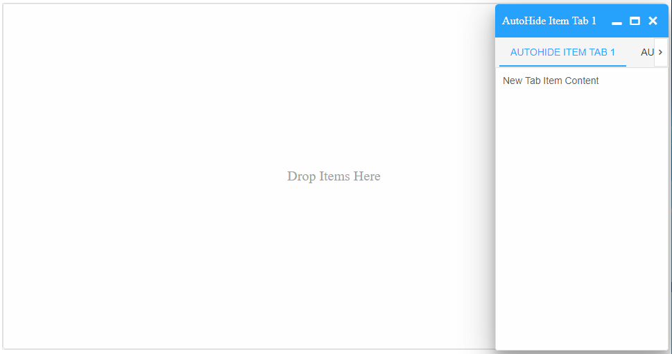
AutoHide items are not like the docked items. These items are position on the sides of the element and display a bar of labels that represent the TabItems of the autoHidden item. When clicking on a label an autoHide window popup opens and displays the content of the selected tab item. AutoHide items can be docked or undocked at any time by calling the appropriate method and passing their instance/index or ID. In order to a collection of all autoHide items inside the DockingLayout, a getter called autoHideItems is provided.
    const dockingLayout = document.querySelector('smart-docking-layout'),
        autoHideItem =
            {
                label: 'AutoHide Item',
                autoHide: true,
                autoHidePosition: 'right',
                items: [{
                    label: 'AutoHide Item Tab 1',
                    content: 'New Tab Item Content'
                },
                {
                    label: 'AutoHide Item Tab 2',
                    content: 'New Tab Item Content'
                }]
            };

    //Insert's a new item to the Base group and autoHide's it.
    dockingLayout.insertLayoutRight(autoHideItem);
Note:
All Docked items can become autoHide items by calling one of the following methods: autoHideBottom, autoHideTop, autoHideLeft and autoHideRight. These methods accept only one argument - the docked item that to become autoHidden.Demo
-
Undocked/Floating items are smartTabsWindow elements that are not part of the layout but can be inserted back in at any time by dragging them back inside. Undocked items exist on their own inside the DOM and like every other window they can be minimized, maximized or closed. In order to get a collection of all undocked/floating items, a getter called undockedItems is provided.
    const dockingLayout = document.querySelector('smart-docking-layout'),
       dockedItems = dockingLayout.items;

    //Undocks the first item from the DockingLayout
    dockingLayout.undock(dockedItems[0]);
Note:
To undock a LayoutPanel it has to be part of the DockingLayout. Docked or AutoHide items can be undocked/floated at any time by calling the undock method. Undock method accepts only one argument - the item to be undocked.Demo
Modifying The Layout
The element has several methods for item modification available in the API docs.
Some methods and operations require the user to know the index of a specific docked item. The getIndex method returns the index of a docked item. The method accepts one argument - an instance of a docked item. The expected result is a numeric value representing it's index.
There are several methods for item inserting:
- To insert a new item in the Base Group the user can use one of the following methods, depending on the desired position: insertLayoutTop, insertLayoutBottom, insertLayoutLeft, insertLayoutRight
- To insert a new item before or after an existing item at it's level of hierarchy the following methods are available: insertBeforeItem, insertAfterItem.
- To insert a a new item at a specific position by splitting an existing item in two can be done via the following methods: insertIntoLeft, insertIntoRight, insertIntoTop, insertIntoBottom.
- To insert a new item outside of an existing item's group by keeping the group unchaged at a specified position can be accomplished with the following methods: insertOutsideTargetGroupTop, insertOutsideTargetGroupBottom, insertOutsideTargetGroupLeft, insertOutsideTargetGroupRight.
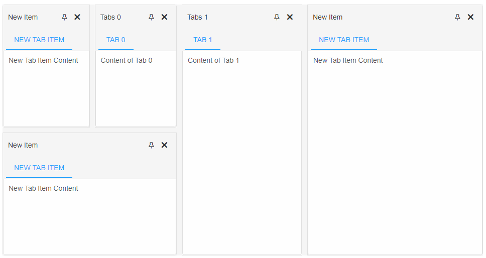
All insert methods accept two aruments. First is the target item. It can be it's index inside the DockingLayout, the reference or the ID if it has been set by the user in the initialization JSON. The second argument is a new object describing a LayoutPanel item or an actual smartTabsWindow instance.
    const dockingLayout = document.querySelector('smart-docking-layout'),
        newItem =
            {
                label: 'New Item',
                size: '50%',
                items: [{
                    label: 'New Tab Item',
                    content: 'New Tab Item Content'
                }]
            };

    //Creating a Layout with two LayoutPanels
    dockingLayout.layout = [
        {
            type: 'LayoutPanel',
            label: 'Tabs 0',
            size: '50%',
            items: [{
                label: 'Tab 0',
                content: 'Content of Tab 0'
            }]
        },
        {
            type: 'LayoutPanel',
            label: 'Tabs 1',
            items: [{
                label: 'Tab 1',
                content: 'Content of Tab 1',
            }]
        }
    ];

    //Insert's a new item at position 0 by splitting the target in two and placing the new item on the left
    dockingLayout.insertIntoLeft(0, newItem);

    //Insert's a new item at position 0 by keeping the target LayoutGroup together as one LayoutPanel and placing the new below it
    dockingLayout.insertOutsideTargetGroupBottom(0, newItem);

    //Insert's a new item on the right side in the Base group ( Top level hierarchy item inserting)
    dockingLayout.insertLayoutRight(newItem);
Demo
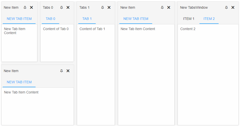
Items can also be inserted via the traditional appendChild method:
    const dockingLayout = document.querySelector('smart-docking-layout'),
          tabsWindow = document.createElement('smart-tabs-window');

    tabsWindow.label = 'New TabsWindow';
    tabsWindow.dataSource =  [{
            label: 'Item 1',
            content: 'Content 1'
        },
        {
            label: 'Item 2',
            content: 'Content 2',
            selected: true
        }];

    //Insert's the new item to the end of the Base group
    dockingLayout.appendChild(tabsWindow);
Demo
DockingLayout items can be dynamically removed as well. Two methods are available for item removing:
- removeChild - accepts one argument - the item to be removed from the DockingLayout.
- remove - accepts one argument - a reference to a docked item inside the DockingLayout, it's index or ID. Removes the target item from the layout and the DOM.
- removeAll - removes all items from the DockingLayout.
Items can also be inserted via the traditional appendChild method:
    const dockingLayout = document.querySelector('smart-docking-layout');

        //Creating a Layout with two LayoutPanels
        dockingLayout.layout = [
            {
                type: 'LayoutPanel',
                label: 'Tabs 0',
                items: [{
                    label: 'Tab 0',
                    content: 'Content of Tab 0'
                }]
            },
            {
                type: 'LayoutPanel',
                label: 'Tabs 1',
                items: [{
                    label: 'Tab 1',
                    content: 'Content of Tab 1',
                }]
            },
            {
                type: 'LayoutPanel',
                id: 'itemToRemove',
                label: 'Tabs 3',
                items: [{
                    label: 'Tab 3',
                    content: 'Content of Tab 3',
                }]
            }
        ];

    const dockingLayoutItems = dockingLayout.items;

    //Removes the first item from the DockingLayout
    dockingLayout.removeChild(dockingLayoutItems[0]);

    //Removes the second item from the DockingLayout
    dockingLayout.remove('itemToRemove');

    //Removes all items
    dockingLayout.removeAll();
Updating
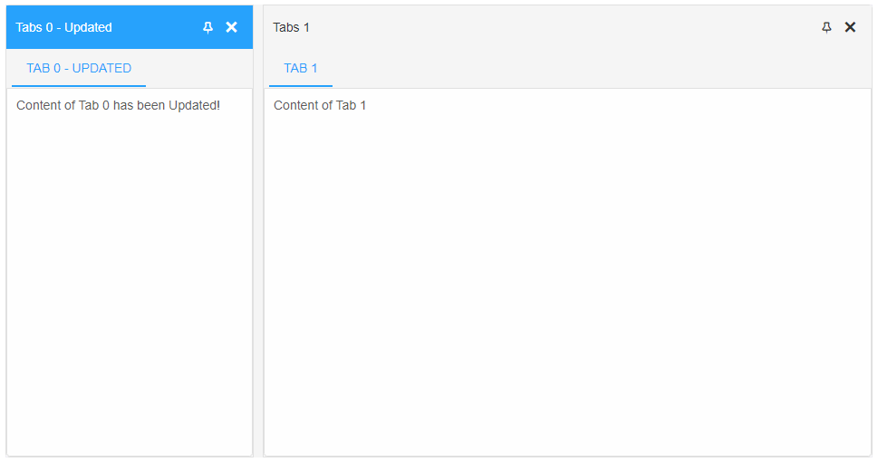
The DockingLayout items can be updated after the layout has been initialized via the update method. It accepts two arguments: a reference to a docked item and a settings object containing the new settings for the item. The settings object follows the same pattern as LayoutPanel item definition:
const dockingLayout = document.querySelector('smart-docking-layout'),
      layoutPanel = dockingLayout.items[0],
      settings = {
                size: '250', label: layoutPanel.label + '- Updated',
                items: [{
                    index: 0, label: layoutPanel.items[0].label + ' - Updated',
                    content: layoutPanel.items[0].textContent + ' has been Updated!'
                }]
            };

       dockingLayout.layout = [
                {
                    type: 'LayoutPanel',
                    label: 'Tabs 0',
                    size: '50%',
                    items: [{
                        label: 'Tab 0',
                        content: 'Content of Tab 0'
                    }]
                },
                {
                    type: 'LayoutPanel',
                    label: 'Tabs 1',
                    items: [{
                        label: 'Tab 1',
                        content: 'Content of Tab 1',
                    }]
                }
            ];

    //Updates the TabItem with index 0
    dockingLayout.update(layoutPanel, settings);
Note: Each DockingLayout item (LayoutPanel) has a getter called 'items' that returns an array of all TabItems inside the window.
The items attribute of the settings object represents an Array of objects. Each object contains TabItem properties with new values assigned to them. Update method will update those items that have a matching index. In this case the updated TabItem is the one with index 0.
Demo
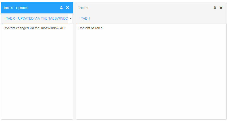
Since the LayoutPanel items are actual smartTabsWindows, their API methods can also be used to make changes:
const dockingLayout = document.querySelector('smart-docking-layout'),
      items = dockingLayout.items,
      layoutPanel = items[0],
      layoutPanelItem = layoutPanel.items[0];

    //Updates the first TabItem of the LayoutPanel with index 0 inside the DockingLayout
    layoutPanel.update(layoutPanelItem.index, layoutPanelItem.label + 'via the TabsWindow API', 'Content changed via the TabsWindow API!');
Note: TabItems can be removed or inserted as well as updated. Check smartTabsWindow API to see the full list of available options.
Demo
Save/Load State
The users of the DockingLayout can make changes to the layout by interacting with the element. Some might have a favorite layout or want to save the current state and continued later with it or just get back to. The element offers the following methods for state handling:
- getState - returns an array of objects describing the current structure of the DockingLayout. The array includes references to actual LayoutPanels which are stored untill the user refreshes the page. This is very helpfull in cases where the user wants to keeps a history of the layout changes and wants to quickly revert to a previous one along with the current data inside the items.
- getJSONStructure - returns a JSON array describing the current structure of the DockingLayout. The array does NOT include a references to LayoutPanels. Suitable for cases where the user wants only the layout structure of the items and not their content. This type of structure can be saved to localStorage and reloaded after page refresh.
- saveState - saves the current layout structure to the localStorage by using the ID of the DockingLayout if it's provided. If no id is provided a console warn is thrown and the operation is aborted. This method uses getJSONStructure to get the current state of the element.
- loadState - loads a previously saved layout. The method accepts an optional argument that represents an Array of a valid DockngLayout structure. If no arguments are provided, which is the case by default, the element will do a localStorage lookup using it's ID in an attempt to find a valid layout and load it. If the element has no ID, a console warn is thrown and the operaton is aborted.
const dockingLayout = document.querySelector('smart-docking-layout'),
      dockingLayoutItems = dockingLayout.items,
      currentState = dockingLayout.getState();

dockingLayout.remove(dockingLayoutItems[0]);
//... make additional changes

//The layout is revered to the saved state
dockingLayout.loadState(currentState);
Keyboard Support
smartDockingLayout implements the following key actions:
| Key | Action |
|---|---|
| Escape | Pressing the 'Escape' key during dragging operation cancels it and returns the dragged item to it's original place. |
| Tab | Pressing Tab will change the focus of the different items inside the DockingLayout. |
Create, Append, Remove, Get/Set Property, Invoke Method, Bind to Event
Create a new element:
const dockinglayout = document.createElement('smart-docking-layout');
Append it to the DOM:
document.body.appendChild(dockinglayout);
Remove it from the DOM:
dockinglayout.parentNode.removeChild(dockinglayout);
Set a property:
dockinglayout.propertyName = propertyValue;
Get a property value:
const propertyValue = dockinglayout.propertyName;
Invoke a method:
dockinglayout.methodName(argument1, argument2);
Add Event Listener:
	const eventHandler = (event) => {
	   // your code here.
	};

	dockinglayout.addEventListener(eventName, eventHandler);
Remove Event Listener:
dockinglayout.removeEventListener(eventName, eventHandler, true);
Using with Typescript
Smart Web Components package includes TypeScript definitions which enables strongly-typed access to the Smart UI Components and their configuration.
Inside the download package, the typescript directory contains .d.ts file for each web component and a smart.elements.d.ts typescript definitions file for all web components. Copy the typescript definitions file to your project and in your TypeScript file add a reference to smart.elements.d.ts
Read more about using Smart UI with Typescript.Getting Started with Angular DockingLayout Component
Setup Angular Environment
Angular provides the easiest way to set angular CLI projects using Angular CLI tool.
Install the CLI application globally to your machine.
npm install -g @angular/cli
Create a new Application
ng new smart-angular-dockinglayout
Navigate to the created project folder
cd smart-angular-dockinglayout
Setup the DockingLayout
Smart UI for Angular is distributed as smart-webcomponents-angular NPM package
- Download and install the package.
Quick Setup with ng-add
Smart Angular UI comes packaged with Angular CLI schematics to make creating Material applications easier. Schematics are included with both @angular/cdk and smart-webcomponents-angular. Once you install the npm packages, they will be available through the Angular CLI.Angular CLI supports the addition of packages through the ng add command. The ng add command provides faster and more user-friendly package installation. To install the Smart UI for Angular package use ng add and add the name of the NPM package.
ng add smart-webcomponents-angular
The ng add smart-webcomponents-angular command executes the following actions:
- Adds the smart-webcomponents-angular package as a dependency.
- Imports the Modules in the current application module.
- Registers the default Smart UI theme in the angular.json file.
- Adds all required peer dependencies to package.json.
- Triggers npm install to install the theme and all peer packages that are added.
Manual Setup
npm install smart-webcomponents-angular
- Adding CSS reference
The following CSS file is available in ../node_modules/smart-webcomponents-angular/ package folder. This can be referenced in [src/styles.css] using following code.@import 'smart-webcomponents-angular/source/styles/smart.default.css';
Another way to achieve the same is to edit the angular.json file and in the styles add the style."styles": [ "node_modules/smart-webcomponents-angular/source/styles/smart.default.css" ]
If you want to use Bootstrap, Fluent or other themes available in the package, you need to add them after 'smart.default.css'. -
Example with Angular Standalone Components
app.component.html
 <smart-docking-layout #docking [layout]="layout"></smart-docking-layout>
<smart-slider #slider (onChange)="handleSliderChange($event)"></smart-slider>
<smart-multiline-text-box #multilinetextbox (onChange)="handleMultilineTextBoxChange($event)">Write more text here ...</smart-multiline-text-box>
app.component.ts
 import { Component, ViewChild, AfterViewInit, ViewEncapsulation, Inject, ElementRef, ViewContainerRef } from '@angular/core';
import { Smart, DockingLayoutComponent } from 'smart-webcomponents-angular/dockinglayout';
import { SliderComponent } from 'smart-webcomponents-angular/slider';
import { MultilineTextBoxComponent } from 'smart-webcomponents-angular/multilinetextbox';

import { CommonModule } from '@angular/common';
import { RouterOutlet } from '@angular/router';
import { DockingLayoutModule } from 'smart-webcomponents-angular/dockinglayout';

@Component({
    selector: 'app-root',
	standalone: true,
	imports: [CommonModule, DockingLayoutModule, RouterOutlet],
    templateUrl: './app.component.html',
    styleUrls: ['app.component.css'],
    encapsulation: ViewEncapsulation.None
})

export class AppComponent implements AfterViewInit {
    @ViewChild('slider', { read: SliderComponent, static: false }) slider!: SliderComponent;
    @ViewChild('multilinetextbox', { read: MultilineTextBoxComponent, static: false }) multilinetextbox!: MultilineTextBoxComponent;
    @ViewChild('docking', { read: DockingLayoutComponent, static: false }) docking!: DockingLayoutComponent;

    layout = [
        {
            type: 'LayoutGroup',
            orientation: 'horizontal',
            items: [
                {
                    type: 'LayoutGroup',
                    items: [
                        {
                            type: 'LayoutPanel',
                            id: 'tabPanel',
                            label: 'Input',
                            items: [{
                                label: 'TextBox Tab',
                                content: ''
                            },
                            {
                                label: 'Slider Tab',
                                content: ''
                            }],
                            size: '50%'
                        },
                        {
                            type: 'LayoutPanel',
                            label: 'Output',
                            items: [
                                {
                                    id: 'outputTab',
                                    label: 'Output',
                                    headerPosition: 'none',
                                    content: 'Lorem Ipsum is simply dummy text of the printing and typesetting industry.'
                                }
                            ]
                        }
                    ],
                    orientation: 'vertical',
                    size: '50%'
                },
                {
                    id: 'item0',
                    label: 'Tabs 0',
                    items: [{
                        label: 'Tab A',
                        selected: true,
                        content: 'What is Lorem Ipsum?\n' +
                            'Lorem Ipsum is simply dummy text of the printing and typesetting industry. Lorem Ipsum has been the industry\'s standard dummy text ever since the 1500s, when an unknown printer took a galley of' + 'type and scrambled it to make a type specimen book. It has survived not only five centuries, but also the leap into electronic typesetting, remaining essentially unchanged. It was popularised in ' + 'the 1960s with the release of Letraset sheets containing Lorem Ipsum passages, and more recently with desktop publishing software like Aldus PageMaker including versions of Lorem Ipsum.\n' +
                            'Why do we use it?\n' +
                            'It is a long established fact that a reader will be distracted by the readable content of a page when looking at its layout. The point of using Lorem Ipsum is that it has a more-or-less normal ' + 'distribution of letters, as opposed to using \'Content here, content here\', making it look like readable English. Many desktop publishing packages and web page editors now use Lorem Ipsum as their' + 'default model text, and a search for \'lorem ipsum\' will uncover many web sites still in their infancy. Various versions have evolved over the years, sometimes by accident, sometimes on ' + 'purpose (injected humour and the like).'
                    }]
                }]
        }];

    handleMultilineTextBoxChange(event: Event) {
        if (document.getElementById('outputTab')) {
            const target = event.target as MultilineTextBoxComponent
            document.getElementById('outputTab')!.innerHTML = target?.value;
        }
    }

    handleSliderChange(event: CustomEvent) {
        if (document.getElementById('outputTab')) {
            document.getElementById('outputTab')!.innerHTML = event.detail.value;
        }
    }

    ngAfterViewInit(): void {
        this.docking.update('tabPanel',
            {
                type: 'LayoutPanel',
                id: 'tabPanel',
                label: 'Input',
                items: [{
                    index: 0,
                    label: 'TextBox Tab',
                    content: this.multilinetextbox.nativeElement
                },
                {
                    index: 1,
                    label: 'Slider Tab',
                    content: this.slider.nativeElement
                }],
                size: '50%'
            }
        );
    }
}
-
Example with Angular NGModule
app.component.html
 <smart-docking-layout #docking [layout]="layout"></smart-docking-layout>
<smart-slider #slider (onChange)="handleSliderChange($event)"></smart-slider>
<smart-multiline-text-box #multilinetextbox (onChange)="handleMultilineTextBoxChange($event)">Write more text here ...</smart-multiline-text-box>
app.component.ts
 import { Component, ViewChild, AfterViewInit, ViewEncapsulation, Inject, ElementRef, ViewContainerRef } from '@angular/core';
import { Smart, DockingLayoutComponent } from 'smart-webcomponents-angular/dockinglayout';
import { SliderComponent } from 'smart-webcomponents-angular/slider';
import { MultilineTextBoxComponent } from 'smart-webcomponents-angular/multilinetextbox';

@Component({
    selector: 'app-root',
    templateUrl: './app.component.html',
    styleUrls: ['app.component.css'],
    encapsulation: ViewEncapsulation.None
})

export class AppComponent implements AfterViewInit {
    @ViewChild('slider', { read: SliderComponent, static: false }) slider!: SliderComponent;
    @ViewChild('multilinetextbox', { read: MultilineTextBoxComponent, static: false }) multilinetextbox!: MultilineTextBoxComponent;
    @ViewChild('docking', { read: DockingLayoutComponent, static: false }) docking!: DockingLayoutComponent;

    layout = [
        {
            type: 'LayoutGroup',
            orientation: 'horizontal',
            items: [
                {
                    type: 'LayoutGroup',
                    items: [
                        {
                            type: 'LayoutPanel',
                            id: 'tabPanel',
                            label: 'Input',
                            items: [{
                                label: 'TextBox Tab',
                                content: ''
                            },
                            {
                                label: 'Slider Tab',
                                content: ''
                            }],
                            size: '50%'
                        },
                        {
                            type: 'LayoutPanel',
                            label: 'Output',
                            items: [
                                {
                                    id: 'outputTab',
                                    label: 'Output',
                                    headerPosition: 'none',
                                    content: 'Lorem Ipsum is simply dummy text of the printing and typesetting industry.'
                                }
                            ]
                        }
                    ],
                    orientation: 'vertical',
                    size: '50%'
                },
                {
                    id: 'item0',
                    label: 'Tabs 0',
                    items: [{
                        label: 'Tab A',
                        selected: true,
                        content: 'What is Lorem Ipsum?\n' +
                            'Lorem Ipsum is simply dummy text of the printing and typesetting industry. Lorem Ipsum has been the industry\'s standard dummy text ever since the 1500s, when an unknown printer took a galley of' + 'type and scrambled it to make a type specimen book. It has survived not only five centuries, but also the leap into electronic typesetting, remaining essentially unchanged. It was popularised in ' + 'the 1960s with the release of Letraset sheets containing Lorem Ipsum passages, and more recently with desktop publishing software like Aldus PageMaker including versions of Lorem Ipsum.\n' +
                            'Why do we use it?\n' +
                            'It is a long established fact that a reader will be distracted by the readable content of a page when looking at its layout. The point of using Lorem Ipsum is that it has a more-or-less normal ' + 'distribution of letters, as opposed to using \'Content here, content here\', making it look like readable English. Many desktop publishing packages and web page editors now use Lorem Ipsum as their' + 'default model text, and a search for \'lorem ipsum\' will uncover many web sites still in their infancy. Various versions have evolved over the years, sometimes by accident, sometimes on ' + 'purpose (injected humour and the like).'
                    }]
                }]
        }];

    handleMultilineTextBoxChange(event: Event) {
        if (document.getElementById('outputTab')) {
            const target = event.target as MultilineTextBoxComponent
            document.getElementById('outputTab')!.innerHTML = target?.value;
        }
    }

    handleSliderChange(event: CustomEvent) {
        if (document.getElementById('outputTab')) {
            document.getElementById('outputTab')!.innerHTML = event.detail.value;
        }
    }

    ngAfterViewInit(): void {
        this.docking.update('tabPanel',
            {
                type: 'LayoutPanel',
                id: 'tabPanel',
                label: 'Input',
                items: [{
                    index: 0,
                    label: 'TextBox Tab',
                    content: this.multilinetextbox.nativeElement
                },
                {
                    index: 1,
                    label: 'Slider Tab',
                    content: this.slider.nativeElement
                }],
                size: '50%'
            }
        );
    }
}
app.module.ts
 import { NgModule } from '@angular/core';
import { BrowserModule } from '@angular/platform-browser';
import { FormsModule } from '@angular/forms';

import { AppComponent } from './app.component';
import { DockingLayoutModule } from 'smart-webcomponents-angular/dockinglayout';
import { TabsModule } from 'smart-webcomponents-angular/tabs';
import { TextBoxModule } from 'smart-webcomponents-angular/textbox';
import { SliderModule } from 'smart-webcomponents-angular/slider';
import { MultilineTextBoxModule } from 'smart-webcomponents-angular/multilinetextbox';

@NgModule({
    declarations: [AppComponent],
    imports: [BrowserModule, FormsModule, DockingLayoutModule, TabsModule, TextBoxModule, SliderModule, MultilineTextBoxModule],
    schemas: [],
	providers: [],
    bootstrap: [AppComponent]
})

export class AppModule { }
Running the Angular application
After completing the steps required to render a DockingLayout, run the following command to display the output in your web browser
ng serveand open localhost:4200 in your favorite web browser.
Read more about using Smart UI for Angular: https://www.htmlelements.com/docs/angular-cli/.
Getting Started with React DockingLayout Component
Setup React Environment
The easiest way to start with React is to use NextJS Next.js is a full-stack React framework. It’s versatile and lets you create React apps of any size—from a mostly static blog to a complex dynamic application.
npx create-next-app my-app
cd my-app
npm run dev
or
yarn create next-app my-app
cd my-app
yarn run dev
Preparation
Setup the DockingLayout
Smart UI for React is distributed as smart-webcomponents-react package
- Download and install the package.
In your React Next.js project, run one of the following commands to install Smart UI DockingLayout for ReactWith NPM:
npm install smart-webcomponents-react
With Yarn:yarn add smart-webcomponents-react
- Once installed, import the React DockingLayout Component and CSS files in your application and render it.
app.js
import 'smart-webcomponents-react/source/styles/smart.default.css';
import React from "react";
import ReactDOM from 'react-dom/client';
import { DockingLayout } from 'smart-webcomponents-react/dockinglayout';
import { Slider } from 'smart-webcomponents-react/slider';
import { MultilineTextBox } from 'smart-webcomponents-react/multilinetextbox';

class App extends React.Component {
	layout = [{
		type: 'LayoutGroup',
		orientation: 'horizontal',
		items: [{
			type: 'LayoutGroup',
			items: [{
				type: 'LayoutPanel',
				id: 'tabPanel',
				label: 'Input',
				items: [{
					label: 'TextBox Tab',
					content: '<div style="padding:10px;" id="firstContainer"></div>'
				},
				{
					label: 'Slider Tab',
					content: '<div style="padding:10px;" id="secondContainer"></div>'
				}
				]
			},
			{
				type: 'LayoutPanel',
				label: 'Output',
				items: [{
					id: 'outputTab',
					label: 'Output',
					headerPosition: 'none',
					content: 'Write more text here ...'
				}]
			}
			],
			orientation: 'vertical'
		},
		{
			id: 'item0',
			label: 'Tabs 0',
			items: [{
				label: 'Tab A',
				selected: true,
				content: 'What is Lorem Ipsum?\n' +
					'Lorem Ipsum is simply dummy text of the printing and typesetting industry. Lorem Ipsum has been the industry\'s standard dummy text ever since the 1500s, when an unknown printer took a galley of' + 'type and scrambled it to make a type specimen book. It has survived not only five centuries, but also the leap into electronic typesetting, remaining essentially unchanged. It was popularised in ' + 'the 1960s with the release of Letraset sheets containing Lorem Ipsum passages, and more recently with desktop publishing software like Aldus PageMaker including versions of Lorem Ipsum.\n' +
					'Why do we use it?\n' +
					'It is a long established fact that a reader will be distracted by the readable content of a page when looking at its layout. The point of using Lorem Ipsum is that it has a more-or-less normal ' + 'distribution of letters, as opposed to using \'Content here, content here\', making it look like readable English. Many desktop publishing packages and web page editors now use Lorem Ipsum as their' + 'default model text, and a search for \'lorem ipsum\' will uncover many web sites still in their infancy. Various versions have evolved over the years, sometimes by accident, sometimes on ' + 'purpose (injected humour and the like).'
			}]
		}
		]
	}];

	componentDidMount() {
	}

	handleReady() {
		ReactDOM.render(<MultilineTextBox />, document.querySelector("#firstContainer"));
		ReactDOM.render(<Slider />, document.querySelector("#secondContainer"));
	}

	render() {
		return (
			<div>
				<DockingLayout onReady={this.handleReady} layout={this.layout}>

				</DockingLayout>
			</div>
		);
	}
}


export default App;
Running the React application
Start the app withnpm run devor
yarn run devand open localhost:3000 in your favorite web browser to see the output.
Setup with Vite
Vite (French word for "quick", pronounced /vit/, like "veet") is a build tool that aims to provide a faster and leaner development experience for modern web projectsWith NPM:
npm create vite@latestWith Yarn:
yarn create viteThen follow the prompts and choose React as a project.
Navigate to your project's directory. By default it is 'vite-project' and install Smart UI for React
In your Vite project, run one of the following commands to install Smart UI DockingLayout for ReactWith NPM:
npm install smart-webcomponents-reactWith Yarn:
yarn add smart-webcomponents-reactOpen src/App.tsx App.tsx
import 'smart-webcomponents-react/source/styles/smart.default.css';
import React from "react";
import ReactDOM from 'react-dom/client';
import { DockingLayout } from 'smart-webcomponents-react/dockinglayout';
import { Slider } from 'smart-webcomponents-react/slider';
import { MultilineTextBox } from 'smart-webcomponents-react/multilinetextbox';

class App extends React.Component {
	layout = [{
		type: 'LayoutGroup',
		orientation: 'horizontal',
		items: [{
			type: 'LayoutGroup',
			items: [{
				type: 'LayoutPanel',
				id: 'tabPanel',
				label: 'Input',
				items: [{
					label: 'TextBox Tab',
					content: '<div style="padding:10px;" id="firstContainer"></div>'
				},
				{
					label: 'Slider Tab',
					content: '<div style="padding:10px;" id="secondContainer"></div>'
				}
				]
			},
			{
				type: 'LayoutPanel',
				label: 'Output',
				items: [{
					id: 'outputTab',
					label: 'Output',
					headerPosition: 'none',
					content: 'Write more text here ...'
				}]
			}
			],
			orientation: 'vertical'
		},
		{
			id: 'item0',
			label: 'Tabs 0',
			items: [{
				label: 'Tab A',
				selected: true,
				content: 'What is Lorem Ipsum?\n' +
					'Lorem Ipsum is simply dummy text of the printing and typesetting industry. Lorem Ipsum has been the industry\'s standard dummy text ever since the 1500s, when an unknown printer took a galley of' + 'type and scrambled it to make a type specimen book. It has survived not only five centuries, but also the leap into electronic typesetting, remaining essentially unchanged. It was popularised in ' + 'the 1960s with the release of Letraset sheets containing Lorem Ipsum passages, and more recently with desktop publishing software like Aldus PageMaker including versions of Lorem Ipsum.\n' +
					'Why do we use it?\n' +
					'It is a long established fact that a reader will be distracted by the readable content of a page when looking at its layout. The point of using Lorem Ipsum is that it has a more-or-less normal ' + 'distribution of letters, as opposed to using \'Content here, content here\', making it look like readable English. Many desktop publishing packages and web page editors now use Lorem Ipsum as their' + 'default model text, and a search for \'lorem ipsum\' will uncover many web sites still in their infancy. Various versions have evolved over the years, sometimes by accident, sometimes on ' + 'purpose (injected humour and the like).'
			}]
		}
		]
	}];

	componentDidMount() {
	}

	handleReady() {
		ReactDOM.render(<MultilineTextBox />, document.querySelector("#firstContainer"));
		ReactDOM.render(<Slider />, document.querySelector("#secondContainer"));
	}

	render() {
		return (
			<div>
				<DockingLayout onReady={this.handleReady} layout={this.layout}>

				</DockingLayout>
			</div>
		);
	}
}


export default App;
Read more about using Smart UI for React: https://www.htmlelements.com/docs/react/.
Getting Started with Vue DockingLayout Component
Setup Vue with Vite
In this section we will introduce how to scaffold a Vue Single Page Application on your local machine. The created project will be using a build setup based on Vite and allow us to use Vue Single-File Components (SFCs). Run the following command in your command linenpm create vue@latestThis command will install and execute create-vue, the official Vue project scaffolding tool. You will be presented with prompts for several optional features such as TypeScript and testing support:
✔ Project name: …If you are unsure about an option, simply choose No by hitting enter for now. Once the project is created, follow the instructions to install dependencies and start the dev server:✔ Add TypeScript? … No / Yes ✔ Add JSX Support? … No / Yes ✔ Add Vue Router for Single Page Application development? … No / Yes ✔ Add Pinia for state management? … No / Yes ✔ Add Vitest for Unit testing? … No / Yes ✔ Add an End-to-End Testing Solution? … No / Cypress / Playwright ✔ Add ESLint for code quality? … No / Yes ✔ Add Prettier for code formatting? … No / Yes Scaffolding project in ./ ... Done.
cdnpm install npm install smart-webcomponents npm run dev
-
Make Vue ignore custom elements defined outside of Vue (e.g., using the Web Components APIs). Otherwise, it will throw a warning about an Unknown custom element, assuming that you forgot to register a global component or misspelled a component name.
Open vite.config.js in your favorite text editor and change its contents to the following:
vite.config.js
import { fileURLToPath, URL } from 'node:url' import { defineConfig } from 'vite' import vue from '@vitejs/plugin-vue' // https://vitejs.dev/config/ export default defineConfig({ plugins: [ vue({ template: { compilerOptions: { isCustomElement: tag => tag.startsWith('smart-') } } }) ], resolve: { alias: { '@': fileURLToPath(new URL('./src', import.meta.url)) } } }) -
Open src/App.vue in your favorite text editor and change its contents to the following:
App.vue
<template>
  <div class="vue-root">
    <smart-docking-layout></smart-docking-layout>
  </div>
</template>

<script>
import { onMounted } from "vue";
import "smart-webcomponents/source/styles/smart.default.css";
import "smart-webcomponents/source/modules/smart.dockinglayout.js";
import "smart-webcomponents/source/modules/smart.textbox.js";
import "smart-webcomponents/source/modules/smart.slider.js";

export default {
  name: "app",
  setup() {
    onMounted(() => {
      const docking = document.querySelector("smart-docking-layout");
      docking.layout = [
        {
          type: "LayoutGroup",
          orientation: "horizontal",
          items: [
            {
              type: "LayoutGroup",
              items: [
                {
                  type: "LayoutPanel",
                  id: "tabPanel",
                  label: "Input",
                  items: [
                    {
                      label: "TextBox Tab",
                      content:
                        '<smart-multiline-text-box id="multiLine">Write more text here ...</smart-multiline-text-box>'
                    },
                    {
                      label: "Slider Tab",
                      content: '<smart-slider id="slider"></smart-slider>'
                    }
                  ]
                },
                {
                  type: "LayoutPanel",
                  label: "Output",
                  items: [
                    {
                      id: "outputTab",
                      label: "Output",
                      headerPosition: "none",
                      content: "Write more text here ..."
                    }
                  ]
                }
              ],
              orientation: "vertical"
            },
            {
              id: "item0",
              label: "Tabs 0",
              items: [
                {
                  label: "Tab A",
                  selected: true,
                  content:
                    "What is Lorem Ipsum?\n" +
                    "Lorem Ipsum is simply dummy text of the printing and typesetting industry. Lorem Ipsum has been the industry's standard dummy text ever since the 1500s, when an unknown printer took a galley of" +
                    "type and scrambled it to make a type specimen book. It has survived not only five centuries, but also the leap into electronic typesetting, remaining essentially unchanged. It was popularised in " +
                    "the 1960s with the release of Letraset sheets containing Lorem Ipsum passages, and more recently with desktop publishing software like Aldus PageMaker including versions of Lorem Ipsum.\n" +
                    "Why do we use it?\n" +
                    "It is a long established fact that a reader will be distracted by the readable content of a page when looking at its layout. The point of using Lorem Ipsum is that it has a more-or-less normal " +
                    "distribution of letters, as opposed to using 'Content here, content here', making it look like readable English. Many desktop publishing packages and web page editors now use Lorem Ipsum as their" +
                    "default model text, and a search for 'lorem ipsum' will uncover many web sites still in their infancy. Various versions have evolved over the years, sometimes by accident, sometimes on " +
                    "purpose (injected humour and the like)."
                }
              ]
            }
          ]
        }
      ];

      docking.whenRendered(() => {
        document
          .getElementById("tabPanel")
          .addEventListener("change", function(event) {
            const target = event.target;
            if (target.tagName === "smart-slider") {
              document.getElementById("outputTab").innerHTML =
                event.detail.value;
            } else if (target.tagName === "smart-multiline-text-box") {
              document.getElementById("outputTab").innerHTML = target.value;
            } else if (target.tagName === "Smart-TABS") {
              const tabs = target;
              const selectedTabItem = tabs.getElementsByTagName(
                "smart-tab-item"
              )[tabs.selectedIndex];
              if (selectedTabItem === undefined) {
                return;
              }
              if (selectedTabItem.label.toLowerCase().indexOf("slider") > -1) {
                const slider = selectedTabItem.querySelector("smart-slider");
                document.getElementById("outputTab").innerHTML = slider.value;
              } else if (
                selectedTabItem.label.toLowerCase().indexOf("textbox") > -1
              ) {
                const textBoxValue = selectedTabItem.querySelector(
                  "smart-multiline-text-box"
                ).value;
                document.getElementById("outputTab").innerHTML = textBoxValue;
              }
            }
          });
      });
    });
  }
};
</script>

<style>
smart-docking-layout {
  width: 100%;
  height: 500px;
  background-color: #eeedf3;
}

smart-docking-layout .smart-items-container smart-splitter-item.smart-element,
smart-docking-layout
  .smart-items-container
  > .smart-container
  > smart-splitter-item.smart-element {
  width: 50%;
  height: 50%;
}

smart-docking-layout smart-tabs-window smart-slider.smart-element,
smart-docking-layout smart-tabs-window smart-multiline-text-box.smart-element {
  height: 100%;
  width: 100%;
}

smart-docking-layout smart-tabs-window smart-multiline-text-box.smart-element {
  display: block;
}
</style>
We can now use the smart-docking-layout with Vue 3. Data binding and event handlers will just work right out of the box.
Running the Vue application
Start the app withnpm run devand open http://localhost:5173/ in your favorite web browser to see the output below:
When you are ready to ship your app to production, run the following:
npm run buildThis will create a production-ready build of your app in the project's ./dist directory.
Read more about using Smart UI for Vue: https://www.htmlelements.com/docs/vue/.