Custom Icons
Smart.Grid - Replace the default icons
This tutorial demonstrates how to replace the default icons in Smart.Grid action buttons with your own custom icons.
Step 1: Prepare Your Custom Icon Font
Before you can use custom icons in Smart.Grid, you need an icon font that contains your desired icons. Popular tools for generating icon fonts include IcoMoon and Fontello. Once you have your font:
- Include the font in your project.
- Note the font-family name.
- Identify the Unicode values or ligature names for each icon.
Step 2: Include the Font in Your Project
Reference your icon font in HTML. For example:
<link rel="stylesheet" href="path/to/custom-icons.css">
In our example, we used the Material icons from https://fonts.googleapis.com/css2?family=Material+Icons
Step 3: Replace a Grid icon
Use CSS to map your custom icons to Smart.Grid actions
html, body { padding: 10px; }

smart-grid {
    width: 100%;
    height: 600px;
}
smart-grid .smart-action-button div {
    border:none !important;
    font-family: 'Material Icons';
    font-weight: normal;
    font-style: normal;
    font-size: 14px;
    line-height: 1;
    text-transform: none;

    /* required for Material Icons */
    letter-spacing: normal;
    white-space: nowrap;
    direction: ltr;
}
smart-grid .smart-action-button div:before {
 content: "menu";
    font-family: "Material Icons";
  border: none !important;
  background: inherit !important;

}
smart-grid .smart-action-button div:after {
  display: none;
   border: none !important;
}

.smart-grid-icon.smart-sort-button {
  font-family: 'Material Icons';
  --smart-icon-arrow-down: 'arrow_downward'
}
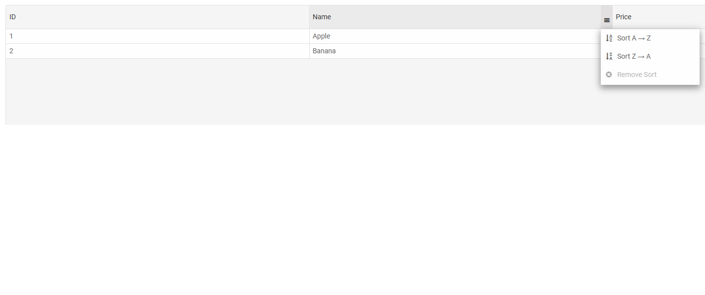
Step 4: Configure Your Grid
Create a Smart.Grid and enable command columns or toolbar actions. Example:
<smart-grid id="grid"></smart-grid>
const grid = document.getElementById('grid');

grid.dataSource = [
{ id: 1, name: 'Apple', price: 1.2 },
{ id: 2, name: 'Banana', price: 0.8 }
];

grid.columns = [
	{ label: 'ID', dataField: 'id' },
	{ label: 'Name', dataField: 'name' },
	{ label: 'Price', dataField: 'price' }
];

grid.sorting = {
  enabled: true
}

grid.editing = {
	enabled: true,
	mode: 'row'
};
Step 5: Verify Your Icons
Open your page in a browser and verify that each action button displays the correct custom icon. Adjust the font size or spacing as needed using CSS.
Tips and Best Practices
- You can use different icons for toolbar and command column buttons by adjusting your CSS selectors.
- If your icons are ligatures, ensure
contentmatches the icon name; for Unicode icons, use the corresponding code. - Use
!importantif your theme overrides it. - Maintain a consistent icon size for a clean UI.
.smart-grid-icon.smart-sort-button {
  font-family: 'Material Icons';
  --smart-icon-arrow-down: 'arrow_downward'
}
For AI tooling
Developer Quick Reference
Topic: grid-custom-icons Component: Grid Framework: JavaScript
Main methods: (none detected)
Common config keys: (none detected)
Implementation Notes
Compatibility: Modern browsers / Web Components API access pattern: const component = document.querySelector(...) + component.method()
Lifecycle guidance: Initialize configuration first, then invoke imperative API when element is available in DOM.
Common pitfalls:
- Calling methods before element initialization.
- Reassigning large configuration partially without understanding merge behavior.
- Missing required module script import for component type.
Validation checklist:
- Ensure module scripts and CSS are loaded once.
- Keep data schema aligned with columns/series definitions.
- Verify method calls target initialized component instance.