Getting Started with React Calendar Component
Smart UI React targets React 18+ and current Node LTS for tooling; use TypeScript templates when you want typed props and events.
Demo source (Smart UI repo): react/source/calendar/overview/App.jsx
1 Create a Vite + React + TypeScript app
npm create vite@latest my-smart-app -- --template react-ts
cd my-smart-app
thennpm install
2 Install Smart UI for React
npm install smart-webcomponents-react
3 Import styles and render the component
Open src/App.tsx (or App.jsx if you chose JavaScript). The snippet below matches Smart UI React demos for this widget:
import 'smart-webcomponents-react/source/styles/smart.default.css';
import './App.css';
import React, { useRef } from "react";
import { Calendar } from 'smart-webcomponents-react/calendar';
const App = () => {
const calendarRef = useRef(null);
const handleCancel = () => {
// Example: clear selection or any other logic
if (calendarRef.current) {
calendarRef.current.clearSelection();
}
};
const handleOk = () => {
// Example: alert selected date(s)
if (calendarRef.current) {
const selected = calendarRef.current.selectedDates;
alert("Selected dates: " + selected.join(", "));
}
};
return (
<div className="smart-demo-container">
<div id="materialPicker">
<section>
<h2>smartCalendar</h2>
<div>
<h2>
Allow users to enter dates easily and visually. You can customize date
formats, language, layout, animations, selection modes and much more
with the smartCalendar.
</h2>
<div className="module"></div>
</div>
</section>
<section id="datePickers">
<h2>Date pickers</h2>
<div className="module">
<p>
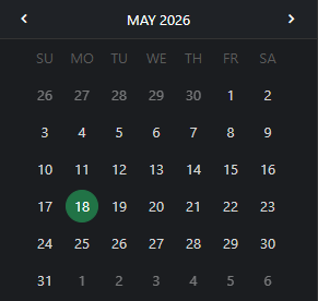
The selected day is indicated by a filled circle. The current day is
indicated by a different color and type weight.
</p>
<p>
Swipe left to right to navigate through the months. Touch the year in
the title bar to transition to the year view.
</p>
</div>
<div className="module">
<div>
<Calendar
ref={calendarRef}
selectionMode="one"
view="portrait"
hideOtherMonthDays
viewSections={["title", "header", "footer"]}
displayModeView="list"
// remove footerTemplate to use custom footer
></Calendar>
<div style={{ marginTop: '10px', textAlign: 'right' }}>
<button
className="material flat"
onClick={handleCancel}
style={{ marginRight: '10px' }}
>
CANCEL
</button>
<button className="material flat" onClick={handleOk}>
OK
</button>
</div>
</div>
<br />
<p>Date and year picker: portrait, month display mode</p>
</div>
{/* ... you can do the same for other Calendar instances if needed */}
</section>
</div>
</div>
);
};
export default App;
4 Run the dev server
npm run dev
Open the URL Vite prints (often http://localhost:5173/).
TypeScript Support
Types ship with smart-webcomponents-react. Import the component and prop types:
import type { Calendar, CalendarProps } from 'smart-webcomponents-react/calendar';
The generated wrappers expose on* callbacks (for example onChange) whose arguments are standard DOM Event values unless the widget typings narrow them further.
Accessibility
The Calendar component follows WAI-ARIA best practices:
- Keyboard navigation - Tab, Arrow keys, Enter, and Escape are supported
- ARIA roles - Appropriate roles and labels are applied automatically
- Focus management - Visible focus indicators for keyboard users
- Screen readers - State changes are announced to assistive technology
- High contrast - Supports Windows High Contrast Mode and forced colors
For custom labeling, set aria-label or aria-labelledby attributes on the component.
Supported stacks: Smart UI targets Angular 17+, React 18+, Vue 3+, Node 18 LTS, and evergreen browsers; pin exact package versions to your org policy.