Grid for Angular
Angular standalone version of this topic (compatible with Angular 17+). Import both the Smart UI component and module in the standalone component.
What this topic covers: practical setup, the framework-specific API access pattern, and copy-adapt guidance for the examples in this page.
import { Component, ViewChild, ViewEncapsulation } from '@angular/core';
import { CommonModule } from '@angular/common';
import { RouterOutlet } from '@angular/router';
import { GridComponent, GridModule } from 'smart-webcomponents-angular/grid';

@Component({
  selector: 'app-root',
  standalone: true,
  imports: [CommonModule, GridModule, RouterOutlet],
  templateUrl: './app.component.html',
  styleUrls: ['./app.component.css'],
  encapsulation: ViewEncapsulation.None
})
export class AppComponent {
  @ViewChild('grid', { read: GridComponent, static: false }) grid!: GridComponent;
}
<!-- app.component.html -->
<smart-grid #grid></smart-grid>
Use this.grid for API methods in this topic.
Build your web apps using Smart UI
Smart.Grid - Appearance
Grid Appearance
Smart.Grid provides many ways to modify its appearance to best suit user requirements. The property/object that controls these features is appearance. Below you can find an overview of some of the major appearance-related features of the Grid:
More information: property appearance in the Grid API documentation.
Auto Height
To make Smart.Grid as high as its content, height: auto has to be applied in the Grid's CSS. This displays all rows without scrollbar. Please note that when displaying large data sets, auto height may cause performance hindrance and using Paging or Scrolling is recommended instead.
Cells Wrap
The text in Grid cells can wrap automatically when the property appearance.allowCellsWrap is set to true. This functionality is especially useful in conjuction with auto row height, which can be enabled by setting layout.rowHeight to 'auto'.
Row Header
In Smart.Grid, rows, as well as columns, can have headers. They are enabled by setting appearance.showRowHeader to true.
Additional properties, part of the appearance object, that control the behavior of row headers are:
-
showRowHeaderNumber - displays a row header number.
- showRowHeaderEditIcon - displays an Edit icon when the row is in edit state.
-
showRowHeaderSelectIcon - displays a Select icon when the pointer is over the row header. It indicates that the user can select the row.
- showRowHeaderFocusIcon - displays a Focus icon when the row is in focus state.
- allowRowHeaderEdit - enables row header cells editing. More information can be found in the Grid Editing help topic.
- allowRowHeaderSelection - sets or gets whether selection by clicking on a Row header is allowed. More information can be found in the Grid Selection help topic.
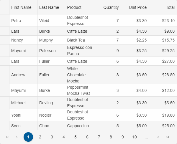
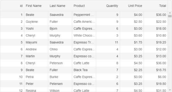
Alternating Rows
Smart.Grid provides alternating rows options. It can render alternation by one or multiple rows with optional custom alternation start and end. This behavior is controlled by the appearance.alternationStart, appearance.alternationEnd, and appearance.alternationCount properties.
The image below shows a Grid with:
appearance: {
    alternationStart: 1,
    alternationEnd: 10,
    alternationCount: 3
},
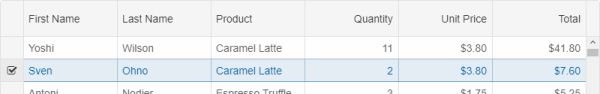
Lines
Smart.Grid provides multiple line customization options. It can render horizontal, vertical, or both horizontal and vertical lines. This is controlled by the properties appearance.showRowLines (horizontal lines), appearance.showColumnLines (vertical cell lines), and appearance.showColumnHeaderLines (vertical column header lines) properties.
The image below shows a Grid with only appearance.showColumnLines set to true:
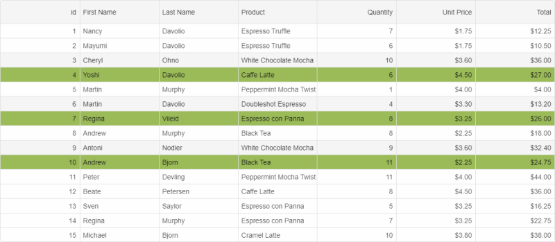
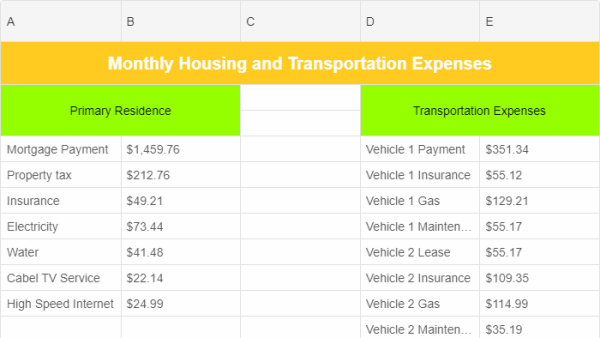
Merged Cells
Merging cells is available in Smart.Grid. This is achieved by setting the properties rowSpan (the number of rows the cell ocupies) and colSpan (the number of columns the cell ocupies) of a Grid cell's object. This object can be retrieved as follows:
const rows = this.grid.rows;

rows[1].cells[0].value = "Primary Residence";
rows[1].cells[0].colSpan = 2;
rows[1].cells[0].rowSpan = 2;
For AI tooling
Developer Quick Reference
Topic: grid-appearance Component: Grid Framework: Angular
Main methods: (none detected)
Common config keys: appearance
Implementation Notes
Compatibility: Angular 17+ (standalone) API access pattern: @ViewChild(...) + this.component.method()
Lifecycle guidance: Bind inputs declaratively and call imperative API through @ViewChild in/after ngAfterViewInit.
Common pitfalls:
- Using @ViewChild API too early (before view init).
- Omitting standalone imports for Smart modules in @Component.imports.
- Type mismatches between configuration fields and template bindings.
Validation checklist:
- Ensure module import exists in standalone component imports array.
- Use typed @ViewChild(..., { read: ComponentType }).
- Call imperative methods after view initialization.