Columns
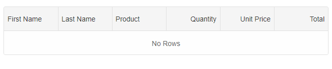
Each column in the grid is defined using a 'columns' property. Columns are displayed in the grid in the same order they are in the 'columns' array. The following example shows a simple grid with 5 columns defined:
const gridOptions = {
    columns: [
        { label: 'First Name', dataField: 'firstName' },
        { label: 'Last Name', dataField: 'lastName' },
        { label: 'Product', dataField: 'productName' },
        { label: 'Quantity', dataField: 'quantity', align: 'right', cellsAlign: 'right' },
        { label: 'Unit Price', dataField: 'price', align: 'right', cellsAlign: 'right', cellsFormat: 'c2' },
        { label: 'Total', dataField: 'total', align: 'right', cellsAlign: 'right', cellsFormat: 'c2' }
    ]
}
const grid = new Smart.Grid("#grid", gridOptions);
Note that 'cellsAlign' and 'align' properties. 'align' defines the alignment of column headers and 'cellsAlign' defines the alignment of the cells in the column. The values could be 'left', 'center' and 'right'.
See Grid API and navigate to "columns" for a list of all properties that can be applied to a column.
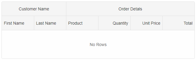
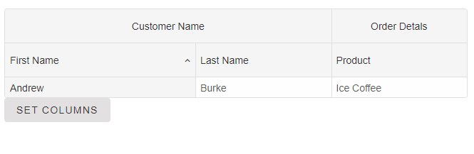
Column Groups
If you want the columns to be displayed in groups look at:
const gridOptions = {
    columns: [
        {
            label: 'First Name', dataField: 'firstName', columnGroup: 'name'
        },
        { label: 'Last Name', dataField: 'lastName', columnGroup: 'name' },
        { label: 'Product', dataField: 'productName', columnGroup: 'order' },
        { label: 'Quantity', dataField: 'quantity', align: 'right', cellsAlign: 'right', columnGroup: 'order' },
        { label: 'Unit Price', dataField: 'price', align: 'right', cellsAlign: 'right', cellsFormat: 'c2', columnGroup: 'order' },
        { label: 'Total', dataField: 'total', align: 'right', cellsAlign: 'right', cellsFormat: 'c2', columnGroup: 'order' }
    ],
    columnGroups: [
        { label: 'Customer Name', align: 'center', name: 'name' },
        { label: 'Order Detals', align: 'center', name: 'order' }
    ]
}
const grid = new Smart.Grid("#grid", gridOptions);
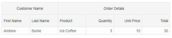
Get Row Data Values
The 'column.dataField' property is used to set the data property name from the row data object. If your data contains nested objects, you can use dot notation to reference deep property values. For example, if the row data has an object property "product" that contains the individual product fields - "name", "quantity", "price" and "total", you can use the following:
const gridOptions = {
    dataSourceSettings: {
        dataFields: [
            { name: 'firstName', dataType: 'string' },
            { name: 'lastName', dataType: 'string' },
            { name: 'productName', map: 'product.name', dataType: 'string' },
            { name: 'quantity', map: 'product.quantity', dataType: 'string' },
            { name: 'price', map: 'product.price', dataType: 'string' },
            { name: 'total', map: 'product.total', dataType: 'string' }
        ]
    },
    dataSource: [
        {
            firstName: 'Andrew',
            lastName: 'Burke',
            product: {
                name: 'Ice Coffee', price: 10, quantity: 3, total: 30
            }
        }
    ],
    columns: [
        {
            label: 'First Name', dataField: 'firstName', columnGroup: 'name'
        },
        { label: 'Last Name', dataField: 'lastName', columnGroup: 'name' },
        { label: 'Product', dataField: 'productName', columnGroup: 'order' },
        { label: 'Quantity', dataField: 'quantity', align: 'right', cellsAlign: 'right', columnGroup: 'order' },
        { label: 'Unit Price', dataField: 'price', align: 'right', cellsAlign: 'right', cellsFormat: 'c2', columnGroup: 'order' },
        { label: 'Total', dataField: 'total', align: 'right', cellsAlign: 'right', cellsFormat: 'c2', columnGroup: 'order' }
    ],
    columnGroups: [
        { label: 'Customer Name', align: 'center', name: 'name' },
        { label: 'Order Detals', align: 'center', name: 'order' }
    ]
}
const grid = new Smart.Grid("#grid", gridOptions);
Adding and removing columns
You can dynamically add new columns. For example:
grid.columns.push({ label: 'Total', dataField: 'total', align: 'right', cellsAlign: 'right', cellsFormat: 'c2', columnGroup: 'order' });
or you can completely change the columns array. The state of the columns even if they already exist will be lost i.e all previous settings will reset. For example:
grid.columns = [
	{ label: 'First Name', dataField: 'firstName', columnGroup: 'name' },
	{ label: 'Last Name', dataField: 'lastName', columnGroup: 'name' },
	{ label: 'Product', dataField: 'productName', columnGroup: 'order' }
]
To remove a column you can use:
grid.columns.pop();or to remove a column at specific index.
grid.columns.splice(0, 1);
It is possible to add and remove columns by updating the list of Colums provided to the grid by using the 'setColumns' method. The difference between the previous approach is that by using 'setColumns', the grid will compare the new columns passed as argument to the method with existing columns. The Grid will automatically create new columns, keep old columns if they already exist and remove columns which are not in the 'setColumns' method argument. The benefit of that is that the state of the column like(sort, filter, width or other) will be kept, if the column exsits after the new columns are applied.
grid.setColumns([
	{ label: 'First Name', dataField: 'firstName', columnGroup: 'name' },
	{ label: 'Last Name', dataField: 'lastName', columnGroup: 'name' },
	{ label: 'Product', dataField: 'productName', columnGroup: 'order' }
]);
Resize and Sort first name column.
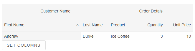
After invoking the 'setColumns' method.
Note changing columns doesn't impact its sort and width.
Updating columns
You can update a column in the columns list by using its index. For example:
grid.columns[0] = {
	label: 'First Name 2', dataField: 'firstName'
}
If you want to update a column property you can use:
grid.columns[0].label = "New First Name";To get a column property, you can use:
const label = grid.columns[0].label;All column properties are reactive. If you change a column property, the grid will be updated.
If you want to get/set column properties by using the column's 'dataField' property, you can use the 'getColumnProperty(dataField, propertyName)' and 'setColumnProperty(dataField, propertyName, value)' methods.
grid.setColumnProperty('productName', 'label', 'New Product');
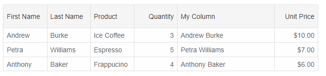
Unbound columns
It is possible to create a column which is not bound to a data field in the data source.For example:
const gridOptions = {
    dataSourceSettings: {
        dataFields: [
            { name: 'firstName', dataType: 'string' },
            { name: 'lastName', dataType: 'string' },
            { name: 'productName', map: 'product.name', dataType: 'string' },
            { name: 'payment', map: 'product.payment', dataType: 'string' },
            { name: 'quantity', map: 'product.quantity', dataType: 'number' },
            { name: 'price', map: 'product.price', dataType: 'number' },
            { name: 'total', map: 'product.total', dataType: 'number' }
        ]
    },
    editing: {
        enabld: true
    },
    layout: {
        allowCellsWrap: true,
        rowHeight: 'auto'
    },
    behavior: {
        columnResizeMode: 'growAndShrink'
    },
    sorting: {
        enabled: true
    },
    dataSource: [
        {
            firstName: 'Andrew',
            lastName: 'Burke',
            product: {
                name: 'Ice Coffee', price: 10, quantity: 3, total: 30, payment: 'Visa'
            }
        },
        {
            firstName: 'Petra',
            lastName: 'Williams',
            product: {
                name: 'Espresso', price: 7, quantity: 5, total: 35, payment: 'Visa'
            }
        },
        {
            firstName: 'Anthony',
            lastName: 'Baker',
            product: {
                name: 'Frappucino', price: 6, quantity: 4, total: 24, payment: 'Mastercard'
            }
        }
    ],
    columns: [
        {
            label: 'First Name', dataField: 'firstName'
        },
        { label: 'Last Name', dataField: 'lastName' },
        { label: 'Product', dataField: 'productName' },
        {
            label: 'Quantity', dataField: 'quantity', cellsAlign: 'right'
        }, {
            label: 'My Column', width: 200, dataField: 'name', getCellValue: (id, dataField, data) => {
                return data.firstName + ' ' + data.lastName;
            }
        },
        {
            label: 'Unit Price', dataField: 'price', cellsAlign: 'right', cellsFormat: 'c2'
        }
    ]
}
The 'My Column' is a custom column which is not bound to the data source. We use the 'getCellValue' callback function which is called for each cell in that column and returns a cell value.
For the purposes of the sample, we return a new value which uses the first name and last name column values.
For AI tooling
Developer Quick Reference
Topic: grid-column-definitions Component: Grid Framework: JavaScript
Main methods: setColumns(), setColumnProperty()
Common config keys: columns, dataSource, editing, layout, behavior, sorting
Implementation Notes
Compatibility: Modern browsers / Web Components API access pattern: const component = document.querySelector(...) + component.method()
Lifecycle guidance: Initialize configuration first, then invoke imperative API when element is available in DOM.
Common pitfalls:
- Calling methods before element initialization.
- Reassigning large configuration partially without understanding merge behavior.
- Missing required module script import for component type.
Validation checklist:
- Ensure module scripts and CSS are loaded once.
- Keep data schema aligned with columns/series definitions.
- Verify method calls target initialized component instance.